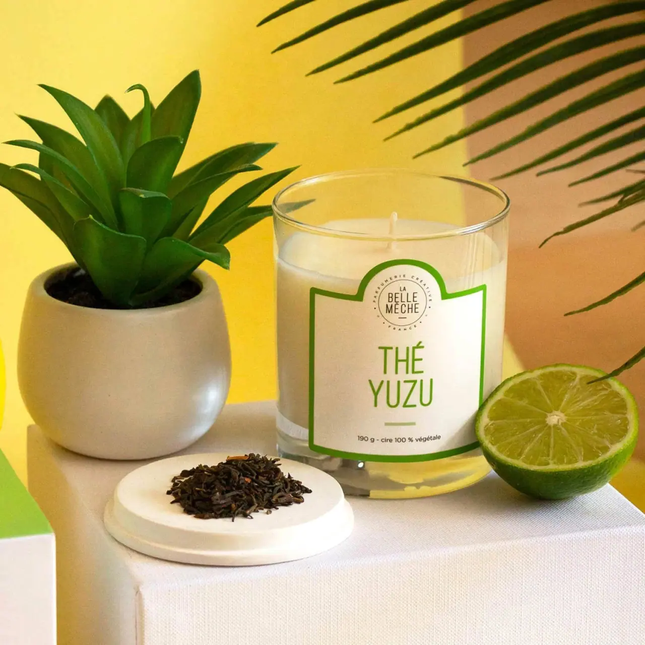
Photography: La Belle Mèche official photography. Images belong to their respective owners.
La Belle Mèche

Green scent lettering inside an arched white candle label
Thé Yuzu gives a simple transparent candle vessel a recognisable front through its label silhouette. A broad pale panel rises into a central arch around the small circular maker seal; a green outline follows the perimeter. Tall green capitals stack the scent name in the large space below, while a compact dark line carries weight and wax wording near the base. The approved image surrounds this restrained artwork with tea leaves, green citrus and a bright yellow setting. Those props make the fragrance story more explicit without becoming part of the printed label.
- Candles & home scent
- Light pack
- Heritage label
- Bold typographic
About this study
The selected Thé Yuzu candle front in the official styled photograph, with its unlit wick and green-bordered label. No universal collection rules or hidden packaging components are established.
Sources & evidence · Reviewed 2026-10-19Color Palette
Approximate colours interpreted from photography. These are screen references, not official brand colours or print specifications.
Label
Warm white field
#F2EFE1
Approximate pale label background under warm photographic light. It remains visibly separate from the transparent margins around it.
Ink
Leaf green
#4F8C13
Approximate border, two-line scent name and short lower dash. It concentrates colour in a few strong marks rather than a full illustrated surface.
Dark seal lettering
#3F392C
Approximate small maker seal and technical footer. Its distinction from green is visible, though exact ink formulation and colour standards are unknown.
Typography
Suggested visual alternatives, not confirmed brand typefaces. Any scale below is an illustrative estimate.
THÉ and YUZU occupy two large centred lines in a tall, relatively narrow sans serif. Their light-to-medium strokes feel open rather than heavy, leaving pale space within and around the characters. Above, the maker is divided into short stacked lines inside a small circular seal, with tiny perimeter wording. Below, a short horizontal dash marks a pause before the much smaller weight and wax statement. Scent is therefore the first textual read, maker the next, and practical detail the close-up read. The acute accent is part of the title's silhouette and needs room above the first line.
Fonts
Original scent-title alternative
Barlow Condensed
- Looks like
- Tall narrow sans serif
- Type
- Condensed sans serif
- Weight
- Regular, Medium
- Case
- Uppercase
- Tracking
- Moderately open
- Fallback
- Arial Narrow, Arial, sans-serif
Build a two-line original fragrance name with an even optical width. Preserve clear accents and counters rather than compressing the title until every line mechanically matches.
Seal and practical-copy alternative
Source Sans 3
- Looks like
- Simple readable sans serif
- Type
- Humanist sans serif
- Weight
- Regular, SemiBold
- Case
- Mixed case for detail; uppercase for small identity
- Tracking
- Open around a circle, normal in footer
- Fallback
- Arial, sans-serif
Keep the lower information line clear at real label size. An original maker seal should use new geometry and proportions rather than rebuilding La Belle Mèche's circular lettering.
Structure & Proportions
Visual proportions and finish previews are illustrative. Confirmed construction details and uncertainties are distinguished in the study notes.
Proportions
| Purpose | Value | Preview |
|---|---|---|
| Wide label on a simple vessel | The panel covers much of the visible front width while leaving transparent margins and a clear base beneath it. Perspective does not yield a reliable wrap percentage. | — |
| Small maker above large scent | The circular identity occupies the raised arch, while the two-line scent uses the broad central field below. | — |
| Visible candle above the panel | The rim, pale fill surface and wick remain readable above the label, preserving the object's candle identity even when the front is dominated by graphics. | — |
Shapes
| Element | Value | Preview |
|---|---|---|
| Vessel | Straight-sided clear cylinder with an elliptical rim in perspective. | |
| Label crown | Broad rectangular panel with stepped shoulders rising into a central arch. | |
| Maker seal | Small round device containing stacked lettering and tiny perimeter text. | |
| Lower separator | Short horizontal green dash between title and footer. |
Finishes
Clear reflective vessel appearance
Rim, side margins and base · transparent
Low-glare pale label appearance
Main printed front panel; stock unverified · matte
Formats and materials
| Formats | Straight-sided transparent cylindrical candle vessel, Open top with one visible wick and pale wax, Broad front label with a central raised arch |
| Materials | The official product page specifies 190 g of 100% soy wax and a lead-free cotton wick; these describe the candle contents rather than label or vessel manufacture., The clear tumbler has a glass-like appearance with a thick-looking base, but the inspected product text does not provide a vessel material specification or glass composition., Label substrate, adhesive, coating and exact cutting process are not documented. A paper-like appearance should not be promoted to a verified uncoated stock. |
| Closures | The candle is shown open, with the upper rim and unlit wick visible. No closure is fitted to the vessel. A round pale object in the foreground supports tea leaves, but this view does not establish that it is a supplied lid or that it fits the candle. Outer-box construction and any transport protection remain outside the selected image. |
| Decoration | Green perimeter with a central upward arch, Compact circular maker seal at the top, Large two-line scent title, Small horizontal dash above the technical footer |
Front Panel
Schematic reading order. The diagram’s zone heights do not represent measured artwork proportions.
The outline does two jobs: it defines the label perimeter and raises the small maker seal into a distinct top compartment. The fragrance title sits lower in the broad uninterrupted field, with a simple dash and footer finishing the centred axis. Nothing in the artwork depicts a literal tea leaf or citrus slice. The name and green treatment carry the scent cue on the physical pack, while photography supplies the more literal associations. The curved lower edge in the image is affected by wrapping and perspective, so it is not an exact flat dieline.
| Zone | Content |
|---|---|
| Arched maker area | Small dark circular La Belle Mèche seal with additional tiny perimeter wording. |
| Main scent field | THÉ above YUZU in large green narrow capitals, centred within a wide pale area. |
| Lower pause | Short green dash separates the title from the technical line. |
| Footer | Readable 190 g and vegetable-wax wording in small dark type. This is product information rather than a visible third-party certification. |
Range System
This single inspected candle supports a scent-first hierarchy, not a verified map of the entire collection. The green border and title can act together as a variant cue, while the small maker seal could remain stable in an original range. Whether La Belle Mèche actually changes every fragrance's ink colour, vessel size or label shape requires additional product comparisons. The label's fairly generous centre leaves room for different title lengths, but longer names would still need individual fitting rather than arbitrary reduction.
- The selected Thé Yuzu front repeats green in both border and scent name.
- Its maker seal is smaller and visually independent of the main fragrance wording.
- A hypothetical original candle series could preserve a clear title position while testing names with different lengths and accents; this is design guidance, not a documented brand manual.
Back of Pack & Shelf
The back, bottom and any outer carton are not visible. The product page includes further information, but that web content does not establish its physical label location.
- No barcode, batch field or candle-use warning position is documented by this view.
- Do not invent a wraparound information panel from the visible front silhouette.
- For an original package, keep practical and safety information readable on the actual vessel or supplied packaging, with its final placement established separately.
On shelf
As a visual interpretation, the combination of a recognisable arched crown and a large two-line name offers two useful distances of recognition. The green border can survive as a simple outline at thumbnail size, while the exact scent becomes readable closer up. The fine maker-seal text will recede earlier and should not carry essential variant information. The photograph's saturated yellow background intensifies the presentation, so a neutral shelf could produce a quieter impression. Evaluating the label independently of those props would reveal how much recognition comes from the package itself.
Imagery
The candle stands on a fabric-covered pale block between a potted plant and a cut green citrus fruit. Tea leaves rest on a round pale prop in front, while long leaves cross the upper-right background. Yellow and green styling gives the scene a vivid summer mood, but the actual label remains restrained. The official scent description connects tea and citrus, supporting the broad association without proving the fruit's botanical identity. The wick is unlit: no flame or burning demonstration appears in the approved image. The pale wax and clear rim remain visible above the label.
Guidelines
Editorial principles for an original design brief, not official brand guidelines.
Do
- Give the scent name the largest readable field.
- Use label silhouette to separate maker and variant roles.
- Check accents and narrow counters at actual print size.
- Keep photographic fragrance props distinct from printed artwork.
- Evaluate the package on a neutral background as well as in a styled scene.
Don't
- Do not describe the photographed wick as burning.
- Do not identify the foreground round prop as a supplied lid without evidence.
- Do not add background yellow to the pack's printed palette.
- Do not infer a complete colour-coded range from one candle.
- Do not copy the maker seal or exact arched outline.
Sources & evidence
How this study was built
structure · Sourced fact
Official specifications identify 190 g, soy wax and a lead-free cotton wick.Bougie Parfumée Thé Yuzu — La Belle Mèchelabel · Visual observation
The pale label has a green outline and central arch enclosing a small maker seal, with a large two-line scent title below.Bougie Parfumée Thé Yuzu — La Belle Mèchetypography · Visual observation
Narrow green capitals dominate the front, with a smaller dark maker seal and technical footer.Bougie Parfumée Thé Yuzu — La Belle Mècheimagery · Visual observation
The selected image shows an unlit wick, cut citrus, tea leaves and plants; no flame appears.Bougie Parfumée Thé Yuzu — La Belle Mècheimagery · Sourced fact
The official scent description links tea and citrus, supporting the broad photographic association without identifying the exact fruit prop.Bougie Parfumée Thé Yuzu — La Belle Mècherange · Editorial interpretation
Scent-first naming and repeated green suggest a usable variant hierarchy, but no complete range colour mapping is established.
What remains unverified
- Vessel material specification, label stock and printing process are not provided in the inspected source.
- Exact fonts, physical colour standards and dimensions are unknown.
- Back, base and any outer carton or supplied lid are not inspected.
- The single selected candle does not establish the whole range's colour code.
Give your AI
packaging taste
Give your design or image tool a packaging study: palette, type, structure, front panel and principles for an original brief.
Export this styleFree with an email. PACK.md works in Claude, ChatGPT, Cursor and image tools.
More like this
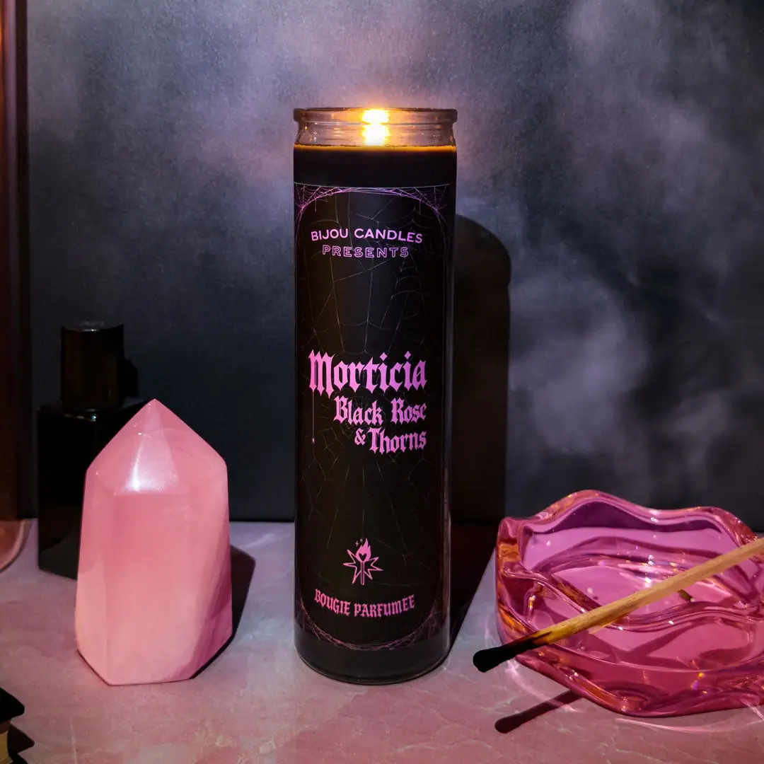
Bijou Candles
Pink blackletter and fine webs on a tall dark candle
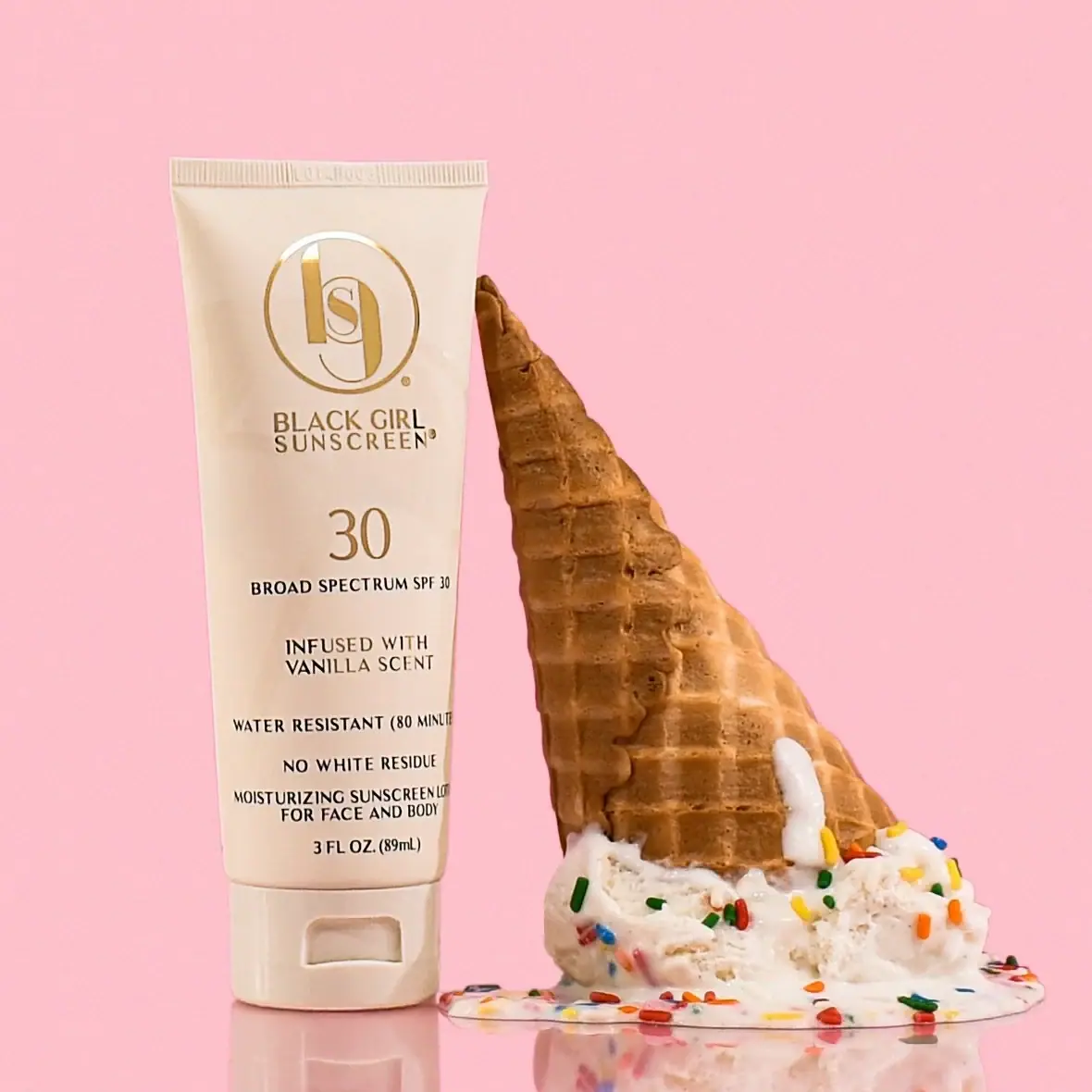
Black Girl Sunscreen
Cream tube with gold crest and an isolated SPF numeral
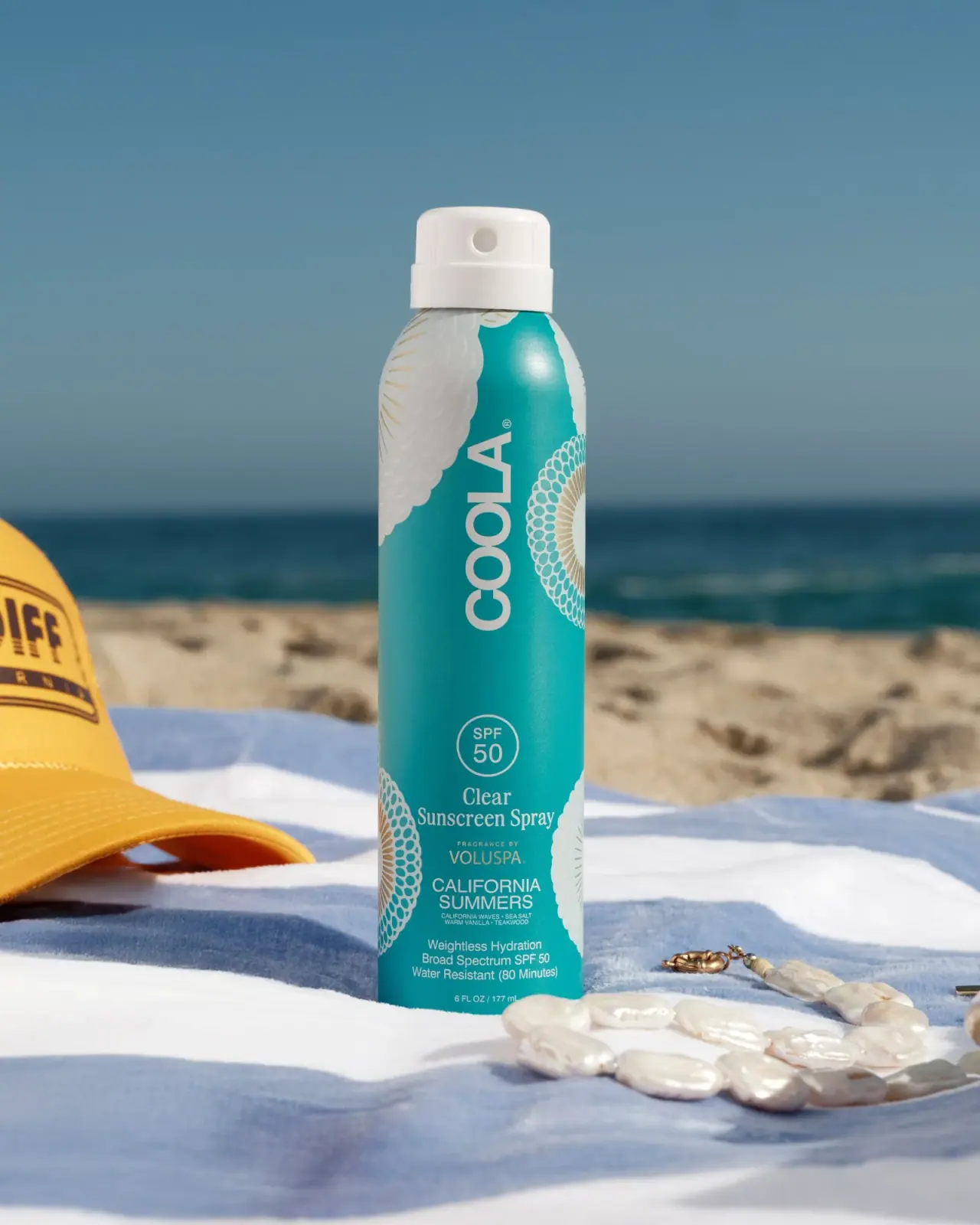
COOLA
Turquoise cylinder, cropped rosettes, vertical brand and fragrance attribution

Coppertone
Blue fields, a yellow sun and a clear number

Dr. Bronner’s
A bright soap wrapper with a densely ordered voice
ICONIC London
Geometric powder relief inside a warm reflective round compact

Kettle & Fire
farmhouse animal badges on black cartons
L:A Bruket
Amber pump bottle with a ruled typographic information label