Photography: Shan Benson Studio — Live Tinted product photography. Images belong to their respective owners.
Live Tinted

Pale peach stick, vertical lettering and exposed golden balm
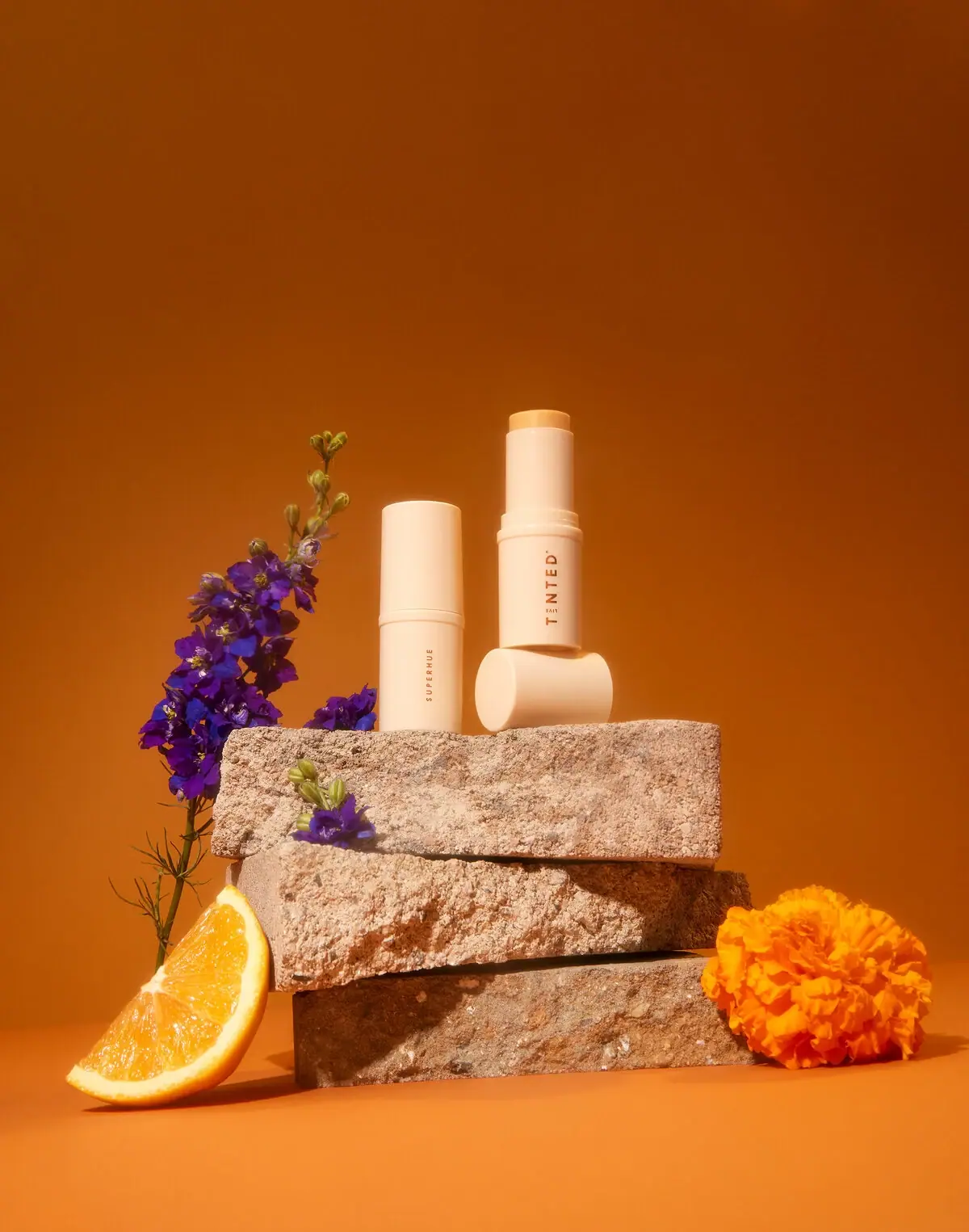
Superhue presents a serum in a compact stick format rather than a conventional dropper bottle. The selected photograph shows one pale peach case closed and a second opened, with its golden balm slightly exposed and its cap lying sideways beneath it. Small SUPERHUE lettering runs vertically on the closed example, while the open example turns a larger TINTED identity toward the viewer. Broad unprinted surfaces and a close colour match between cap, base and inner sleeve make the simple cylinder the main visual feature. The two examples demonstrate viewing states, not a verified comparison between product sizes.
- Skincare
- Light pack
- Clinical minimal
- Pastel soft-touch
About this study
Selected Superhue serum-stick photograph showing capped and open examples with complementary text orientations. Current source confirms product format, but exact photographed size and edition date are not established.
Sources & evidence · Reviewed 2026-10-19Color Palette
Approximate colours interpreted from photography. These are screen references, not official brand colours or print specifications.
Pack body
Pale peach shell
#F4D3AF
Approximate case, cap and inner-sleeve colour under warm light. The shared appearance does not prove identical component materials or a tactile coating.
Ink
Warm brown lettering
#9A542D
Approximate vertical maker and product-name text. It is darker than the shell but occupies very little of the visible surface.
Accent
Golden balm tip
#E8AF58
Approximate exposed product colour, distinct from the pale case and from the saturated orange background.
Typography
Suggested visual alternatives, not confirmed brand typefaces. Any scale below is an illustrative estimate.
The typography is sparse and longitudinal. SUPERHUE appears in small spaced uppercase letters along the closed case's lower body, leaving most of the shell blank. On the opened example, TINTED is larger and similarly aligned along the long axis, with tiny associated maker detail. The two shown orientations do not provide a single flat front containing both names. Their hierarchy should therefore be read as complementary views of the same reference rather than a large combined title stack. The small product name is restrained, not an oversized graphic filling the case.
Fonts
Original maker alternative
Montserrat
- Looks like
- Clean spaced uppercase sans
- Type
- Geometric sans serif
- Weight
- Medium, SemiBold
- Case
- Uppercase
- Tracking
- Open
- Fallback
- Arial, sans-serif
Explore a modest original identity on a narrow case while preserving clear contrast. Avoid recreating the proprietary TINTED arrangement or assuming a small vertical name is readable at every distance.
Small product-name alternative
Barlow
- Looks like
- Compact practical sans
- Type
- Sans serif
- Weight
- Medium
- Case
- Uppercase
- Tracking
- Moderately open
- Fallback
- Arial, sans-serif
Keep an original short product name readable without crowding the cylinder. Check how rotation hides the beginning or end of a word, and test the pack in the user's natural holding orientation.
Structure & Proportions
Visual proportions and finish previews are illustrative. Confirmed construction details and uncertainties are distinguished in the study notes.
Proportions
| Purpose | Value | Preview |
|---|---|---|
| Long cap on closed cylinder | The cap occupies a substantial upper part of the closed silhouette, with its seam separating two similarly coloured cylindrical sections. No measured cap/body ratio is asserted. | — |
| Small exposed application surface | Only a short golden product segment projects above the pale inner sleeve, making the application end visible without displaying a large length of balm. | — |
| Typography subordinate to form | The words use a narrow strip of the case, leaving the solid pale silhouette more visually dominant than the printed information. | — |
Shapes
| Element | Value | Preview |
|---|---|---|
| Closed stick | Tall simple cylinder with a gently rounded cap edge and a narrow horizontal seam. | |
| Open inner sleeve | Slimmer cylinder extending above the lower housing and ending around the exposed balm. | |
| Balm surface | Small round application face, foreshortened in the selected viewing angle. | |
| Detached cap | Matching cylindrical piece shown on its side with a circular end facing the viewer. |
Finishes
Smooth pale case appearance
Cap, outer housing and inner sleeve · matte
Soft product highlight
Exposed golden balm tip · gloss
Formats and materials
| Formats | Pale cylindrical stick case shown both capped and uncapped, Matching detached cap used as a horizontal prop in the composition, Narrow inner sleeve holding a slightly exposed solid product tip |
| Materials | The smooth opaque case has a plastic-like appearance, but the inspected source does not specify its polymer, recycled content or layer construction., The official product page identifies a balm-to-serum formula, supporting the visible solid-stick presentation without establishing the packaging material., Cap fit, internal carrier, advance mechanism and decorative process are not inspected. Smooth highlights do not prove a soft-touch coating despite the gentle visual palette. |
| Closures | The closed example has a long cylindrical cap meeting the lower body at a narrow horizontal seam. On the open example, the cap is removed and lies on its side below the case; a raised collar and inner sleeve become visible. The image communicates a retractable-stick-style arrangement but does not demonstrate the actual advance motion, locking action or internal mechanism. No refill cartridge or replaceable insert is documented. |
| Decoration | Vertical product-name lettering on the closed view, Larger longitudinal maker identity on the opened view, Broad unprinted case areas, No visible ingredient illustration, patterned wrap or contrasting front label |
Front Panel
Schematic reading order. The diagram’s zone heights do not represent measured artwork proportions.
The case itself acts as the label field. No paper rectangle or printed border separates information from the pale housing. The closed and open examples expose different longitudinal text: a small product name on one, a larger maker identity on the other. This sparse treatment makes the open tip and cap seam especially useful for explaining the object. It does not reveal a full information panel or establish where the product role, quantity and directions appear on the physical unit. Those missing details should not be reconstructed from the current webpage.
| Zone | Content |
|---|---|
| Closed-case product face | Small vertical SUPERHUE lettering placed on the lower cylindrical body. |
| Opened-case maker face | Larger TINTED identity running along the body with small associated maker detail. |
| Cap surface | Broad plain pale area in the selected views; no additional readable front copy. |
| Application end | A slightly exposed golden balm face above the matching pale sleeve, providing a physical function cue. |
Range System
The official page offers Original and Mini sizes, but the selected photograph does not identify either example's capacity. Apparent height differences can result from the opened state, viewing position and stacked presentation, so these must not be labelled as two sizes. The useful comparison here is capped versus exposed product and product-name face versus maker face. An original family could preserve a restrained shell while varying role names, but this single product cannot establish a universal Live Tinted colour or geometry system.
- Two photographed examples show complementary orientations of the selected Superhue reference.
- Current Original and Mini options are source context, not a proven identification of the two shown cases.
- An original extension should keep functional naming legible when several similar pale sticks stand together, rather than relying only on exposed product colour.
Back of Pack & Shelf
Although the image offers two text orientations, it does not reveal a complete reverse, underside or carton. There is no readable full ingredient, capacity or batch panel in the selected composition.
- Do not treat the current online ingredient list as the photographed edition's printed back layout.
- No refill direction or internal mechanism diagram is established.
- For original packaging, retain practical identification on a durable readable surface even when a removable cap is separated from its base.
On shelf
As a visual interpretation, the simple pale cylinder communicates a compact personal-care object before the small lettering can be read. The opened state helps explain the unusual serum-stick format, but a closed stick alone provides less functional information in this view. The vertical product name rewards a closer look and may require rotation in the hand. Testing the case on a neutral counter, beside similar pale sticks and without the dramatic open-state arrangement would reveal how effectively the permanent information distinguishes it outside the campaign scene.
Imagery
Shan Benson's photograph raises the two pale sticks on rough stone blocks against a deep orange field. Purple flowers climb along the left side, while an orange wedge and a bright orange flower sit near the base. One open stick is balanced above its sideways cap, giving the composition more height and revealing the product tip. The rich setting intensifies the pale shell's visibility. These props are not a verified formula diagram: the fruit and flowers should not be converted into ingredient claims, and the stone blocks are not supplied packaging components.
Guidelines
Editorial principles for an original design brief, not official brand guidelines.
Do
- Show open and closed states when the format needs explanation.
- Distinguish complementary views from different product sizes.
- Keep essential identity readable on the base when the cap is removed.
- Evaluate sparse vertical text at realistic viewing distance.
- Separate ingredient evidence from colourful photographic props.
Don't
- Do not call the small SUPERHUE name oversized.
- Do not infer polymer or soft-touch coating from appearance.
- Do not assign Original and Mini to the two photographed examples.
- Do not claim a refill system or tested advance mechanism.
- Do not copy the maker arrangement or the stacked stone-and-flower scene.
Sources & evidence
- Superhue Hyperpigmentation Serum Stick — Live Tintedproduct
- Beauty Product Photography — Shan Benson Studiophotographer
How this study was built
edition · Sourced fact
Official product page identifies a balm-to-serum stick and offers Original and Mini options without identifying this photograph's size.Superhue Hyperpigmentation Serum Stick — Live Tintedimagery · Sourced fact
Shan Benson's portfolio lists the matching asset as 20211129 LIVETINTED_SHOT2; filename alone is not treated as a public launch date.Beauty Product Photography — Shan Benson Studiostructure · Visual observation
Two examples show a closed cylinder and an exposed balm tip with a detached matching cap.Beauty Product Photography — Shan Benson Studiotypography · Visual observation
Small vertical SUPERHUE appears on one view and larger longitudinal TINTED identity on the other, leaving extensive unprinted surfaces.Beauty Product Photography — Shan Benson Studiopalette · Visual observation
Pale peach housing, warm dark lettering and golden tip are distinct from orange background, flowers and stone props.Beauty Product Photography — Shan Benson Studiorange · Editorial interpretation
The two examples illustrate viewing states rather than a verified Original-versus-Mini packaging comparison.
What remains unverified
- Original and Mini are offered currently, but photographed cases are not assigned a size.
- Case material, coating, mechanism and refillability are unverified.
- Exact fonts, physical colour standards, dimensions and edition date are not established.
- No full reverse, underside or carton is inspected; props are not ingredient evidence.
Give your AI
packaging taste
Give your design or image tool a packaging study: palette, type, structure, front panel and principles for an original brief.
Export this styleFree with an email. PACK.md works in Claude, ChatGPT, Cursor and image tools.
More like this

Cocokind
sideways lowercase on spa-water pastels

Herbivore
pastel tinted vessels with a white tag
ILIA
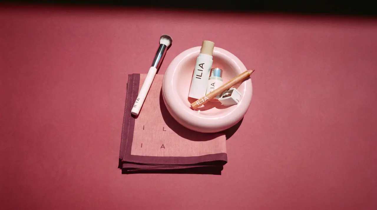
whispered capitals on skin-tone sleeves
Lixirskin
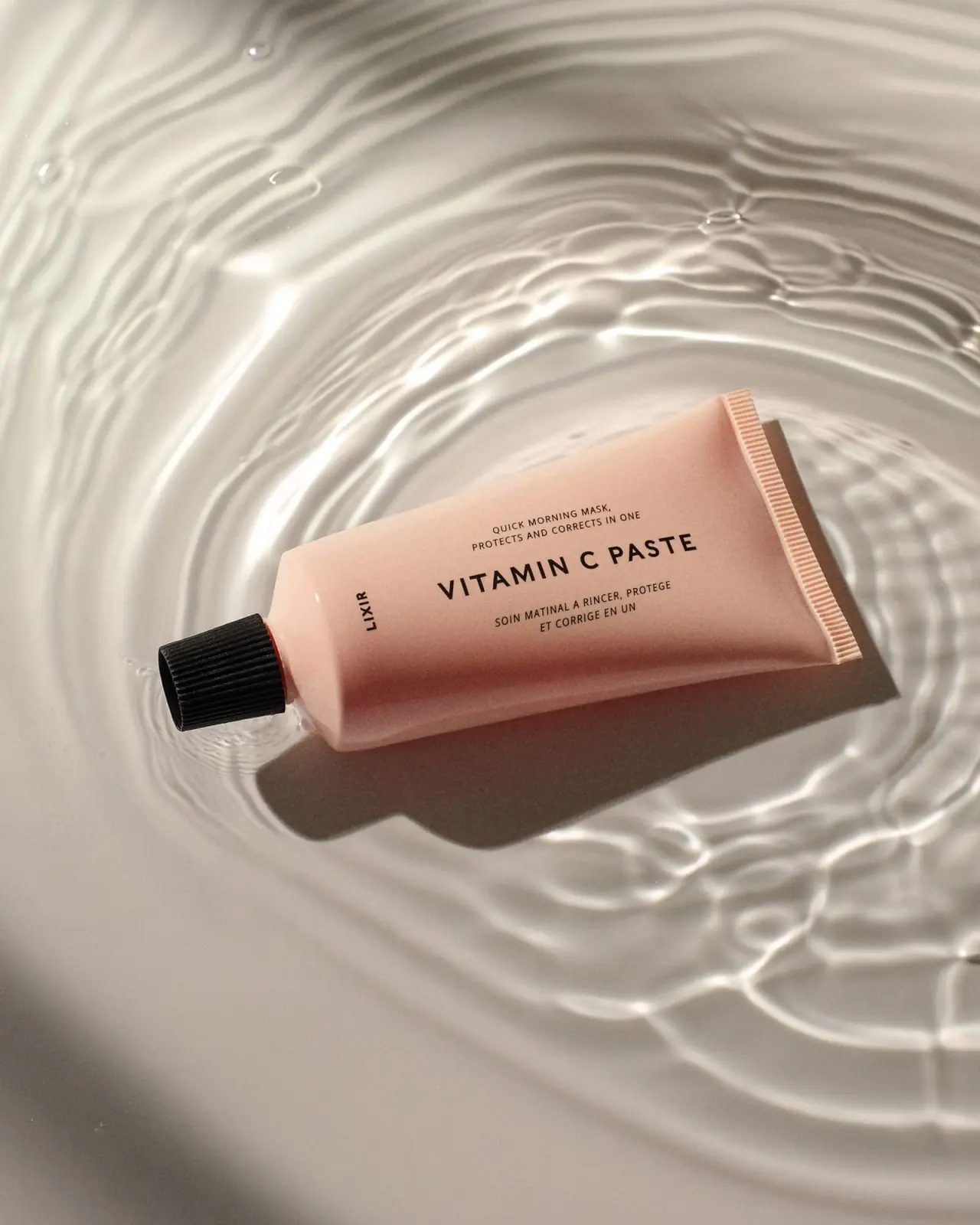
Peach archival tube with centered title and perpendicular maker

OSEA
sea-glass frosted bottles and a tidal wordmark

OUAI
sheer tinted bottles, small black capitals
Rare Beauty
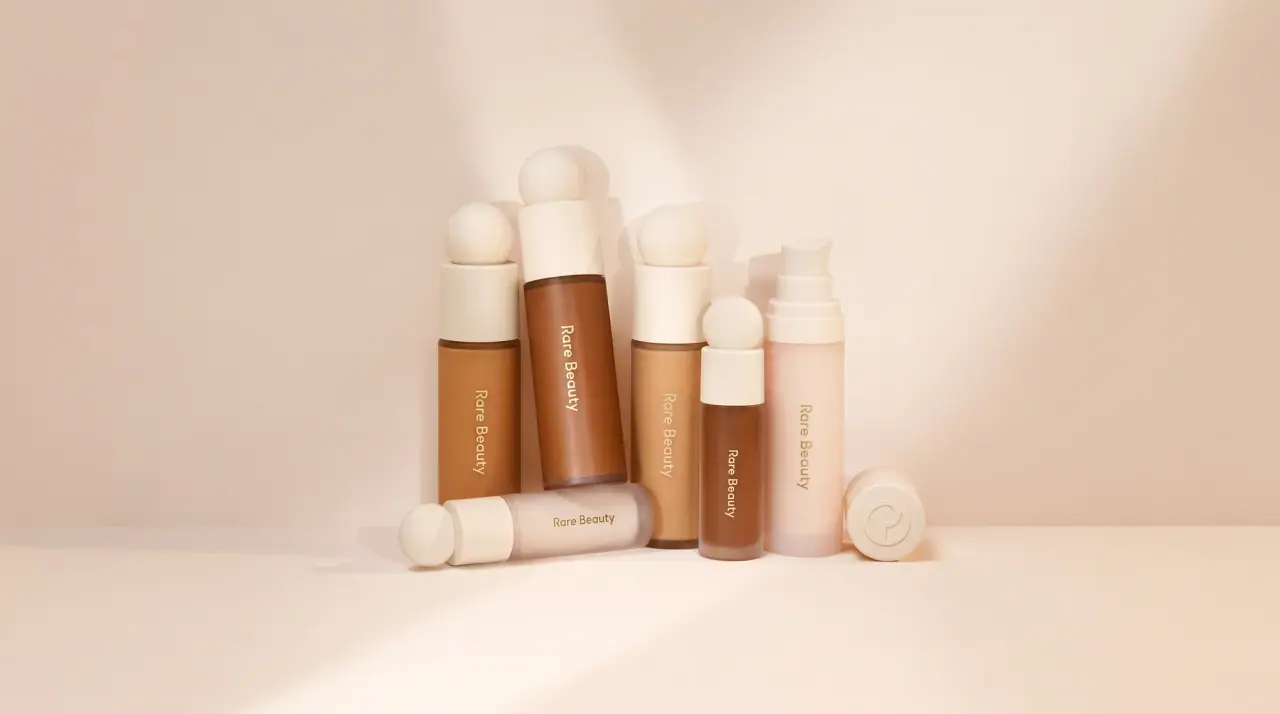
sculpted sphere caps in warm skin nudes
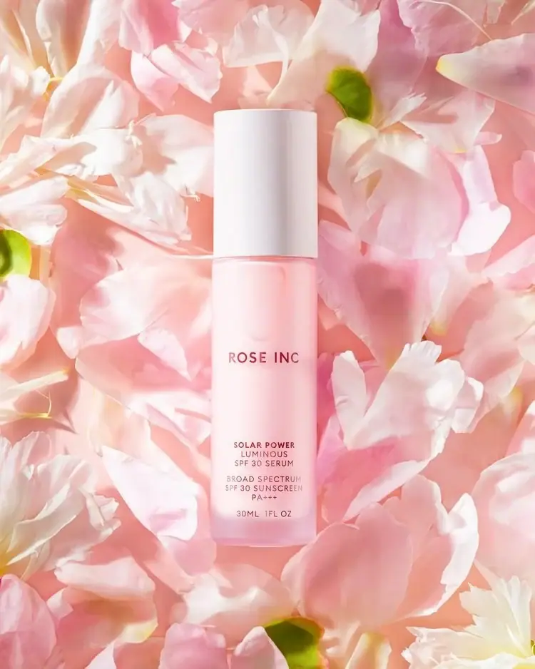
Rose Inc
Translucent blush serum with tall white cap and quiet typography