Photography: Franco Guidi — Lixirskin still-life photography. Images belong to their respective owners.
Lixirskin

Peach archival tube with centered title and perpendicular maker
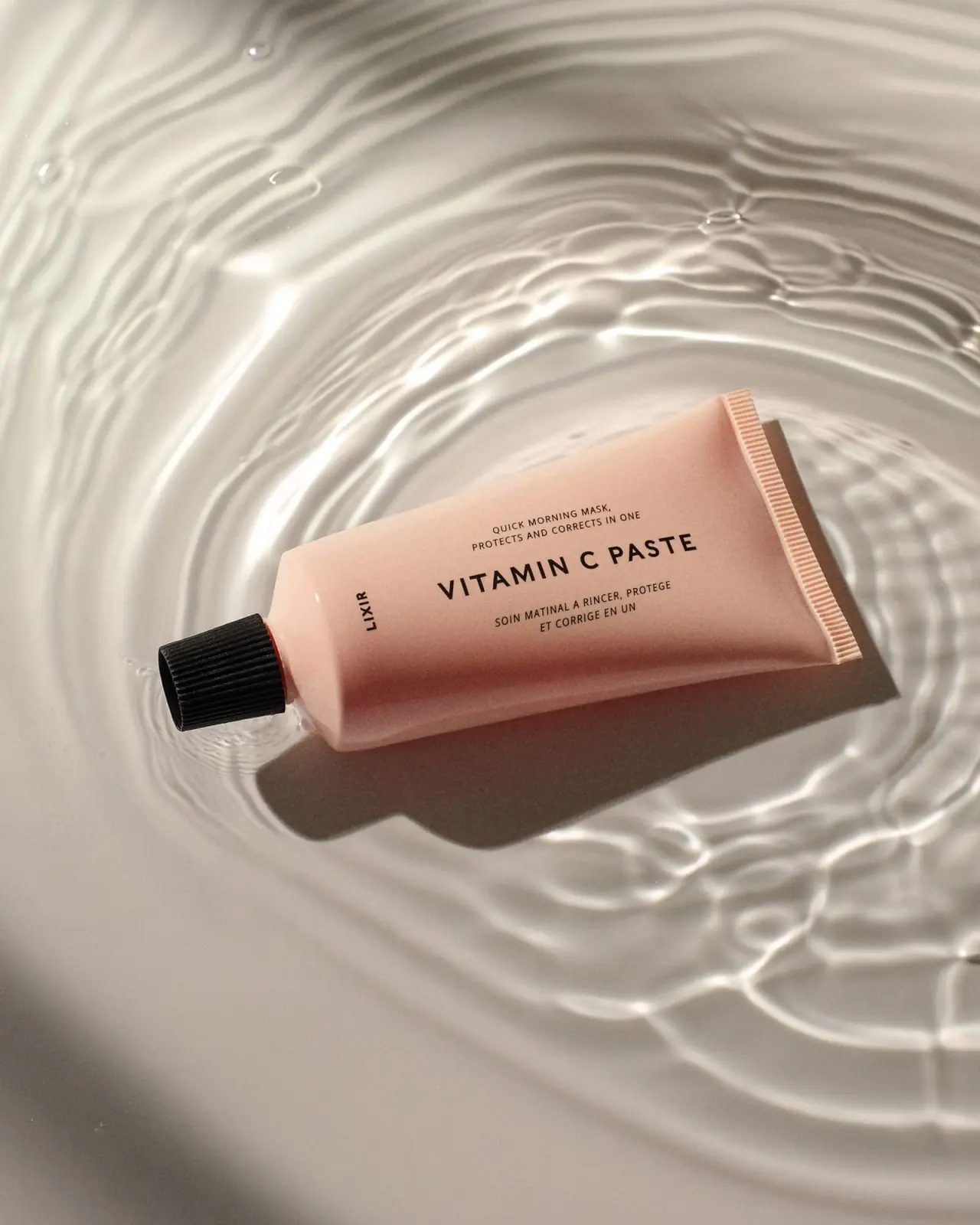
The earlier LIXIR Vitamin C Paste tube uses a muted peach field and black typography, with the product title taking precedence over a small maker signature. In the selected near-horizontal composition, the title runs along the tube length between compact English and French descriptor blocks. A black ribbed cap closes one end and a broad peach seam closes the other. The source image belongs to an archival photographer file carrying a 2018 date cue; its short LIXIR identity should remain distinct from the current Lixirskin name.
- Skincare
- Light pack
- Clinical minimal
- Pastel soft-touch
About this study
Earlier short LIXIR label photographed in an archival file with a 2018 date cue. Current Lixirskin product information confirms identity but not historical material, quantity or launch date.
Sources & evidence · Reviewed 2026-10-19Color Palette
Approximate colours interpreted from photography. These are screen references, not official brand colours or print specifications.
Pack body
Muted peach
#D8A58F
Approximate middle tone of the tube under warm light; darker lower shading is curvature and scene lighting, not a separately established color band.
Ink
Soft black
#201A17
Maker, product title and bilingual descriptor lines share a dark printed appearance.
Accent
Ribbed black cap
#161616
The strongest solid dark element, balancing the long pale body without a separate decorative panel.
Typography
Suggested visual alternatives, not confirmed brand typefaces. Any scale below is an illustrative estimate.
VITAMIN C PASTE is the largest line, set in widely spaced uppercase sans letters across the broad front. Two small centered English lines sit above, and two French lines below. Their shorter widths reinforce the main title's horizontal span. Near the cap, the small LIXIR word turns perpendicular to the title, acting as a signature rather than a competing headline. The system depends on size, spacing and direction within a restrained sans vocabulary, not a mixture of decorative scripts or elaborate borders.
Fonts
Product headline and small maker
Montserrat
- Looks like
- Clean moderately geometric sans
- Type
- Geometric sans-serif
- Weight
- Medium, SemiBold
- Case
- Uppercase
- Tracking
- Open title spacing; compact maker spacing
- Fallback
- Arial, sans-serif
Use for an original product name that fits one line without becoming compressed. A small rotated maker can share the same family while remaining visibly subordinate.
Bilingual supporting information
Source Sans 3
- Looks like
- Neutral compact sans
- Type
- Humanist sans-serif
- Weight
- Regular, Medium
- Case
- Uppercase short descriptors
- Tracking
- Slightly open spacing
- Fallback
- Arial, sans-serif
An alternative for smaller explanatory lines. Keep their two-line rhythm and centered relationship to the title, but rewrite the content for the new product rather than copying treatment claims.
Structure & Proportions
Visual proportions and finish previews are illustrative. Confirmed construction details and uncertainties are distinguished in the study notes.
Proportions
| Purpose | Value | Preview |
|---|---|---|
| Long title span | The product name uses the length of the tube rather than the narrower upright width, allowing a generous single-line presentation. | — |
| Centered descriptor pair | Shorter supporting blocks sit above and below the main line, keeping the central composition balanced without filling the entire body. | — |
| Small maker counterpoint | The maker occupies a modest area near the cap and turns perpendicular to the principal text. | — |
| Contrasting ends | A narrow dark cap and wide pale ribbed seal define the taper and keep the object legible against the pale watery setting. | — |
Shapes
| Element | Value | Preview |
|---|---|---|
| Tube body | Broad tapered smooth body with a curved shoulder at the cap end. | |
| Ribbed closure | Small black cylindrical cap with closely spaced grip grooves. | |
| Sealed end | Wide straight ribbed seam in the same peach color as the body. | |
| Title group | Long central headline bounded by two shorter centered descriptor blocks. |
Finishes
Soft body sheen
Broad peach front with localized highlights; a soft-touch manufacturing treatment is not verified despite the visual category tag. · matte
Cap surface contrast
Dark ribs catch narrow highlights, emphasizing grip texture rather than a decorative emboss specification. · gloss
Formats and materials
| Formats | Peach squeeze-tube appearance with black ribbed cap, photographed lying diagonally; no quantity is clearly visible on this selected face |
| Materials | The body is smooth and opaque-looking, but the accessed product information does not establish the historical tube substrate, barrier structure or cap resin., A straight ribbed upper seal and fine cap grooves are visible. Neither feature proves aluminium, a particular plastic, recycled content or a soft-touch coating. The water surrounding the object is part of the photograph, not a material specification. |
| Closures | The black cap has closely spaced longitudinal ribs and a compact cylindrical shape. It is closed and fits around the narrow neck at the left side of the selected image. A screw-cap interpretation is plausible from the shape, but the threads, orifice and any tamper seal are unseen. At the opposite end, a wide ribbed seam creates a crisp linear termination that contrasts with the rounded shoulder near the cap. |
| Decoration | Centered widely spaced uppercase product title, Small English and French descriptor blocks above and below, Perpendicular compact maker near the cap, Uninterrupted peach ground without visible illustrations or framing |
Front Panel
Schematic reading order. The diagram’s zone heights do not represent measured artwork proportions.
The main information reads comfortably when the tube lies along its length, as photographed. The central title is the dominant horizontal line; small descriptors create an upper and lower frame using text alone. The rotated maker occupies the otherwise quiet cap-side area. No separate label edge or box border is visible. This precise arrangement gives a practical product title the visual authority often reserved for a large brand word, without requiring a bright accent or ingredient illustration.
| Zone | Content |
|---|---|
| English descriptor | Two small centered lines above the title describe the morning-mask positioning. These are photographed label claims, not independent efficacy findings. |
| Primary title | VITAMIN C PASTE is the largest, widest line and the main entry point. |
| French descriptor | Two compact French lines sit beneath the title and follow the same center axis. |
| Maker signature | Short LIXIR word rotates perpendicular near the cap, preserving the older photographed identity. |
Range System
Only this earlier label edition is studied. The current product page confirms continuity of the Vitamin C Paste name, but it does not establish that present-day tubes retain the same maker spelling, quantity position or construction. A transferable principle is to use a dominant functional title and a quiet maker signature. Any broader family comparison would need photographs of the actual companion products and their relevant editions.
- Preserve a stable title axis for related products while letting names remain the primary differentiator.
- Use bilingual supporting lines as compact explanatory blocks rather than a dense continuous paragraph.
- Treat a renamed maker or revised tube as a separate edition when documenting a design archive.
Back of Pack & Shelf
The reverse and open closure are unseen. No quantity can be confidently read on the selected front, and current size listings should not be silently assigned to this historical package.
- Inspect the reverse before documenting ingredients, quantity or detailed instructions.
- Keep archival filename dates separate from confirmed product-launch dates.
- Do not infer a carton, tamper system or recycling route from the closed tube.
On shelf
Interpretively, the unusually prominent product title can help identify a function at close range, while the small maker is less dominant than on many skincare tubes. If displayed upright, the main text requires a turned reading angle, so presentation orientation matters. The dark cap provides a compact recognition cue even when the body is partially obscured. An original design should test whether the intended retail holder preserves the title's legibility rather than assuming the campaign angle will always be available.
Imagery
The peach tube lies diagonally in a shallow-looking watery scene, surrounded by concentric ripples and bright caustic lines. A hard shadow below gives the body a strong physical presence despite the otherwise soft palette. The typography remains readable because the brightest water patterns sit mostly around the object rather than through its main title. The warm gray, cream and brown tones in the background are photographic surroundings, not additional packaging colors. The scene does not establish waterproof labeling or storage instructions.
Guidelines
Editorial principles for an original design brief, not official brand guidelines.
Do
- Let the product title lead when function is central.
- Keep bilingual descriptors aligned to one clear center.
- Use a small turned maker deliberately.
- Preserve the photographed historical name.
- Evaluate the package in its actual display orientation.
Don't
- Do not replace LIXIR with the current name inside the historical analysis.
- Do not infer material or quantity from a newer listing.
- Do not treat water caustics as a tube finish.
- Do not convert a filename date into a confirmed launch date.
- Do not copy the source treatment claims into an unrelated concept.
Sources & evidence
- Lixirskin — Vitamin C Pasteproduct
- Franco Guidi — Still Life Photographyphotographer
How this study was built
edition · Sourced fact
Current official page retains Vitamin C Paste identity; selected archival image visibly uses the shorter LIXIR name.Lixirskin — Vitamin C Paste · Franco Guidi — Still Life Photographytypography · Visual observation
Wide uppercase product title leads between shorter centered English and French blocks; small maker turns perpendicular.Franco Guidi — Still Life Photographystructure · Visual observation
Peach tube has a dark ribbed closed cap and broad ribbed opposite seal; material and capacity are not established.Franco Guidi — Still Life Photographypalette · Visual observation
Peach body and black text/cap define the pack; warm watery surroundings are excluded from its palette.Franco Guidi — Still Life Photographylabel · Visual observation
Text-only centered composition has no visible rectangular label panel or illustrated ingredient motif.Franco Guidi — Still Life Photographyimagery · Visual observation
Water ripples and hard cast shadow frame the tube without establishing waterproof construction.Franco Guidi — Still Life Photographyrange · Editorial interpretation
Product-first naming and quiet maker placement can inform an original family; current and historical editions remain separate.
What remains unverified
- Archival filename contains 2018-04-11; portfolio text does not independently confirm publication or launch date.
- Historical tube substrate, cap resin, coating and printing unknown.
- Quantity, reverse and open closure unseen.
- Original fonts and measured dimensions unverified.
Give your AI
packaging taste
Give your design or image tool a packaging study: palette, type, structure, front panel and principles for an original brief.
Export this styleFree with an email. PACK.md works in Claude, ChatGPT, Cursor and image tools.
More like this

Cocokind
sideways lowercase on spa-water pastels

Herbivore
pastel tinted vessels with a white tag
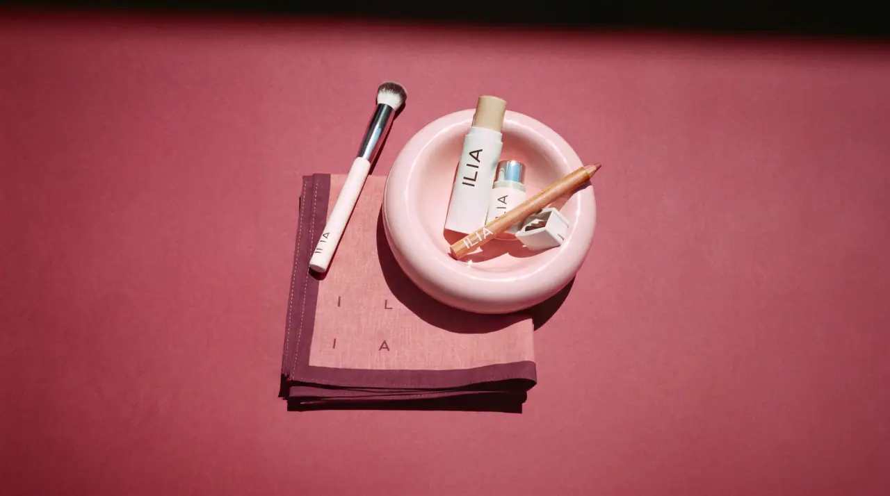
ILIA
whispered capitals on skin-tone sleeves
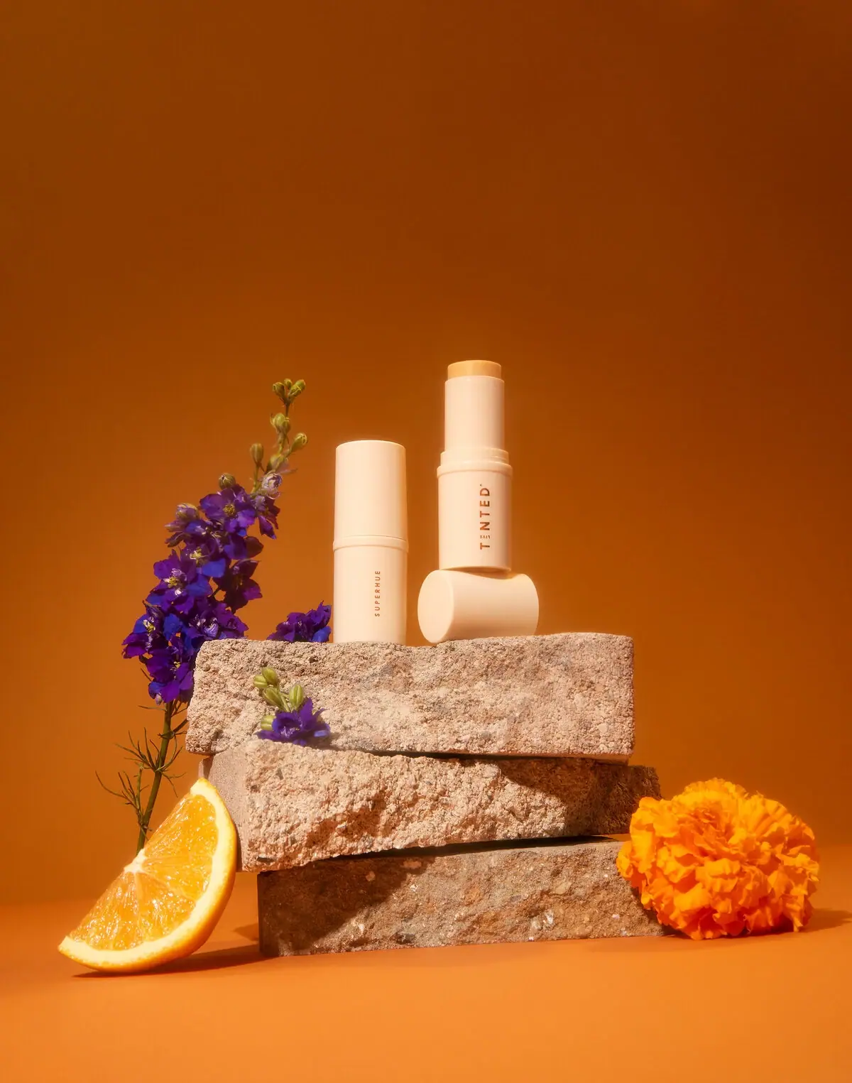
Live Tinted
Pale peach stick, vertical lettering and exposed golden balm

OSEA
sea-glass frosted bottles and a tidal wordmark

OUAI
sheer tinted bottles, small black capitals
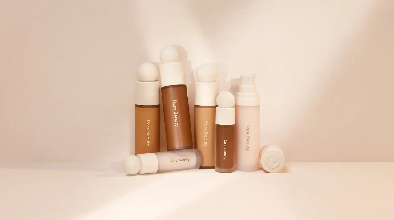
Rare Beauty
sculpted sphere caps in warm skin nudes
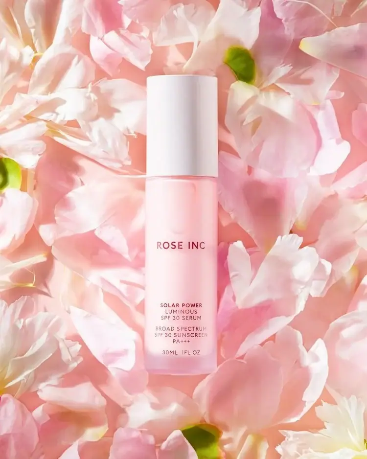
Rose Inc
Translucent blush serum with tall white cap and quiet typography