About this packaging
Lumière de Lily’s Inner Peace candle uses its named onyx vessel as a defining part of the product presentation.
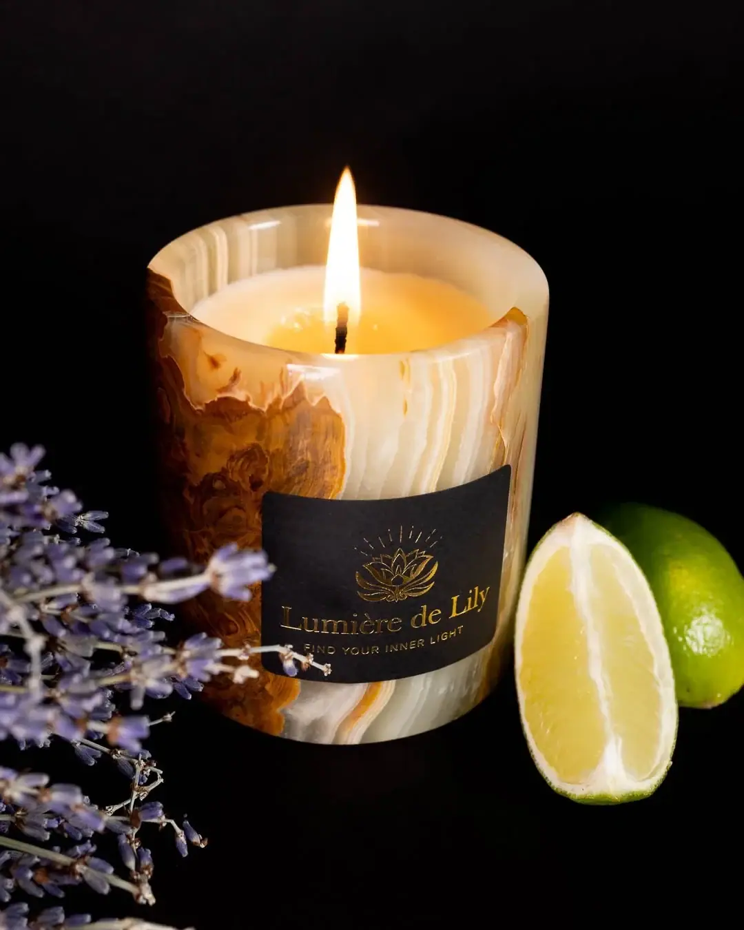
Lumière de Lily describes Inner Peace in Onyx as a signature candle encased in green onyx and lists lavender, lime, and patchouli among its notes. The selected image shows a marbled cylindrical vessel; the brand’s stated stone identity is cited as product context.[1]
Pack construction & use
- Vessel material and candle
- Lumière de Lily describes Inner Peace in Onyx as a candle encased in green onyx and supplied in a cup with lid.[1]
- Label and vessel pattern
- The thick-walled cylindrical vessel has irregular cream, brown and pale green bands. A black rectangular label contrasts with the patterned container. Gold lettering is centered beneath a delicate floral emblem with radiating lines.Observed in the reference photograph
What makes the design work
Editorial analysis of this packaging reference.
Stone as surface
The irregular banding becomes the package’s main graphic, making the vessel itself carry more visual detail than the front label.
Dark label island
A black rectangular label creates a calm reading zone against the patterned surface; the gold-colored emblem and centered wordmark retain clear contrast.
Material-led naming
The “Onyx” name connects product identity to the vessel’s visible stone pattern, while the compact label leaves the material visually prominent.
Ideas for your next brief
- When the container surface is distinctive, keep the main label compact so the material remains visible.
- Use a high-contrast label panel to preserve legibility over a varied patterned substrate.
Sources & further reading
Researched 19 October 2026