Photography: Sian T — Lumière de Lily photography. Images belong to their respective owners.
Lumière de Lily

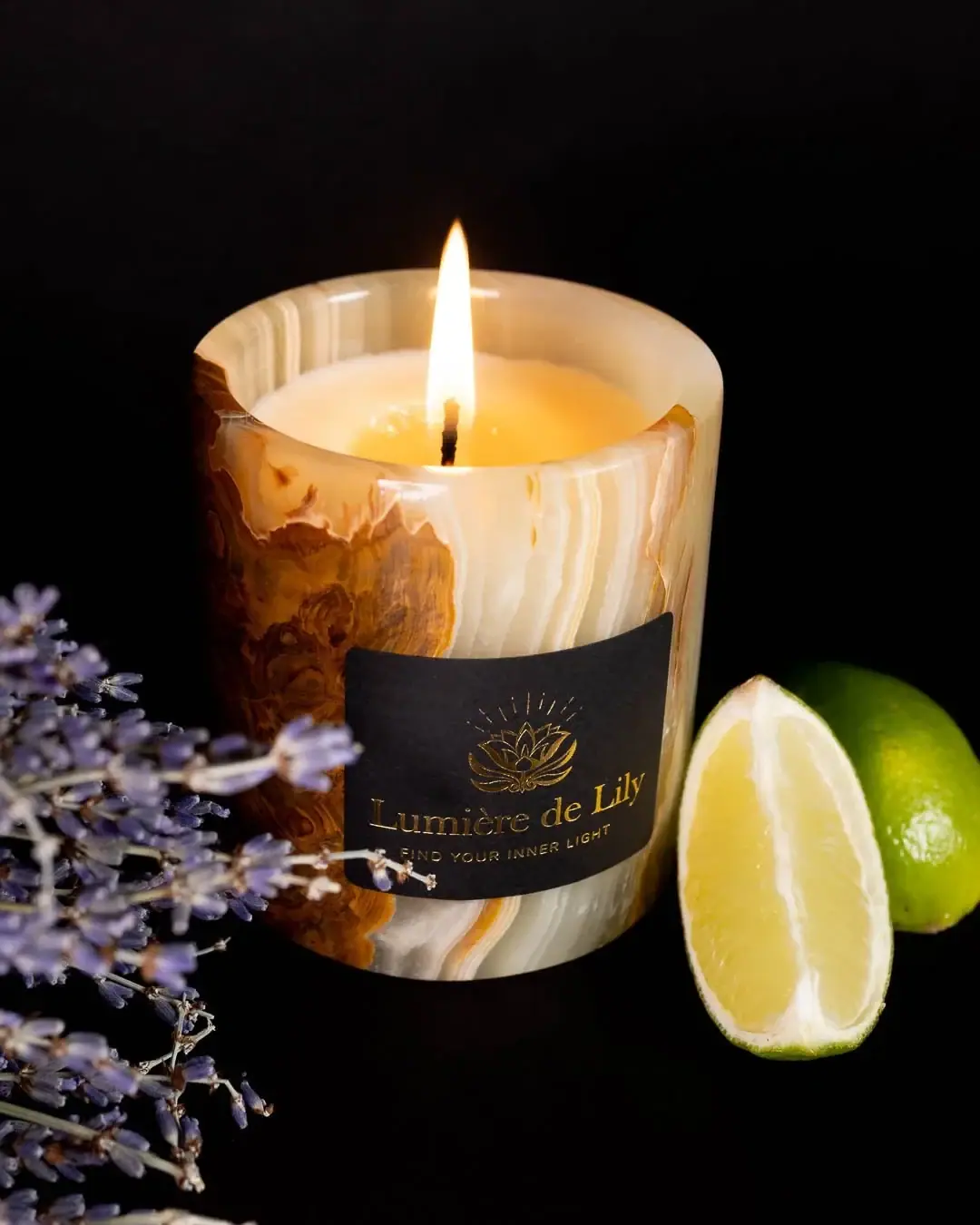
Banded onyx framed by a black label and golden emblem
The selected Inner Peace candle uses a thick-walled stone vessel as its main decorative surface. Irregular cream, honey-brown and pale green-grey bands run around a simple cylindrical cup, while a black rectangular front label creates a calm reading area. A fine gold-coloured floral emblem with radiating lines sits above the serif producer name and a small uppercase tagline. The candle is lit and uncovered in the photograph. The official listing identifies green onyx and a supplied lid, but that lid is not shown in this selected view.
- Candles & home scent
- Light pack
- Luxe monochrome
- Heritage label
About this study
Selected lit Inner Peace in Onyx photograph. Official green-onyx/lid context is separated from the open lidless image; size option is unassigned.
Sources & evidence · Reviewed 2026-10-19Color Palette
Approximate colours interpreted from photography. These are screen references, not official brand colours or print specifications.
Pack body
Cream stone bands
#E6D2AC
Approximate pale bands in the source-identified onyx. Natural-looking variation and candlelight prevent a single production colour specification.
Honey-brown stone bands
#8E561D
Approximate darker swirling areas visible on the left and lower body. These belong to the vessel pattern rather than a printed illustration.
Label
Black reading panel
#1B1818
Approximate compact front label ground. It isolates the fine identity from the much more varied stone surface.
Ink
Gold-coloured identity
#B7954F
Approximate floral emblem, serif producer and small tagline. Reflective appearance is visible, but foil, metallic ink and application method are not verified.
Typography
Suggested visual alternatives, not confirmed brand typefaces. Any scale below is an illustrative estimate.
The upper emblem creates the first pictorial anchor, with its thin floral lines and short rays arranged around a central axis. The producer name spans the label beneath it in a restrained serif. A much smaller uppercase tagline follows with open spacing. All three elements are centred, but the fine emblem occupies more height than the text. The selected front does not visibly state Inner Peace or a net weight, so it functions primarily as a producer label rather than a complete variant-information panel.
Fonts
Producer serif alternative
Cormorant Garamond
- Looks like
- Cormorant Garamond
- Type
- Serif
- Weight
- Regular 400 / Medium 500
- Case
- Title case
- Tracking
- Natural optical spacing
- Fallback
- serif
A proposed refined serif for an original candle maker name. Preserve readable thin strokes over black and create a distinct identity rather than reproducing Lumière de Lily lettering.
Tagline and supporting information
Montserrat
- Looks like
- Montserrat
- Type
- Geometric sans serif
- Weight
- Regular 400 / Medium 500
- Case
- Uppercase short line
- Tracking
- Open
- Fallback
- sans-serif
Use for a brief original tagline or verified small identifier beneath the serif. Wide tracking should not be pushed so far that the phrase becomes difficult to read on the curved vessel.
Structure & Proportions
Visual proportions and finish previews are illustrative. Confirmed construction details and uncertainties are distinguished in the study notes.
Proportions
| Purpose | Value | Preview |
|---|---|---|
| Stone cup | The simple cylindrical body keeps the irregular bands visible over a broad continuous surface. The rim appears thick, but no wall measurement is inferred. | — |
| Front panel | A compact dark rectangle covers part of the lower-middle front while leaving substantial stone visible above, beside and below it. | — |
| Emblem and name | The emblem occupies the upper label area, with the wide producer name below and a narrow small tagline at the bottom. | — |
Shapes
| Element | Value | Preview |
|---|---|---|
| Vessel | Straight-sided cylindrical stone cup with a rounded-looking thick rim. | |
| Opening | Circular aperture surrounding pale wax and a lit wick. | |
| Black label | Rectangular panel bent around the curved body. | |
| Stone bands | Irregular flowing bands and swirls, not a repeating printed pattern. |
Finishes
Smooth stone reflections
Onyx rim and body; specific polish/coating unverified. · gloss
Dark quiet label
Black front panel; stock unverified. · matte
Gold-coloured fine detail
Emblem and lettering; metallic-looking effect without verified process. · metallic
Formats and materials
| Formats | A cylindrical stone candle cup with a visibly thick rim and pale wax around a single lit wick. The official page offers small and large options, but the selected photograph does not establish which size is shown. |
| Materials | The exact product page identifies green onyx and natural soy wax. That is a brand material statement, not a geological analysis of the specimen or a complete description of sealants and internal treatment., Label stock, adhesive, print process, wick construction and any vessel liner are not specified. The smooth stone appearance does not establish a particular polish or protective coating. |
| Closures | The official page says the cup is supplied with a lid. The selected photograph shows the candle open and burning, with no lid visible. Lid shape, material, fit and any sealing role therefore remain unverified visually. |
| Decoration | The naturally varied vessel pattern supplies most visual detail. The label adds one centred floral emblem, a serif producer and a small tagline rather than repeating the stone pattern in print. |
Front Panel
Schematic reading order. The diagram’s zone heights do not represent measured artwork proportions.
The dark rectangle acts as a local reading field over a highly varied substrate. Its curved upper and lower edges in the photograph result from the cylindrical surface and viewing angle rather than proving a custom curved dieline. The emblem, producer and tagline align centrally, with no visible border. The label is compact enough for the onyx pattern to remain the main material feature.
| Zone | Content |
|---|---|
| Floral emblem | A delicate symmetrical flower-like line drawing sits below short radiating strokes. It provides identity without filling the black field with dense ornament. |
| Producer name | Gold-coloured serif lettering spans beneath the emblem. The title-case rhythm contrasts with the smaller spaced uppercase line below. |
| Tagline | A short uppercase line sits near the lower label edge. Some foreground lavender overlaps the left region, so the image is better for hierarchy than for exact small-copy transcription. |
| Variant-information limit | The selected front does not clearly name Inner Peace, state size or list notes. Those details come from the linked product context, not a visible front panel. |
Range System
The official page places Inner Peace in a Signature Collection and names green onyx as its vessel. Only this specimen is visually audited. Its irregular pattern should be treated as a material feature whose exact appearance may vary, not a repeatable printed brand asset or proof that every collection member uses the same stone.
- For an original natural-stone candle family, a stable dark label can preserve reading contrast across variable banding. Test it against both pale and dark areas instead of relying on one ideal specimen.
- If scents share similar vessels, a separate clear variant identifier is useful. The selected photograph does not demonstrate where that identifier is printed on all Lumière de Lily products.
Back of Pack & Shelf
The reverse, underside, supplied lid and any outer box are unseen. No precise location can be assigned to scent, quantity, care or batch information.
- Inspect the supplied lid before describing its material, profile or function.
- Do not infer refillability, food-contact suitability or a waterproof internal coating from the stone cup.
- Keep product-page scent information separate from what is actually readable on the front label.
On shelf
The stone pattern should register first as an object feature, followed by the dark label and gold-coloured identity. The compact panel gives the eye a place to read amid irregular bands. This is visual interpretation rather than a retail test. A neutral unlit view would help distinguish actual stone colour from flame warmth and would make a useful companion to this atmospheric campaign photograph.
Imagery
The candle burns against a deep black background, with lavender stems crossing the left foreground and a cut lime at the right. The official listing names lavender, lime and patchouli, so the visible props support part of the scent context. They do not establish exact concentrations or therapeutic outcomes. Candlelight warms the wax and pale stone, while external light reveals the darker bands and fine label detail. The black backdrop visually merges with the label, allowing the gold-coloured identity to float against a darker field without erasing the vessel edges.
Guidelines
Editorial principles for an original design brief, not official brand guidelines.
Do
- Let source-confirmed stone identity remain distinct from unverified treatment details.
- Use a compact high-contrast panel over variable material patterning.
- State that the supplied lid is source-confirmed but unseen.
- Keep scent props separate from printed graphics and efficacy claims.
Don't
- Do not assign the photograph to a size option without evidence.
- Do not claim foil from gold-coloured lettering alone.
- Do not infer refillability or safe reuse categories from a stone vessel.
- Do not treat a specific band pattern as identical across every unit.
Sources & evidence
- Inner Peace in Onyx — Lumière de Lilyproduct
- Product photography — Sian T.photographer
How this study was built
structure · Sourced fact
Official page identifies green onyx, soy wax and a cup supplied with lid.Inner Peace in Onyx — Lumière de Lilyimagery · Sourced fact
Photographer portfolio documents Lumière de Lily product work; official scent context includes lavender and lime.Inner Peace in Onyx — Lumière de Lily · Product photography — Sian T.palette · Visual observation
Cream/brown bands, black panel and gold-coloured detail define selected package.typography · Visual observation
Serif producer and small uppercase tagline sit beneath fine floral emblem.label · Visual observation
Compact dark rectangle provides contrast over irregular stone banding.structure · Visual observation
Open thick-rimmed cup shows pale wax and single lit wick; lid absent from frame.range · Editorial interpretation
Stable label over variable stone offers a design principle, not a full collection specification.
What remains unverified
- Stone treatment, liner, label stock and decoration process unverified.
- Lid is source-confirmed but not pictured; exact size option unknown.
- Front does not visibly identify scent or quantity.
- Fonts/colours are alternatives or approximations; flame affects appearance.
Give your AI
packaging taste
Give your design or image tool a packaging study: palette, type, structure, front panel and principles for an original brief.
Export this styleFree with an email. PACK.md works in Claude, ChatGPT, Cursor and image tools.
More like this

Aerangis
a quiet numbered object, an intimate scent memory

Alexander McQueen
An oval flacon crowned with dense black relief

Arquiste
blush transparency, white lettering and a stepped gold cap

Chabaud
A framed perfume label beneath a clear architectural cap
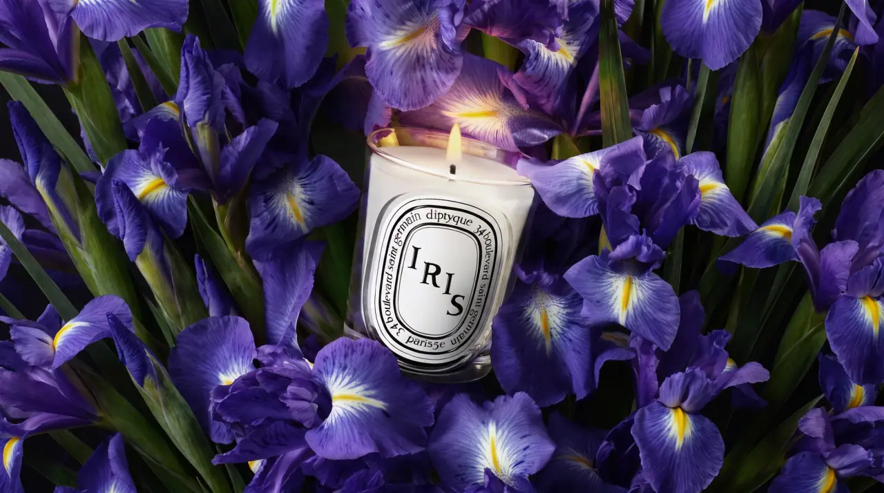
Diptyque
engraved oval labels on clear glass
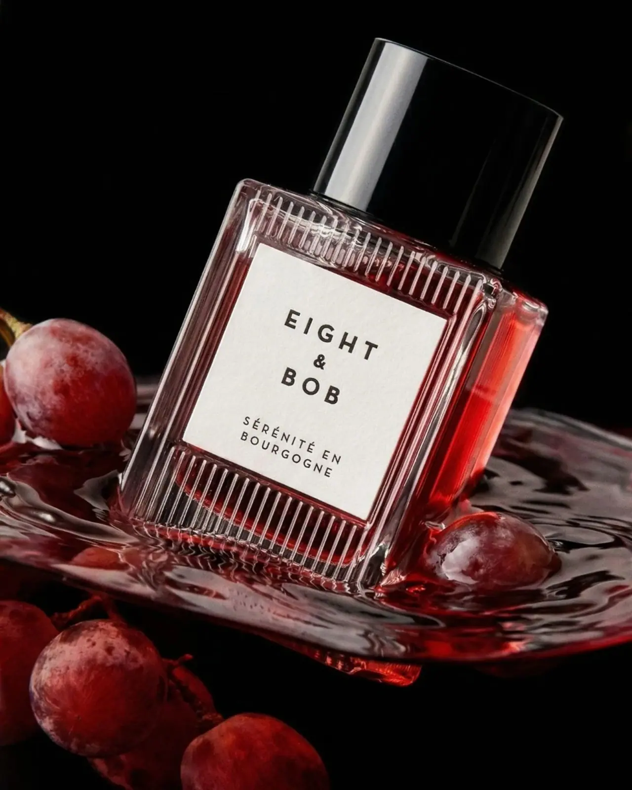
Eight & Bob
Ribbed red flacon, pale label and polished black cap
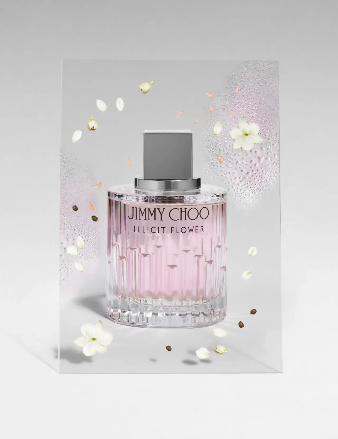
Jimmy Choo
Blush transparency, staggered flutes and a silver square cap
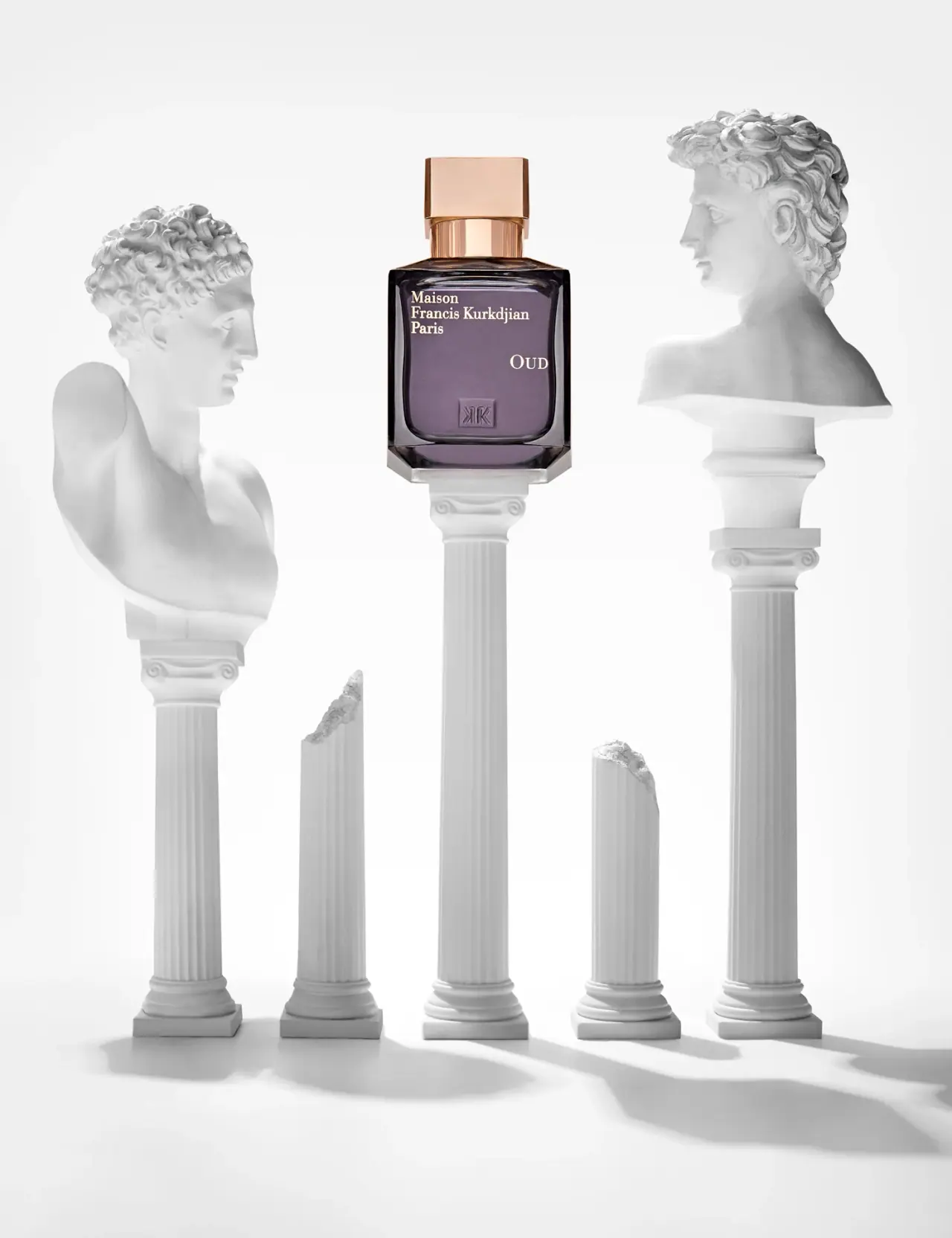
Maison Francis Kurkdjian
offset ivory serif names on plum flacon beneath warm cap