Photography: Moodcast official photography. Images belong to their respective owners.
Moodcast

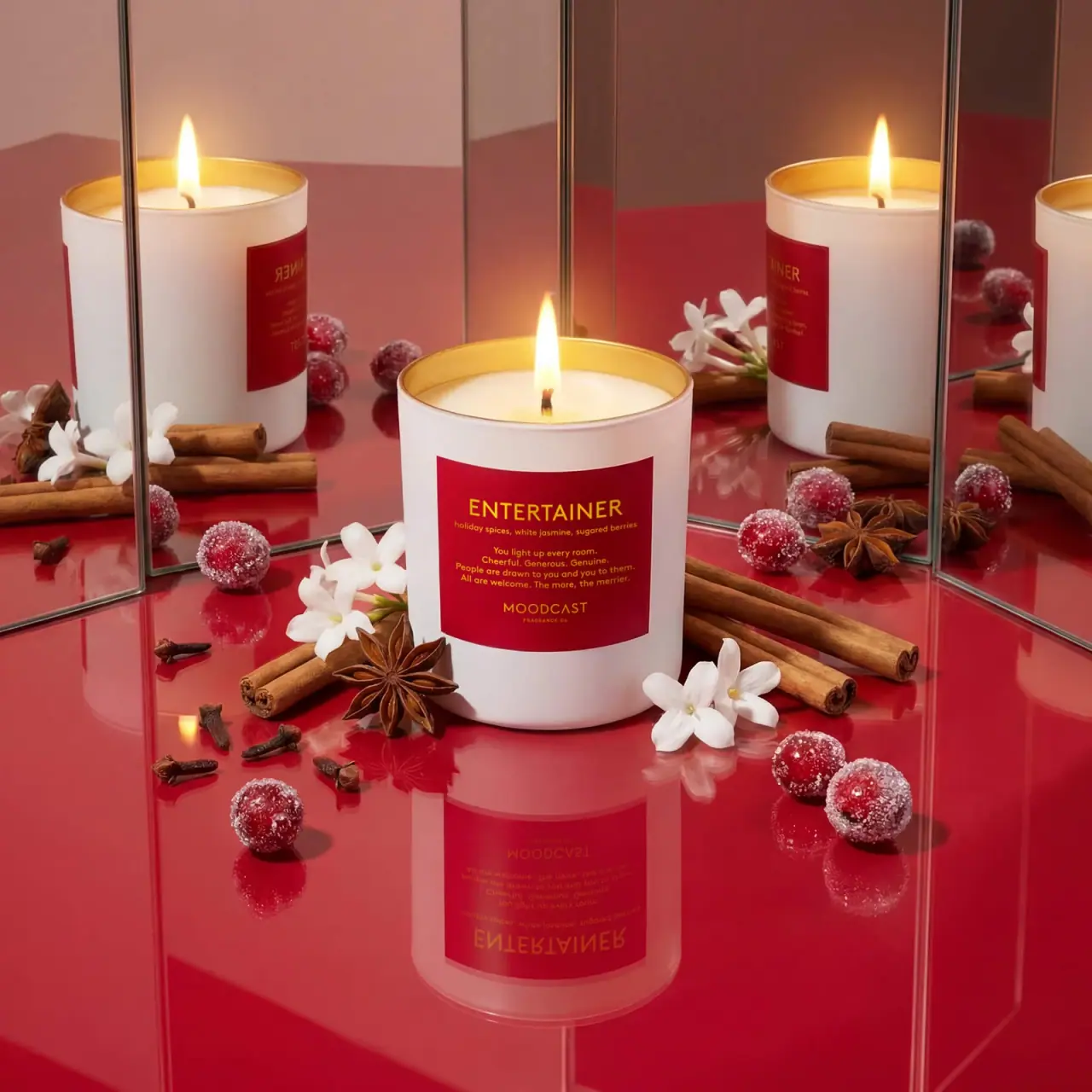
White candle with red personality label and golden inner rim
Entertainer places a deep red rectangular label on an opaque white candle vessel, using warm yellow-gold lettering for the scent name, notes, personality copy and maker. The open top reveals a golden-looking inner rim around pale wax and one lit wick. The label stays compact and typographic even though the surrounding campaign is richly staged with mirrors, spices, berries and white flowers. Repeated reflected jars amplify the same design rather than showing a wider packaging range.
- Candles & home scent
- Light pack
- Bold typographic
- Playful colour
About this study
Selected white Entertainer candle in mirrored red campaign. Official page returned 404 on direct open; substantive indexed official product text supports identity, fill and wax/wick details.
Sources & evidence · Reviewed 2026-10-19Color Palette
Approximate colours interpreted from photography. These are screen references, not official brand colours or print specifications.
Pack body
Warm vessel white
#EDE5DF
Approximate opaque exterior under warm light; the actual neutral white is affected by nearby red reflections.
Label
Deep festive red
#A60C1D
Large rectangular front field, darker than parts of the reflective red photographic ground.
Ink
Warm golden yellow
#E6AE28
Scent name, descriptive copy and maker appear yellow-gold; metallic foil is not confirmed.
Accent
Golden inner rim
#DCA42D
Visible warm reflective band inside the open vessel; exact metal content and application process unknown.
Typography
Suggested visual alternatives, not confirmed brand typefaces. Any scale below is an illustrative estimate.
ENTERTAINER is the largest line near the label's upper edge, set in clean uppercase sans lettering. A much smaller scent-note line follows immediately. The center contains several short, centered mixed-case lines that describe a social personality, creating a verbal portrait rather than an ingredient illustration. MOODCAST appears lower down in spaced capitals with a tiny company descriptor beneath. The maker is deliberately smaller than the named personality, so the product identity becomes the first point of recognition.
Fonts
Personality title and maker
Montserrat
- Looks like
- Clean geometric sans
- Type
- Geometric sans-serif
- Weight
- Medium, SemiBold
- Case
- Uppercase
- Tracking
- Moderate title spacing and wider maker spacing
- Fallback
- Arial, sans-serif
Use for an independent mood name, with a smaller maker at the bottom. Preserve a clear size difference so the two uppercase lines do not compete.
Notes and narrative copy
DM Sans
- Looks like
- Compact readable sans
- Type
- Sans-serif
- Weight
- Regular, Medium
- Case
- Sentence case and lowercase note words
- Tracking
- Natural compact spacing
- Fallback
- Arial, sans-serif
Use for a short original personality description and factual scent notes. Keep the centered lines short enough to remain legible on the curved front without squeezing the letter spacing.
Structure & Proportions
Visual proportions and finish previews are illustrative. Confirmed construction details and uncertainties are distinguished in the study notes.
Proportions
| Purpose | Value | Preview |
|---|---|---|
| Broad label field | The red panel occupies much of the central front while leaving clear white margins above, below and at the sides. | — |
| Open upper band | A visible white area separates the label from the rim, allowing the golden interior to remain a distinct accent. | — |
| Narrative center | The personality paragraph sits between scent identification and maker, with enough vertical separation to read as its own content group. | — |
| Compact candle form | The vessel appears only modestly taller than its width; no ratio is measured from the perspective photograph. | — |
Shapes
| Element | Value | Preview |
|---|---|---|
| Vessel silhouette | Straight-sided cylinder with a softly rounded bottom edge. | |
| Front label | Broad rectangular panel bending around the cylindrical front. | |
| Open top | Elliptical rim in perspective surrounding pale wax and one wick. | |
| Centered copy groups | Title, notes, narrative and maker form separated horizontal blocks. |
Finishes
White smooth exterior
Broad vessel surface catches soft warm reflections; exact coating and substrate unknown. · gloss
Golden-looking interior
Exposed inner rim catches flame and scene light; not a verified gold leaf or plating specification. · metallic
Formats and materials
| Formats | Open cylindrical one-wick candle; indexed official product text specifies 8 oz / 227 g fill |
| Materials | The exterior appears opaque white and the inner rim gold-colored. The accessed indexed product text does not establish the vessel substrate or exact finish process, so glass, ceramic and metal are not assigned as verified materials., The official indexed candle result specifies a coconut wax blend and natural cotton wick. These describe the candle contents, not the vessel or label. The red front panel's stock, adhesive and printing method remain unverified. |
| Closures | No lid is shown. The top is open, exposing pale wax, a single wick and a golden-looking interior band above the wax surface. The rim is a continuous ellipse in perspective, with no visible screw threads or closure interface. The vessel base is softly rounded. A missing lid in campaign photography does not prove that the retail product is sold without one. |
| Decoration | Large uppercase personality name, Small scent-note line beneath, Centered short personality paragraph, Smaller spaced maker and company descriptor near the lower label edge |
Front Panel
Schematic reading order. The diagram’s zone heights do not represent measured artwork proportions.
The label is a compact portrait in words. A large personality title sets the theme; the scent-note line gives tangible olfactory context; a central paragraph develops the character; and the small maker signs the composition below. All groups share a centered axis and one warm text color. The red field creates a clear boundary against the white vessel, while the absence of printed botanical imagery leaves the campaign props to illustrate the scent externally.
| Zone | Content |
|---|---|
| Named personality | ENTERTAINER is the largest line and occupies the upper portion of the panel. |
| Scent cues | A small line lists holiday spices, white jasmine and sugared berries, matching the indexed official candle description. |
| Character copy | Several short centered lines describe a welcoming social personality. The narrative is a branding device, not a performance claim. |
| Maker signature | MOODCAST sits below the narrative with a much smaller company descriptor underneath. |
Range System
The study covers Entertainer only. Multiple apparent candles in the selected image are mirror reflections of the same front and should not be counted as variant evidence. An independently designed mood-led family could repeat the four-part label hierarchy while changing title, notes and narrative. The selected photo alone does not establish a universal Moodcast color assignment or identical vessel treatment across every collection.
- Keep personality names prominent while supplying concrete fragrance notes nearby.
- Give each variant an original short narrative rather than changing only its color.
- Do not infer multiple products from repeated mirrored label views.
Back of Pack & Shelf
The underside, reverse label and retail carton are not visible. Reflections show side curvature but do not reveal a complete warning or product-information panel.
- Verify the underside before describing candle-use warnings or batch details.
- Do not invent a lid, gift box or closure from the open campaign shot.
- Keep indexed product fill weight separate from quantities actually visible on the label.
On shelf
Interpretively, the white vessel isolates the red panel so the name remains easy to locate among a busy environment. The title is readable before the small personality paragraph, creating two levels of engagement. Golden text on deep red is warm but less stark than black on white; small text should therefore be proofed under ordinary room lighting. The interior color adds a second discovery when viewed from above, while the external label remains the main identification surface.
Imagery
Upright mirrors multiply the lit candle and reflect the red floor, creating a dense festive scene around a clear central label. Cinnamon-like sticks, star anise, cloves, sugar-coated berry props and white blossoms echo the named fragrance cues. Their repetition comes from the set, not a printed pattern or multiple container colors. The still life is a campaign composition rather than a diagram of how to place objects around a burning candle; an original reference image can retain the color richness with an unlit vessel and more open space.
Guidelines
Editorial principles for an original design brief, not official brand guidelines.
Do
- Separate title, notes, narrative and maker clearly.
- Keep the main label readable within a rich campaign.
- Use personality copy that adds meaning beyond a color name.
- Distinguish mirrored repetition from a product range.
- Treat golden appearance separately from verified metal content.
Don't
- Do not claim gold foil or plated metal from color alone.
- Do not turn scent props into literal formulation ingredients.
- Do not count reflections as distinct variants.
- Do not assign diffuser specifications to the candle.
- Do not imply an unseen lid or carton is included.
Sources & evidence
How this study was built
structure · Sourced fact
Indexed official candle result specifies 8 oz / 227 g, coconut wax blend and natural cotton wick; no diffuser specification transferred.Moodcast — Entertainer candle (indexed official product text)palette · Visual observation
White exterior, red panel, golden-yellow lettering and gold-colored inner rim define the selected package.Moodcast — Entertainer candle (indexed official product text)typography · Visual observation
Large uppercase personality title leads smaller notes, centered narrative and lower maker.Moodcast — Entertainer candle (indexed official product text)label · Visual observation
The broad rectangular panel uses words alone; botanical and spice cues sit outside the vessel.Moodcast — Entertainer candle (indexed official product text)imagery · Visual observation
Mirrors duplicate the same candle and props around an unobstructed central front.Moodcast — Entertainer candle (indexed official product text)edition · Visual observation
One open lit candle is analyzed; no lid or retail carton is visible.Moodcast — Entertainer candle (indexed official product text)range · Editorial interpretation
A mood-led hierarchy can organize an original family, but reflections do not establish multiple variants.
What remains unverified
- Direct page returned 404; source text accessed through indexed official result.
- Vessel substrate, label stock and golden finish processes unverified.
- Reverse, underside, lid and retail carton unseen.
- Original fonts and physical measurements not independently verified.
Give your AI
packaging taste
Give your design or image tool a packaging study: palette, type, structure, front panel and principles for an original brief.
Export this styleFree with an email. PACK.md works in Claude, ChatGPT, Cursor and image tools.
More like this
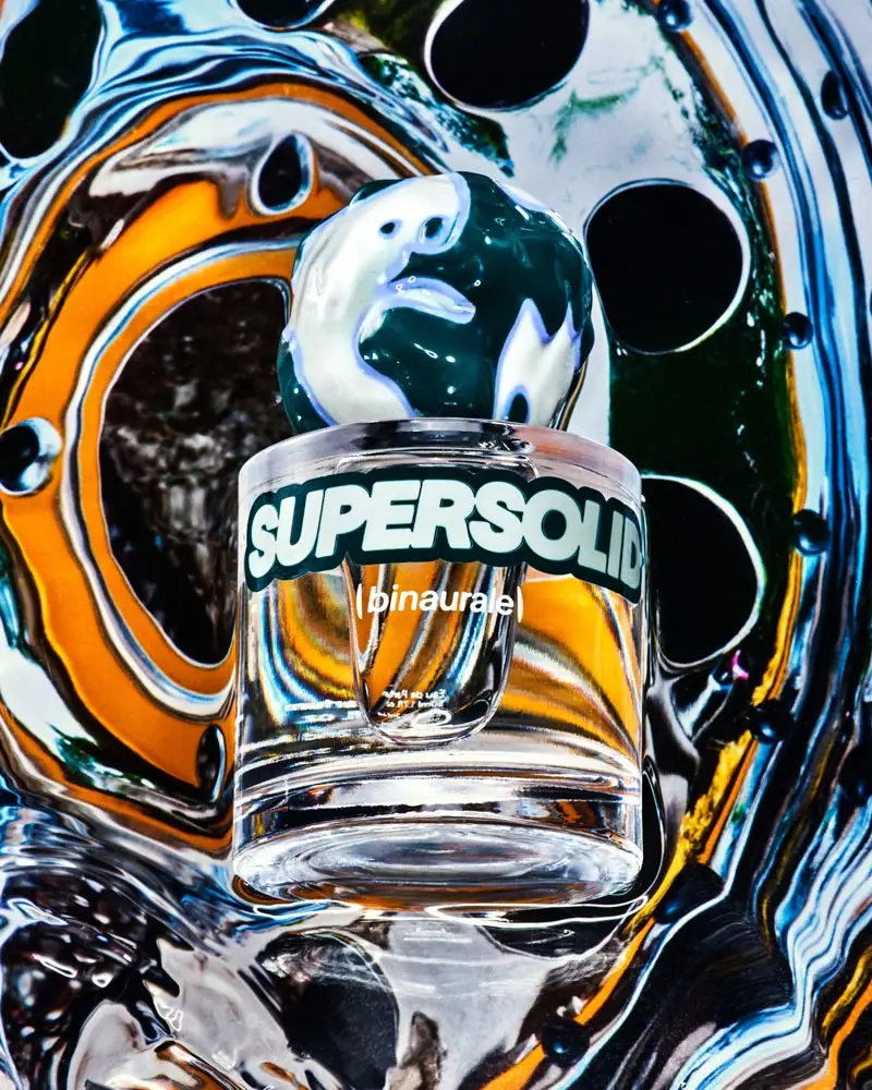
Binaurale
Globular teal cap above slanted pale fragrance lettering

Boy Smells
candy-shell flacons over blush pink glass
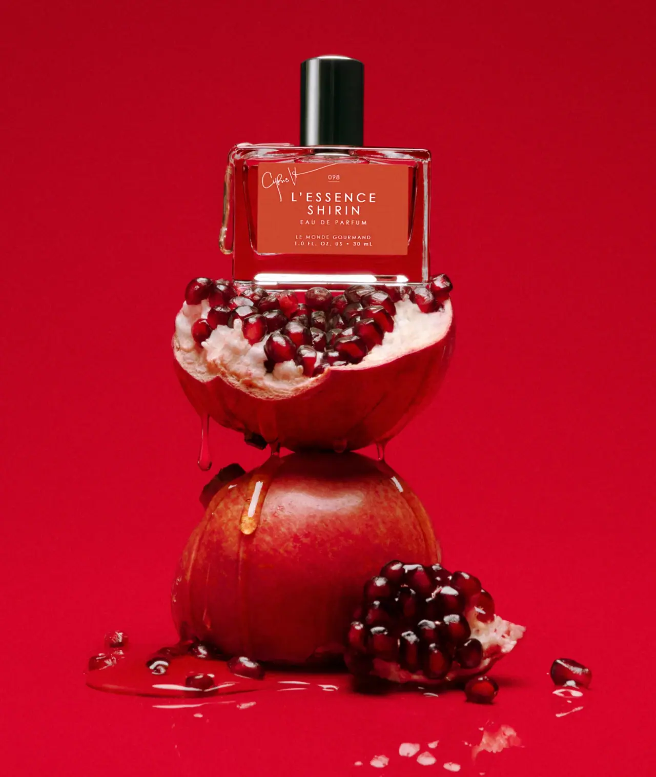
Le Monde Gourmand
white spaced scent naming on red beneath a black cap

ACURE
Iridescent spectacle with practical, tightly ordered type

Bask
sunny yellow with a playful turquoise signature

Beame
Orange bubble lettering, pink mascot, clear product badge

Behave
struck-through wordmark on sour neon pouches

Bread Beauty Supply
bubblegum pumps and a fat black wordmark