Photography: Panier des Sens official photography. Images belong to their respective owners.
Panier des Sens

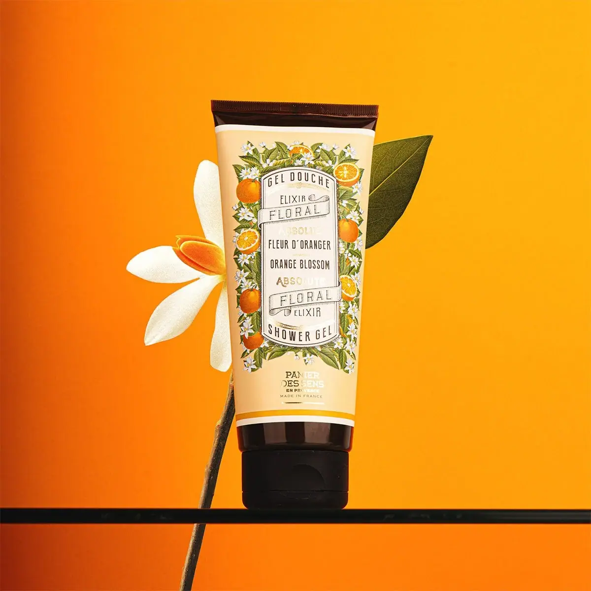
Botanical orange-blossom tube with a framed bilingual cartouche
The selected Orange Blossom Shower Gel tube surrounds a long cream cartouche with detailed citrus fruit, green leaves and white blossoms. Narrow black lettering, fine engraved-looking borders and illustrated ribbon banners organise French and English naming. The producer sits separately below the botanical frame, while a dark sealed top and dark flip cap anchor both ends. The official listing identifies a 200 ml French-made shower gel, but does not provide a complete tube and cap material specification.
- Body & bath
- Light pack
- Botanical
- Heritage label
- Retro illustrated
About this study
Selected 200 ml Orange Blossom Shower Gel tube with bilingual cartouche and citrus border; reverse and component materials unverified.
Sources & evidence · Reviewed 2026-10-19Color Palette
Approximate colours interpreted from photography. These are screen references, not official brand colours or print specifications.
Pack body
Warm cream ground
#F1D7A5
Approximate decorated body background and pale naming field. The cartouche appears lighter than the surrounding ground in the photograph.
Deep brown closure
#251C19
Dark cap and sealed upper edge, with highlights that make parts appear warmer. Material is unverified.
Ink
Dark cartouche lettering
#31261E
Narrow product text, fine border detail and parts of the small lower producer mark.
Leaf green
#727C39
Detailed illustrated foliage surrounding the cartouche, distinct from the actual large leaf behind the tube.
Blossom white
#F4F1DE
Small floral petals within the printed border and pale banner areas.
Accent
Citrus orange
#E99828
Whole and cut fruit illustrations plus a narrow lower band. The much larger orange backdrop is not a packaging surface.
Typography
Suggested visual alternatives, not confirmed brand typefaces. Any scale below is an illustrative estimate.
GEL DOUCHE arches across the top of the central cartouche and SHOWER GEL curves at its bottom. Between them, ELIXIR and FLORAL sit within or beside illustrated ribbon forms, framing the French FLEUR D’ORANGER and English ORANGE BLOSSOM scent names. Pale gold-looking ABSOLUE and ABSOLUTE lines add another tier. The producer PANIER DES SENS sits below the main botanical block with smaller provenance text. Rather than one largest brand name, the design relies on the tall framed category-and-scent system as its main visual identifier.
Fonts
Narrow category and scent alternative
Barlow Condensed
- Looks like
- Barlow Condensed
- Type
- Condensed sans serif
- Weight
- Regular 400 / Medium 500
- Case
- Uppercase
- Tracking
- Moderately open
- Fallback
- sans-serif
A proposed narrow voice for bilingual category and scent lines. Retain enough character spacing to avoid crowding within the long cartouche, especially around apostrophes and curved text.
Banner and producer alternative
Cormorant Garamond
- Looks like
- Cormorant Garamond
- Type
- Serif
- Weight
- Regular 400 / SemiBold 600
- Case
- Uppercase banners and stacked producer
- Tracking
- Open in decorative banners; neutral in small producer
- Fallback
- serif
Use a distinct serif to add contrast to the narrow practical text. Any outlined or engraved treatment should remain simple enough to survive small-scale printing rather than copying the existing letterforms.
Structure & Proportions
Visual proportions and finish previews are illustrative. Confirmed construction details and uncertainties are distinguished in the study notes.
Proportions
| Purpose | Value | Preview |
|---|---|---|
| Long cartouche | A narrow tall central field occupies most of the illustrated panel height, allowing several bilingual tiers without spreading text into the foliage. | — |
| Botanical frame | Fruit and flowers create a dense border on all sides, while the cream middle remains comparatively quiet. | — |
| Separate producer area | The small maker mark sits below the frame above a narrow orange-and-white lower band, distinct from the main scent information. | — |
Shapes
| Element | Value | Preview |
|---|---|---|
| Tube silhouette | Tall body with straight crimped top, narrowing towards the dark standing cap. | |
| Framed cartouche | Long bordered panel with curved upper and lower ends. | |
| Illustrated ribbons | Fine-line banners curve across the naming field. | |
| Flip cap | Closed dark cap with seam and finger recess. |
Finishes
Smooth illustrated tube
Cream body; print and coating process unknown. · matte
Reflective dark cap
Closed flip-top assembly; component material unknown. · gloss
Formats and materials
| Formats | A tall squeeze tube standing on its dark flip cap, with a straight sealed crimp at the opposite end. The official product listing gives 200 ml; that quantity is not clearly readable on the selected front. |
| Materials | The official page describes the packaging as recyclable but does not provide the component-level tube laminate, resin or cap specification in the accessed text. That claim is not used to infer a particular polymer., The pale illustrated field resembles a continuous printed wrap, but a sleeve, direct print or label construction cannot be confirmed from the photograph. Metallic-looking lettering does not establish foil. |
| Closures | The dark cap has a visible horizontal flip-top seam and a curved finger recess on the front. The cap is closed, so the outlet, hinge interior and any seal are unseen. The sealed top has a narrow ribbed edge and dark band below it. |
| Decoration | Dense orange fruit, slices, white flowers and leaves form a rectangular botanical border around the central cartouche., The cartouche has bowed upper and lower ends, fine repeated edge lines and two illustrated ribbon banners. A small producer block remains outside the botanical frame near the cap end. |
Front Panel
Schematic reading order. The diagram’s zone heights do not represent measured artwork proportions.
The tall framed cartouche gives the dense botanical decoration a stable centre. French category naming opens the panel, paired scent names occupy the middle, and the English category closes it below. Ribbon illustrations and small qualifier lines introduce a heritage-label rhythm. The maker’s separate lower position prevents the main frame from becoming even denser, while still connecting the product to its provenance.
| Zone | Content |
|---|---|
| Upper category arch | GEL DOUCHE follows the bowed top of the cartouche above the first floral-elixir ribbon region. |
| Bilingual scent centre | FLEUR D’ORANGER and ORANGE BLOSSOM sit on separate narrow uppercase lines with small surrounding qualifier text. |
| Lower banner and category | A second ribbon region leads into SHOWER GEL along the lower curved edge, mirroring the upper category placement. |
| Producer and provenance | PANIER DES SENS appears below the botanical frame, followed by small EN PROVENCE and MADE IN FRANCE wording visible in the image. |
Range System
The official page identifies this orange-blossom variant and places it within the brand’s fragrance-led body-care offer. The selected illustration is therefore described as scent-specific. This one tube does not establish exactly how every fragrance, category or size uses the cartouche, and no universal colour code is assigned.
- An original botanical range can preserve a stable central text field while changing the surrounding plant illustration. Keep the plant story specific and avoid implying that every pictured fruit is a formula ingredient.
- Bilingual packaging benefits from an intentional reading sequence rather than duplicating each line at random. Here the category bookends and paired scent names offer a useful compositional principle for a distinct original design.
Back of Pack & Shelf
The reverse, full side wrap and open cap are unseen. The official website provides product information, but its text does not establish the layout or exact wording of this specimen’s rear panel.
- Obtain the reverse before documenting ingredients, instructions and quantity placement.
- Verify component materials before turning a general recyclability statement into a resin specification.
- Inspect the open cap before describing outlet size or dispensing control.
On shelf
The dense citrus border and tall cream cartouche should create recognition before the fine bilingual lines become readable. The dark cap and crimp keep the pale tube silhouette bounded against the bright scene. This is visual interpretation rather than tested shelf performance. A neutral front close-up would help users inspect the delicate banners, pale qualifier text and small provenance block without the orange background dominating colour perception.
Imagery
The tube stands on a narrow dark horizontal support against a saturated orange background. A large white blossom and green leaf sit behind it, extending the printed botanical subject into the scene. The actual flower is much larger than the printed blossoms and must not be mistaken for part of the tube artwork. Bright lighting makes the cream body stand out while the cap and top band provide dark endpoints. The campaign reinforces the scent theme without covering the central label.
Guidelines
Editorial principles for an original design brief, not official brand guidelines.
Do
- Keep the bilingual reading order clear within the tall panel.
- Distinguish engraved-looking artwork from actual engraving.
- Separate the printed botanical border from the larger scene props.
- Keep material claims tied to component-level evidence.
Don't
- Do not infer tube polymer from a recyclable-packaging claim.
- Do not call pale reflective text confirmed foil.
- Do not assign the unseen rear panel from website copy.
- Do not let decorative ribbons obscure the scent or category.
Sources & evidence
How this study was built
edition · Sourced fact
Official product page identifies 200 ml Orange Blossom Shower Gel and French manufacture.Gel douche Fleur d’Oranger 200 ml — Panier des Sensstructure · Visual observation
Tube has dark sealed top and closed flip cap with front recess.typography · Visual observation
Narrow bilingual naming and ribbon lettering form a tall framed hierarchy above separate producer.label · Visual observation
Dense citrus-and-blossom border surrounds a cream cartouche with curved category bookends.palette · Visual observation
Cream, orange, green, white and dark lettering occur on pack; background orange is separate.imagery · Visual observation
Large blossom and leaf behind the upright tube extend the printed botanical theme.range · Editorial interpretation
Scent-specific border can inform original systems without establishing universal brand rules.
What remains unverified
- Exact product page accessible via regional redirect; three-pack image-provenance page failed.
- General packaging recyclability statement does not identify component resin.
- Print, foil and coating methods unverified.
- Reverse and open cap unseen; current 200 ml not legible on selected front.
- Fonts proposed; scene strongly affects colour.
Give your AI
packaging taste
Give your design or image tool a packaging study: palette, type, structure, front panel and principles for an original brief.
Export this styleFree with an email. PACK.md works in Claude, ChatGPT, Cursor and image tools.
More like this

Benamôr
Ornamental lilac medallion suspended above golden botanical oil
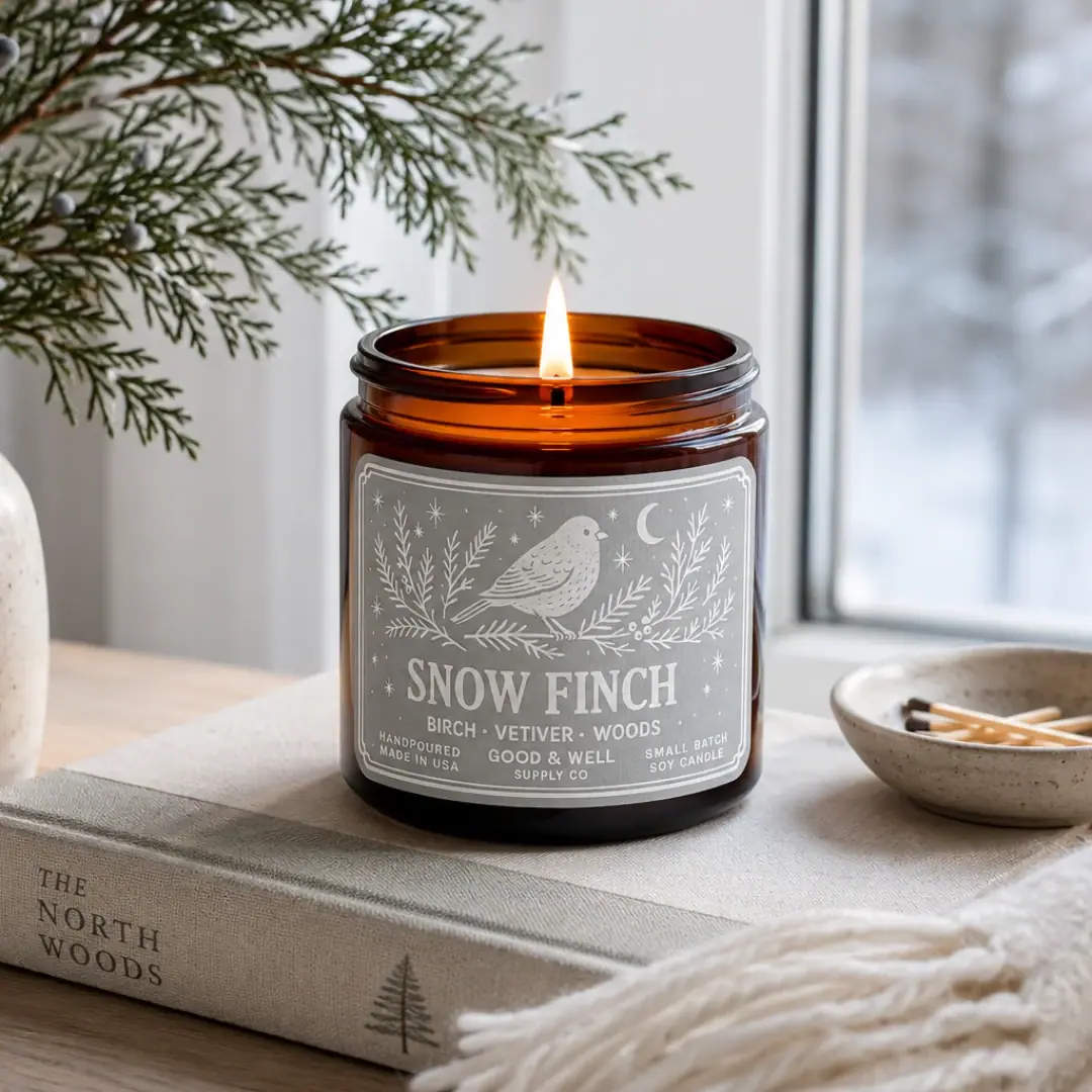
Good & Well Supply Co.
Pale winter bird illustration on a grey amber-jar label
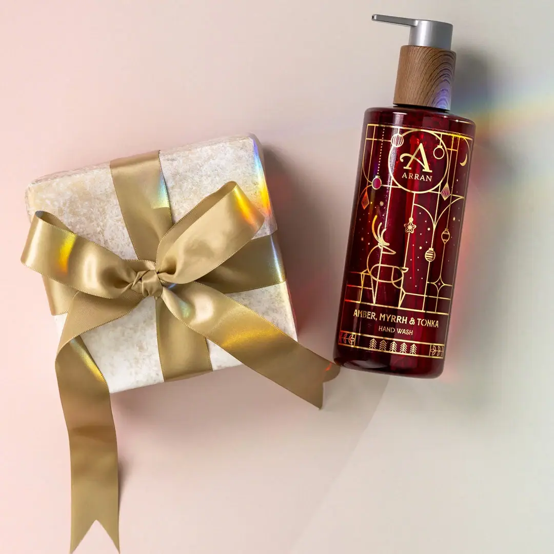
ARRAN
Festive golden linework on garnet with a grain-textured collar
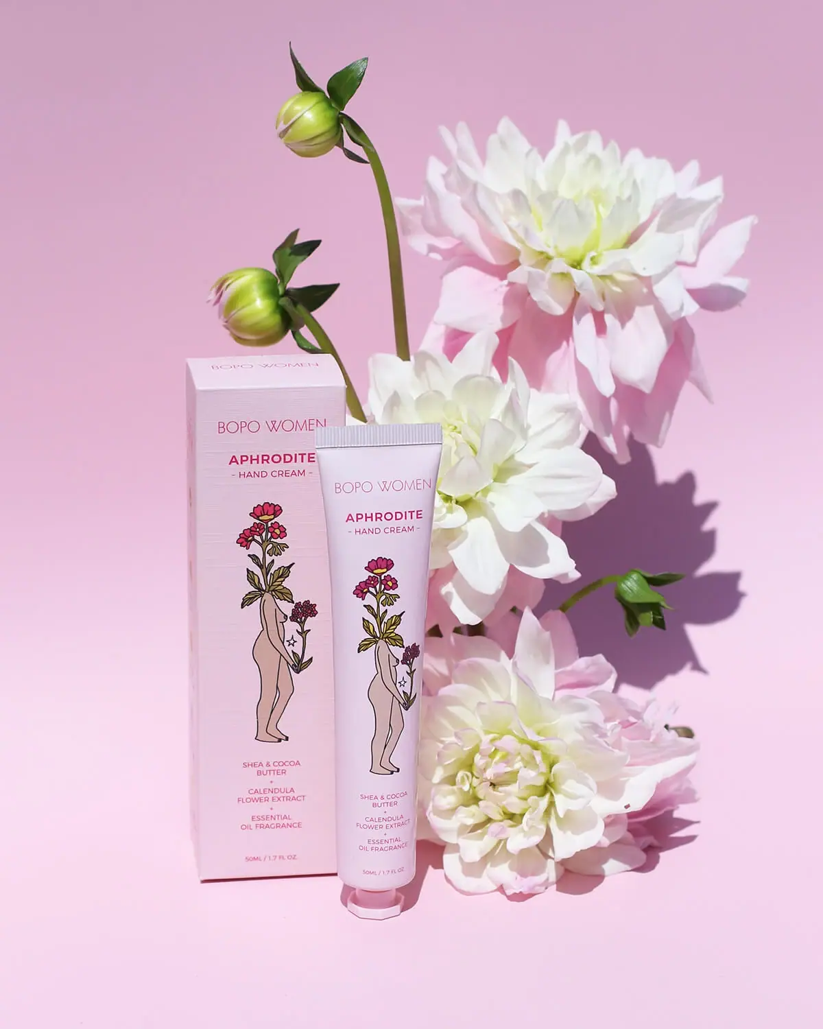
Bopo Women
a botanical figure on a coordinated blush-pink pair
Claus Porto
Golden geometric wrapping around a pale floral medallion
Fable & Mane
Arched serif maker, tiger portrait and amber dropper bottle
Flamingo Estate
A green oval turns silver utility into botanical character
Kate McLeod
A burgundy botanical wrap around a reusable bamboo case