About this packaging
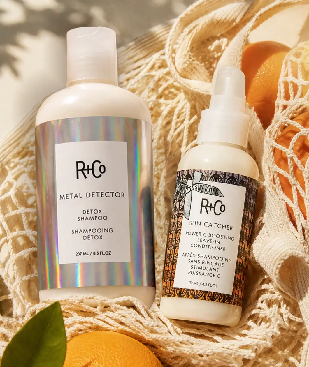
R+Co’s Après Sun Detox + Style Duo pairs a detox shampoo bottle with a smaller leave-in conditioner bottle. The photographed set uses two distinct label treatments while keeping both products within the same white-bottle architecture.
R+Co presents Après Sun Detox + Style as a limited-edition seasonal set.[1]
Pack construction & use
- Bottle details
- The selected cover shows 237 ml and 119 ml size lines. The larger bottle has a translucent-looking flip-top closure; the smaller has a short covered dispensing assembly whose action is not established from this view. It is the leave-in conditioner, not the separate Sun Catcher styling mist.Observed in the reference photograph
- Label treatments
- The larger bottle has an iridescent-looking label, while the smaller bottle uses a dark illustrated border.Observed in the reference photograph
What makes the design work
Editorial analysis of this packaging reference.
Shared architecture
Both bottles use white bodies and centered rectangular labels, establishing a common family structure across different product formats.
Distinct surface language
The shampoo label sits on an iridescent-looking wrap; the conditioner has a black illustrated border. The paired contrast separates products without changing the core layout.
Product naming
R+Co sits above each product name, with the size line at the bottom. Repeating this order keeps names easy to locate despite the different graphics.
Ideas for your next brief
- Keep a coordinated set recognizable through a repeated label grid, then vary one clear surface cue to distinguish each product.
- Use the same brand-to-product-to-size reading order across different closures and bottle formats.
Sources & further reading
Researched 19 October 2026