Photography: R+Co official photography. Images belong to their respective owners.
R+Co

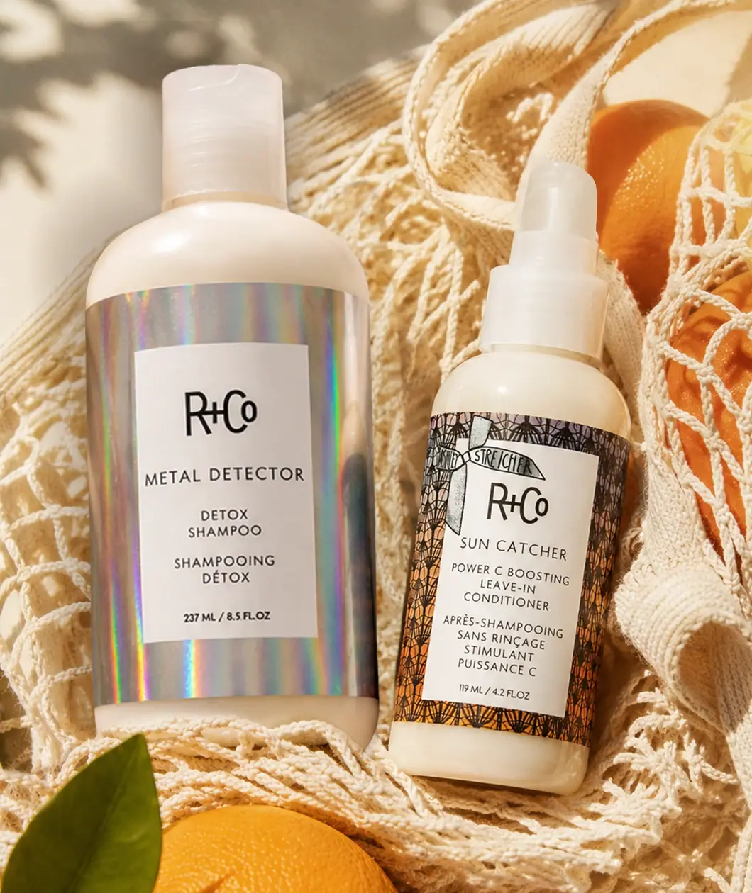
matching white information panels over holographic and tangled artwork
The Après Sun Detox + Style Duo pairs a larger Metal Detector shampoo bottle with a smaller Sun Catcher leave-in conditioner. Both have pale bodies and central white information rectangles, but their surrounding artwork is deliberately different. Metal Detector uses an iridescent-looking silver field; Sun Catcher uses dense dark looping linework over warm colour, with a small banner overlapping the upper label. Repeated typography holds the two products together while size, dispenser and outer graphics distinguish their roles.
- Hair
- Light pack
- Colour-coded range
- Bold typographic
About this study
Selected Après Sun duo with photographed 237 mL shampoo and 119 mL leave-in conditioner. Other R+Co formats and later Sun Catcher products are outside scope.
Sources & evidence · Reviewed 2026-10-19Color Palette
Approximate colours interpreted from photography. These are screen references, not official brand colours or print specifications.
Pack body
Warm white bottles
#E9E1CD
Approximate pale body appearance under sunny lighting; material and intrinsic opacity are unverified.
Label
White reading panels
#F3F0E6
Approximate central information fields shared by both products.
Ink
Black type and linework
#24231E
Approximate maker, product information and Sun Catcher’s looping illustration.
Accent
Silver appearance
#B9BBB4
Approximate neutral portion of Metal Detector’s rainbow-reflective surround; not a metallic substrate specification.
Warm Sun Catcher field
#C99A56
Approximate warm colour behind the dark linework. Fruit and textile colours outside the labels are excluded.
Typography
Suggested visual alternatives, not confirmed brand typefaces. Any scale below is an illustrative estimate.
The compact R+Co maker leads each white panel. A widely spaced uppercase product name follows: METAL DETECTOR on the larger bottle and SUN CATCHER on the smaller. Functional descriptions and French translations form shorter centred lines below. The shampoo’s quantity footer is visibly heavier than much of its supporting copy, while the conditioner’s lower information is lighter and more densely stacked. A hand-drawn-looking Ashley Streicher banner crosses the conditioner’s upper panel edge, adding a local collaboration cue without replacing the shared maker hierarchy.
Fonts
Product-name alternative
Work Sans
- Looks like
- Work Sans as an independent visual alternative
- Type
- Sans serif
- Weight
- Medium 500
- Case
- Uppercase
- Tracking
- Open
- Fallback
- Arial, sans-serif
Use a readable geometric sans-serif for short product names and preserve a consistent location across different bottle heights. Check longer names before fixing panel width. Do not reconstruct the distinctive R+Co wordmark.
Functional-copy alternative
Inter
- Looks like
- Inter as an independent visual alternative
- Type
- Sans serif
- Weight
- Regular 400 / SemiBold 600
- Case
- Uppercase with mixed case available for long translations
- Tracking
- Normal to moderately open
- Fallback
- Arial, sans-serif
Give product function and translation enough space to remain distinct from the name. Use weight selectively for quantity or key format information, but keep the lower block readable when the bottle is photographed at a small scale.
Structure & Proportions
Visual proportions and finish previews are illustrative. Confirmed construction details and uncertainties are distinguished in the study notes.
Proportions
| Purpose | Value | Preview |
|---|---|---|
| Different capacities | Visible front quantities are 237 mL and 119 mL; the larger shampoo is wider and taller in the selected pair. | — |
| Shared reading island | Each white panel leaves visible artwork around its edges, separating typography from the more active surround. | — |
| Format-specific lower copy | The conditioner needs more stacked functional and translated lines than the shampoo, making its smaller panel denser. | — |
Shapes
| Element | Value | Preview |
|---|---|---|
| Shampoo bottle | Broad cylindrical body with rounded shoulder and tall flip-top cap. | |
| Conditioner bottle | Smaller cylinder with short covered dispensing assembly. | |
| Information panels | Portrait rectangles centred within contrasting wraps. | |
| Collaboration banner | Small ribbon-like illustration overlapping the conditioner’s upper panel edge. |
Finishes
Iridescent-looking surround
Metal Detector wrap shows vertical rainbow reflections; process unverified. · holographic
Illustrated surround
Sun Catcher’s dense dark loops over a warm field; exact printing method unknown. · matte
Pale bottle sheen
Rounded shoulders and lower margins catch soft bright light. · gloss
Formats and materials
| Formats | Selected 237 mL Metal Detector Detox Shampoo with a translucent-looking flip-top closure and 119 mL Sun Catcher leave-in conditioner with a short covered dispensing head. |
| Materials | The duo page identifies the two products and seasonal set, but does not provide exact bottle, closure or label materials for this photographed edition., Metal Detector’s iridescent appearance does not prove aluminium, foil stamping or a particular holographic film. Sun Catcher’s dark linework is graphic artwork, not netting wrapped around the bottle. |
| Closures | The larger bottle has a broad rounded shoulder and tall pale translucent-looking cap with a visible flip-top indentation. The smaller bottle has a narrower shoulder and a multi-level pale dispensing assembly beneath a short translucent-looking cover. Its nozzle and dispensing action are not clearly visible, so this study does not call it a fine-mist spray. The two closures communicate different use formats while remaining similar in colour. Internal pumps, seals, delivered dose and transport locks are not established by this scene. |
| Decoration | Repeated central white rectangular information panel., Contrasting outer artwork for the two product roles., Small illustrated collaboration banner on the conditioner. |
Front Panel
Schematic reading order. The diagram’s zone heights do not represent measured artwork proportions.
Both panels follow maker, product name, function, translation and quantity from top to bottom. They are related rather than mechanically identical: line counts and spacing adapt to each product. Metal Detector’s plain white island is surrounded by a relatively uninterrupted reflective field. Sun Catcher’s panel is crossed near the top by an illustrated banner, and its dense outer drawing remains visible on all sides. The pattern is not a simple thin border; it fills the surrounding wrap and introduces its own visual rhythm.
| Zone | Content |
|---|---|
| Maker | R+Co near the top of each white panel. |
| Product | METAL DETECTOR or SUN CATCHER in spaced uppercase. |
| Function and translation | Detox shampoo or leave-in conditioner descriptions in separate centred lines. |
| Quantity | 237 mL on the larger bottle and 119 mL on the smaller. |
| Outer artwork | Reflective silver/rainbow field versus dense looping illustration and collaboration banner. |
Range System
The official page explicitly identifies Après Sun as a limited-edition duo containing Metal Detector and Sun Catcher. The separate brand interview establishes Ashley Streicher’s collaboration on Sun Catcher, but does not identify the person who drew this package artwork. These are two coordinated products within one selected reference, not two independent brand studies. Their repeated panel architecture can be compared directly; the same rules should not automatically be extended to every R+Co bottle or later Sun Catcher product.
- Metal Detector: larger 237 mL bottle with reflective surround and detox-shampoo naming.
- Sun Catcher: smaller 119 mL bottle with illustrated surround, banner and leave-in-conditioner naming.
Back of Pack & Shelf
Rear panels, bases, open closures and any set carton are unseen. The French front text is descriptive information, not a complete use-direction panel. Current online product descriptions cannot establish the precise reverse artwork of this photographed edition.
- Inspect the smaller dispenser before describing spray versus cream delivery.
- Verify label and bottle materials from exact component records.
- Review the set’s sold contents before assuming textile or fruit props are included.
On shelf
Interpretation: the repeated white panel makes the maker and product name easy to locate across different artwork. The reflective shampoo may attract attention through changing colour, while the conditioner relies on graphic density. The smaller bottle’s long bilingual block risks becoming crowded. A new paired system should preserve the functional distinction and test both products at the same viewing distance, rather than simply scaling the larger label down.
Imagery
The pair rests among a cream open-weave textile and citrus fruit in warm sunlight. The fabric’s loose loops echo the conditioner’s dense dark illustration, while the sunny reflections activate the shampoo’s iridescent-looking surround. These correspondences help the different labels feel connected in one seasonal scene. The fabric and fruit are styling elements, not verified gift-set contents or proof of the formula’s ingredients. A neutral image would be needed to isolate the pale bottle colour from the warm reflected light.
Guidelines
Editorial principles for an original design brief, not official brand guidelines.
Do
- Keep information order consistent across different artwork.
- Adapt line count to each product rather than shrinking everything.
- Distinguish the leave-in product from a styling mist.
- Separate collaboration provenance from artwork authorship.
Don't
- Do not infer metal construction from rainbow reflections.
- Do not call the conditioner’s linework physical netting.
- Do not treat the textile and fruit as included set contents.
- Do not copy R+Co lettering or the Ashley Streicher banner.
Sources & evidence
- R+Co — Après Sun Detox + Style Duoproduct
- R+Co — Ashley Streicher discusses Sun Catcher collaborationbrand
How this study was built
range · Sourced fact
Official page identifies the limited-edition duo and its two named products.R+Co — Après Sun Detox + Style Duocontext · Sourced fact
Brand interview confirms Ashley Streicher’s Sun Catcher collaboration, not packaging-art authorship.R+Co — Ashley Streicher discusses Sun Catcher collaborationlabel · Visual observation
Both bottles use white information panels with different surrounding artwork.R+Co — Après Sun Detox + Style Duostructure · Visual observation
Selected quantities read 237 mL and 119 mL; smaller covered dispensing action is not established.R+Co — Après Sun Detox + Style Duoimagery · Visual observation
Textile and citrus are scene elements distinct from the labels.R+Co — Après Sun Detox + Style Duoshelf · Editorial interpretation
Shared reading order needs format-specific spacing rather than uniform scaling.
What remains unverified
- Bottle and label materials, reflective process and smaller dispenser action unverified.
- Original fonts and illustration authorship unknown.
- Rear, bases, open closures and set carton unseen.
Give your AI
packaging taste
Give your design or image tool a packaging study: palette, type, structure, front panel and principles for an original brief.
Export this styleFree with an email. PACK.md works in Claude, ChatGPT, Cursor and image tools.
More like this

AKT
Lilac stage directions with a quiet metallic detail
Bouclème
warm colour blocks crossed by flowing white ribbons
Ceremonia
Warm colour labels bounded by upright and inverted wordmarks

Dr. Bronner’s
A bright soap wrapper with a densely ordered voice
Essie
Visible red colour, clear relief and a white cap
KraveBeauty
cropped wordmarks on minty skincare bottles
L'Oréal Paris
translucent amber shampoo under a gilded serif masthead

Malin+Goetz
pharmacy label set in bracketed helvetica