Photography: Lucas Zarebinski — product photography. Images belong to their respective owners.
Sephora Collection

Black identity cap over a clear bilingual concealer tube
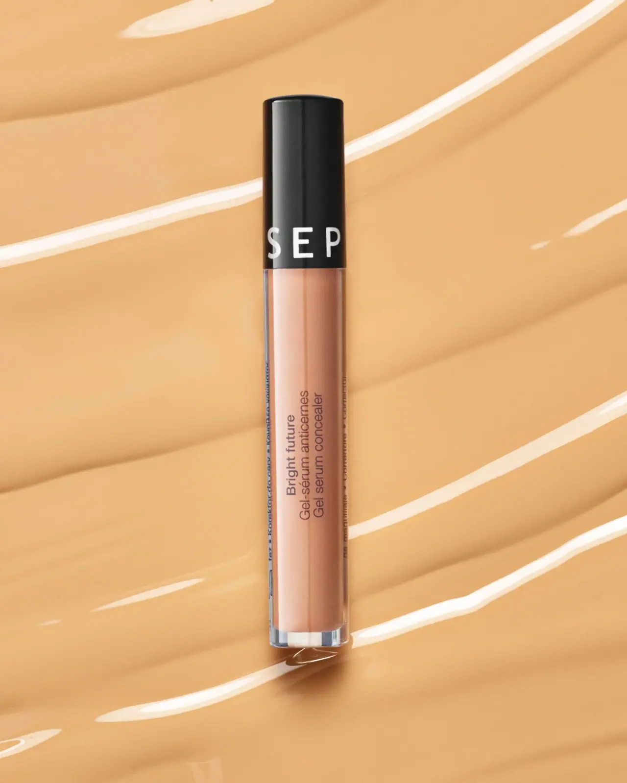
This archival Bright Future Gel Serum Concealer uses a slim transparent cylinder and a tall black cap whose lower edge carries large spaced white producer lettering. The body shows the peach-toned formula through most of its length, with a compact three-line product block rotated along the tube’s axis. The contrast is structural as much as graphic: dark identity above, visible shade below, and a thick-looking clear base at the foot. The official Sephora Mexico listing confirms the product identity, but its current shade selection does not identify the lighter-toned tube in this photograph.
- Make-up
- Light pack
- Clinical minimal
- Bold typographic
About this study
Archival Bright Future tube in selected Lucas Zarebinski photograph; current Mexico page supports identity, not exact shade or component specifications.
Sources & evidence · Reviewed 2026-10-19Color Palette
Approximate colours interpreted from photography. These are screen references, not official brand colours or print specifications.
Pack body
Visible peach concealer
#D3A084
Formula appearance through the clear tube; not an exact shade identification or a fixed printed brand color.
Black identity cap
#202120
Tall opaque closure gives the narrow object a strong dark anchor against the warm scene.
Ink
White cap lettering
#F4F3ED
Large spaced producer letters reverse from the cap near its lower edge.
Dark body copy
#58453D
Small product and bilingual category wording over the visible contents; approximate under warm lighting.
Typography
Suggested visual alternatives, not confirmed brand typefaces. Any scale below is an illustrative estimate.
The cap’s oversized white letters lead from a distance, although only part of the circumferential word is visible at this angle. On the body, Bright future has a stronger weight than the adjacent French and English category lines. The full block is rotated, preserving normal word shapes while exploiting the long tube.
Fonts
Original cap identity
Barlow
- Looks like
- Clean open uppercase sans
- Type
- Grotesque sans-serif
- Weight
- Medium 500
- Case
- Uppercase
- Tracking
- Wide but controlled; test how many letters remain visible on the curved cap face.
- Fallback
- Arial, sans-serif
An original producer name near the cap’s lower edge. The narrow cylinder cannot show an entire long word at once, so test recognition from several rotations rather than widening letters artificially.
Rotated product and bilingual category
Roboto
- Looks like
- Plain compact functional sans
- Type
- Grotesque sans-serif
- Weight
- Regular 400 / Bold 700
- Case
- Sentence case
- Tracking
- Neutral, with consistent spacing between parallel lines.
- Fallback
- Arial, sans-serif
A stronger short product-family line beside two regular category lines. Rotate the complete block rather than stacking individual letters, and preserve a legible French/English relationship at actual tube scale.
Structure & Proportions
Visual proportions and finish previews are illustrative. Confirmed construction details and uncertainties are distinguished in the study notes.
Proportions
| Purpose | Value | Preview |
|---|---|---|
| Cap identity zone | The cap occupies roughly the upper third of the closed object in this photograph; this is an approximate visual relationship, not a component drawing. | — |
| Long transparent body | The visible formula-bearing section is substantially longer than the cap, preserving a generous view of the concealer color. | — |
| Compact copy block | Three short parallel lines occupy a narrow strip along the body, leaving clear space above, below and around them. | — |
Shapes
| Element | Value | Preview |
|---|---|---|
| Slender cylinder | Nearly continuous cap/body diameter creates a long straight silhouette with a small rounded lower edge. | |
| Identity band | A horizontal line of large white letters wraps near the bottom of the black cap. | |
| Long-axis text group | A compact rectangular grouping rotated to run along the tube’s height. |
Finishes
Smooth opaque black
Closed cap; surface treatment unverified · gloss
Clear formula window
Tube walls and base; material unverified · transparent
Formats and materials
| Formats | Slender closed cylindrical concealer tube with clear walls, a long opaque black cap and a substantial-looking transparent lower edge., No reliable amount or shade code is readable in this selected photograph. The archival catalogue identity should not be expanded into an exact capacity claim without additional evidence. |
| Materials | The body appears clear and rigid, while the cap is opaque black. The official listing consulted does not specify the tube resin, glass content, cap polymer or recycled content., The peach color is visible formula rather than a verified colored body coating. The clear base has optical depth, but apparent thickness is not a measured wall specification. |
| Closures | The tall black cap meets the transparent body at a narrow seam. The package is closed, so the applicator, wand, wiper and attachment mechanism remain unseen. The product category alone is not enough to specify the exact applicator construction. |
| Decoration | Large white circumferential producer letters occupy the cap’s lower band., Dark rotated product and bilingual category copy occupies only a small portion of the clear body., Additional tiny side text is visible but not sufficiently clear for a complete transcription. |
Front Panel
Schematic reading order. The diagram’s zone heights do not represent measured artwork proportions.
Separate producer identification onto the cap and product naming onto the clear body. The front does not need a broad opaque label because the narrow rotated text block can sit directly over the visible formula. Its language lines remain adjacent and share a reading direction. Direct printing versus a clear label is not established.
| Zone | Content |
|---|---|
| Upper cap | Large quiet black area with a vertical highlight and no readable top message. |
| Cap baseline | White spaced producer lettering wraps around the circumference; only the front-facing portion is visible, not a full Sephora Collection phrase. |
| Body naming | Bright future in a stronger weight, followed by Gel-sérum anticernes and Gel serum concealer in parallel rotated lines. |
| Side information | Very small dark wording follows the tube edge; it is not fully transcribed. |
| Base | Clear lower edge below the formula field; no verified shade or amount is read here. |
Range System
The official regional page retains the Bright Future product identity and displays a named shade variant, while the selected image is catalogued as archival packaging. Neither that current default variant nor current availability establishes the photographed shade or the status of every market. A proposed family should keep shade identity explicit and independent of contents photography.
- Maintain a consistent black identity cap while allowing the actual formula color to distinguish shades visually.
- Add a clearly legible shade identifier on a verified surface instead of relying on screen color alone.
- Preserve the exact archival product name rather than replacing it with a newer Sephora Collection concealer that uses a similar tube.
Back of Pack & Shelf
The opposite side, bottom label and applicator are not visible. Partial side text is insufficient to reconstruct the full ingredient declaration, responsible business details or shade naming.
- For an original concealer brief, reserve a readable place for shade, amount and traceability before finalizing the narrow decoration area.
- Verify the actual applicator and closure components before specifying opening or dosing behavior.
- Use current production information for a new design rather than copying an archival ingredient panel or assuming unchanged formulation.
On shelf
The black cap provides the strongest visual anchor in a small thumbnail, while its large partial lettering can still signal a recognizable producer system. The transparent body makes shade comparison possible in principle, but photography and screen display cannot replace explicit shade identifiers. Rotated text uses space efficiently while requiring the package to be turned for ordinary reading. These are visual tradeoffs, not measured recognition or usability findings.
Imagery
Lucas Zarebinski’s photograph isolates the upright tube against broad glossy swatch-like forms in warm beige. The scene echoes the visible concealer but does not establish an exact shade match, coverage result or real skin appearance. Bright curved streaks create motion around the straight package. Because the body and background are close in tone, the black cap, clear edges and dark copy provide separation. A reference crop should retain the whole tube and clear base rather than reducing it to the cap logo.
Guidelines
Editorial principles for an original design brief, not official brand guidelines.
Do
- Use the cap as an identity surface while preserving a clear view of the formula.
- Keep bilingual category lines adjacent and readable when the tube is rotated.
- Retain archival edition information and identify the photographed shade as unknown.
- Test circumferential lettering from several angles because only part of a long word faces the viewer.
Don't
- Do not assign the current regional page’s selected shade to this image.
- Do not claim a full Sephora Collection phrase is readable on the cap when only partial producer letters are visible.
- Do not infer glass, a specific plastic or an applicator shape from a closed tube.
- Do not treat warm swatch scenery as evidence of coverage or exact color matching.
Sources & evidence
How this study was built
edition · Sourced fact
Official regional listing identifies Bright Future; current selected shade not assigned to archive photo.Sephora Mexico — Bright Future Gel Serum Concealerstructure · Visual observation
Clear slim cylinder, tall black cap and clear base; closed applicator unobserved.palette · Visual observation
Black/white identity and peach formula appearance, distinct from warm scene.typography · Visual observation
Large partial circumferential cap lettering and small rotated bilingual block.label · Visual observation
Bright future weighted above adjacent French/English category lines.imagery · Visual observation
Glossy warm swatch-like background is styling, not a shade or coverage test.range · Editorial interpretation
Contents visibility should complement explicit shade identification, not replace it.
What remains unverified
- Exact photographed shade, capacity and manufacture date unknown.
- Tube/cap materials and decoration process unspecified.
- Applicator, reverse and base markings hidden or unreadable.
- Original fonts unverified; colors and proportions visual estimates.
Give your AI
packaging taste
Give your design or image tool a packaging study: palette, type, structure, front panel and principles for an original brief.
Export this styleFree with an email. PACK.md works in Claude, ChatGPT, Cursor and image tools.
More like this

AussieZinc
Sun-yellow numerals on a tall, information-rich white cylinder

BioSeivas
Vertical serif identity on a mauve treatment band
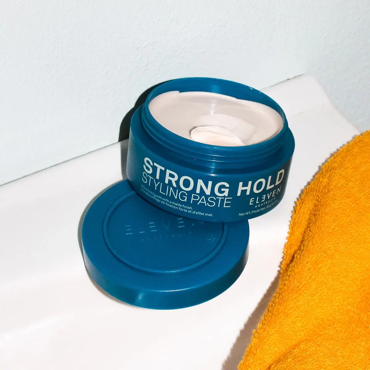
ELEVEN Australia
Deep blue open jar with emphatic hold-first typography
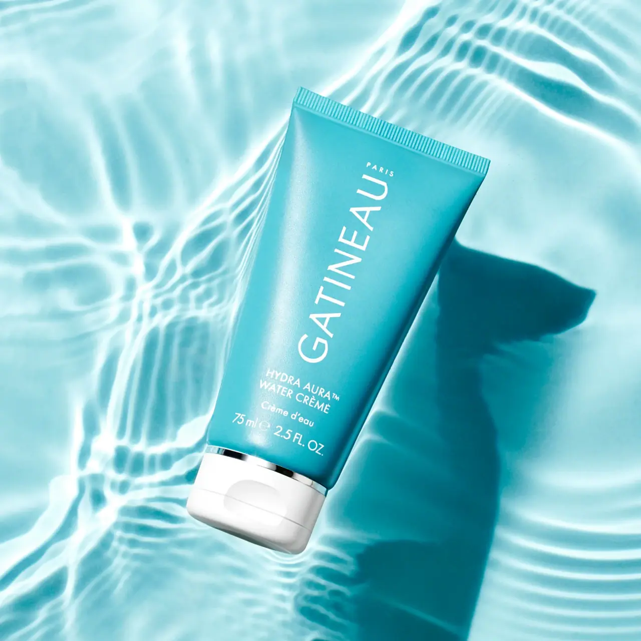
Gatineau
Turquoise tube with lengthwise white name and silver accent

Malin+Goetz
pharmacy label set in bracketed helvetica
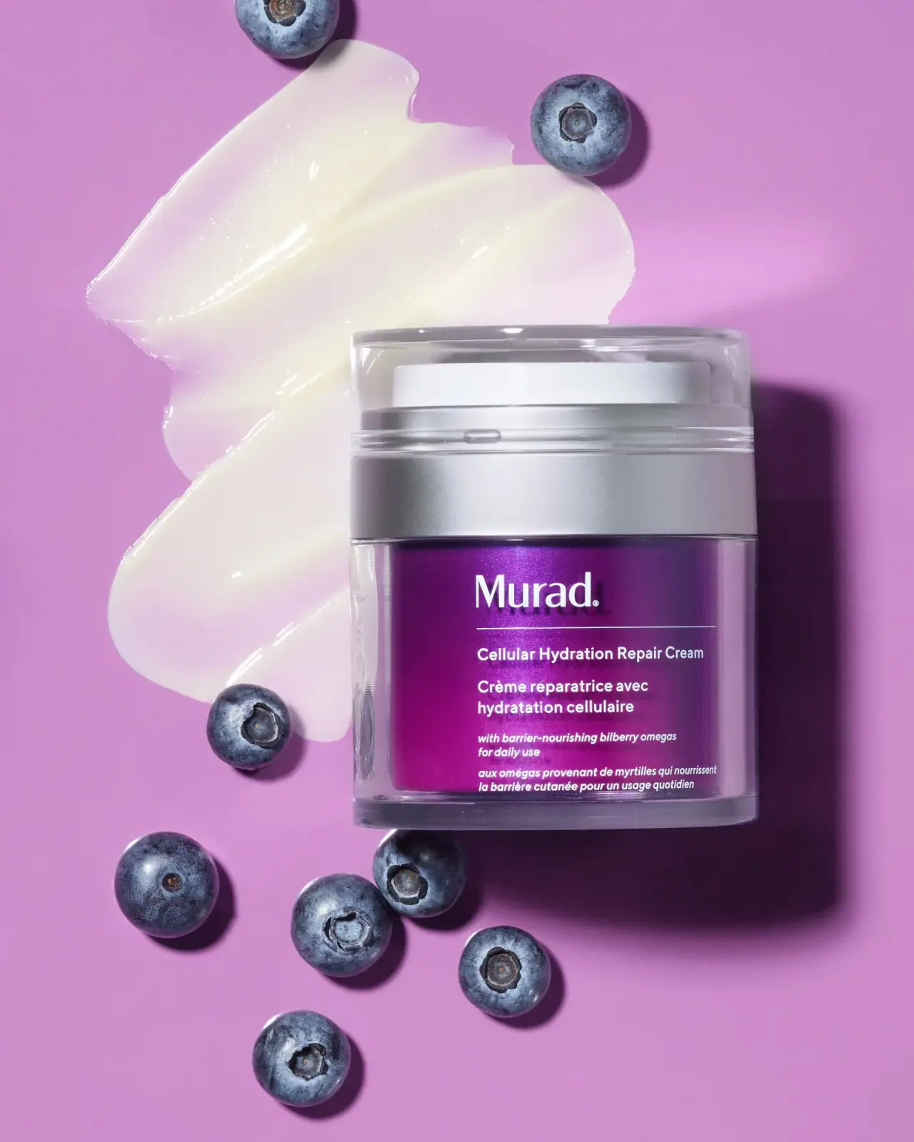
Murad
Purple inner field framed by clear walls and silver

Native
white drugstore bottles, scent-tinted vertical caps
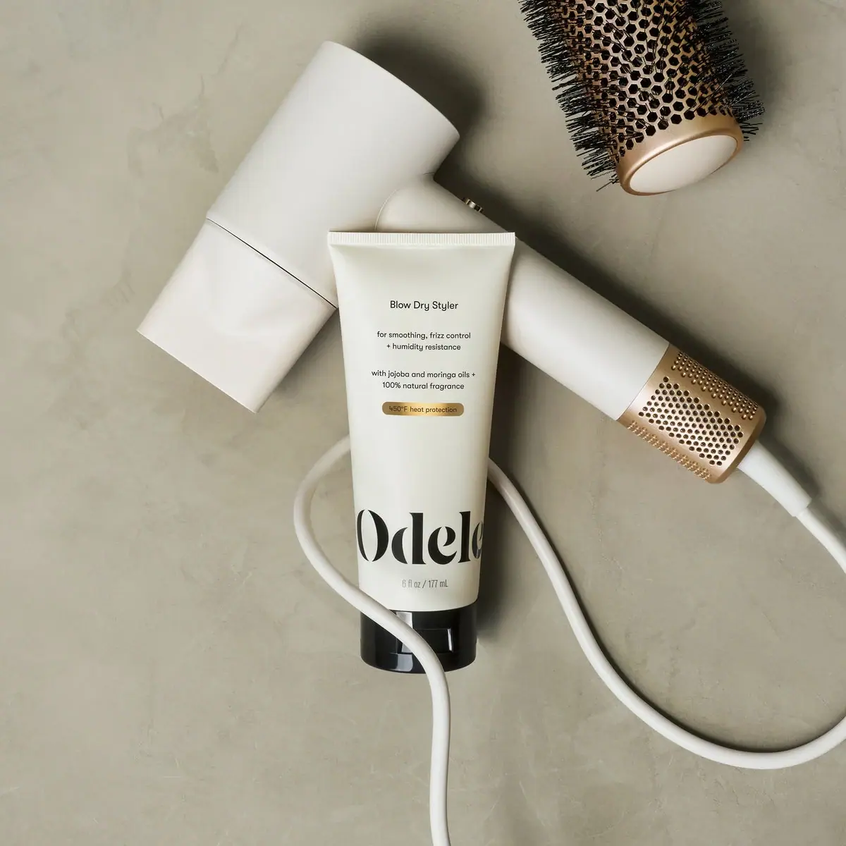
Odele
Cream tube with tiny utility copy and oversized lower serif