About this packaging
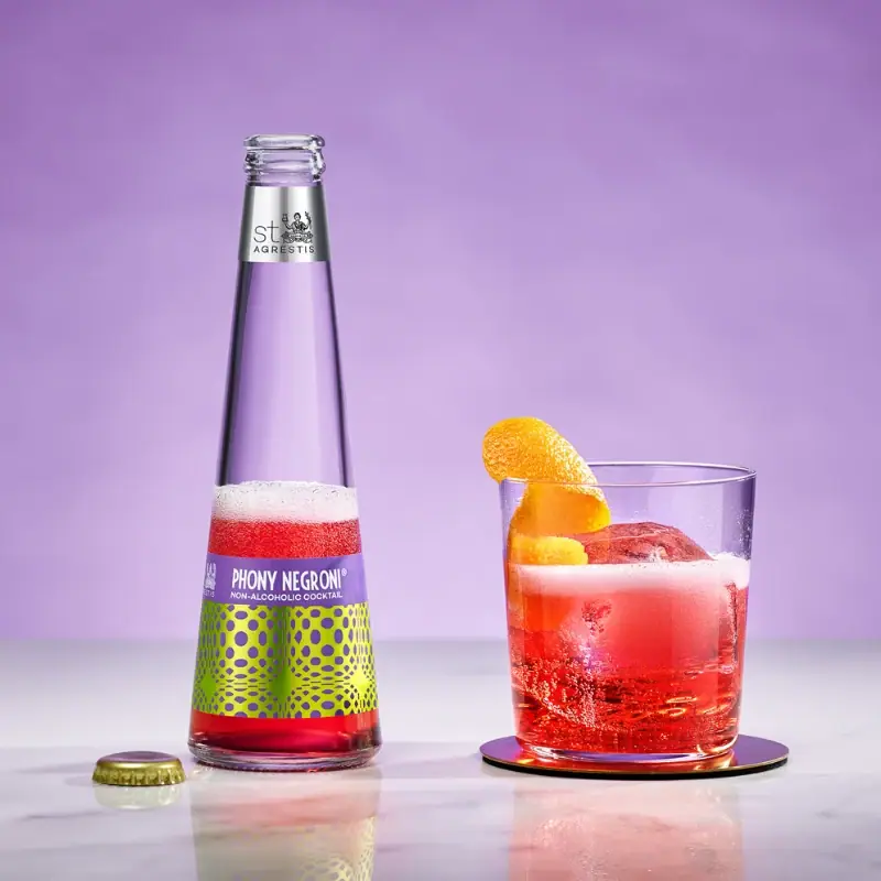
The photographed Phony Negroni bottle uses a long, clear neck above a vivid lower label. A narrow purple title strip sits over lime and purple dots, separating the product name from the high-energy pattern.
St. Agrestis identifies Phony Negroni as a ready-to-serve non-alcoholic cocktail offered in a 200 ml bottle format. Its shipping page states company packaging is plastic-free and recyclable, without detailing each bottle component.[1]
Pack construction & use
- Bottle format
- The selected cover shows a long-necked bottle and crown-style cap.Observed in the reference photograph
- Label system
- The image shows a narrow silver-colored neck band and a low body label with a purple name strip over a dotted lime-purple field.Observed in the reference photograph
What makes the design work
Editorial analysis of this packaging reference.
Reserve the neck
The long neck leaves visual breathing room above the patterned body label, giving this small-format cocktail a slender silhouette.
Quiet title, energetic field
The purple name strip creates a calm band above the high-contrast dot pattern. This split keeps the flavor name readable while retaining a distinctive surface.
A second brand marker
The small neck band repeats the brand at a distance from the main label, creating a second point of recognition without adding another large panel.
Ideas for your next brief
- Set the product name in a quiet strip when the main label uses a dense pattern.
- Use the neck as a secondary brand location on a tall bottle, leaving the body to carry the variant graphics.
Sources & further reading
Researched 19 October 2026