Photography: St. Agrestis official photography. Images belong to their respective owners.
St. Agrestis

Optical lime-and-purple graphics below a long clear neck
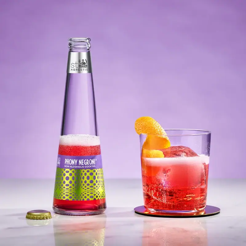
The selected Phony Negroni bottle combines an unusually long tapered clear silhouette with a compact, highly animated lower label. A quiet purple title strip sits above a lime-yellow field of purple circles and stretched ovals. The red drink becomes another visual layer, visible around the label and through the neck. A small silver-looking brand band near the mouth is separated from the main artwork by ample clear glass. The photograph shows the bottle open beside a prepared glass, making both the packaged object and its serving ritual visible. This study covers that bottle edition, not the can or the entire St. Agrestis range.
- Beer & aperitifs
- Light pack
- Maximalist pattern
- Playful colour
About this study
The approved Phony Negroni bottle-and-serving photograph. Current product context identifies a 200 ml bottle option; the exact artwork revision date is not established. Cans, other flavours and unseen rear panels are outside scope.
Sources & evidence · Reviewed 2026-10-19Color Palette
Approximate colours interpreted from photography. These are screen references, not official brand colours or print specifications.
Label
Aperitivo purple
#7854A0
Approximate title-strip and optical-mark colour. It is darker and more concentrated than the lavender photographic backdrop.
Acid yellow-lime
#C8D322
Approximate bright ground beneath the optical pattern. Its contrast with purple makes a relatively small label visually forceful.
Silver neck band
#C1C5C1
Approximate metallic-looking midtone on the upper brand label; exact stock and decoration method are unverified.
Ink
Title white
#F6F2EA
Approximate light lettering in the calm title strip, separating readable information from the energetic pattern below.
Accent
Visible cocktail red
#E22E31
Approximate liquid appearance in the photograph, not a red glass or printing specification. Lighting, bubbles and fill level affect it.
Gold-looking cap
#A79D42
Approximate removed crown-cap appearance at lower left. Its small purple top detail relates it to the body artwork.
Typography
Suggested visual alternatives, not confirmed brand typefaces. Any scale below is an illustrative estimate.
The body label gives the product name a short, light-coloured line of condensed capitals on purple, with the non-alcoholic category description smaller beneath. This is a quiet reading area above the pattern, rather than lettering placed over changing dots. The neck band carries a separate compact brand mark with an illustrated emblem. The distance between those two labels creates hierarchy through placement as much as through scale.
Fonts
Product-title alternative
Barlow Condensed
- Looks like
- Narrow upright sans-serif capitals
- Type
- Condensed sans serif
- Weight
- Semibold
- Case
- Uppercase
- Tracking
- Compact to neutral
- Fallback
- Arial Narrow, Arial, sans-serif
An original product name within a plain horizontal strip. Keep a buffer above and below the letters so the busy graphic field does not invade the reading area.
Category-detail alternative
Roboto Condensed
- Looks like
- Clean small sans serif
- Type
- Condensed sans serif
- Weight
- Regular to medium
- Case
- Uppercase for a brief category line
- Tracking
- Slightly open if space permits
- Fallback
- Arial Narrow, Arial, sans-serif
A clear category descriptor below the title. It should remain a practical identifier, not be reduced to an illegible decorative rule.
Original neck-signature alternative
Lato
- Looks like
- Restrained humanist sans-serif direction
- Type
- Humanist sans serif
- Weight
- Regular
- Case
- Original mixed-case name
- Tracking
- Optically adjusted
- Fallback
- Arial, sans-serif
A new secondary brand signature for the neck label. Do not reconstruct the St. Agrestis illustrated emblem or treat this font as an attribution.
Structure & Proportions
Visual proportions and finish previews are illustrative. Confirmed construction details and uncertainties are distinguished in the study notes.
Proportions
| Purpose | Value | Preview |
|---|---|---|
| Bottle silhouette | The lower body widens gradually from a long narrow upper section, creating a conical impression. No standard bottle dimensions or neck-to-body ratio is assumed. | — |
| Label separation | The small upper brand band and low main label leave a substantial transparent interval between them. That gap is central to the package's lightness. | — |
| Graphic density | The busy optical field is concentrated into the broad lower area, while the upper portion remains sparse. This is a compositional observation, not a measured coverage percentage. | — |
Shapes
| Element | Value | Preview |
|---|---|---|
| Tapered bottle | Long narrowing sides connect the fuller base to a slender neck; this is not a conventional straight cylindrical silhouette. | |
| Optical cells | Repeating circles and horizontally stretched ovals change apparent spacing across the curved label. | |
| Title strip | A short horizontal field follows the top of the lower label. |
Finishes
Transparent reflective vessel
Exposed glass between labels and around the lower body; highlights and liquid remain visible · transparent
Metallic-looking brand band
Small upper neck label; silver appearance does not establish hot foil or metallised paper · metallic
Metallic-looking cap
Removed crown-style cap beside the bottle; exact material and liner are outside this review · metallic
Formats and materials
| Formats | Slender tapered glass bottle with a broad lower body and very narrow mouth |
| Materials | Glass bottle: supported by the official bottle context and the co-owner's first-person explanation of custom glass., Crown-style closure appears metallic in the photograph; alloy, liner and coating are not specified., Body and neck labels are visible; their substrate, adhesive and printing processes remain unverified. |
| Closures | The bottle is open in the selected scene. Its removed crown-style cap sits separately on the surface at left, showing a ridged skirt and purple-looking top detail. The image does not establish whether a consumer twists or pries it off, and no closure specification is inferred from the lip alone. |
| Decoration | Separate upper brand label and lower product label, Plain purple information strip above an optical circle/oval field, Visible liquid used as a colour element rather than hidden by a full-height sleeve |
Front Panel
Schematic reading order. The diagram’s zone heights do not represent measured artwork proportions.
Two labels divide brand identity from product identity. The neck label provides a restrained signature high on the silhouette. The body label has its own internal split: a readable purple header above a dense lime-and-purple pattern. The label is positioned low enough to let the transparent upper area and drink colour remain prominent. Information and decoration occupy distinct territories.
| Zone | Content |
|---|---|
| Upper neck | Compact St. Agrestis signature and emblem on a silver-looking band. The illustration is not reconstructed as generic ornament. |
| Clear interval | A long view through the bottle between the two labels; liquid level and background affect what is visible here in a served scene. |
| Body-label header | Light condensed product name and smaller category line on a solid purple ground. |
| Pattern field | Purple circular and oval forms across acid yellow-lime. The marks create a changing rhythm rather than a uniform polka-dot repeat. |
| Base margin | A small transparent area beneath the label exposes the red liquid and the thicker-looking glass base. |
Range System
In a 2024 primary interview, co-owner Louie Catizone describes the motif as abstract zeros referencing the absence of alcohol, and says it also appears on related non-alcoholic products. That establishes intent, not a complete artwork specification. Only this Phony Negroni bottle has been visually reviewed here; other variants' colours, text sizes and current format differences require their own studies.
- Observed: purple title area and purple optical marks on a lime-yellow lower field, with red drink visible through the glass.
- Sourced intent: the abstract-zero pattern belongs to a broader non-alcoholic product concept.
- Original-design interpretation: retain a clear information strip while changing a graphic system deliberately, rather than overlaying variant text directly on dense pattern.
Back of Pack & Shelf
The reverse is not visible. The photograph does not support a nutrition layout, ingredient order, barcode position or exact volume-text location. The official product page's information is product context, not a transcription of this unseen label.
- Acquire a readable back view before mapping nutrition and ingredient areas.
- For a fictional drink, allocate verified practical information separately from the optical display field.
On shelf
Interpretation: the unusual taper can be recognised by silhouette, and the bright optical field provides another cue below it. The design does not require a large full-height label to feel distinctive. Its separation of pattern and title is particularly useful at close range, where viewers must still identify the drink. A new interpretation should test the bottle both full and partially poured, because the exposed liquid is an active part of its appearance.
Imagery
The official still life pairs the open bottle with a low glass containing a red drink, ice and an orange twist. The removed cap and foam make the scene feel like a serving moment rather than a sealed warehouse packshot. A lavender background harmonises with the label, while reflections on the pale surface echo the red liquid. These props are outside the package. The co-owner explains that making the red drink visible was intentional; the image shows how transparent packaging can participate in the serving presentation.
Guidelines
Editorial principles for an original design brief, not official brand guidelines.
Do
- Separate a busy graphic from the product's reading zone.
- Consider silhouette, label placement and visible liquid together.
- Use a restrained second brand marker when the vessel provides enough clear space.
- Test the design at several fill levels and viewing angles.
- Attribute stated design intentions to the source rather than presenting them as visual deductions.
Don't
- Do not confuse the lavender backdrop with the darker label purple.
- Do not infer foil technology from a silver-looking surface.
- Do not assume the cap is attached in an opened serving photograph.
- Do not reconstruct the unseen rear from current website copy.
- Do not reuse the brand emblem or exact optical pattern in an original concept.
Sources & evidence
- Phony Negroni — St. Agrestis official product pageproduct
- Louie Catizone primary interview — No Hesitations Podcast, episode 26, 4 March 2024editorial
How this study was built
structure · Sourced fact
The official listing identifies the bottle format; Catizone describes custom glass in his first-person interview.Phony Negroni — St. Agrestis official product page · Louie Catizone primary interview — No Hesitations Podcast, episode 26, 4 March 2024label · Visual observation
The approved image shows two separated labels and a plain purple title strip above the optical lower field.Phony Negroni — St. Agrestis official product pagerange · Sourced fact
Catizone explains the marks as abstract zeros tied to non-alcoholic products; this source establishes intention, not dimensions.Louie Catizone primary interview — No Hesitations Podcast, episode 26, 4 March 2024palette · Visual observation
Purple and lime belong to the label, red to the visible drink, and lavender primarily to the scene.Phony Negroni — St. Agrestis official product pageimagery · Visual observation
The bottle is open, with a removed crown-style cap and a separate prepared glass; the cap is not mounted on the mouth.Phony Negroni — St. Agrestis official product pagetypography · Editorial interpretation
Proposed Google families serve an original design; the actual wordmark and emblem are not reproduced or attributed to those fonts.
What remains unverified
- Exact label substrate, metallic decoration process, cap alloy and liner remain unspecified.
- No actual font names, calibrated colour references or dimensional artwork were obtained.
- The opened photo is not evidence of the sealed fill level or complete rear information.
- The primary interview explains design intent in 2024, not all future component or range specifications.
Give your AI
packaging taste
Give your design or image tool a packaging study: palette, type, structure, front panel and principles for an original brief.
Export this styleFree with an email. PACK.md works in Claude, ChatGPT, Cursor and image tools.
More like this
Flower Knows
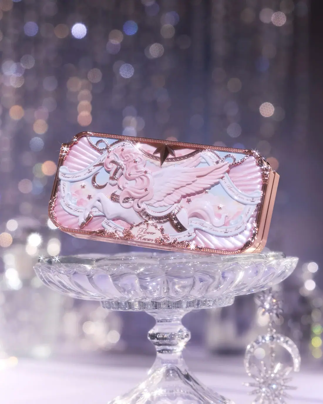
Winged unicorn relief with pastel ribbons and reflective borders
Kate Somerville
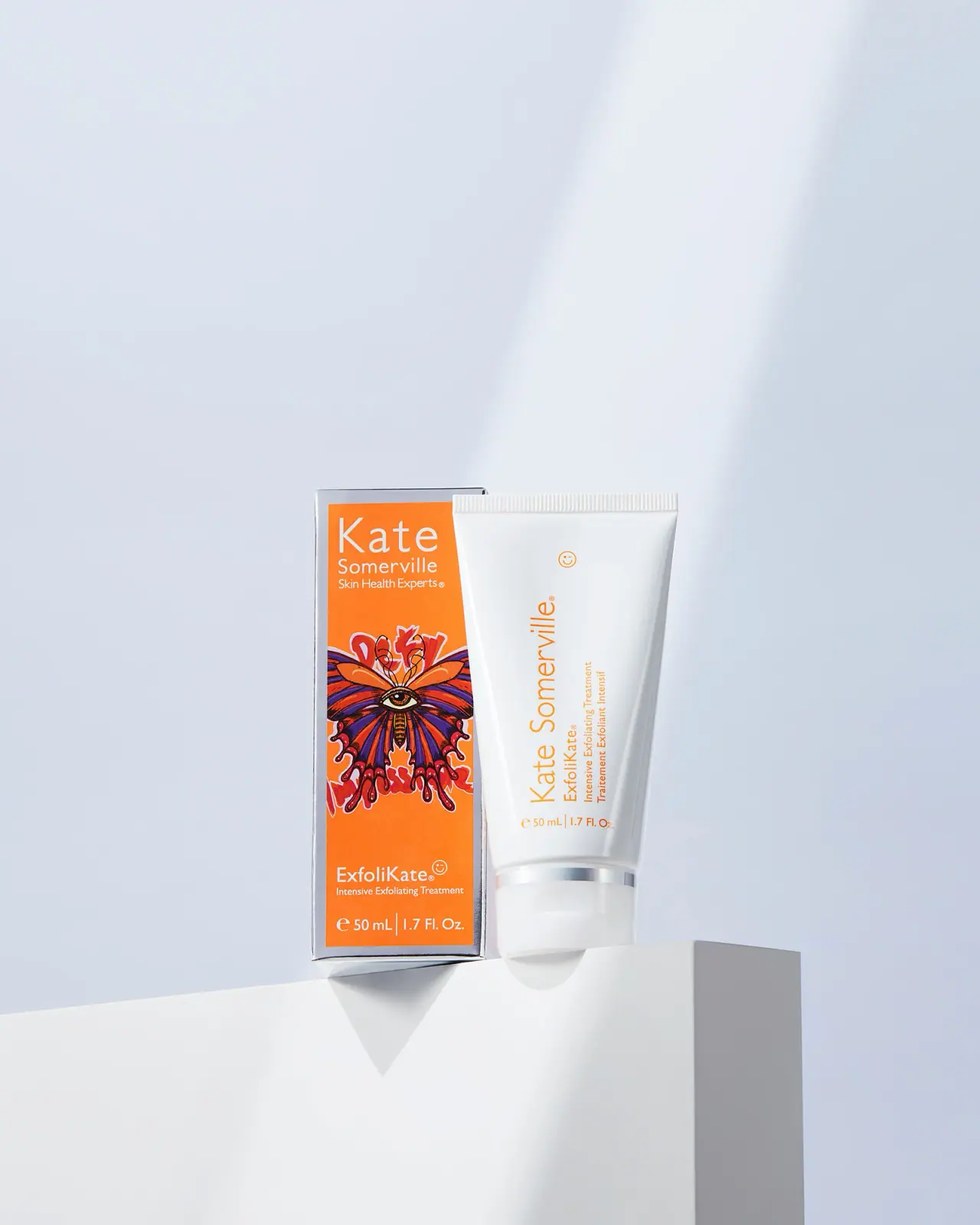
Orange artist carton beside a clean white vertical-text tube
Leif
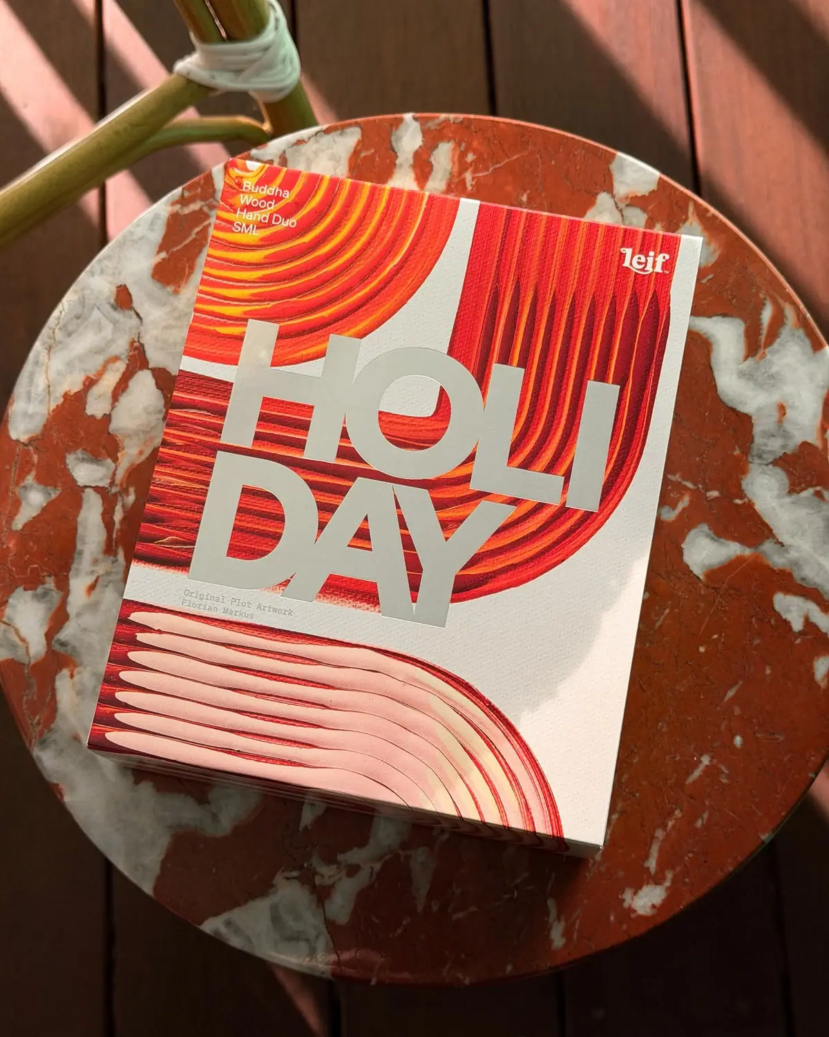
Huge silver holiday type over vivid plotted paint curves
Paddywax
Painted koi, scalloped rim and striped pedestal

Culture Pop
fruit-for-an-o wordmark on dewy cans
Hiyo
a warm fruit gradient framed with quiet cream
Olipop
sunny soda fountain in flat colour

Yerba Madre
golden cans woven with andean textile geometry