About this packaging
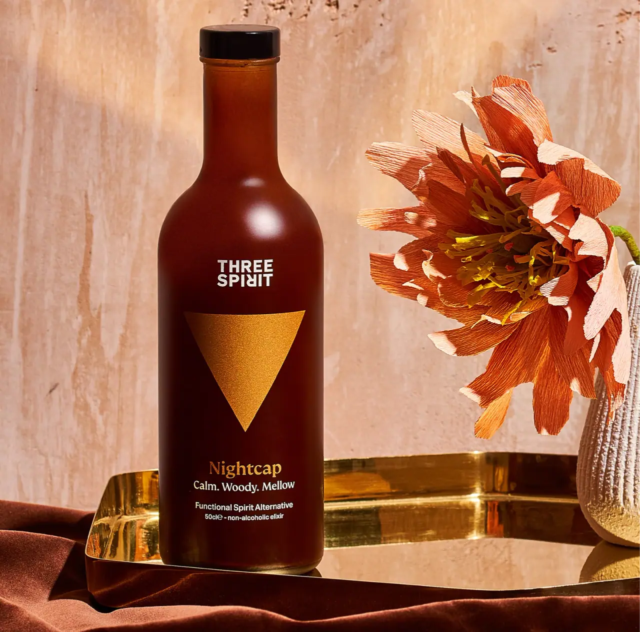
Three Spirit’s Nightcap is presented in a tall, dark amber-looking bottle with a black closure and a prominent gold triangular mark. The selected image uses warm lighting and a sculptural flower to support the drink’s evening positioning while keeping its product name and serving cues on the front.
Three Spirit describes Nightcap as a non-alcoholic, spiced botanical drink and lists a 16.9 fl oz US bottle with ten servings. The photographed label states 50 cl, a volume that is approximately equivalent to the US listing’s rounded 16.9 fl oz size.[1]
Pack construction & use
- Bottle and closure
- The selected cover shows a tall, rounded-shoulder bottle with a dark closure and a warm brown appearance. Three Spirit’s US listing gives a 16.9 fl oz size; bottle material and closure construction are not confirmed on that page.[1]
- Front label
- The image shows the Three Spirit wordmark above a large gold triangle, with Nightcap and the short descriptors Calm. Woody. Mellow. below it. Functional Spirit Alternative and 50 cl non-alcoholic elixir appear near the base of the front panel.Observed in the reference photograph
What makes the design work
Editorial analysis of this packaging reference.
One geometric symbol anchors the pack
The large gold triangle occupies the center of the dark bottle and gives the label a distinctive focal point. The triangle is simple enough to read from a distance, while the wordmark above and product name below establish brand and variant in a clear vertical sequence.
Front-of-pack language sets an occasion and taste expectation
Nightcap is paired with Calm. Woody. Mellow. and then the functional-spirit description, so the panel moves from the product’s role to its sensory shorthand and category. The restrained amount of wording leaves the dark field open and avoids competing with the central mark.
Warm tones connect bottle and evening scene
The brown bottle, gold triangle, and warm beige background share a muted palette; the orange flower adds a more tactile, handmade accent. This visual framing suggests a considered evening ritual while keeping the front-panel typography legible against the darker bottle.
Ideas for your next brief
- Use a single oversized geometric mark to give a tall bottle a memorable central anchor, then place brand and variant above and below it.
- For a drink positioned around an occasion, use a short sensory trio and a clear category descriptor to orient a shopper without overloading the front panel.
- A restrained bottle palette can gain warmth from the product photography while leaving label contrast intact.
Sources & further reading
Researched 19 October 2026