Photography: Sydney Hale Co. official photography. Images belong to their respective owners.
Sydney Hale Co.

Pale double-wick tumbler with a scent-first maker label
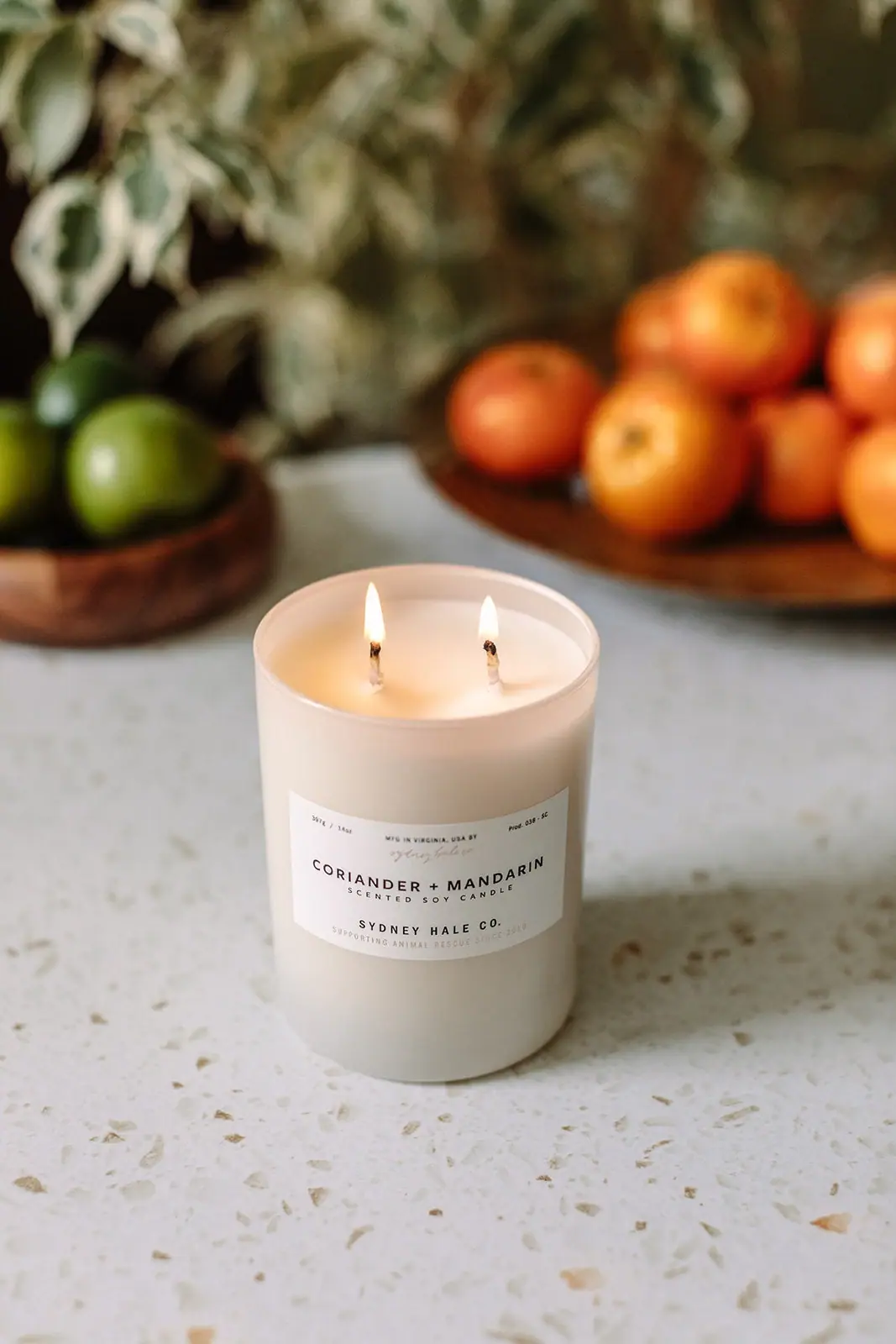
Coriander + Mandarin pairs a pale straight-sided tumbler with a low, wide white label whose strongest line is the scent name. Small production-style details and a faint script signature sit above it; a spaced product descriptor and producer line sit below. Two lit wicks are visible above the label, giving this restrained package a clear candle-use cue. The official source confirms a 14 oz tumbler, soy wax blend and double cotton wick. The citrus and greenery behind the candle communicate the fragrance through photography rather than printed botanical illustration.
- Candles & home scent
- Light pack
- Apothecary
- Heritage label
About this study
Selected official Coriander + Mandarin 14 oz candle photograph; wax/wicks and bottom-instruction location sourced, vessel substrate unverified.
Sources & evidence · Reviewed 2026-10-19Color Palette
Approximate colours interpreted from photography. These are screen references, not official brand colours or print specifications.
Pack body
Warm pale vessel
#DCD8C9
Softly opaque-looking tumbler exterior. The flame and warm environment influence this screen color; exact substrate and coating are unverified.
Label
Paper-like white
#F1EEE7
Wide rectangular front panel, slightly lighter than the vessel and clearly separated at its edges.
Ink
Charcoal text
#302B25
Scent, category, producer and small header details; most of the readable hierarchy uses this restrained dark tone.
Accent
Muted warm signature
#BEAB97
Faint script-like signature and small lower supporting line; exact ink color and process unknown.
Typography
Suggested visual alternatives, not confirmed brand typefaces. Any scale below is an illustrative estimate.
The scent name is the broad central headline. Scented Soy Candle sits immediately underneath with a smaller size and wider spacing. Sydney Hale Co. supplies a separate lower maker line. Tiny header details and the pale script introduce a workshop-like register without competing with the scent choice.
Fonts
Scent and maker capitals
Montserrat
- Looks like
- Open geometric sans-serif
- Type
- Geometric sans-serif
- Weight
- Medium 500 / SemiBold 600
- Case
- Uppercase
- Tracking
- Wide, particularly on the scent and maker lines; fit through line length rather than character distortion.
- Fallback
- Arial, sans-serif
An original paired scent name and separate producer line. Keep a clear plus sign between scent terms and test the full phrase as it curves toward the label edges.
Production details and category
Barlow
- Looks like
- Compact practical sans
- Type
- Grotesque sans-serif
- Weight
- Regular 400 / Medium 500
- Case
- Uppercase short labels; mixed-case quantities
- Tracking
- Open for the short category, neutral for tiny numerical details.
- Fallback
- Arial, sans-serif
Small amount, production identifier and functional descriptor. These details should remain informational rather than becoming imitation batch or provenance claims for a fictional product.
Independent maker flourish
Allura
- Looks like
- Light informal signature script
- Type
- Script
- Weight
- Regular 400
- Case
- Natural mixed case
- Tracking
- Unmodified script spacing.
- Fallback
- cursive
A new short maker flourish used at a subdued scale. Do not copy the photographed signature or imply a named person hand-signed every label.
Structure & Proportions
Visual proportions and finish previews are illustrative. Confirmed construction details and uncertainties are distinguished in the study notes.
Proportions
| Purpose | Value | Preview |
|---|---|---|
| Label footprint | A low wide rectangle occupies the middle-lower part of the vessel, leaving a noticeable pale band above and below. Its apparent curve comes from the cylinder. | — |
| Scent line width | The paired scent name nearly fills the useful label width, while category and maker lines are shorter or more loosely spaced. | — |
| Wick arrangement | Two distinct wicks sit across the visible wax surface. Their separation is observed, but no spacing dimension or burn-performance inference is made. | — |
Shapes
| Element | Value | Preview |
|---|---|---|
| Straight tumbler | Simple cylindrical body with a shallow visible circular rim and gently softened lower edge. | |
| Wide label | Rectangular panel curves around the body without a printed ornamental frame. | |
| Paired wick points | Two small vertical wick/flame positions across the open top, not a decorative double-logo motif. |
Finishes
Diffuse pale vessel
Tumbler exterior; finish process unknown · frosted
Paper-like information panel
Front label; stock unspecified · matte
Formats and materials
| Formats | Open straight-sided candle tumbler with a circular mouth and two visible lit wicks. The white front label is broader than it is tall., The official page identifies a 14 oz tumbler and describes a premium soy wax blend with two cotton wicks. It also lists an estimated burn time, which is not a geometric package specification. |
| Materials | Soy wax blend and cotton wick configuration are source-confirmed. The vessel’s exact glass or ceramic composition is not stated on the consulted product page and is not inferred from its pale appearance., The front panel looks like an applied paper label, but stock, adhesive, coating and printing method remain unverified. |
| Closures | The candle is shown open in use. No lid, dust cover, carton or transport seal is visible, and the source details consulted do not establish a specific closure for this photographed presentation. |
| Decoration | Scent-led typographic label with a tiny upper information band and a lower maker signature block., A pale script-like element adds a small change of texture above the scent headline., No coriander or mandarin illustration is printed on the visible front. |
Front Panel
Schematic reading order. The diagram’s zone heights do not represent measured artwork proportions.
Build a compact central hierarchy within a wide label: tiny production details above, a modest script accent, strong scent name, small category, then the maker and a faint supporting line. The scent choice receives priority over the producer without eliminating provenance-like details.
| Zone | Content |
|---|---|
| Tiny upper band | Amount and a small product-code-like mark flank a manufacturing-location line. Not all tiny characters are transcribed or treated as independently verified provenance. |
| Script accent | A faint signature-like flourish introduces a softer texture above the main name. |
| Scent headline | CORIANDER + MANDARIN in spaced dark capitals. |
| Category | SCENTED SOY CANDLE in smaller widely spaced capitals. |
| Maker footer | SYDNEY HALE CO. above a faint animal-rescue support statement. The visible statement is label content, not an independent audit of donations. |
Range System
The official product page links a matching room spray, establishing a cross-format fragrance relationship. Only this candle is visually analyzed; the linked spray’s structure and label are not assumed. A transferable system could keep scent naming stable while clearly changing the category and size fields for each format.
- Retain the paired scent name as the strongest variant identifier across a proposed candle family.
- Use the actual format descriptor when adapting to a room spray rather than preserving Scented Soy Candle wording.
- Keep the pale vessel and restrained typography as a selected-product principle, not proof that every Sydney Hale package uses the same material.
Back of Pack & Shelf
The base is hidden in the photograph. The official page explicitly says candle-use instructions are provided on the bottom, so that location is source-backed even though the label itself is not visible.
- Do not reconstruct the exact base instructions, symbols or layout from the front image.
- For an original candle, allocate a clear bottom information panel compatible with the actual vessel and supplier requirements.
- Verify component material before adding disposal or reuse guidance; pale appearance and soy-blend contents do not establish those claims.
On shelf
The wide scent line supports comparison between variants, while the separated maker line remains available to close reading. The pale tumbler can fit into many domestic settings without a large colored graphic, but its pale-on-pale label edge relies on controlled lighting. The two visible wicks communicate configuration through the product itself. This is an interpretation of the image rather than a measured claim about burn quality or retail recognition.
Imagery
The official image places the lit candle on a pale speckled worktop, with blurred citrus bowls and greenery behind it. The orange and green props refer to the fragrance setting while the white vessel remains the calm foreground focus. Shallow depth of field protects the scent label from competing detail. These props are not proof that whole citrus or herbs are present in the wax, and their colors should not become printed package swatches. Keep both wicks and the whole label visible in a reference crop.
Guidelines
Editorial principles for an original design brief, not official brand guidelines.
Do
- Give the paired scent name the clearest central label position.
- Distinguish source-confirmed wax and wick details from unverified vessel material.
- Keep the two-wick arrangement visible in an appropriate product-use photograph.
- Use small production-style details only when they correspond to real product information.
Don't
- Do not identify the pale tumbler as glass or ceramic without a component source.
- Do not copy the signature or invent a manufacturing location for an original concept.
- Do not treat citrus scenery as printed illustration or a literal ingredient inventory.
- Do not reconstruct hidden base safety instructions merely because their location is confirmed.
Sources & evidence
How this study was built
structure · Sourced fact
Official page identifies 14 oz tumbler, soy wax blend and double cotton wick.Sydney Hale Company — Coriander + Mandarinpalette · Visual observation
Pale vessel, white label, dark capitals and faint warm accent; fruit/background excluded.typography · Visual observation
Spaced scent/maker capitals contrast with a small pale script accent.label · Sourced fact
Official page says use instructions are on bottom; actual bottom layout remains unseen.Sydney Hale Company — Coriander + Mandarinimagery · Visual observation
Two lit wicks and blurred citrus/greenery frame the readable label.edition · Visual observation
Selected front includes scent, category, maker and small supporting statements.range · Sourced fact
Official page links a matching room spray, without establishing its construction.Sydney Hale Company — Coriander + Mandarin
What remains unverified
- Vessel substrate, finish process and label stock unknown.
- No lid, carton or base label visible.
- Original typefaces and exact tiny production code not verified.
- Palette and proportions approximate under warm domestic light.
Give your AI
packaging taste
Give your design or image tool a packaging study: palette, type, structure, front panel and principles for an original brief.
Export this styleFree with an email. PACK.md works in Claude, ChatGPT, Cursor and image tools.
More like this

Aesop
a botanical still life around a disciplined apothecary label
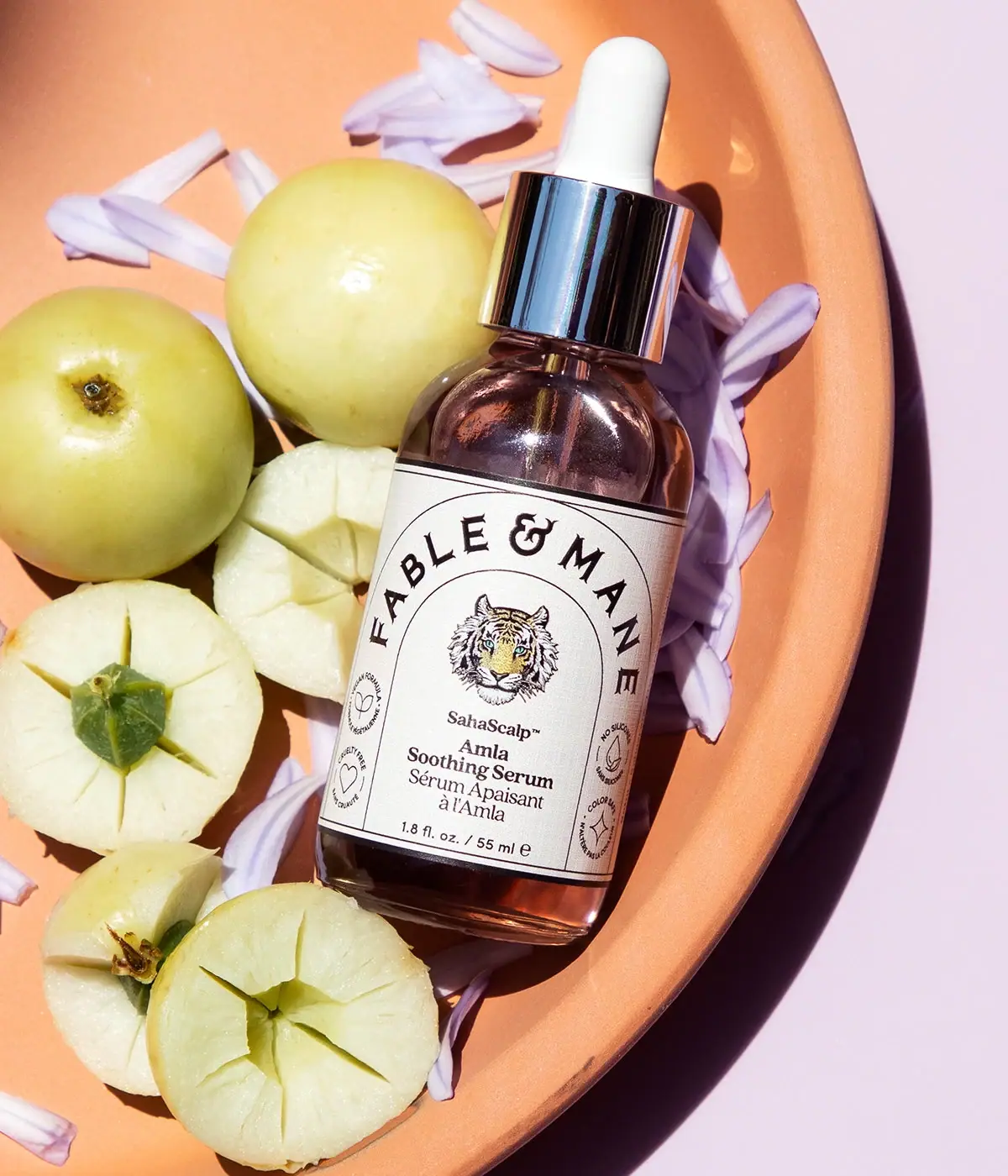
Fable & Mane
Arched serif maker, tiger portrait and amber dropper bottle
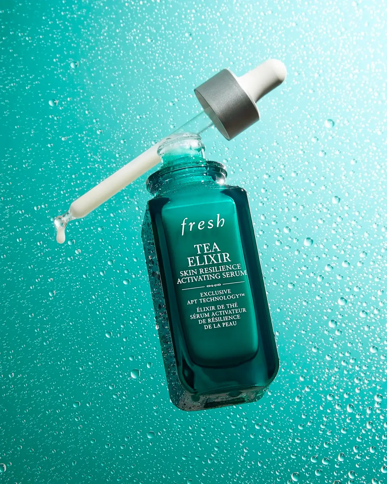
Fresh
Teal dropper bottle with white serif naming and silver collar
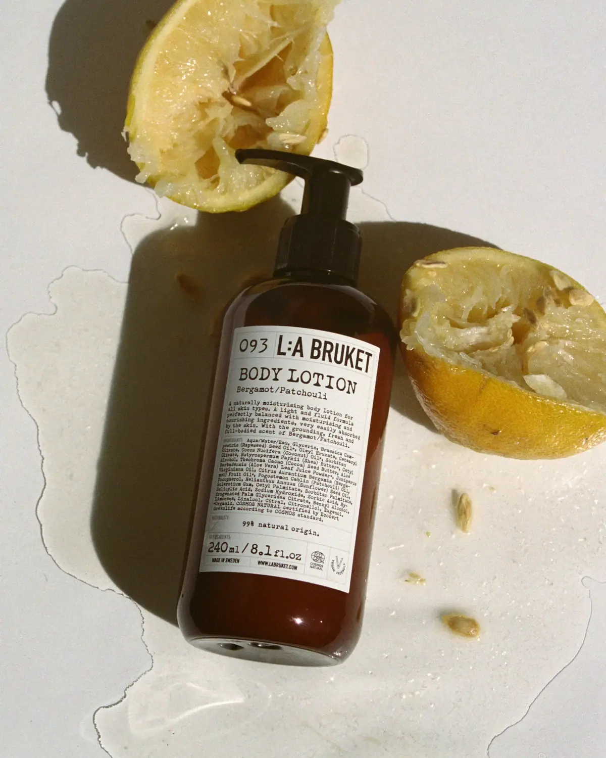
L:A Bruket
Amber pump bottle with a ruled typographic information label
Marie-Stella-Maris
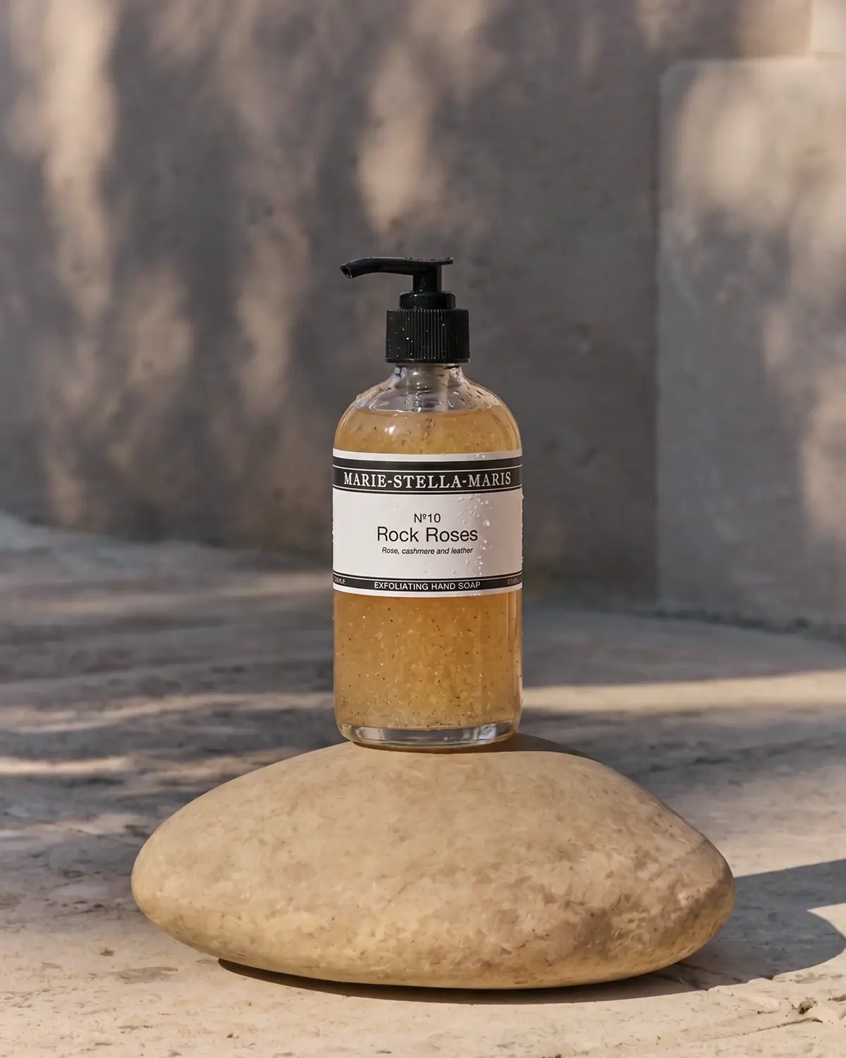
Black label bands frame numbered scent and amber texture
Rahua
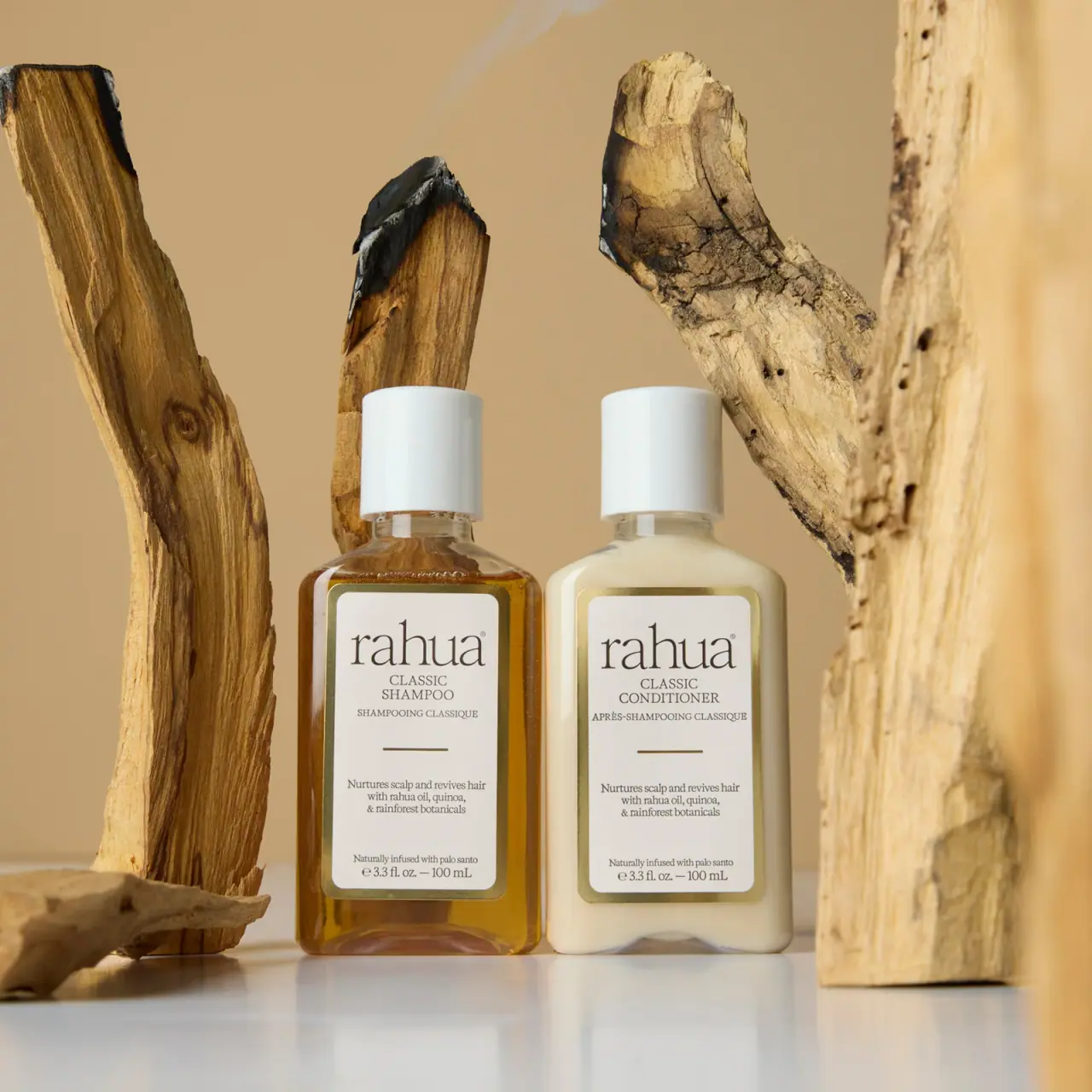
paired cream serif labels with gold borders and white caps

Aerangis
a quiet numbered object, an intimate scent memory

Alexander McQueen
An oval flacon crowned with dense black relief