Photography: Symbiome official photography. Images belong to their respective owners.
Symbiome

matcha green with serif naming and handwritten ingredient signature
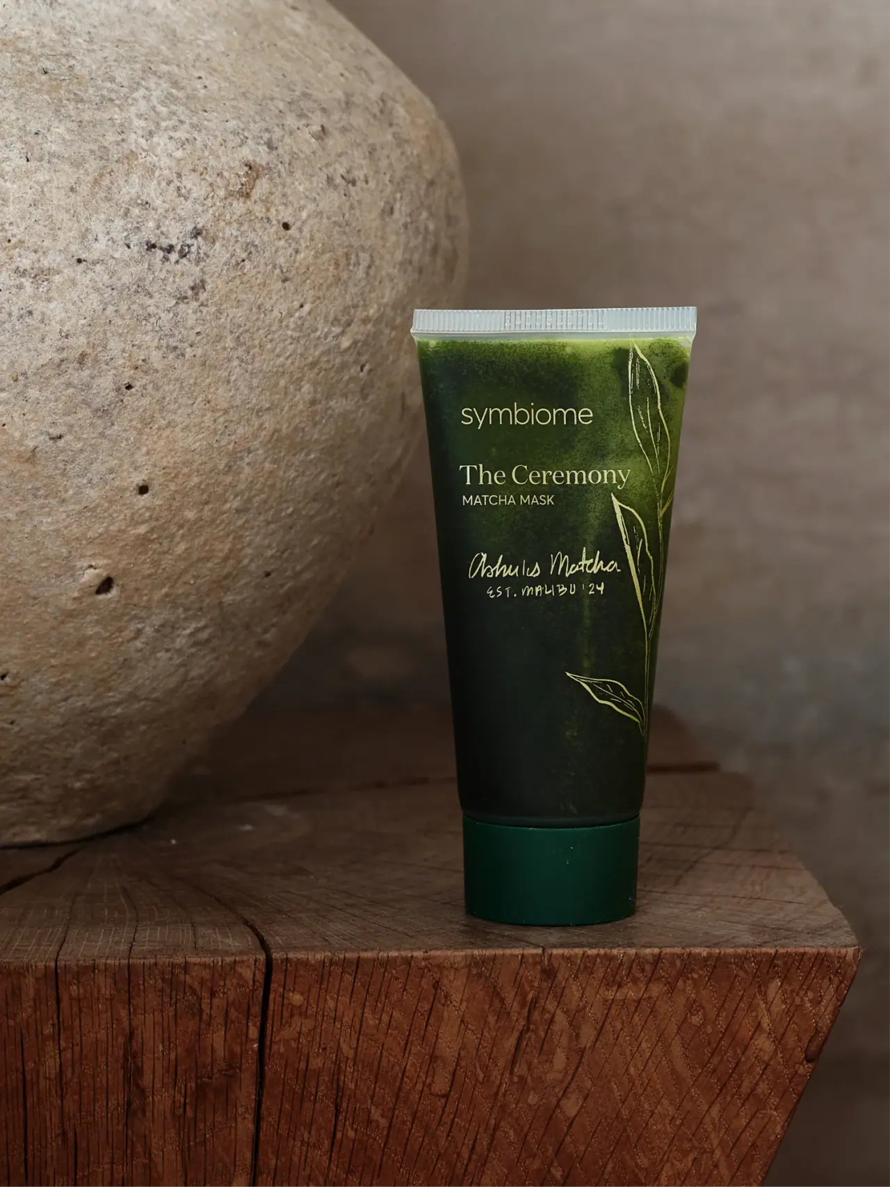
The Ceremony Matcha Mask is presented in a dark green tapered tube with a pale crimped top and a deep green bottom cap. Its front is asymmetric: the maker and product wording begin on a shared left edge, while fine botanical outlines travel down the right. A handwritten-looking Ashu’s Matcha signature creates a third typographic voice below the serif product name. The textured green field appears mottled rather than uniformly printed.
- Skincare
- Dark pack
- Botanical
About this study
Selected green The Ceremony Matcha Mask tube with Ashu’s Matcha signature. Current official capacity is contextual; photographed edition date and reverse are unverified.
Sources & evidence · Reviewed 2026-10-19Color Palette
Approximate colours interpreted from photography. These are screen references, not official brand colours or print specifications.
Pack body
Deep matcha appearance
#26351D
Approximate dark tube appearance. The photo alone cannot distinguish printed colour from visible contents or a combination of both.
Dark green cap
#073D2A
Approximate bottom closure colour, more even than the mottled tube above.
Ink
Pale botanical lettering
#D7D6A3
Approximate type and leaf-line appearance under warm lighting.
Accent
Pale top seam
#BED0C9
Approximate translucent-looking crimp appearance, not a verified material colour specification.
Typography
Suggested visual alternatives, not confirmed brand typefaces. Any scale below is an illustrative estimate.
A light lowercase symbiome maker sits near the upper left. The Ceremony follows in a larger mixed-case serif, with a smaller uppercase MATCHA MASK line immediately below. A separate handwritten-looking Ashu’s Matcha signature appears farther down, followed by a small hand-drawn-looking location/date line. This creates three distinct voices: restrained house identity, literary product naming and informal ingredient provenance. The product block is left-aligned, not centred within a narrow universal label grid.
Fonts
Product-name alternative
Libre Baskerville
- Looks like
- Libre Baskerville as an independent visual alternative
- Type
- Serif
- Weight
- Regular 400
- Case
- Title case
- Tracking
- Natural
- Fallback
- Arial, sans-serif
Use a calm serif for an evocative product name, with enough space above the functional descriptor to keep the two roles distinct. Avoid forcing a long title into a single line on a narrowing tube. This is not an attribution of the original lettering.
House and function alternative
Inter
- Looks like
- Inter as an independent visual alternative
- Type
- Sans serif
- Weight
- Light 300 / Regular 400
- Case
- Lowercase maker and uppercase descriptor
- Tracking
- Normal to slightly open
- Fallback
- Arial, sans-serif
Use one clear sans-serif voice for house identity and product type. Keep the function line readable even if the larger name is poetic. Position the group independently rather than duplicating the selected margins.
Handwritten accent alternative
Caveat
- Looks like
- Caveat as an independent visual alternative
- Type
- Handwritten
- Weight
- Regular 400
- Case
- Mixed case
- Tracking
- Natural handwriting rhythm
- Fallback
- Arial, sans-serif
An original short ingredient or collaboration note can introduce an informal voice. It must be newly written and supported by the product’s real provenance; do not imitate the Ashu’s signature or invent a founding date.
Structure & Proportions
Visual proportions and finish previews are illustrative. Confirmed construction details and uncertainties are distinguished in the study notes.
Proportions
| Purpose | Value | Preview |
|---|---|---|
| Upper information concentration | Maker, product name and handwritten note occupy the upper-to-middle body, leaving a quieter lower area. | — |
| Right-edge illustration | Long narrow leaves follow the tube’s right side without enclosing the text in a full border. | — |
| Tapered field | The tube is broader at the sealed top and narrows toward the supporting cap, changing available line length down the front. | — |
Shapes
| Element | Value | Preview |
|---|---|---|
| Tube | Flattened upper seal and tapered flexible-looking body. | |
| Cap | Broad short cylinder forming the standing base. | |
| Botanical linework | Slender pointed leaves on a narrow curving stem at the right edge. |
Finishes
Mottled green appearance
Tube body, especially near the upper edge; origin of the texture is unverified. · gloss
Even dark cap
Bottom closure with modest diffuse reflections. · matte
Formats and materials
| Formats | Selected flexible-looking tapered tube standing on a deep green bottom cap. Current official product listing is 60 mL / 2 oz; quantity is not readable on this selected front. |
| Materials | Tube laminate, barrier layers, cap polymer and decoration method are not identified by the reviewed product page., The mottled green appearance may involve visible product and lighting; it is not enough to establish a printed texture or a specific transparent substrate. |
| Closures | The tube narrows into a broad flat-bottomed cap that supports it upright. The closure is darker and more evenly coloured than the body. Its seam is visible, but the photograph does not clearly show a hinge, nozzle, thread or underside. It therefore supports a bottom-cap description without establishing flip-top versus screw action. At the opposite end, a pale flattened seal carries close vertical ribs, making the filled tube construction visible. The small embossed-looking characters there are not reliably transcribed. |
| Decoration | Asymmetric text groups concentrated left of a tall botanical branch., Serif product name paired with simple sans-serif function., Handwritten-looking ingredient signature below the main title. |
Front Panel
Schematic reading order. The diagram’s zone heights do not represent measured artwork proportions.
The maker and the product block share a left starting position, while the lower handwritten note has a looser rhythm. The leaves occupy the right margin and continue into the lower open area, balancing the text without forming a symmetrical frame. The pale linework remains fine enough for the dark green field to dominate. No separate rectangular paper label edge is visible. The smaller line beneath Ashu’s Matcha includes a Malibu and date-like reference, but it should not be converted into a manufacturing location or production date for the finished cosmetic.
| Zone | Content |
|---|---|
| House | Light lowercase symbiome near the upper left. |
| Product | Serif The Ceremony above uppercase MATCHA MASK. |
| Ingredient signature | Handwritten-looking Ashu’s Matcha and a smaller location/date-like line. |
| Botanical margin | Fine pale stem and pointed leaves travelling down the right. |
Range System
The official page identifies the product at 60 mL and names Ashu’s organic matcha in its ingredient information. This supports the ingredient relationship visible on the selected tube, but does not identify the artist who drew the leaves or establish a full collaboration packaging system. Other Symbiome products are not reviewed here. The current size listing is contextual rather than a reading of a visible front capacity mark, and the exact photographed edition date is not established.
- Selected green Ceremony tube with Ashu’s Matcha signature and pale botanical drawing.
- Official current 60 mL listing; no second size or alternative artwork is visually analysed.
Back of Pack & Shelf
The reverse and cap opening are unseen. Ingredients and application directions available online cannot be mapped to a rear panel without another approved view. The decorative signature does not replace legal manufacturer information or establish where the tube was filled.
- Inspect cap opening to confirm its mechanism.
- Verify laminate and printing details with component documentation.
- Review reverse artwork before locating quantity, ingredients or batch information.
On shelf
Interpretation: the dark green field and pale product name communicate a botanical direction before the smaller signature is read. The right-side leaves give the front a distinctive edge, but fine lines may lose definition at thumbnail scale. The maker’s lighter stroke weight can recede against the mottled ground. An original design should test the text over the darkest and lightest body areas and preserve enough contrast for the practical MATCHA MASK descriptor.
Imagery
The tube stands on a rough wooden block beside a large pale rounded stone. Warm subdued light brings out the grain of the wood and irregular stone surface while leaving the green pack comparatively dark. These textures complement the botanical linework but remain outside the package. The brighter granular-looking green near the top may be influenced by the formula and illumination; the photograph does not establish a deliberately printed speckle pattern. Neither the stone nor the wood proves an ingredient or a sustainability attribute.
Guidelines
Editorial principles for an original design brief, not official brand guidelines.
Do
- Keep product function clear beside an evocative name.
- Give a real ingredient partner a distinct but subordinate voice.
- Separate visible texture from verified decoration process.
- Test fine linework against uneven dark grounds.
Don't
- Do not describe the front as a centred label stack.
- Do not infer tube laminate from translucency.
- Do not treat the signature date as the cosmetic’s manufacturing date.
- Do not reproduce the Ashu’s signature or leaf artwork.
Sources & evidence
How this study was built
context · Sourced fact
Official page lists 60 mL and names Ashu’s organic matcha in ingredient information.Symbiome — The Ceremony Matcha Masktypography · Visual observation
Left-aligned maker and serif product block are followed by a handwritten-looking signature.Symbiome — The Ceremony Matcha Masklabel · Visual observation
Fine botanical outlines occupy the right edge rather than a symmetrical border.Symbiome — The Ceremony Matcha Maskstructure · Visual observation
Pale ribbed top seal and deep green bottom cap frame the tapered body.Symbiome — The Ceremony Matcha Maskpalette · Visual observation
Mottled green is observed appearance, not a verified printed texture.Symbiome — The Ceremony Matcha Maskshelf · Editorial interpretation
Fine pale lines and light maker text require contrast checks over the uneven ground.
What remains unverified
- Tube laminate, cap mechanism, decoration process and source of mottled appearance unknown.
- Original fonts, illustration authorship and physical dimensions unverified.
- Capacity not visible on selected front; reverse and open closure unseen.
Give your AI
packaging taste
Give your design or image tool a packaging study: palette, type, structure, front panel and principles for an original brief.
Export this styleFree with an email. PACK.md works in Claude, ChatGPT, Cursor and image tools.
More like this

Benamôr
Ornamental lilac medallion suspended above golden botanical oil

Bomba Curls
tropical foliage gathered around a bold yellow nameplate
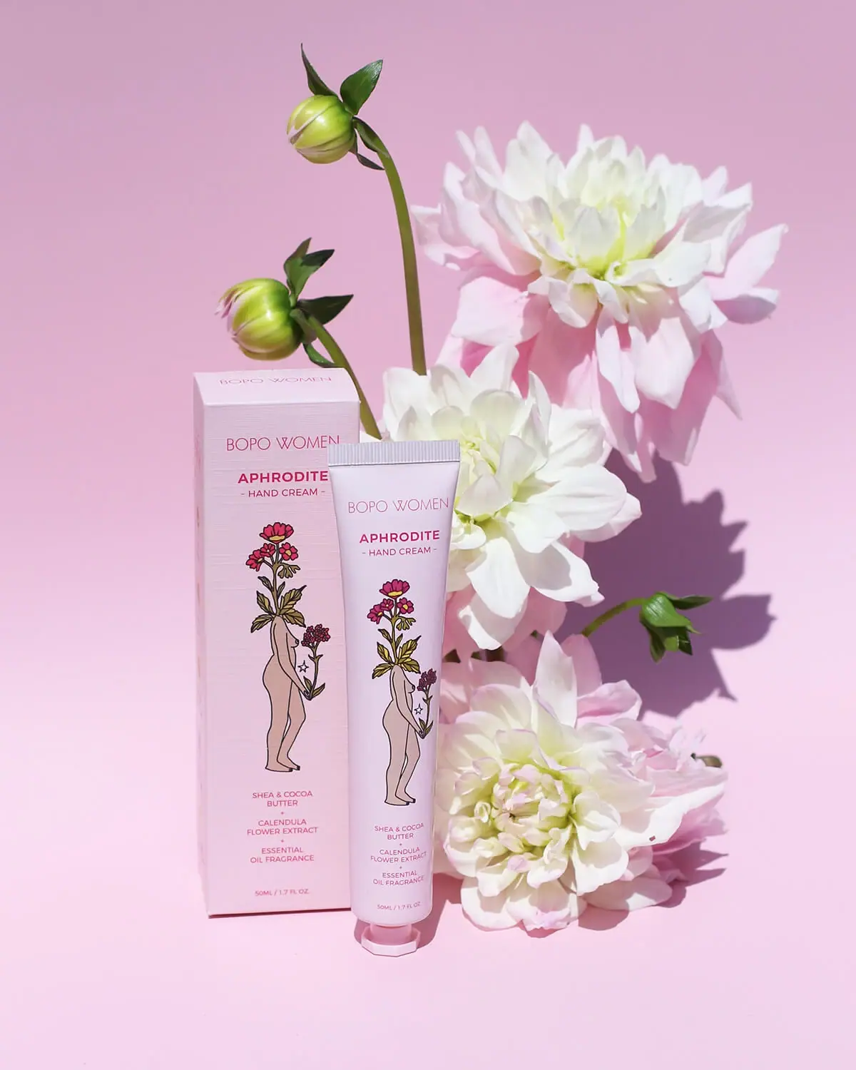
Bopo Women
a botanical figure on a coordinated blush-pink pair
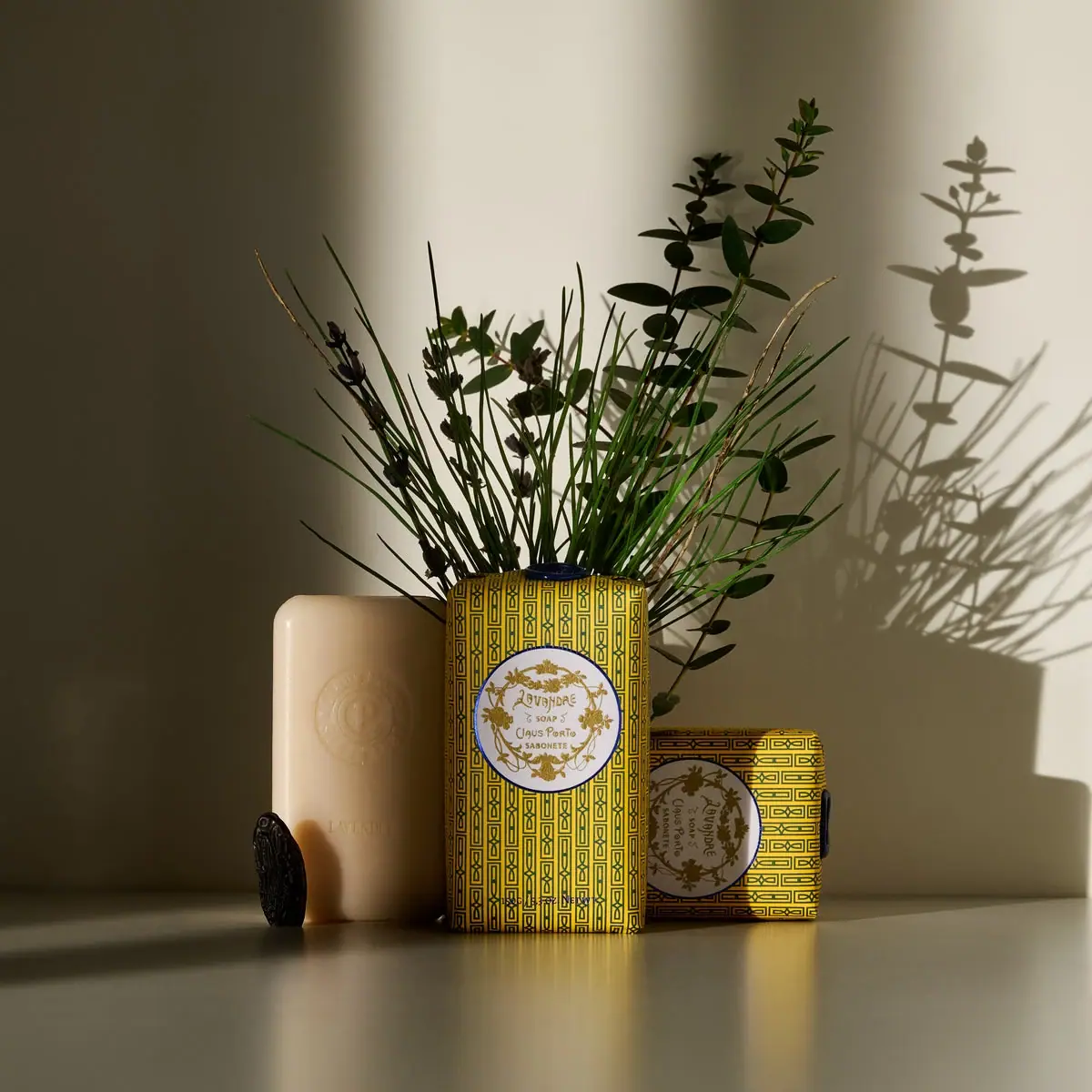
Claus Porto
Golden geometric wrapping around a pale floral medallion
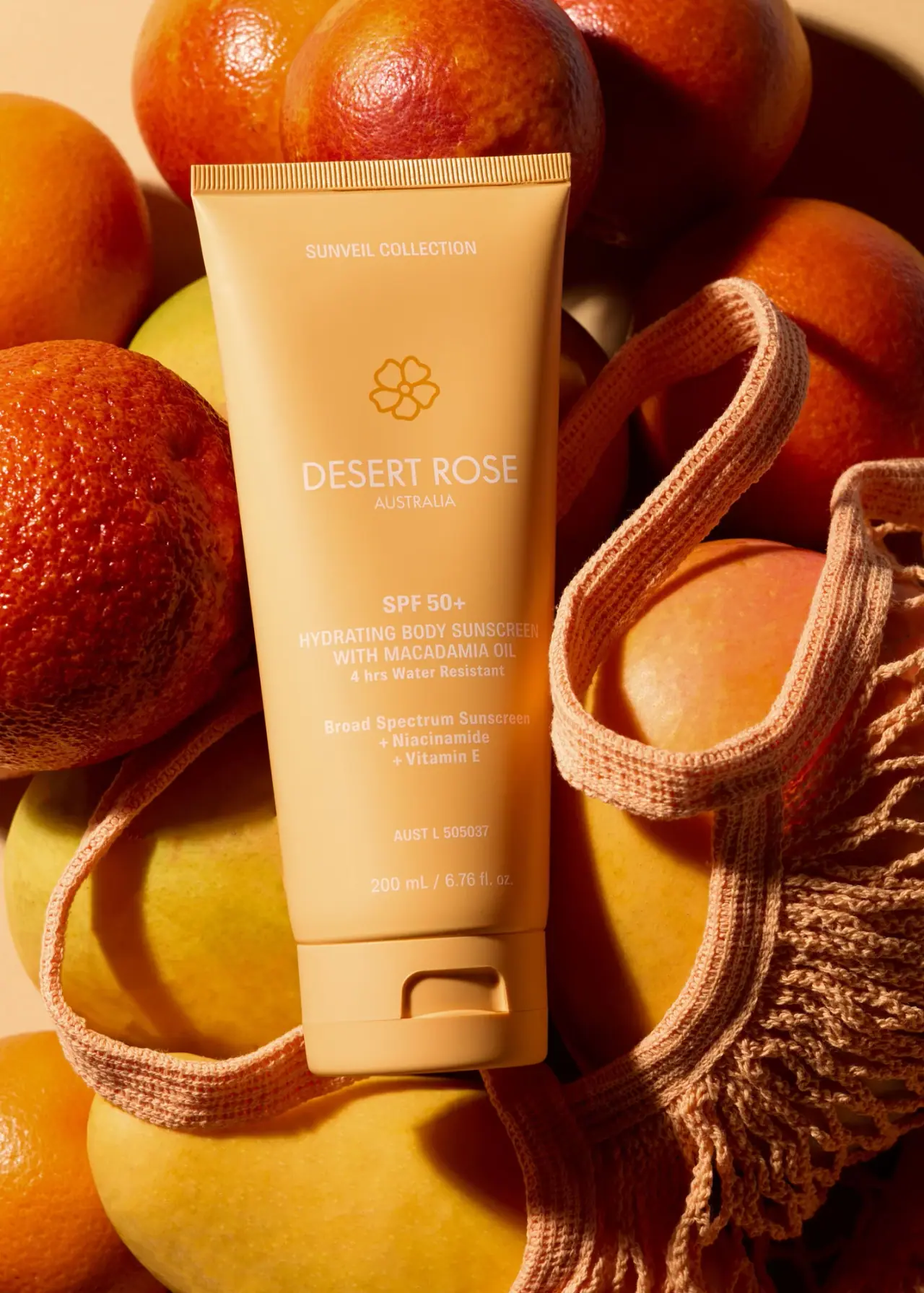
Desert Rose Australia
Apricot sunscreen tube with white type and ochre flower
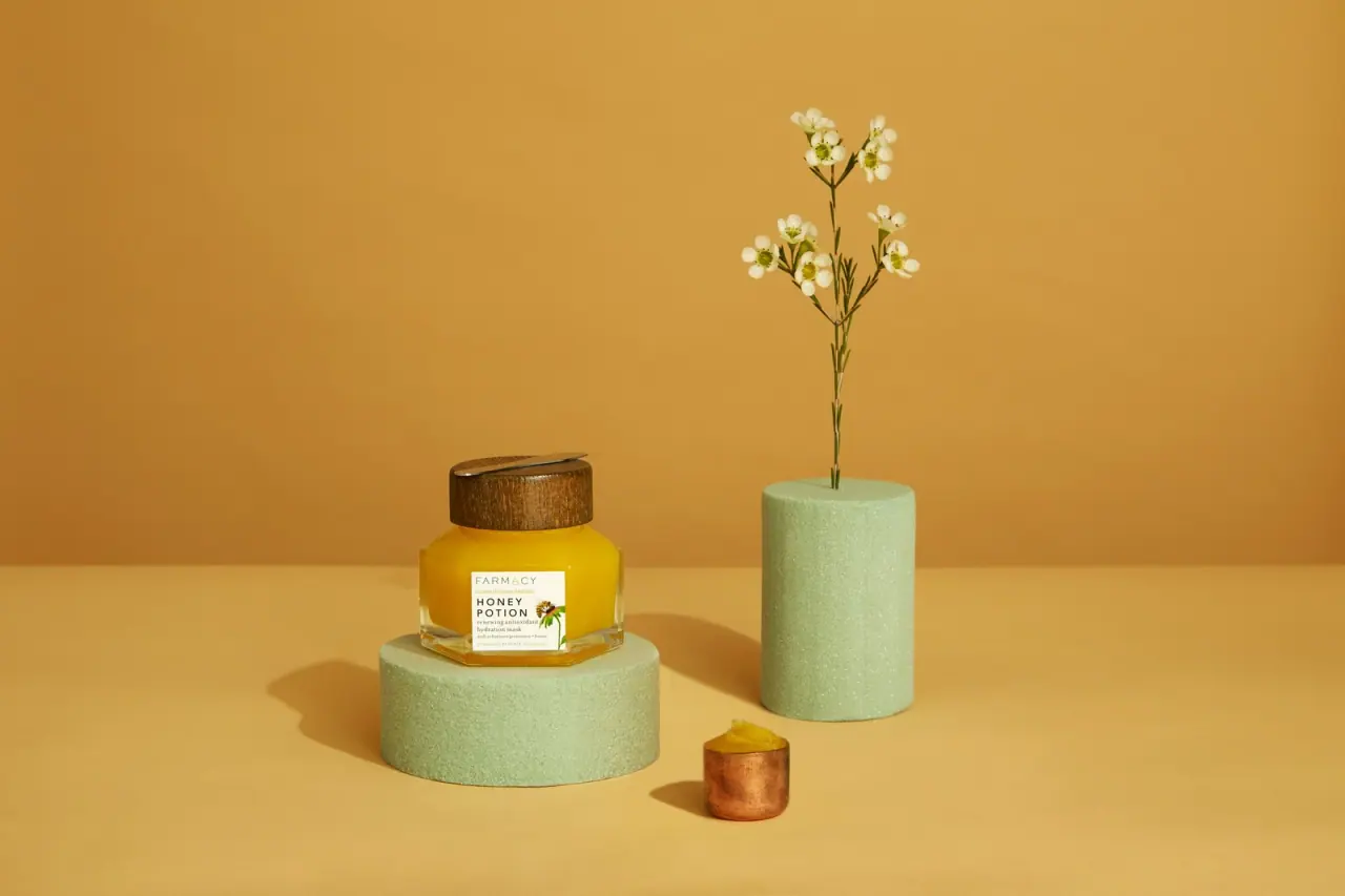
Farmacy
Golden contents in a faceted jar beneath a wood-toned lid
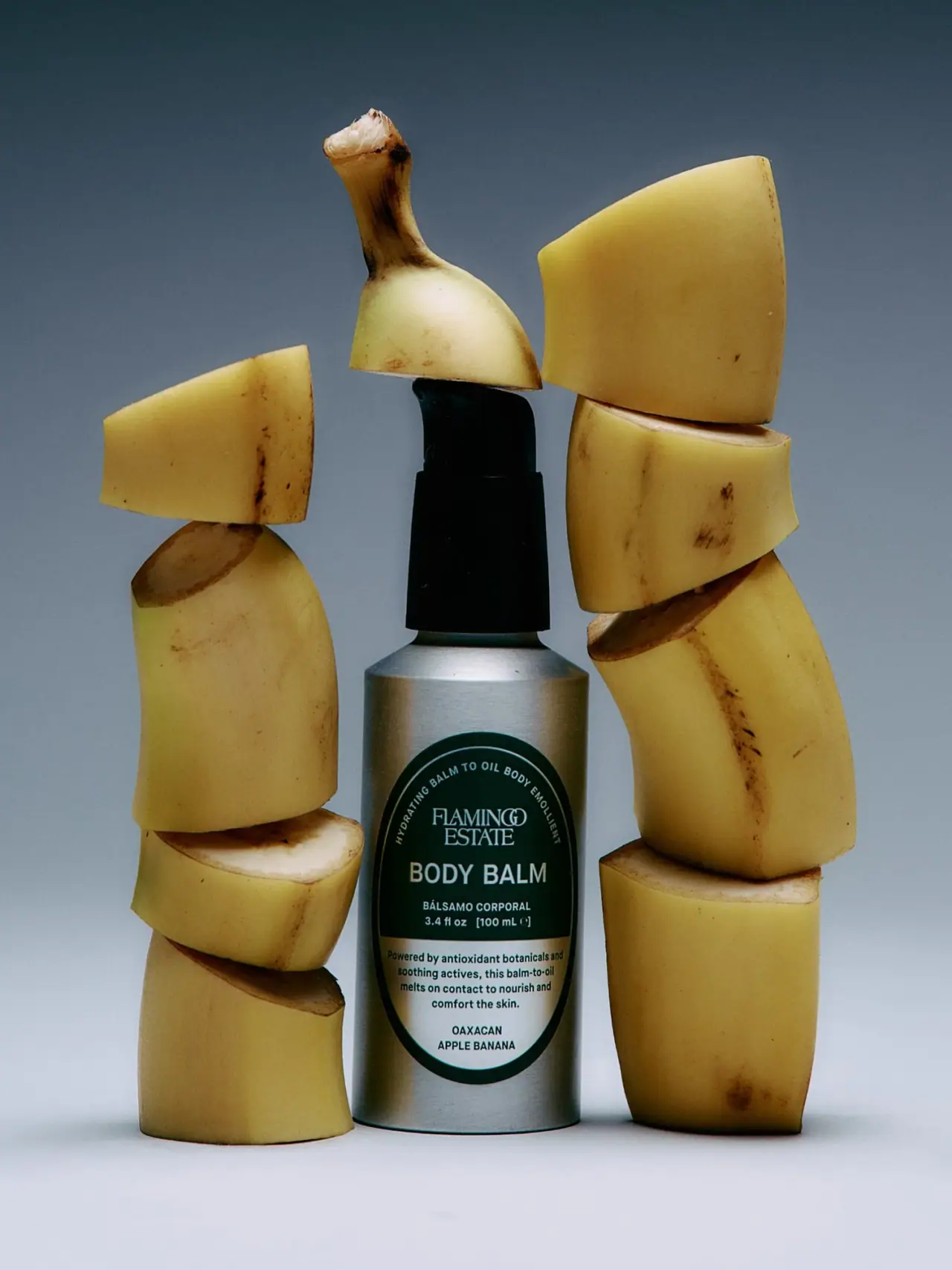
Flamingo Estate
A green oval turns silver utility into botanical character
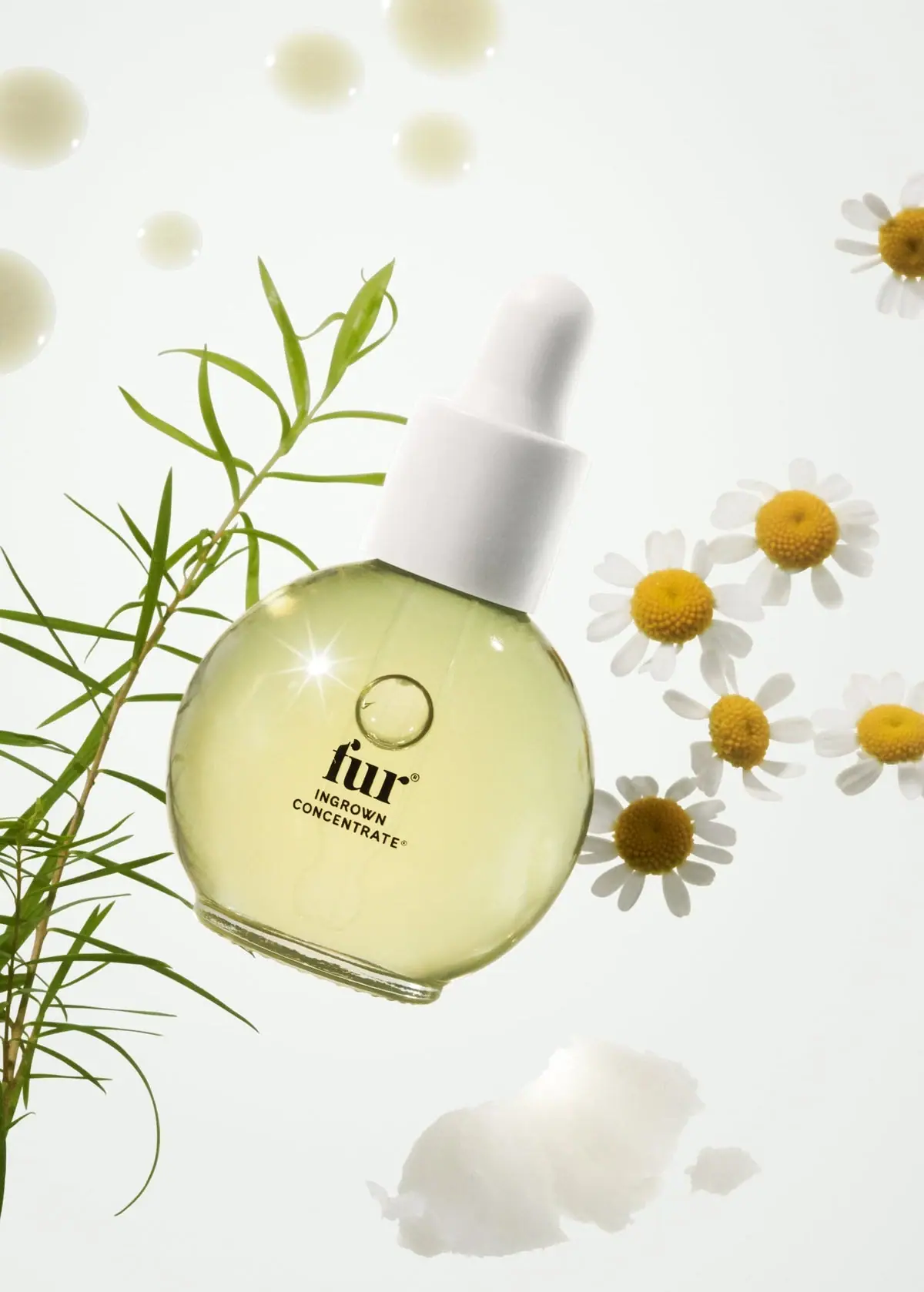
Fur
Pale oil and compact black type in a rounded dropper