Photography: Three Spirit official photography. Images belong to their respective owners.
Three Spirit

a warm amber silhouette anchored by one gold triangle
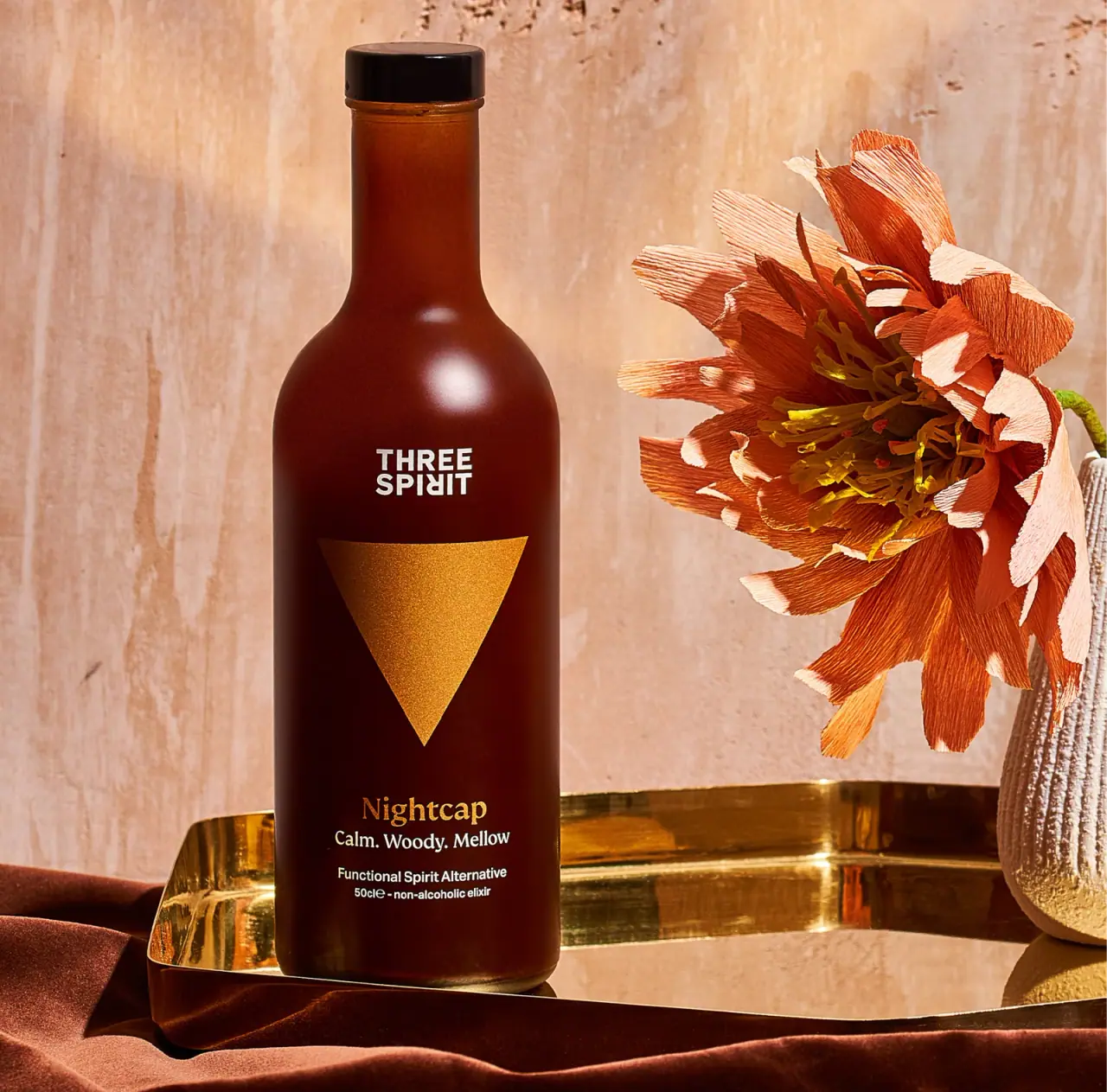
Nightcap uses one oversized downward triangle to organise a tall, otherwise restrained bottle. The amber-brown appearance supports a compact white wordmark above the symbol and a gold-coloured serif name below. Small white descriptors finish the front without competing with the geometric centre. The silhouette suggests a considered bar object, while the typography separates brand, variant and category. This study follows the selected 50 cl artwork and its photographed appearance; the current US listing is contextual evidence, not proof that every market edition or component is identical.
- Beer & aperitifs
- Light pack
- Luxe monochrome
- Bold typographic
About this study
Selected Nightcap front marked 50 cl in official warm-toned photography. Current US 16.9 fl oz product information is regional context and does not verify identical artwork or construction.
Sources & evidence · Reviewed 2026-10-19Color Palette
Approximate colours interpreted from photography. These are screen references, not official brand colours or print specifications.
Pack body
Deep amber brown
#532210
Approximate lower-body tone from the selected image. Light, liquid and vessel surface all affect its appearance; material and colour treatment are unverified.
Near-black closure
#1A1110
Approximate closed cap colour. Its gloss and dark tone do not identify material or attachment.
Ink
Warm white lettering
#ECE9D9
Approximate stacked brand and practical descriptors against the dark body.
Accent
Warm gold symbol
#CE8F30
Approximate triangle and product-name colour. The visible reflective-looking texture does not establish foil, metallic ink or a specific application process.
Typography
Suggested visual alternatives, not confirmed brand typefaces. Any scale below is an illustrative estimate.
The stacked THREE SPIRIT wordmark is compact, bold and white near the upper body. The oversized triangle then creates a long visual pause before Nightcap appears in a warmer serif voice. A short descriptive trio follows, then smaller category and volume information. This hierarchy is unusually dependent on a symbol: the strongest area is not a word, and the text has to stay disciplined to avoid diluting that centre.
Fonts
Brand and utility alternative
Archivo
- Looks like
- Archivo for compact confident sans-serif information
- Type
- Grotesque sans serif
- Weight
- Bold for identity, Regular for details
- Case
- Uppercase identity and sentence-case descriptors
- Tracking
- Normal with optical adjustment for a short stacked name
- Fallback
- Arial, sans-serif
Develop an original compact name above a strong symbol. Do not copy the distinctive Three Spirit letter treatment; retain readability in smaller category and volume lines.
Variant alternative
Fraunces
- Looks like
- Fraunces for a warm characterful serif name
- Type
- Soft display serif
- Weight
- Medium
- Case
- Title case
- Tracking
- Normal
- Fallback
- Georgia, serif
Give an original variant name a more expressive voice than the utility text. Match its size to the space below the symbol rather than turning it into a second oversized hero.
Structure & Proportions
Visual proportions and finish previews are illustrative. Confirmed construction details and uncertainties are distinguished in the study notes.
Proportions
| Purpose | Value | Preview |
|---|---|---|
| Symbol dominance | The downward triangle occupies a large central portion of the body. Its broad upper edge and low point create a clear vertical direction toward the variant name. | — |
| Neck and shoulder | A long narrow neck flows into rounded shoulders, leaving the principal graphics on the broad lower body. No physical dimensions have been measured. | — |
| Text spacing | Clear gaps separate wordmark, triangle, variant and small information. This prevents the large symbol from becoming one element in a crowded stack. | — |
| Closure restraint | The short cap completes the tall outline without adding a second large geometric feature. | — |
Shapes
| Element | Value | Preview |
|---|---|---|
| Bottle | Tall round-sided body with rounded shoulders and an elongated neck. | |
| Central symbol | Large downward-pointing triangle; exact production geometry unmeasured. | |
| Closure | Short cylindrical dark cap over the neck; fastening mechanism unseen. |
Finishes
Soft body reflection
Amber-brown shoulder and body; no etched or frosted treatment is confirmed. · matte
Gold-coloured reflective appearance
Central triangle and variant name; foil or metallic ink is not established. · metallic
Glossy cap appearance
Closed dark top; material specification unknown. · gloss
Formats and materials
| Formats | Selected tall bottle with rounded shoulders, long neck and front marked 50 cl. The current US listing uses 16.9 fl oz. |
| Materials | Bottle and closure materials are unconfirmed in the consulted product page. Amber appearance alone does not establish coloured glass or a coating specification. |
| Closures | A short dark cylindrical closure sits at the top of the long neck. The image is closed, so threading, stopper insert, tamper feature and sealing method are not established. The cap is visually modest relative to the neck and large front symbol. |
| Decoration | Stacked white masterbrand above a large downward triangle., Warm serif product name below, followed by short white descriptors., No contrasting rectangular label boundary is clearly visible on the inspected front. |
Front Panel
Schematic reading order. The diagram’s zone heights do not represent measured artwork proportions.
The front is a centred vertical composition on a dark continuous-looking field. A small masterbrand gives way to an enormous symbol; lower text resumes only after a substantial gap. White and gold-coloured details divide roles without requiring several labels or badges. The selected wording is preserved as photographed rather than updated from current marketing text.
| Zone | Content |
|---|---|
| Upper identity | Stacked white THREE SPIRIT lettering sits above the triangle and remains compact relative to the symbol. |
| Central mark | A gold-coloured downward triangle anchors the face. Its visual meaning is not assigned a verified symbolic interpretation in this study. |
| Variant name | Nightcap in a serif style appears below the symbol, sharing its warm accent colour. |
| Short descriptors | The selected front reads Calm. Woody. Mellow. These words are observed label language, not an independent claim about physiological effects. |
| Category and volume | Smaller white lines identify a functional spirit alternative and a 50 cl non-alcoholic elixir near the base. No unseen regulatory information is reconstructed. |
Range System
The current official site places Nightcap beside Livener and Social. These named products support a multi-variant collection, but their artwork was not inspected for this study. A symbol-led range with clear names is a useful design interpretation; the exact shape or colour rules across Three Spirit are not asserted.
- Nightcap: selected downward gold-coloured triangle and amber-brown appearance.
- Livener and Social: official sibling product names, without claiming their current symbol geometry here.
- Interpretation: an original range can pair a simple distinctive device with a readable name so recognition does not depend on colour alone.
Back of Pack & Shelf
The reverse, base and opened closure are not shown. Ingredients, nutrition, serving instructions and batch information may be elsewhere, but their physical placement is unverified. Current webpage information is not a substitute for a complete bottle-wrap view.
- Inspect the reverse before allocating ingredients or nutrition information in a technical reference.
- For an original drink, identify its non-alcoholic category clearly and verify any functional wording independently.
- Do not assume refillability, cap construction or recyclability from this closed front photograph.
On shelf
Interpretation: a large simple symbol should remain identifiable at smaller image sizes than the fine descriptors below it. The dark body and pale wordmark support contrast, while the gold-coloured element offers warmth without several accent colours. Reflection could alter the triangle’s visibility under different lighting, so a new design should be tested on real shelves and in diffuse product photography. No recognition or consumer-use study was consulted.
Imagery
The bottle stands on a warm reflective tray beside a large sculptural orange flower and textured vase. Amber fabric and a pale warm wall complete a restrained tonal setting. The tray echoes the gold-coloured mark, while the flower adds tactile complexity outside the bottle’s simple graphic face. These objects are styling props, not confirmed included accessories. The scene can suggest an evening serving occasion visually, but neither the palette nor the name establishes a calming or sleep-related effect.
Guidelines
Editorial principles for an original design brief, not official brand guidelines.
Do
- Give one geometric device enough space to become a recognisable anchor.
- Use typography to distinguish masterbrand, variant and category.
- Keep photographed market wording separate from current regional listing text.
- Treat occasion cues as design interpretation rather than physiological evidence.
Don't
- Do not call gold-coloured decoration foil without a production source.
- Do not infer bottle material or cap fastening from familiar appearance.
- Do not reproduce Three Spirit lettering or the exact triangle composition.
- Do not add unsupported relaxation or sleep claims to a fictional design.
Sources & evidence
How this study was built
edition · Sourced fact
Official US page identifies Nightcap and 16.9 fl oz; selected front has 50 cl wording.Three Spirit US — Nightcap, official product and photographystructure · Visual observation
Long neck, rounded shoulder and closed dark cap are visible without revealing material or fastening.Three Spirit US — Nightcap, official product and photographytypography · Visual observation
Compact bold identity, warm serif variant and small practical text have distinct roles.Three Spirit US — Nightcap, official product and photographylabel · Visual observation
Large downward triangle anchors the front above the selected sensory and category lines.Three Spirit US — Nightcap, official product and photographypalette · Visual observation
Amber brown, gold-coloured mark, white lettering and dark cap are approximate pack readings.Three Spirit US — Nightcap, official product and photographyrange · Sourced fact
The official site lists Livener and Social beside Nightcap; their artwork is not generalised here.Three Spirit US — Nightcap, official product and photographyimagery · Editorial interpretation
Warm props suggest an evening occasion without establishing a functional effect or accessory inclusion.
What remains unverified
- Bottle material, cap mechanism, gold decoration process and surface coating are unverified.
- Original fonts, exact colours and physical proportions are not established.
- Reverse, base and opened closure are unseen.
- Observed calm-related label wording is not independently evaluated as a health or physiological claim.
Give your AI
packaging taste
Give your design or image tool a packaging study: palette, type, structure, front panel and principles for an original brief.
Export this styleFree with an email. PACK.md works in Claude, ChatGPT, Cursor and image tools.
More like this

Akro
soft pink interrupted by an assertive black signature
Blake Brown
sculptural rose-brown fragrance with a jewel-like centre

Color Wow
Tall condensed naming on a broad reflective silver jar
DIZZIAK
Oversized black lettering unites two pale haircare tubes

EADEM
Mirror-bright tube, oversized black identity, juicy campaign color
Hugo Boss
Blue transparent bottle with dimensional lettering and silver spray hardware
MAKE UP FOR EVER
Long tapered black cap above a compact colour chamber
MUTHA
Reflective violet tube with bold maker and spacious middle