About this packaging
Blake Brown’s Blackcurrant Vanille mist uses fragrance naming and a sculptural brand device to distinguish the hair-and-body format.
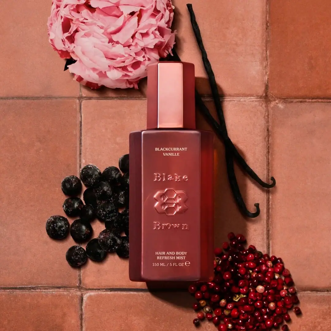
Blake Brown’s official listing identifies Blackcurrant Vanille Hair & Body Mist. The selected front labels the product as a 150 ml hair and body refresh mist; the page supports product identity, while the cover supplies the visible size and packaging details.[1]
Pack construction & use
- Product identity and size
- Blake Brown’s official page identifies Blackcurrant Vanille Hair & Body Mist.[1]
- Bottle and label
- A tall faceted cap echoes the beveled rectangular bottle below it. The copper-pink appearance surrounds raised brand lettering and a central floral emblem. Small pale uppercase lettering separates the scent name at the top from the product type at the bottom.Observed in the reference photograph
What makes the design work
Editorial analysis of this packaging reference.
Embossed-looking brand mark
Raised lettering and emblem give the center of the bottle dimensional emphasis; the cap and body use related rectangular geometry.
Scent-first hierarchy
Blackcurrant Vanille appears high on the front, above the central brand device and the smaller Hair and Body Refresh Mist descriptor.
Bottle as color block
The rose body and matching cap create one continuous color field. Fine pale type creates contrast without competing with the raised emblem.
Ideas for your next brief
- Place the fragrance or variant name above the brand device when the scent is the principal differentiator.
- Repeat a distinctive silhouette in the cap and bottle to make a coherent set of components.
Sources & further reading
Researched 19 October 2026