Photography: Blake Brown — official product photography. Images belong to their respective owners.
Blake Brown

sculptural rose-brown fragrance with a jewel-like centre
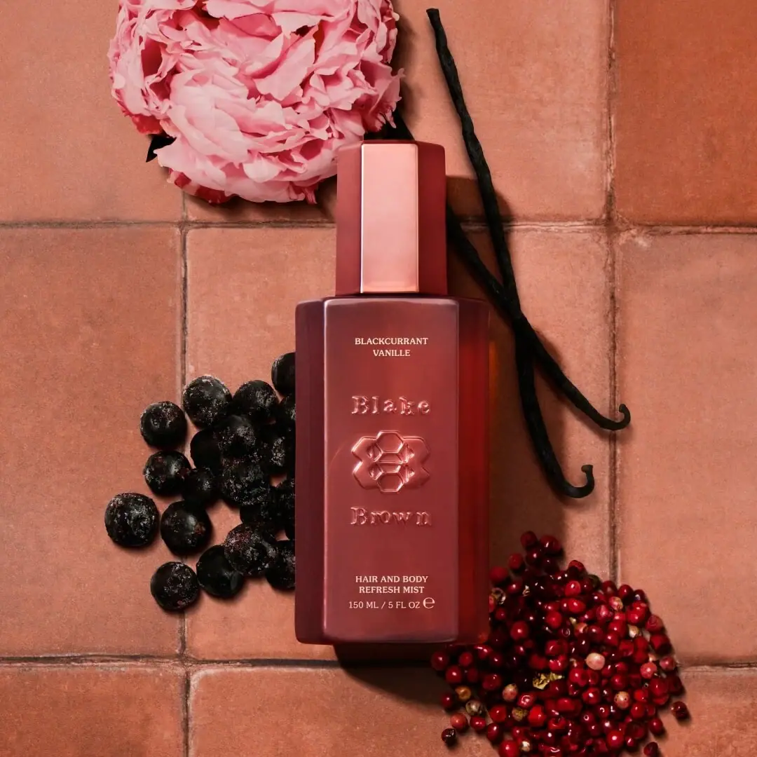
Blackcurrant Vanille Hair & Body Mist combines a strict rectangular silhouette with a dimensional central identity. The cap is tall and faceted, the bottle front broad, and the visible finish shifts between deep rose brown and copper-pink highlights. Small pale lettering identifies the scent above the raised-looking Blake Brown device, then names the product below. The hierarchy gives the package two speeds: the sculptural name and emblem catch the eye, while precise flat lettering provides practical information. This study concerns the photographed 150 mL mist, not the brand’s differently shaped haircare packs.
- Perfume
- Light pack
- Luxe monochrome
- Bold typographic
About this study
Blackcurrant Vanille Hair & Body Mist in the selected official 150 mL front photograph. Other listed mists provide naming context only; haircare formats are outside scope.
Sources & evidence · Reviewed 2026-10-19Color Palette
Approximate colours interpreted from photography. These are screen references, not official brand colours or print specifications.
Pack body
Rose-brown body
#8A3E37
Approximate front-face midtone, excluding the dark edge shadow. It is a visual reading, not a specified resin, coating or liquid colour.
Ink
Pale warm lettering
#E5D9C5
Approximate printed scent name and lower descriptor. Its contrast distinguishes functional information from the tonal centre relief.
Accent
Copper-pink highlight
#D88D79
Approximate highlight on the cap and dimensional identity. Changing light creates this lighter tone; no metallic substrate or coating is verified.
Typography
Suggested visual alternatives, not confirmed brand typefaces. Any scale below is an illustrative estimate.
The first small line names BLACKCURRANT VANILLE in two centred lines near the shoulder. The middle is reserved for Blake above an emblem and Brown below. Those letters appear dimensional and share the body colour, so highlights rather than a separate ink colour define their edges. The lower face carries HAIR AND BODY REFRESH MIST and the size. This deliberately separates scent, identity and product function instead of compressing them into a single wordmark block.
Fonts
Sculptural identity alternative
Bodoni Moda
- Looks like
- Bodoni Moda as a high-contrast serif exploration
- Type
- High-contrast display serif
- Weight
- Medium or Semibold
- Case
- Title case
- Tracking
- Optical spacing for an original name
- Fallback
- Didot, Georgia, serif
Explore a new serif identity whose strong contrast can work in relief. Supplier advice is needed before translating fine strokes into tooling; do not trace Blake Brown letterforms or split the name in its exact arrangement.
Practical information alternative
Libre Baskerville
- Looks like
- Libre Baskerville for restrained small serif text
- Type
- Text serif
- Weight
- Regular and Bold
- Case
- Uppercase for short scent and format labels
- Tracking
- Slightly open without breaking short words
- Fallback
- Georgia, serif
Set scent and product function as crisp flat information, distinct from the sculptural centre. Use actual-size print proofs to choose a readable weight rather than matching the tiny photographic type literally.
Structure & Proportions
Visual proportions and finish previews are illustrative. Confirmed construction details and uncertainties are distinguished in the study notes.
Proportions
| Purpose | Value | Preview |
|---|---|---|
| Cap and body relationship | The cap is notably tall and narrower than the body, making a distinct upper tier. It is not a short anonymous closure; its height is part of the visual identity. | — |
| Central face | A broad flat-looking front is framed by darker angled side planes. This gives the identity a defined stage without a printed border. | — |
| Information spacing | Small scent text and lower practical text bracket a much taller central identity area. The relationship is qualitative; no dimensional measurements were taken. | — |
| Depth cue | Beveled edges and the relief-like marks catch light at different angles, allowing a nearly single-colour object to contain multiple visual layers. | — |
Shapes
| Element | Value | Preview |
|---|---|---|
| Bottle | Upright rectangular body with softened corners and beveled side planes. | |
| Cap | Tall narrow rectangular block with faceted vertical edges. | |
| Central identity | Interlocking geometric emblem between two name lines; described as a visible form without assigning a symbolic meaning. |
Finishes
Reflective rose appearance
Cap, body and relief-like identity; metal content and coating process are unverified. · gloss
Dimensional-looking identity
Central letters and emblem appear raised under directional light. This visual category does not confirm an embossing process. · emboss
Formats and materials
| Formats | Selected 150 mL / 5 fl oz hair-and-body refresh mist bottle, with a tall fitted-looking outer cap. |
| Materials | Bottle, cap and dispenser substrates are unverified in the consulted official product information. Reflective rose colour does not establish glass, metal or a particular plastic. |
| Closures | The closed cap hides the dispensing head. Its narrow rectangular profile and beveled vertical edges echo the wider bottle. A spray function is supported by the official product instructions, but nozzle geometry, closure attachment and pump specification are not visible. |
| Decoration | A stacked brand identity and central interlocking emblem occupy the main face., Scent name sits above and functional copy below, with generous intervening space., No fruit or botanical imagery is printed on the inspected bottle front. |
Front Panel
Schematic reading order. The diagram’s zone heights do not represent measured artwork proportions.
There is no separate contrasting label panel on the inspected face. The body colour is the background for three centred vertical zones. Flat pale print defines information while relief-like tonal forms define identity. This distinction allows material appearance and lettering to work together without an illustrated label.
| Zone | Content |
|---|---|
| Upper scent identity | BLACKCURRANT VANILLE is stacked in two small lines above the central identity. The viewer can identify the fragrance without decoding the emblem. |
| Centre brand device | Blake and Brown sit on either side of an interlocking emblem. Highlights around the forms make them read as raised; their exact construction is unknown. |
| Lower product role | HAIR AND BODY REFRESH MIST is grouped in two lines near the base. It is separate from the scent name and clarifies the product format. |
| Size line | The visible front states 150 ML / 5 FL OZ. The small adjacent mark is visible but no further regulatory detail is inferred. |
| Side planes | Dark angled edges frame the front without additional visible copy in the selected view. Hidden side information is not reconstructed. |
Range System
The official mist collection includes Blackcurrant Vanille, Wild Nectar Santal, Sandalwood Vanille and Bergamot Woods. That establishes scent-led naming within this format. Only the selected Blackcurrant image is visually studied here, so fixed bottle dimensions and exact colour assignments across the range are not asserted.
- Blackcurrant Vanille: the selected rose-brown bottle and pale scent identifier.
- Wild Nectar Santal and Sandalwood Vanille: other officially listed mist names, not visual colour specifications in this study.
- Bergamot Woods: another listed scent, demonstrating the need for a naming zone that can accept different word lengths.
- Interpretation: an original system could keep the practical product descriptor stable while changing an upper scent line, but must test longer names and colour contrast.
Back of Pack & Shelf
The bottle reverse, cap underside and dispenser are unseen. Ingredient placement, warning text, batch coding and any recycling marks cannot be mapped from this front. The official ingredient list establishes product information, not its printed location on this package.
- Inspect reverse and side photographs before allocating a regulatory panel.
- Reserve readable usage and safety information appropriate to the formulation and intended market.
- Confirm how the spray head, cap and bottle separate before making any component or end-of-life claims.
On shelf
Interpretation: cap height and the raised-looking centre could make the bottle distinguishable before the fine scent text is read. In flat diffuse light, however, tonal relief may have less contrast than in this directional photograph. A new design using the same principle should test identity recognition under ordinary bathroom and retail lighting, not only under flattering studio highlights. No such test was part of this study.
Imagery
The selected photograph places the closed bottle on warm terracotta tiles surrounded by dark berries, pink flowers, vanilla pods and red peppercorn-like clusters. The bottle remains vertically aligned with the tile grid, creating order within the looser ingredient arrangement. The props echo the official fragrance description but do not establish ingredient concentrations or formulation claims. Warm directional light produces pronounced shadows and makes the central relief readable. Tile colour occupies much of the image and should not be mistaken for an additional packaging swatch.
Guidelines
Editorial principles for an original design brief, not official brand guidelines.
Do
- Separate sculptural identity from the practical information users need to read quickly.
- Design cap and body as related forms without assuming identical materials.
- Test tonal relief under several lighting conditions.
- Keep scent imagery outside the pack distinct from printed decoration.
Don't
- Do not call the bottle metal or glass based on its reflections.
- Do not label the production process embossing merely because the letters appear raised.
- Do not reproduce the Blake Brown emblem, split name arrangement or exact facets.
- Do not convert fragrance props into unsupported ingredient or performance claims.
Sources & evidence
- Blake Brown — Blackcurrant Vanille Hair & Body Mist, official product and imageproduct
- Blake Brown — Mists collectionbrand
How this study was built
structure · Sourced fact
Official usage identifies a spray mist; the image front supplies the 150 mL marking. No material specification is supplied.Blake Brown — Blackcurrant Vanille Hair & Body Mist, official product and imagelabel · Visual observation
Scent above, relief-like identity in the centre and function below form three separate visible zones.Blake Brown — Blackcurrant Vanille Hair & Body Mist, official product and imagetypography · Visual observation
Serif-like identity contrasts with pale practical print; font suggestions remain independent alternatives.Blake Brown — Blackcurrant Vanille Hair & Body Mist, official product and imagepalette · Visual observation
Rose-brown face, copper-pink highlights and pale text are approximate readings; tile colour is excluded.Blake Brown — Blackcurrant Vanille Hair & Body Mist, official product and imageimagery · Sourced fact
Official scent notes support the ingredient-themed photographic context without establishing ingredient concentration.Blake Brown — Blackcurrant Vanille Hair & Body Mist, official product and imagerange · Sourced fact
The official collection names four mist scents; no universal colour or geometry specification is inferred.Blake Brown — Mists collectionedition · Editorial interpretation
This is a study of the shown closed-bottle configuration, not a technical breakdown or complete brand standard.
What remains unverified
- Bottle and cap materials, coating, tooling method and relief depth are not verified.
- The cap hides the dispensing head; reverse and underside are unseen.
- Original fonts, precise colours and physical dimensions are unverified.
- Raised-looking appearance does not establish embossing, molding or an applied decoration process.
Give your AI
packaging taste
Give your design or image tool a packaging study: palette, type, structure, front panel and principles for an original brief.
Export this styleFree with an email. PACK.md works in Claude, ChatGPT, Cursor and image tools.
More like this

Akro
soft pink interrupted by an assertive black signature
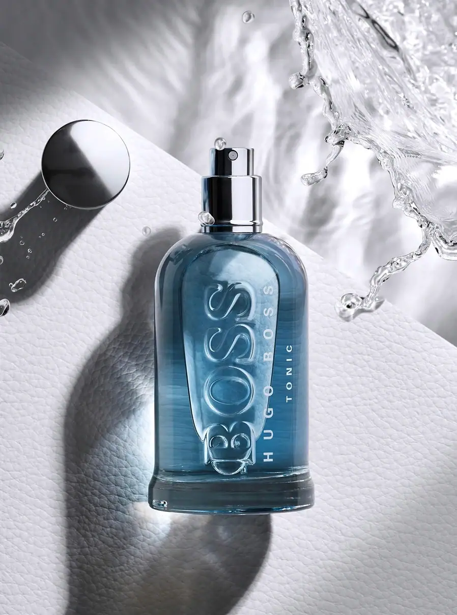
Hugo Boss
Blue transparent bottle with dimensional lettering and silver spray hardware
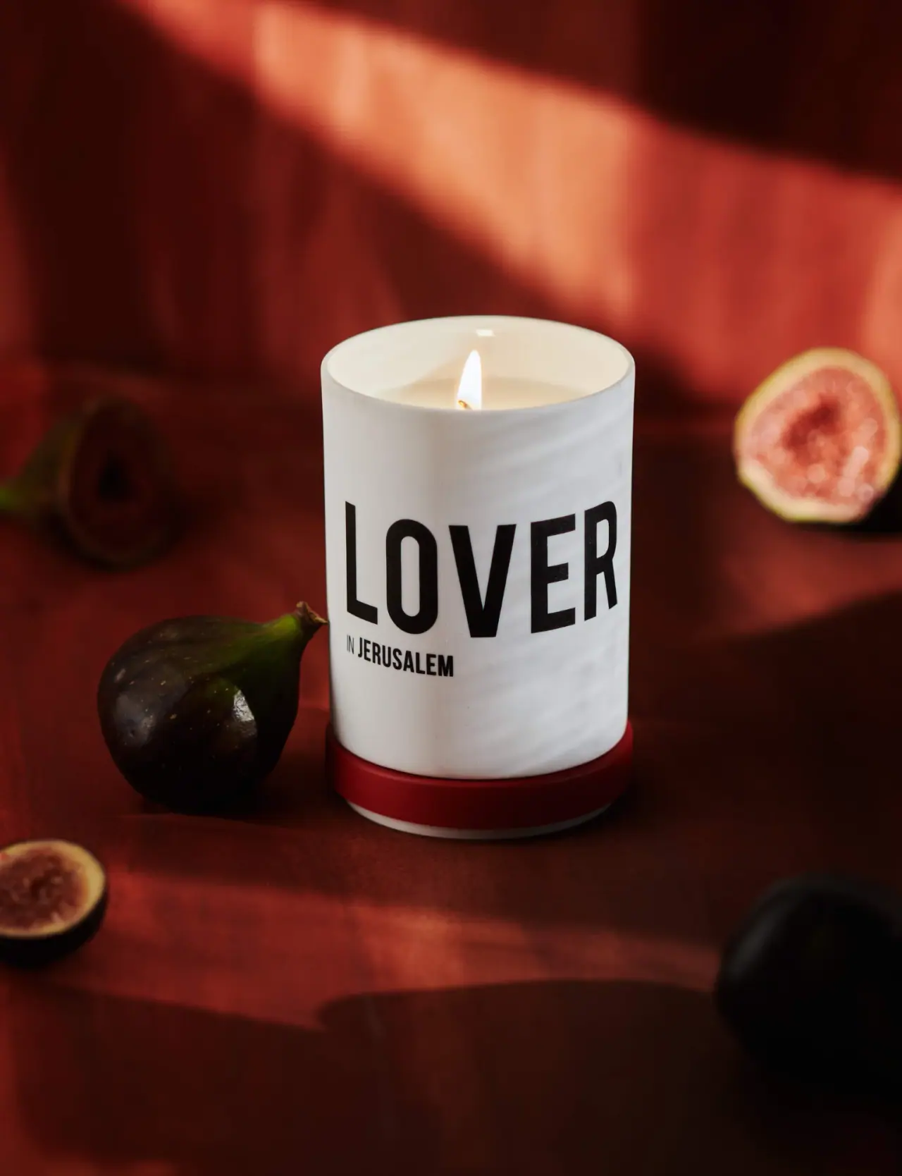
Nomad Noé
Giant black character name on white porcelain and red
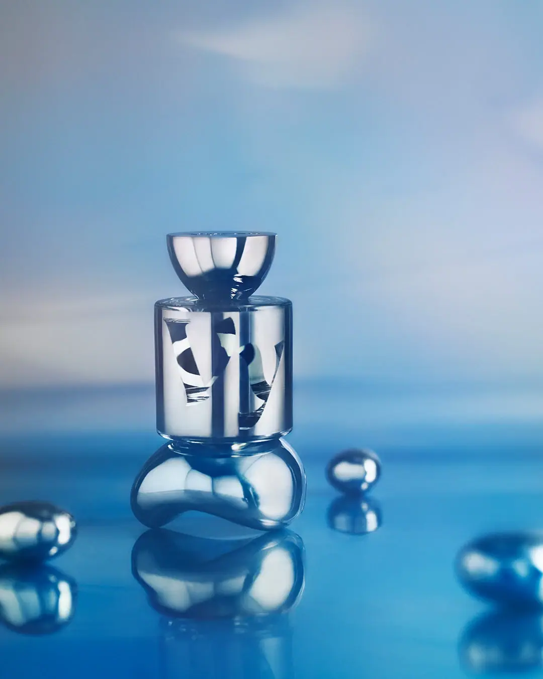
Vyrao
mirror cylinder with cropped lettering and a bowl-shaped cap

Color Wow
Tall condensed naming on a broad reflective silver jar
DIZZIAK
Oversized black lettering unites two pale haircare tubes

EADEM
Mirror-bright tube, oversized black identity, juicy campaign color
MAKE UP FOR EVER
Long tapered black cap above a compact colour chamber