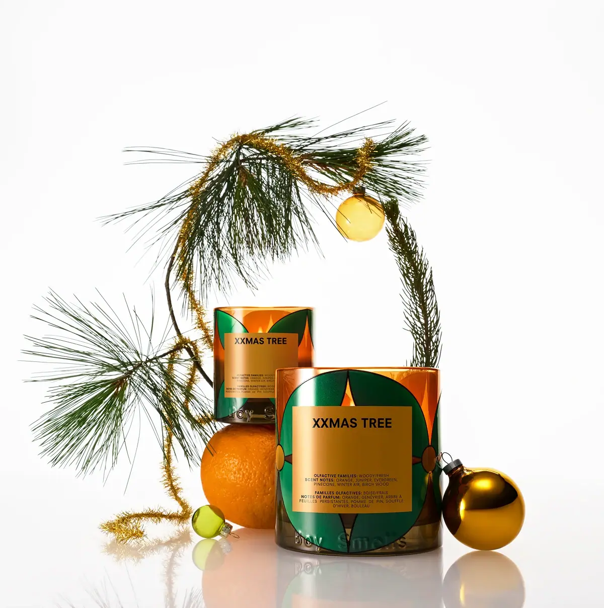
CITRUSH PERFUME

Photography: boysmells.com. All imagery belongs to its respective owner.
What makes the design work
Boy Smells brand studyVisual observations across the brand’s packaging. Individual formats and editions may vary.
Split flacon
Squat rounded rectangular bottle with an opaque coloured top coating over the upper 55% and translucent blush-pink glass (#f6cdbd) below a sharp horizontal split.
Embossed name
The two words of the brand set in a bold grotesque, one centred in each half at about 60% of the flacon width, raised in tone-on-tone relief with no ink.
Ball stopper
Sphere about 55% of the body width on a short collar, coloured and finished exactly like the top coating.
Reading the label
No label: the rounded rectangular flacon is split at mid-height between opaque colour above and pink glass below, with the two words of the brand embossed one per half.
- Top half
- First word embossed into the opaque coloured coating
- Bottom half
- Second word embossed into the pink glass
- Base
- Scent logotype or capitals printed small in white or gold, edition word beside it
Typography & hierarchy
The two words of the brand name are the loudest element, one per half of the flacon at the same size, embossed so they read as relief in the colour of the surface. The scent name is the only printed line, centred at the base of the pink glass at about a quarter of the wordmark size, sometimes followed by a small edition word. On travel sprays the name runs vertically in black along the sleeve with 'Eau de Parfum' at the foot.
Display
Helvetica Now Display Bold, Neue Haas Grotesk Bold
Bold neo-grotesque sans
Title case · Bold
Script
Custom bold italic brush logotype
Heavy slanted brush script
Title case · Regular (heavy stroke)
Label
Futura Bold Condensed, Helvetica Neue Bold Condensed
Bold condensed grotesque
Uppercase · SemiBold, Bold
Typeface suggestions based on visual similarity. These are not verified font identifications.
How the range holds together
The split flacon, the pink glass and the embossed name are fixed; each scent swaps the colour of the top half, the stopper and the travel sleeve, and editions change the finish of that same top.
Shelf presence
On shelf the flacons line up as a row of identical pink bases under changing candy-coloured tops and balls, so the brand reads by silhouette and the scent by colour from across a room.
Related packaging
More curated references in perfume, matched by format and visual style.

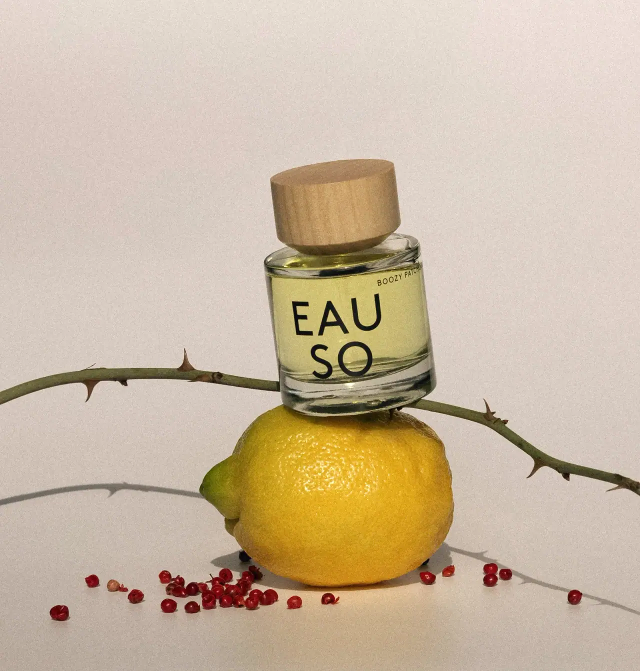
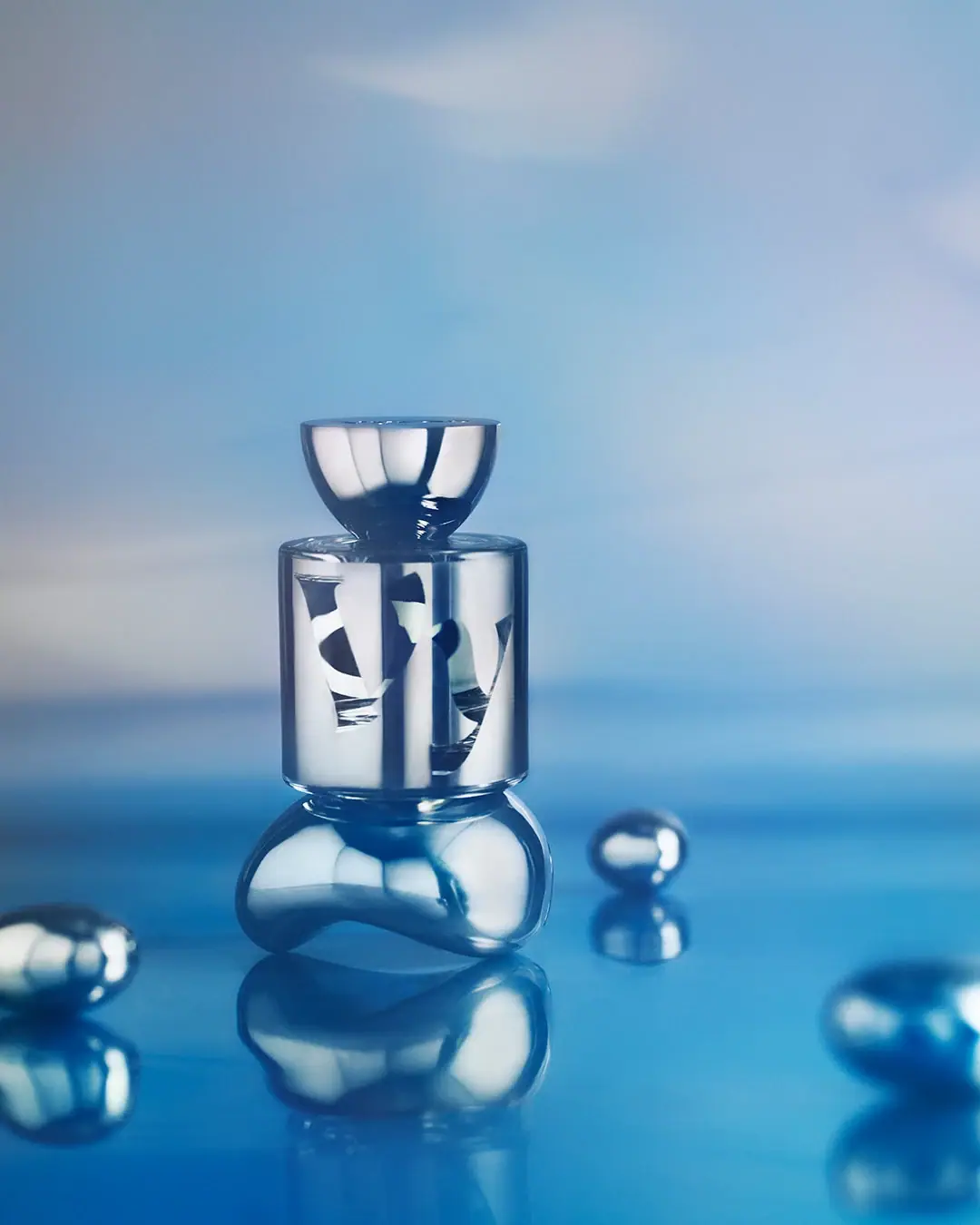

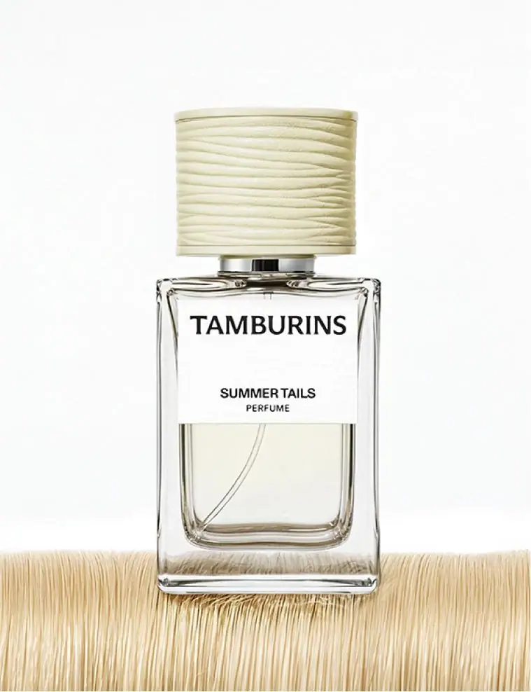
Featured from Boy Smells
The selected packaging reference for this brand.