Photography: HIRO — still-life photography. Images belong to their respective owners.
Estée Lauder

Glossy navy case and gold barrel beneath red lipstick
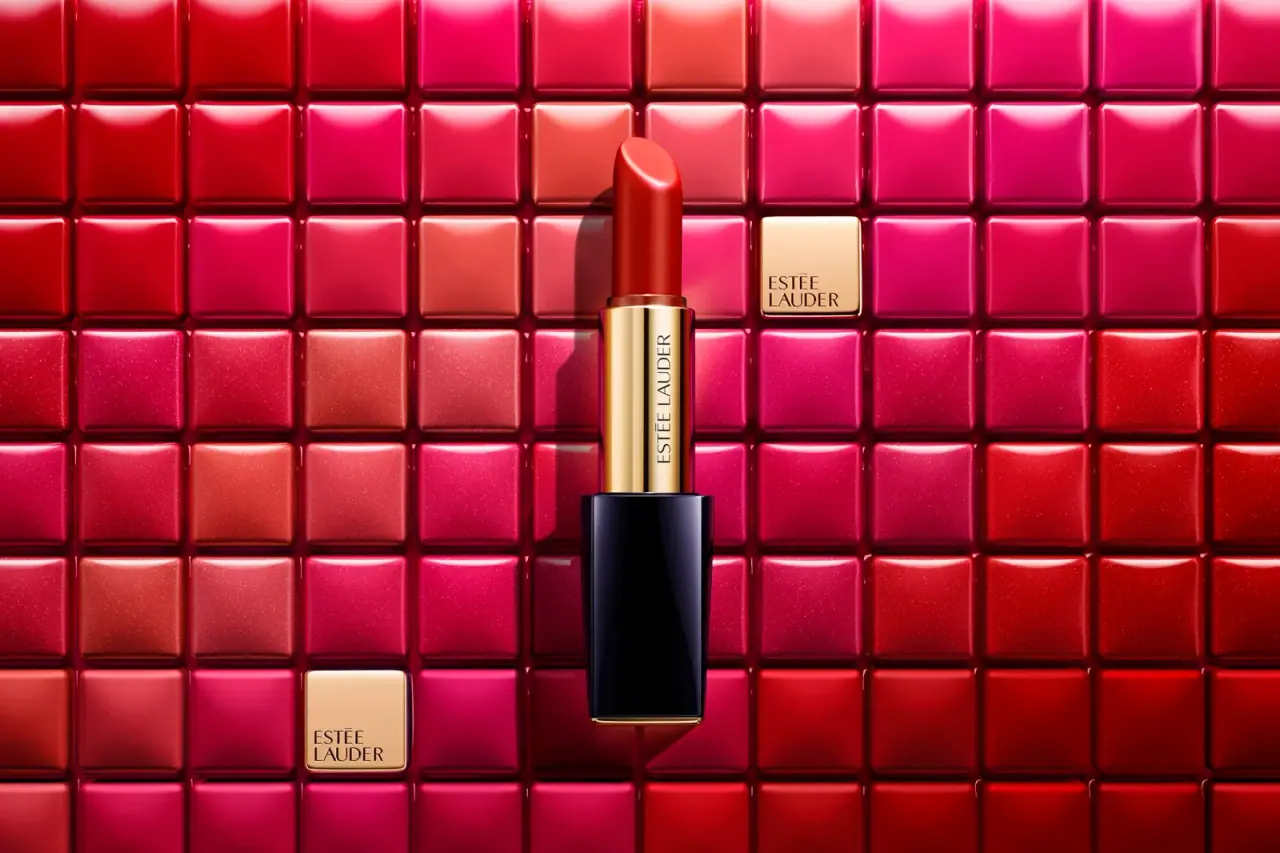
The earlier Pure Color Envy package uses component contrast as its main design language. A glossy dark navy rectangular lower case anchors a narrow reflective gold-coloured barrel, with a red lipstick bullet rising above it. Estée Lauder lettering runs along the barrel rather than filling the dark case face. A fine gold-coloured foot repeats the barrel tone at the bottom. The selected photograph turns these restrained components into a dramatic colour image through a surrounding grid of red and pink squares. That grid is the scene, while navy, gold appearance and exposed lipstick define the actual package under study.
- Make-up
- Dark pack
- Luxe monochrome
About this study
Earlier navy-case Pure Color Envy as shown in the selected HIRO photograph. Historical family context comes from the 2015 company report; exact shade and photograph date remain unresolved.
Sources & evidence · Reviewed 2026-10-19Color Palette
Approximate colours interpreted from photography. These are screen references, not official brand colours or print specifications.
Pack body
Deep navy case
#111221
Approximate dominant lower-case colour. Broad highlights make its edges appear cooler and lighter, while the central face remains almost black.
Ink
Dark barrel lettering
#27241B
Approximate thin maker lettering on the gold-coloured barrel. Its restrained weight allows the reflective component to remain visually dominant.
Accent
Warm gold appearance
#DAB875
Approximate barrel and narrow lower-foot appearance. This is a reflective colour reference, not a claim of solid gold, plating or a specific metal.
Photographed lipstick red
#BD251B
Approximate exposed product colour in this image. The precise shade name is unidentified, and the surrounding pink squares do not identify additional packaged shades.
Typography
Suggested visual alternatives, not confirmed brand typefaces. Any scale below is an illustrative estimate.
The visible package carries a single prominent maker line running along the narrow gold-coloured barrel. Read in the orientation of the letters, ESTÉE LAUDER is a long, light uppercase treatment. Turning that line along the barrel uses the component's available length and leaves the navy lower face quiet. There is no confidently visible front product-family title or shade name. The two stacked maker names on gold squares in the background belong to the photographic arrangement and should not be treated as extra labels on the lipstick itself.
Fonts
Original vertical maker-line alternative
Roboto Condensed
- Looks like
- Light narrow uppercase sans
- Type
- Condensed sans serif
- Weight
- Light, Regular
- Case
- Uppercase
- Tracking
- Normal to slightly open
- Fallback
- Arial Narrow, Arial, sans-serif
Explore a modest long maker name aligned to a narrow barrel. Check letter width, rotation and reading direction on a physical mock-up rather than relying on a flat layout.
Optional outer-pack information alternative
Source Sans 3
- Looks like
- Quiet readable text sans
- Type
- Sans serif
- Weight
- Regular, Medium
- Case
- Sentence case for practical information
- Tracking
- Normal
- Fallback
- Arial, sans-serif
A proposed companion for original carton or underside information. It does not describe an inspected Estée Lauder back panel, which is absent from this study.
Structure & Proportions
Visual proportions and finish previews are illustrative. Confirmed construction details and uncertainties are distinguished in the study notes.
Proportions
| Purpose | Value | Preview |
|---|---|---|
| Stepped width | The navy lower case is wider than the exposed barrel, creating a clear ledge between grip and mechanism. No dimensions are inferred. | — |
| Vertical sequence | Dark rectangular case, reflective narrow barrel and saturated bullet form three successive sections, each with a different visual weight. | — |
| Fine terminal accent | The gold-coloured foot is a very narrow edge compared with the navy face, echoing the barrel without turning the lower case into a fully metallic field. | — |
Shapes
| Element | Value | Preview |
|---|---|---|
| Lower case | Rectangular front with slightly softened edges and a reflective vertical highlight. | |
| Exposed barrel | Narrow rounded cylinder, visibly inset from the wider lower case. | |
| Bullet tip | Rounded sloping application surface above a straight lipstick column. |
Finishes
Glossy navy appearance
Lower case faces and edges · gloss
Reflective gold appearance
Exposed barrel and narrow foot · metallic
Formats and materials
| Formats | Opened lipstick with a rectangular navy lower case, Slender cylindrical gold-coloured barrel, Exposed red lipstick bullet with a sloping rounded tip |
| Materials | The selected photograph establishes reflective gold and glossy navy appearances, not the exact substrates beneath them., The contemporary company annual report discusses the Pure Color Envy case but does not specify component materials for this photographed example., No refill construction, recycled content, metal alloy or surface-treatment process is verified. |
| Closures | The lipstick is photographed open with no separately identifiable cover. The lower case and exposed barrel are visible, but the cap's internal fit, attachment method and closing action are not. A magnetic closure should not be inferred from the product family name or from specifications of later editions. |
| Decoration | Restrained dark maker lettering on the barrel, Broad largely unmarked navy face, Gold-coloured foot defining the lower edge |
Front Panel
Schematic reading order. The diagram’s zone heights do not represent measured artwork proportions.
This is a component-led front rather than a printed label panel. The maker name is carried by the exposed barrel, while the lower case contributes colour and reflection. Its broad face remains visually calm. That division makes the identity part of the opening presentation: the barrel lettering is visible here because the product is uncapped. The photograph does not establish how the name is communicated when the package is closed.
| Zone | Content |
|---|---|
| Lipstick bullet | Exposed red product and its shaped application tip; no shade identification can be read. |
| Gold-coloured barrel | Dark ESTÉE LAUDER lettering aligned along the length of the component. |
| Navy lower body | Large glossy field with no confidently readable front copy in the selected view. |
| Bottom edge | Fine gold-coloured foot repeats the reflective barrel tone; underside details remain concealed. |
Range System
The 2015 company report identifies Pure Color Envy and discusses the importance of its case alongside multiple shade names. This supports the historical family context but does not identify the red bullet in the photograph. The design lesson is a consistent neutral case surrounding changing product colour, interpreted within this earlier edition. It should not be extended automatically to current Estée Lauder lipstick construction or every Pure Color release.
- Navy and gold appearance can remain stable while the exposed lipstick supplies the main chromatic variation.
- The selected red is left unnamed even though historical source text lists example shades.
- The background's many red and pink squares suggest colour abundance photographically, without documenting a complete shade assortment.
Back of Pack & Shelf
The image does not show an underside label, cap reverse or carton. Product-family name, shade code, quantity and practical information cannot be reconstructed from the visible barrel alone.
- Keep shade identity explicitly unresolved until an exact label or source confirms it.
- Do not import current edition specifications into this historical package.
- For original work, plan identification on the closed object as well as the opened barrel, because the latter may be concealed during purchase.
On shelf
As an interpretation, the package's dark rectangular mass and bright barrel can communicate a formal, polished character without extensive printed graphics. The opened red bullet supplies immediate product colour, but that cue may disappear under a cover. The photograph is therefore strongest as an open-product composition, not proof of closed-case identification or retail colour selection. A design evaluation should separately inspect cap artwork, shade labelling and how the package looks beside neighbouring products; those elements are unavailable here.
Imagery
HIRO's portfolio supplies the photographic provenance and includes Pure Color Envy work. The approved image centres one opened lipstick over a dense matrix of glossy red, coral and pink square forms. Two gold-coloured logo squares break the colour grid. Those small squares echo the package's reflective barrel, while the dark lower case creates a strong interruption in the warm field. Directional light models the bevel-like edges and casts a clear shadow beside the product. The grid should be understood as a constructed visual setting rather than a literal package surface, shade chart or retail display specification.
Guidelines
Editorial principles for an original design brief, not official brand guidelines.
Do
- Use component contrast to organise a small object.
- Keep narrow branding aligned with its available surface.
- Separate opened-product analysis from closed-case assumptions.
- Treat historical editions as distinct references.
- Distinguish the lipstick colour from the surrounding photographic palette.
Don't
- Do not infer a magnetic cap from an open photograph.
- Do not call the gold-coloured surface solid gold or a verified plating.
- Do not assign a shade by matching the red to a historical name.
- Do not reproduce the branded square grid or proprietary maker lettering.
Sources & evidence
- The Estée Lauder Companies 2015 Annual Report — Lips, Lips, Lips!brand
- HIRO still-life photography portfoliophotographer
How this study was built
edition · Sourced fact
The 2015 report identifies Pure Color Envy and highlights its case, providing historical family context rather than an exact shade identification.The Estée Lauder Companies 2015 Annual Report — Lips, Lips, Lips!structure · Visual observation
The local approved image shows a wider navy lower case beneath a narrow gold-coloured barrel and red bullet.HIRO still-life photography portfoliotypography · Visual observation
Dark maker lettering follows the barrel's long axis, leaving the navy face visually quiet.HIRO still-life photography portfoliopalette · Visual observation
A narrow gold-coloured foot echoes the barrel; red and pink grid squares belong to the surrounding composition.HIRO still-life photography portfolioimagery · Sourced fact
The photographer's accessible portfolio names Pure Color Envy work; the selected local image retains that recorded provenance.HIRO still-life photography portfoliorange · Editorial interpretation
Stable case colours could support changing lipstick shades, but this study does not establish the whole historical or current assortment.
What remains unverified
- Exact shade, production date and photographed weight are unidentified.
- Materials, finish processes and closure mechanism are not specified by the inspected sources.
- No cap, underside or carton is directly analysed.
- Current product construction and refill specifications are not transferred to this earlier case.
Give your AI
packaging taste
Give your design or image tool a packaging study: palette, type, structure, front panel and principles for an original brief.
Export this styleFree with an email. PACK.md works in Claude, ChatGPT, Cursor and image tools.
More like this

African Botanics
Technical black label with a low serif signature

al.ive body
warm architectural calm, built as a paired vanity object

bareMinerals
a restrained black compact framing the powder itself

BeautyPWR
Clear square shell, white cream cup, black serif identity

Christian Louboutin
Faceted turquoise base beneath an extreme silver taper
Clé de Peau Beauté
Faceted navy base, reflective gold barrel, discreet repeated emblem

Color Wow
Tall condensed naming on a broad reflective silver jar

Corpus
sage gloss with whispered gold lettering