
Photography: HIRO — still-life photography. Images belong to their respective owners.
HAKU

Pearly narrow tube with stacked serif identity and clear base
The selected HAKU foundation image presents a narrow pearly white tube above a substantial transparent-looking cap. Four upright serif letters stack vertically near the sealed end, with a small Japanese product block and SPF line much lower down. The long blank interval between them gives the front its calm proportions. Blue and pink reflections appear around the clear base, while beige and white flowing ribbons frame the object externally. The library's earlier-edition scope is retained because the photograph itself does not establish its date, quantity or shade.
- Make-up
- Light pack
- Clinical minimal
- Luxe monochrome
About this study
Selected earlier HAKU tube from HIRO's portfolio. Official 2019/2024 releases provide product-family context; exact photographed date, size and shade remain unconfirmed.
Sources & evidence · Reviewed 2026-10-19Color Palette
Approximate colours interpreted from photography. These are screen references, not official brand colours or print specifications.
Pack body
Pearly warm white
#EEE7E4
Approximate luminous tube field with pink-gray shadows. Pearly describes the visual impression, not a confirmed pigment or coating.
Ink
Near-black lettering
#252323
Stacked maker letters, Japanese category wording and the small protection line supply the front's restrained information contrast.
Accent
Cool clear-edge blue
#A8BED6
A localized optical accent around the transparent-looking cap rim; not a verified printed blue band or fixed material color.
Pink edge reflection
#DDB6CA
Small warm iridescent-looking highlights at the cap base, kept separate from the beige formula-like ribbon in the scene.
Typography
Suggested visual alternatives, not confirmed brand typefaces. Any scale below is an illustrative estimate.
H, A, K and U remain upright and are arranged one beneath another. This is stacked lettering, not a horizontal word rotated through ninety degrees. Their formal serif forms occupy a narrow central axis near the tube's upper end. Japanese product wording sits lower in a compact group above the SPF30/PA+++ line. A broad unprinted interval separates maker and function. The lower text follows the curved body in perspective, so its photographed arc should not automatically be treated as an intentionally curved baseline in flat artwork.
Fonts
Original stacked Latin maker letters
Cormorant Garamond
- Looks like
- Formal contrasting serif capitals
- Type
- Display serif
- Weight
- Medium, SemiBold
- Case
- Uppercase
- Tracking
- Individual optical placement in a vertical stack
- Fallback
- Georgia, serif
Proposed starting point for a different short maker name. Judge each upright letter's width and vertical space individually, rather than rotating a complete word or copying the HAKU arrangement exactly.
Japanese product information
Noto Serif JP
- Looks like
- Traditional Japanese serif text
- Type
- Japanese Mincho serif
- Weight
- Regular, Medium
- Case
- Japanese characters with appropriate Latin support
- Tracking
- Natural script spacing
- Fallback
- serif
Use for a legible Japanese descriptor in an original bilingual system. Keep the product category clear and use only substantiated factual wording; the source's treatment and protection statements are not reusable decorative copy.
Structure & Proportions
Visual proportions and finish previews are illustrative. Confirmed construction details and uncertainties are distinguished in the study notes.
Proportions
| Purpose | Value | Preview |
|---|---|---|
| Narrow vertical object | The elongated body favors a single slim identity axis rather than a broad horizontal wordmark. Exact width and height are not measured. | — |
| Two reading clusters | Maker letters near the top and product information near the cap are separated by a generous blank field, giving both groups a distinct location. | — |
| Clear base mass | The cap has enough height to read as a substantial lower section, not a thin closing disc. Its reflective edges make that mass visible against white. | — |
| Sealed-end transition | The flattened upper seam is wider than the nearby body in this view, while the lower portion transitions into the rounded clear cap. | — |
Shapes
| Element | Value | Preview |
|---|---|---|
| Tube body | Slim softly tapering vessel with a flattened ridged sealed end. | |
| Cap base | Deep clear-looking rounded cover with a bright elliptical lower edge in perspective. | |
| Maker stack | Four separate upright serif capitals aligned on a narrow vertical axis. | |
| Lower information group | Small centered Japanese lines and a separate protection line above the cap seam. |
Finishes
Pearly white appearance
Main tube with soft pink-gray modulation; no confirmed pearlescent pigment or coating. · pearlescent
Transparent-looking base
Lower cap, where light passes through and edges create crisp reflections; material unverified. · transparent
Formats and materials
| Formats | Narrow closed foundation tube with a ridged sealed end and a large clear-looking lower cap; photographed quantity not visible |
| Materials | The tube appears opaque pearly white, but laminate layers, resin, barrier construction and decoration treatment are not established., The lower cap appears transparent with reflective edges and an inner pale form. Its exact material, wall thickness, internal structure and iridescent treatment are unverified; optical effects may depend on lighting and image production. |
| Closures | The lower cap stays attached, hiding the dispensing aperture and neck. Its substantial depth gives the tube a distinct base, but does not prove a particular screw thread, seal or refill mechanism. The upper sealed end has diagonal ridges visible across its narrow flattened edge. This establishes an important silhouette detail without supplying a production specification for the seal. |
| Decoration | Four upright maker letters stacked vertically, Small Japanese product naming low on the body, Protection rating below the product block, No visible colored label panel, border or printed illustration |
Front Panel
Schematic reading order. The diagram’s zone heights do not represent measured artwork proportions.
The face is divided by distance rather than rules or panels. The maker occupies an upper vertical column; the practical Japanese block sits near the lower end with the rating immediately beneath. Dark type is sparse against a luminous white field. The clear cap adds another visual layer without introducing a large printed color patch. Because the surface is curved and reflective, apparent letter alignment should be checked against flat artwork before becoming a specification for a new design.
| Zone | Content |
|---|---|
| Sealed upper edge | A ridged crimp-like top remains visible above the maker lettering, making the flexible-tube format apparent. |
| Maker identity | Four upright HAKU letters form a compact vertical serif stack on the upper front. |
| Quiet middle | A large uninterrupted pearly interval keeps the face from becoming a continuous column of copy. |
| Japanese product block | Small black Japanese naming groups near the lower body communicate product category and positioning. This study does not independently assess treatment claims. |
| Protection line | SPF30 / PA+++ is visible above the cap. It is recorded as printed information, not generalized to other HAKU formulas or proposed designs. |
Range System
Shiseido's 2024 release describes a two-shade foundation with SPF30/PA+++; its 2019 release supplies earlier hybrid-foundation context. Neither dates the selected photographer image conclusively or identifies the beige ribbon's shade. The study therefore avoids transferring release-specific quantity or shade count into a specification for the photographed unit. Range ideas below are design interpretations only.
- An original family could retain a restrained white body and a clear lower component while varying explicit product wording.
- When maker letters stack, use another location for category names rather than stacking long functional phrases letter by letter.
- Keep shade identification independent of an atmospheric swatch image, whose color depends on lighting and image processing.
Back of Pack & Shelf
Reverse, underside and dispensing opening are not visible. No net quantity, shade code or complete instructions can be mapped from this front view.
- Obtain edition-matched reverse and base photographs before documenting shade or quantity placement.
- Inspect the open closure before describing the nozzle or threading.
- Keep market-specific product statements tied to the exact substantiated edition.
On shelf
Interpretively, the combination of sparse black type and a dimensional clear base can distinguish this tube within a field of plain white skincare packaging. The vertical maker remains compact and legible letter by letter, while the lower Japanese block supplies product specificity on closer viewing. On a small image, the cap's fine optical colors may disappear; the main system still depends on silhouette, white space and dark letter placement. A new design should be tested without the dramatic ribbons to assess its standalone identity.
Imagery
HIRO's image suspends the upright tube between sweeping beige and white cream-like ribbons against a very pale background. The ribbons curve around the object while leaving its face clear, connecting complexion color and a light cream texture without crowding the typography. Their sculptural scale is a campaign construction, not a dispensing demonstration. The specific shade, amount of formula, physical staging and compositing method are not established. The beige is excluded from the package palette because it belongs to the surrounding texture image.
Guidelines
Editorial principles for an original design brief, not official brand guidelines.
Do
- Distinguish stacked letters from a rotated word.
- Use white space to separate maker and category.
- Keep exact edition and shade uncertainty explicit.
- Describe optical color without inventing a coating process.
- Test the isolated package apart from texture staging.
Don't
- Do not assign the 2024 release size to an undated photo.
- Do not interpret the beige ribbon as a verified shade sample.
- Do not infer glass or a particular resin from clarity.
- Do not carry SPF or treatment claims into fictional designs.
- Do not reproduce the maker's exact letter stack and cap signature.
Sources & evidence
- Shiseido — HAKU 2024 foundation releasebrand
- HIRO — Still-Life Portfoliophotographer
- Shiseido — Medicated Care-Hybrid Foundation, 2019brand
How this study was built
edition · Sourced fact
2019 and 2024 releases establish product-family context without conclusively dating the selected photographer image.Shiseido — HAKU 2024 foundation release · Shiseido — Medicated Care-Hybrid Foundation, 2019structure · Visual observation
Slim pearly tube has a ridged upper seal and deep clear-looking lower cap.HIRO — Still-Life Portfoliotypography · Visual observation
Four upright serif letters stack vertically; the whole word is not rotated.HIRO — Still-Life Portfoliolabel · Visual observation
Small Japanese product wording and SPF30/PA+++ sit low, separated from the maker by blank space.HIRO — Still-Life Portfoliopalette · Visual observation
Pearly white and dark copy define the pack, with localized blue/pink cap reflections.HIRO — Still-Life Portfolioimagery · Visual observation
Beige and white cream-like ribbons are external campaign textures; exact formula shade not identified.HIRO — Still-Life Portfoliorange · Editorial interpretation
Separate maker/category clusters and a restrained clear component are adaptable principles, not complete HAKU brand rules.
What remains unverified
- Undated photographed edition, no visible quantity or shade code.
- 2024 PDF text accessible but screenshot failed; release specifications not assigned to pictured unit.
- Tube layers, cap material and optical treatment unknown.
- Original fonts, exact proportions, reverse and opening not established.
- Product claims recorded as naming/print, not independently assessed.
Give your AI
packaging taste
Give your design or image tool a packaging study: palette, type, structure, front panel and principles for an original brief.
Export this styleFree with an email. PACK.md works in Claude, ChatGPT, Cursor and image tools.
More like this

African Botanics
Technical black label with a low serif signature

bareMinerals
a restrained black compact framing the powder itself

BeautyPWR
Clear square shell, white cream cup, black serif identity

Corpus
sage gloss with whispered gold lettering

Costa Brazil
Pale matching vessels with small, deliberate bilingual labels

Crown Affair
Pale frosted-looking bottle, black pump and small looping emblem

Haus Labs
mirror chrome hardware over frosted shade
Hourglass
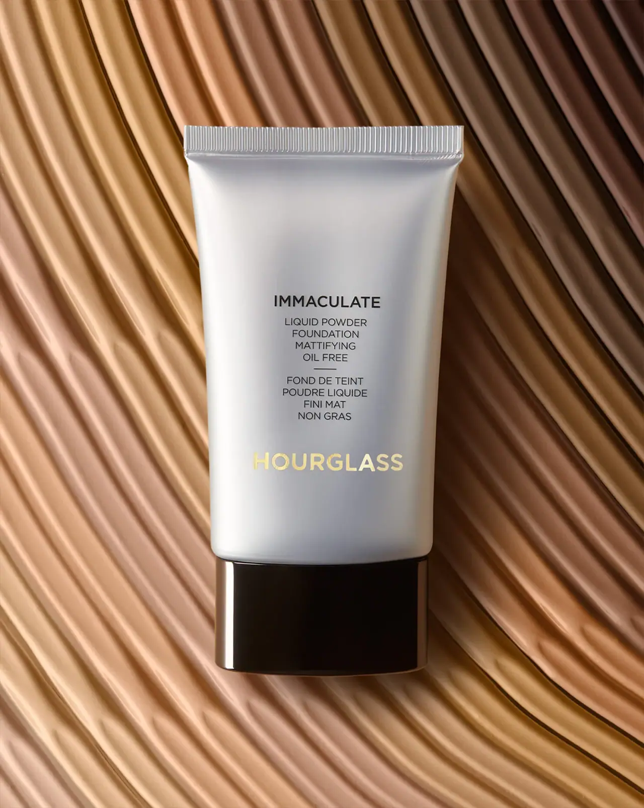
Silver-grey foundation tube with bilingual precision and golden signature