NOVA Turmeric + Niacinamide Bi-Phase Glow Facial Oil

Photography: herbivorebotanicals.com. All imagery belongs to its respective owner.
What makes the design work
Herbivore brand studyVisual observations across the brand’s packaging. Individual formats and editions may vary.
Gallery tag
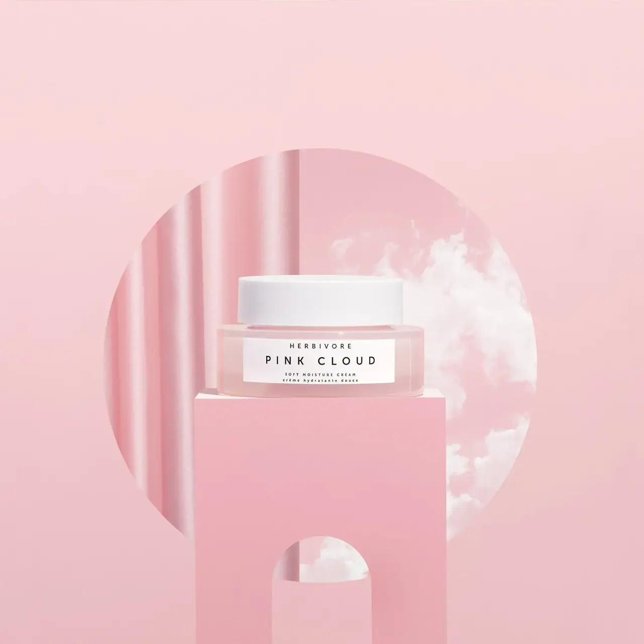
Small white (#fbfbfa) rectangle about 30% of the front, centred slightly below mid-height, carrying all front text.
Tracked brand line
Tiny geometric sans capitals tracked about +40% at the top of the tag, the smallest type on the front.
Collection name
Condensed high-contrast serif capitals at about 70% of tag width, stacked on two lines for two-word names.
Reading the label
One small white rectangle, portrait or landscape to suit the vessel, centred on the front and occupying well under half the face; vertical on slim tubes.
- Top
- Brand name in tiny tracked capitals
- Centre
- Collection name in condensed serif capitals
- Bottom
- Ingredient-led descriptor in English and French
Typography & hierarchy
The collection name is the only large element, set in condensed high-contrast serif capitals in the centre of the label and stacked onto two lines when it has two words. Above it the brand name is tiny and widely tracked; below it a two-line descriptor names the key ingredients and product in English, then in French.
Display
Didot Condensed, Bodoni 72 Condensed
Condensed high-contrast modern serif
Uppercase · Regular
Label
Futura Book, Neue Haas Grotesk
Geometric sans, very wide tracking
Uppercase · Regular
Body
Helvetica Neue, Arial
Neutral grotesque
Title case · Regular
Typeface suggestions based on visual similarity. These are not verified font identifications.
How the range holds together
Colour coding by collection through the vessel tint, while label size, type and white closures stay fixed; clear glass is used where the white product itself provides the colour.
Shelf presence
On shelf the range reads as a row of soft pastel vessels each wearing the same small white tag, so collections group by colour while the identical labels make the brand recognisable at a glance.
Related packaging
More curated references in skincare, matched by format and visual style.



Featured from Herbivore
The selected packaging reference for this brand.