About this packaging
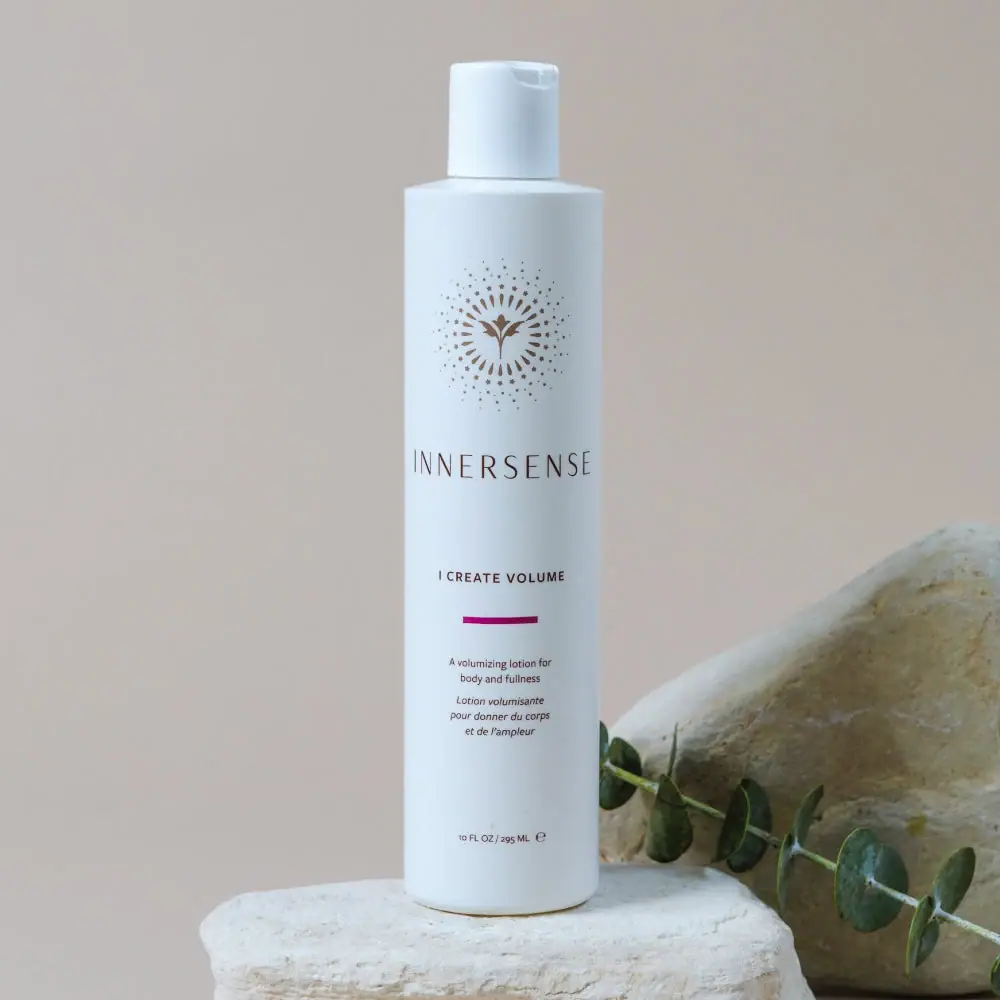
Innersense I Create Volume uses a pale cylindrical bottle, a small matching flip-top and a concise label marked by a gold-colored bird emblem. The official product family spans 59.15 mL, 295 mL and 946 mL bottles, plus a 946 mL refill, so the pictured format sits within a broader scale system.
Innersense identifies I Create Volume as a styling lotion for body and fullness.[1]
Pack construction & use
- Format range
- The brand lists 59.15 mL, 295 mL and 946 mL bottle sizes plus a 946 mL refill. The selected bottle reads 10 fl oz / 295 mL.[1]
- Bottle and closure
- The cover shows a pale cylindrical bottle with sloping shoulders and a small matching flip-top cap. No material claim is inferred from the light opaque appearance.Observed in the reference photograph
What makes the design work
Editorial analysis of this packaging reference.
The bird emblem leads into the wordmark
A radiating gold-colored bird mark sits above the widely spaced Innersense name. Together they create a compact identity block that can be read quickly on the bottle’s curved face.
A short accent separates name and description
A short magenta bar sits below I Create Volume and above the smaller English and French product description. These lines describe the lotion's role; they are not usage directions.
A size family requires separate format inspection
The official page lists travel, regular, large and refill options. This verifies a size family but does not establish that every option uses the selected 295 mL bottle's silhouette, closure or materials.[1]
Ideas for your next brief
- Establish a compact emblem-and-wordmark block that remains legible on a curved bottle face.
- Use a short accent bar to separate the product name from bilingual descriptive copy without creating another large colour field.
- Keep the label hierarchy consistent when a product spans travel, regular, large and refill formats.
Sources & further reading
Researched 19 October 2026