Photography: Innersense official photography. Images belong to their respective owners.
Innersense

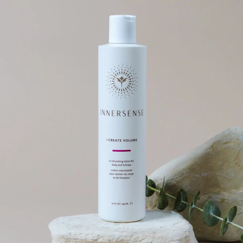
Radiating bird emblem and magenta bar on a pale cylinder
The selected 295 mL I Create Volume bottle uses a pale cylindrical body as an open field for a compact sequence of identity and information. A gold-brown bird-like emblem surrounded by radiating details sits above the widely spaced INNERSENSE wordmark. Lower down, the small product title is followed by one magenta bar, bilingual descriptive copy and the quantity. The restrained front combines an ornate symbol with narrow typography rather than botanical illustrations. A small matching flip-top completes the silhouette; the stone and leafy stem in the photograph remain separate styling elements.
- Hair
- Light pack
- Clinical minimal
- Colour-coded range
About this study
Selected 295 mL I Create Volume bottle. Other sizes and refill availability are sourced but their shapes, closures and materials are not inferred from this image.
Sources & evidence · Reviewed 2026-10-19Color Palette
Approximate colours interpreted from photography. These are screen references, not official brand colours or print specifications.
Pack body
Pale cool white
#DEE9EB
Approximate body and cap appearance under cool light. The slight blue cast is not a verified production tint or coating.
Ink
Warm brown-gold identity
#816A53
Approximate emblem and maker colour. No foil, metallic pigment or specific decoration process is established.
Dark small copy
#514138
Approximate product title, bilingual description and quantity appearance. Exact separation from the maker ink is unverified.
Accent
Magenta product bar
#A31771
A short saturated horizontal accent between the product name and description, carrying much more visual colour than its small area suggests.
Typography
Suggested visual alternatives, not confirmed brand typefaces. Any scale below is an illustrative estimate.
The emblem is the most elaborate element, followed by a wide-spaced narrow uppercase maker. I CREATE VOLUME sits much lower in a smaller but firmer uppercase line. The magenta bar introduces the descriptive block, where the English wording uses small upright type and the French translation appears italic. A tiny quantity line anchors the lower front. Generous vertical gaps separate each group, making the label feel measured without requiring boxes or large panels. The descriptive copy explains the product's role; it should not be mistaken for application directions simply because it appears below a divider.
Fonts
Original narrow maker alternative
Barlow Condensed
- Looks like
- Light condensed sans capitals
- Type
- Condensed sans serif
- Weight
- Light, Regular
- Case
- Uppercase
- Tracking
- Wide
- Fallback
- Arial Narrow, sans-serif
Create an independent maker with a quiet narrow rhythm. Wide tracking should still allow a complete word to be recognised around a curved bottle, rather than pushing its final letters out of view.
Bilingual description alternative
Source Sans 3
- Looks like
- Readable neutral sans with italic
- Type
- Humanist sans serif
- Weight
- Regular, SemiBold
- Case
- Uppercase title and sentence-case description
- Tracking
- Normal
- Fallback
- Arial, sans-serif
Use a firmer small product name and a readable descriptive block. If italic differentiates a translation, retain adequate size and contrast instead of treating the secondary language as decorative texture.
Structure & Proportions
Visual proportions and finish previews are illustrative. Confirmed construction details and uncertainties are distinguished in the study notes.
Proportions
| Purpose | Value | Preview |
|---|---|---|
| Emblem breathing room | The radiating mark occupies a substantial upper region with open pale space around it, making a small detailed symbol act as a visual crown. | — |
| Separated information groups | Maker, product name, accent and description are placed in distinct vertical stages rather than one dense continuous block. | — |
| Minimal colour area | The magenta bar is much shorter than the body width, so it works as a local cue instead of dividing the bottle into large colour sections. | — |
| Small functional top | The cap is noticeably narrower than the body and comparatively short, leaving the main cylinder as the dominant shape. | — |
Shapes
| Element | Value | Preview |
|---|---|---|
| Body | Tall straight cylinder with shallow sloped shoulder and softened base. | |
| Closed cap | Small cylindrical flip-top with a visible opening recess. | |
| Radiating emblem field | Circular arrangement of rays, dots and small star-like details around a bird-like centre. | |
| Magenta bar | Short narrow horizontal rectangle beneath the product title. |
Finishes
Low-glare pale exterior
Bottle and cap; exact stock and coating unspecified · matte
Flat graphic appearance
Magenta bar and small copy; print process unknown · matte
Formats and materials
| Formats | Tall pale cylindrical bottle with shallow sloping shoulders, Small matching closed flip-top cap, Selected quantity reads 10 fl oz / 295 mL, Straight main body with softly rounded lower edge |
| Materials | Opaque pale appearance does not identify a particular polymer, glass, coating or recycled content., The cap is visually similar in colour to the body but is a separate component with an unverified material specification., No clear label edge proves whether the identity is direct decoration or an applied transparent or opaque label. |
| Closures | The short cylindrical cap sits above the broader shoulder and has a small recessed opening area near its top edge. It is photographed closed, so the outlet, hinge interior and any seal are not visible. The form is consistent with a flip-top closure, but dose, opening force, travel sealing and material cannot be assessed. The official existence of a refill option does not by itself establish the selected cap's removal method or the procedure for refilling this pictured bottle. |
| Decoration | Bird-like central emblem within concentric radiating marks, Widely spaced narrow maker lettering, Short single magenta bar below the product name, Small centred English and French description above the quantity |
Front Panel
Schematic reading order. The diagram’s zone heights do not represent measured artwork proportions.
The front is organised as a sequence of centred groups on a pale ground. At the top, the radiating emblem has more visual detail than any other printed element. The maker sits below it with long letter spacing. The product name then appears after a large pause, followed by the short magenta bar. English and French descriptions use several compact lines, and the volume sits near the bottom with a generous gap above it. No enclosing border or opaque coloured panel is visible. The emblem is treated as proprietary artwork rather than a generic certification or a verified symbol with an assigned spiritual meaning.
| Zone | Content |
|---|---|
| Upper emblem | Warm-toned bird-like centre surrounded by rays, dots and star-like marks. |
| Maker | INNERSENSE in narrow widely spaced uppercase lettering. |
| Product and accent | I CREATE VOLUME above a short magenta horizontal bar. |
| Bilingual description | English volumizing-lotion description followed by italic French wording; not usage directions. |
| Quantity foot | 10 fl oz / 295 mL with a small estimated-quantity symbol. |
Range System
The official page lists 59.15 mL, 295 mL and 946 mL sizes plus a 946 mL refill. The selected front explicitly identifies the regular 295 mL size. This establishes a size family without proving identical silhouettes, cap types or label scaling across the other options. The magenta bar is a clear local accent, but this study does not infer a complete brand-wide colour code from one product. A useful range comparison would inspect each format independently, checking how the emblem and bilingual text adapt rather than assuming that all artwork simply enlarges in proportion to volume.
- Selected photographed bottle: 10 fl oz / 295 mL, with a small closed flip-top.
- Official alternatives include travel, larger volume and a separately named refill option; their physical packaging is not inspected here.
- A short colour bar can remain a stable product cue while layouts adapt to different surfaces, but that adaptation must be demonstrated rather than presumed.
Back of Pack & Shelf
Reverse, base markings and opened cap are absent. The front's short English and French description is not a complete label system.
- No full ingredient panel, barcode, batch code or recycling mark is established from the selected image.
- Online application directions are not transcribed into an unseen reverse panel.
- Refill availability is sourced, but a particular refill procedure or selected-bottle disassembly method is not shown.
On shelf
The ornate upper emblem and narrow maker create a quiet but recognisable top-half arrangement. The magenta bar becomes a useful small focal point when the finer wording is too distant to read. This is a visual inference rather than measured retail performance. The long vertical spacing may help separate groups, but the light narrow maker and tiny bilingual copy still require actual-size checks. A practical review would compare the selected bottle against neighbouring pale bottles and test whether the short colour cue is enough to support product selection alongside the explicit name.
Imagery
The official image sets the pale bottle on a rough light stone block, with another stone and a leafy stem behind it. Soft cool light gives the body a blue-white cast and keeps the dark fine copy visible without strong glare. The textured stones contrast with the smooth cylinder, while the stem crosses the lower background without covering the product title. Neither stone texture nor leaf green belongs to the printed pack palette. The botanical prop is not used to establish a specific ingredient, and the stone setting does not imply a mineral bottle material.
Guidelines
Editorial principles for an original design brief, not official brand guidelines.
Do
- Separate ornate identity from plain functional copy.
- Use a small saturated accent when the main surface is restrained.
- Identify the pictured size from its readable mark.
- Inspect refill and larger formats independently.
- Keep bilingual description distinct from directions.
Don't
- Do not call gold-looking artwork foil without evidence.
- Do not assign material from a pale opaque surface.
- Do not claim every size has an identical bottle shape.
- Do not infer refill instructions from availability alone.
- Do not turn botanical styling into a verified ingredient claim.
Sources & evidence
- I Create Volume — Innersenseproduct
How this study was built
range · Sourced fact
Official listing offers 59.15 mL, 295 mL, 946 mL and 946 mL refill options.I Create Volume — Innersenselabel · Visual observation
Selected front reads 10 fl oz / 295 mL.I Create Volume — Innersensetypography · Visual observation
Radiating emblem, spaced maker, product name and short magenta bar form separated groups.I Create Volume — Innersenselabel · Visual observation
English and italic French lines describe the volumizing lotion rather than giving application directions.I Create Volume — Innersensestructure · Visual observation
Pale bottle has a short matching closed flip-top and shallow sloping shoulders.I Create Volume — Innersenserange · Editorial interpretation
A verified size family does not establish identical construction or proportional artwork scaling across all formats.I Create Volume — Innersense
What remains unverified
- Bottle, cap and decoration materials are unverified.
- No opened cap, reverse or refill procedure inspected.
- No exact typefaces or complete brand colour-code mapping.
- Cool light influences pale body colour; props are excluded from pack palette.
Give your AI
packaging taste
Give your design or image tool a packaging study: palette, type, structure, front panel and principles for an original brief.
Export this styleFree with an email. PACK.md works in Claude, ChatGPT, Cursor and image tools.
More like this

Byoma
candy-coloured barrier science on a shelf
CeraVe
white pump bottles split by a coloured diagonal

Cocokind
sideways lowercase on spa-water pastels
FEKKAI
Green styling duo with vertical hairline maker and white actuators
Glossier
clean white tubes with candy accents

Herbivore
pastel tinted vessels with a white tag

Malin+Goetz
pharmacy label set in bracketed helvetica

Native
white drugstore bottles, scent-tinted vertical caps