About this packaging
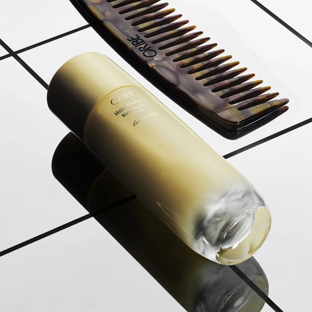
Oribe’s Hair Alchemy Bond Building Elixir is presented in a pale gold-toned glass bottle with a tall, smooth closure. In the selected image, the pack is angled beside an Oribe comb, allowing the translucent-looking lower section and restrained bilingual label to become the main visual features.
Oribe’s product page identifies the container as a glass bottle and states that the bottle is recyclable. The page also says its paper-based packaging uses Forest Stewardship Council-certified materials; that paper statement applies to Oribe paper packaging generally, not a specification of this bottle’s label.[1]
Pack construction & use
- Bottle
- The brand confirms this product uses a glass bottle and describes it as recyclable. The selected photograph shows a pale gold appearance over most of the body, with a clearer-looking base.[1]
- Closure and dispensing context
- A smooth broad cap covers the dispensing area in the selected image. An official-page professional tip refers to using pumps, but the actuator and internal assembly are not visible here; cap material and attachment details remain unverified.[1]
What makes the design work
Editorial analysis of this packaging reference.
The angled presentation reveals the bottle’s proportions
The long bottle is set diagonally across a gridded white surface, drawing attention to its rounded shoulder, extended body, and large cap. A clear-looking base creates a visual break at the bottom, so the gold-colored center does not read as a uniform block.
Fine type supports an elevated haircare hierarchy
ORIBE appears first in a refined serif wordmark, followed by Hair Alchemy and Bond Building Elixir in smaller mixed-case lines. The sparse front arrangement makes the product family and specific treatment easy to distinguish without extra badges.
A comb acts as a category cue, not a package feature
The tortoiseshell-looking comb echoes the amber and gold tones of the bottle while clarifying that the product belongs to a hair routine. Keeping the prop separate avoids mistaken reading as a set component and leaves the bottle label unobstructed.
Ideas for your next brief
- A tall closure can balance a long treatment bottle, especially when the lower body has a distinct transparent-looking section.
- Keep the product family and treatment name in a clear type hierarchy when serving a product line with several steps.
- Use a category-relevant prop alongside the pack without covering the front label or implying it is included.
Sources & further reading
Researched 19 October 2026