About this packaging
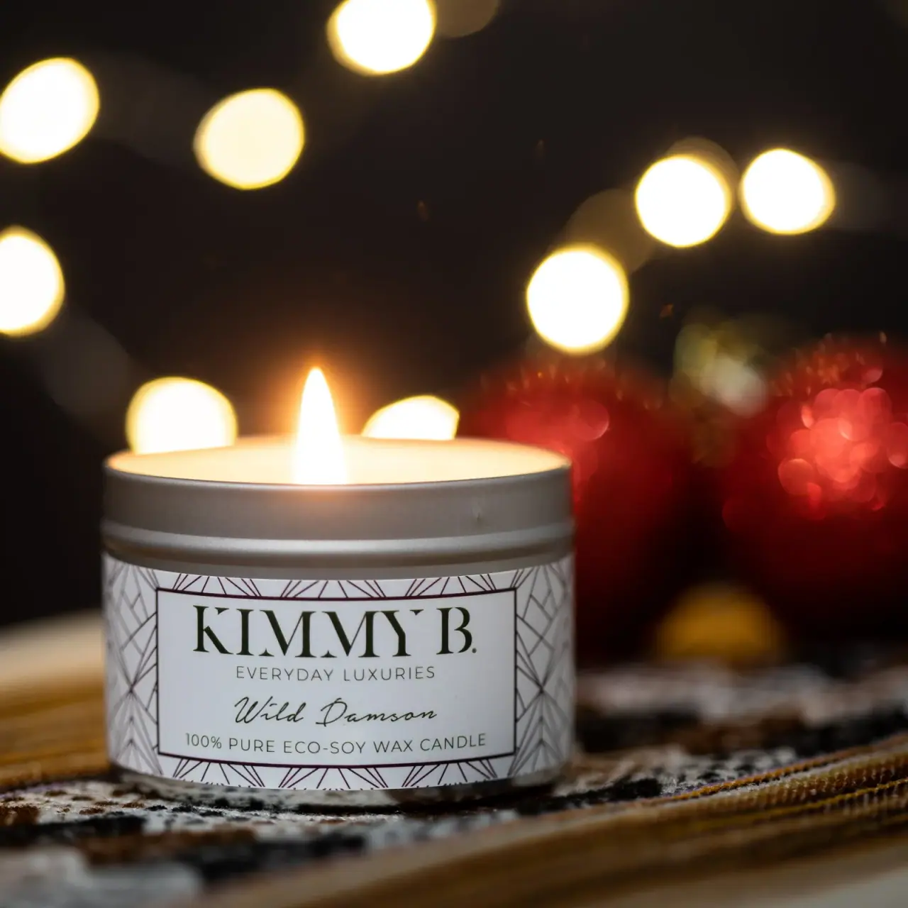
Kimmy B. Wild Damson candle appears in a short cylindrical vessel with a patterned wrap label and one lit wick. The close, warm composition gives the border, brand name and scent lettering equal visual weight.
The Siant Photography product portfolio includes the Kimmy B. Wild Damson candle image. Its visible label identifies the fragrance and states “100% pure eco-soy wax candle.”[1]
Edition note. The photograph does not establish a release date or product volume.
Pack construction & use
- Container
- The cover shows a short cylindrical vessel with a fitted rim.Observed in the reference photograph
- Label
- The visible wrap reads Kimmy B., Wild Damson and “100% pure eco-soy wax candle.”Observed in the reference photograph
- Historical edition
- The item is catalogued as historical. The image supports the visible branding, fragrance name and wax statement but does not provide a date or product volume.Observed in the reference photograph
What makes the design work
Editorial analysis of this packaging reference.
Decorative frame, clear center
A repeated geometric line pattern forms a border around a white central label field. The border adds ornament without interfering with the strong brand and fragrance hierarchy.
Contrasting type treatments
Kimmy B. uses large formal capitals, Everyday Luxuries a thin spaced line, and Wild Damson a flowing script. These type changes distinguish maker, brand positioning and scent without color variation.
Mood through close crop
Warm bokeh and a single flame create an intimate evening mood, with the label remaining the sharpest element.
Ideas for your next brief
- Use a patterned border to frame brand and scent lettering without competing with either.
- Combine distinct type styles to separate maker, brand descriptor and fragrance name.
Sources & further reading
Researched 19 October 2026