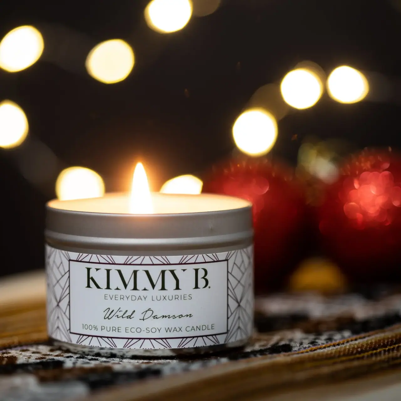
Photography: Sian T — KimmyB photography. Images belong to their respective owners.
KimmyB

Silver tin, geometric frame and handwritten damson scent
The selected Wild Damson candle uses a short silver-colored tin and a broad white wrap. Fine intersecting geometric lines surround a clean rectangular title panel. Inside it, large formal maker capitals, a restrained positioning line and a flowing scent script create three distinct reading voices. The open rim and single flame show the object in use, while warm background bokeh adds occasion without becoming package decoration. This is an individually studied historical photograph, not a specification for every current KimmyB product.
- Candles & home scent
- Light pack
- Heritage label
- Maximalist pattern
About this study
Historical Wild Damson tin as photographed by Sian T; no release date, fill quantity or closed-lid construction established. Current collection used only for maker/product context.
Sources & evidence · Reviewed 2026-10-19Color Palette
Approximate colours interpreted from photography. These are screen references, not official brand colours or print specifications.
Pack body
Soft silver tin
#8F8C88
Approximate exposed metal-looking rim and lower edge. Reflections from the warm scene alter the apparent gray; no alloy or plating is inferred.
Label
Cool white paper-like field
#DCDDD9
Broad wrap and central panel provide a pale reading surface. Paper-like describes appearance, not a verified label stock.
Ink
Dark olive lettering
#343B25
Approximate maker and supporting type tone in this photograph. The warm lighting prevents a confident production ink match.
Accent
Muted plum linework
#50383F
Fine geometric perimeter and rectangular keyline appear slightly purple-brown relative to the text; no foil process established.
Typography
Suggested visual alternatives, not confirmed brand typefaces. Any scale below is an illustrative estimate.
KIMMY B. dominates the upper panel with large contrast-serif capitals and a full stop. A thin, widely spaced uppercase positioning line sits immediately below, followed by Wild Damson in an inclined connected script. The small wax descriptor forms a straight uppercase baseline at the bottom. These roles are differentiated through letterform, weight and spacing rather than competing accent colors. The script gives the scent a personal quality while the formal maker name and rectangular frame keep the composition orderly.
Fonts
Formal maker capitals
Bodoni Moda
- Looks like
- High-contrast display serif
- Type
- Didone serif
- Weight
- Regular, Medium
- Case
- Uppercase
- Tracking
- Optically balanced broad capitals
- Fallback
- Georgia, serif
Use an original maker name in large capitals, retaining clear gaps around the frame. Thin strokes need proofing at the actual tin size rather than judging only a magnified lifestyle photo.
Scent signature
Allura
- Looks like
- Light connected handwriting
- Type
- Script
- Weight
- Regular
- Case
- Title case
- Tracking
- Natural connected spacing
- Fallback
- cursive
Proposed expressive scent alternative. Keep the written name short enough to fit without squeezing its connecting strokes, and do not trace the source's individual flourishes.
Positioning and product detail
Montserrat
- Looks like
- Light spaced utility capitals
- Type
- Geometric sans-serif
- Weight
- Light, Regular
- Case
- Uppercase
- Tracking
- Open on short positioning line; moderate on longer descriptor
- Fallback
- Arial, sans-serif
Separate small factual copy from the decorative script. Use sufficient weight on the longest line so it remains legible against a pale label at a normal reading distance.
Structure & Proportions
Visual proportions and finish previews are illustrative. Confirmed construction details and uncertainties are distinguished in the study notes.
Proportions
| Purpose | Value | Preview |
|---|---|---|
| Low vessel | The visible tin reads broad and squat, giving the label a landscape-shaped front rather than a long vertical reading path. No dimensions are inferred. | — |
| Exposed rim band | A substantial silver band remains above the wrap, separating printed information from the illuminated top opening. | — |
| Pattern margin | The central rectangle occupies most of the useful front, while patterned strips remain visible on all sides and broaden toward the curved edges. | — |
| Typographic rhythm | A tall maker line gives way to a thin small line, a fluid scent line and a compact final baseline; successive roles vary in texture rather than simply shrinking evenly. | — |
Shapes
| Element | Value | Preview |
|---|---|---|
| Tin silhouette | Low cylinder with exposed upper rim and a subtle lower metal edge. | |
| Inner information frame | Wide thin-lined rectangle visually curved by the cylindrical wrap. | |
| Perimeter pattern | Fine straight rays and intersecting diagonals create repeated angular cells around the central field. | |
| Open top | Elliptical opening in perspective with pale wax and one visible flame. |
Finishes
Exposed silver surface
Upper rim and narrow lower edge; metallic appearance without verified alloy or plating. · metallic
Quiet printed wrap
Broad front label appears relatively low-glare; exact coating and paper type unknown. · matte
Formats and materials
| Formats | Short cylindrical candle tin shown open with one visible flame; historical edition with no confirmed size or fill weight |
| Materials | Exposed rim and base have a silver metallic appearance. Exact metal, coating, interior lining and recycled content are not established by the photograph or accessed photographer page., The wrap is opaque and pale, but its stock, adhesive and finish are unverified. The printed soy-wax description is recorded as a label claim rather than an independent material analysis. |
| Closures | The candle is open. A broad exposed upper wall and shallow ridge remain visible above the label, but no separate lid is present in the selected frame. A matching lid, friction fit, screw thread or seal should not be invented from this rim alone. The photo establishes an in-use top opening, not the complete closed retail presentation. |
| Decoration | Repeated intersecting angular lines around the outer label, Thin rectangular keyline isolating the central information panel, Large formal maker lettering above a restrained uppercase line, Flowing scent name above a small product-material statement |
Front Panel
Schematic reading order. The diagram’s zone heights do not represent measured artwork proportions.
A thin dark rectangle creates an inner information island within the geometric wrap. All principal lines are centered on that island, and the maker name spans nearly its full width. The outer pattern carries activity around the edges, leaving the scent script on an uninterrupted pale field. This is ornament managed through containment: the frame prevents fine linework from crossing letters, while the pattern still wraps visibly around the cylinder and suggests continuity beyond the front.
| Zone | Content |
|---|---|
| Pattern perimeter | Repeating straight-line geometry runs outside the central keyline, with the side areas compressing through perspective as the label curves away. |
| Maker name | Large KIMMY B. capitals sit high in the frame, using serif contrast and scale to establish the main identity. |
| Positioning line | A small widely spaced uppercase phrase acts as a quiet bridge between maker and scent. |
| Scent name | Wild Damson is written in a fluid dark script with open space around its ascending and descending strokes. |
| Product statement | The bottom uppercase line identifies the candle and includes a soy-wax claim. Its wording is source packaging content, not proof of broader environmental performance. |
Range System
The official current collection lists Wild Damson in both tin and boxed candle formats, but that does not date the selected historic label or confirm an unchanged graphic system. Only this photographed tin receives visual analysis. The adaptable lesson is the division of a constant maker frame and a distinct scent-writing role; any broader pattern or color code remains unverified.
- An original scent family could keep a fixed information frame while allowing scent wording to change within a dedicated script area.
- A taller format would require redesigned proportions; the squat tin's landscape panel should not simply be stretched vertically.
- If linework changes between fragrances, retain written names so identification does not depend on subtle pattern differences alone.
Back of Pack & Shelf
Rear wrap, base label and any lid are not shown. The visible front contains branding and a material statement, but does not reveal the location or full content of directions and warnings.
- Inspect the underside and reverse before documenting practical candle information.
- Obtain a closed view before defining the complete retail silhouette.
- Keep an independently designed front free enough that required supporting information can remain readable elsewhere.
On shelf
Interpretively, the pale framed panel gives a small tin a clear front-facing identity, while the fine perimeter pattern rewards closer viewing. At thumbnail size the script and linework will recede before the large maker capitals. An original system should therefore test the scent name at real pack size, especially where a retail row includes several similar white labels. The warm campaign background can make the neutral package feel festive, but it does not establish that Wild Damson is a seasonal edition.
Imagery
The photographer places the lit tin in sharp foreground against dark surroundings, warm circular bokeh and blurred red decorative objects. A patterned textile beneath the vessel adds another texture, separate from the geometric wrap. The flame and soft reflections lend warmth to the silver and white pack without proving a special colored coating. Treat this as a mood reference rather than a complete packshot: the open state, crop and shallow focus conceal the rear, lid and surrounding retail presentation.
Guidelines
Editorial principles for an original design brief, not official brand guidelines.
Do
- Keep patterned ornament outside the main letterforms.
- Assign distinct typographic voices to clear information roles.
- Check short scent scripts at actual pack size.
- Distinguish silver reflection from verified metal specification.
- Document historical scope separately from current availability.
Don't
- Do not infer a lid design from an open rim.
- Do not transfer current volume or burn time to this photograph.
- Do not call warm bokeh a printed color palette.
- Do not treat eco wording as an independently verified certification.
- Do not reproduce the source's maker lettering and precise geometric border.
Sources & evidence
- Sian T — Product Photographyphotographer
- KimmyB — All Candlesbrand
How this study was built
edition · Sourced fact
Photographer portfolio supplies selected image provenance; current collection still lists Wild Damson formats without dating this label.Sian T — Product Photography · KimmyB — All Candlesstructure · Visual observation
Low silver-colored open tin has an exposed upper ridge and one visible flame.Sian T — Product Photographytypography · Visual observation
Large serif maker name, thin spaced capitals and flowing scent script occupy distinct roles.Sian T — Product Photographylabel · Visual observation
Fine intersecting perimeter geometry surrounds a clean rectangular centered-text panel.Sian T — Product Photographypalette · Visual observation
Silver, pale wrap and dark print belong to the pack; warm bokeh and red blur belong to the scene.Sian T — Product Photographyimagery · Visual observation
Lit close-up and shallow focus emphasize atmosphere while concealing parts of the retail object.Sian T — Product Photographyrange · Editorial interpretation
A constant information frame with a dedicated scent role is an adaptable principle, not a verified universal KimmyB system.
What remains unverified
- Historical image has no confirmed release date or volume.
- Exact metal, liner, label substrate and coating unknown.
- No original font attribution or measured proportions.
- Lid, reverse and underside unseen.
- Printed wax/environmental wording not independently audited.
Give your AI
packaging taste
Give your design or image tool a packaging study: palette, type, structure, front panel and principles for an original brief.
Export this styleFree with an email. PACK.md works in Claude, ChatGPT, Cursor and image tools.
More like this
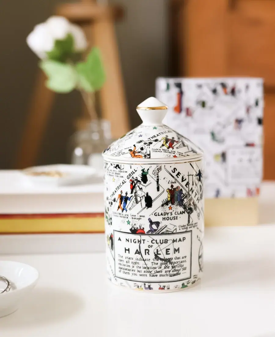
Harlem Candle Company
Illustrated ceramic map jar with coordinated lid and gold trim

Miu Miu
aqua relief, ivory neck band and a yellow disc
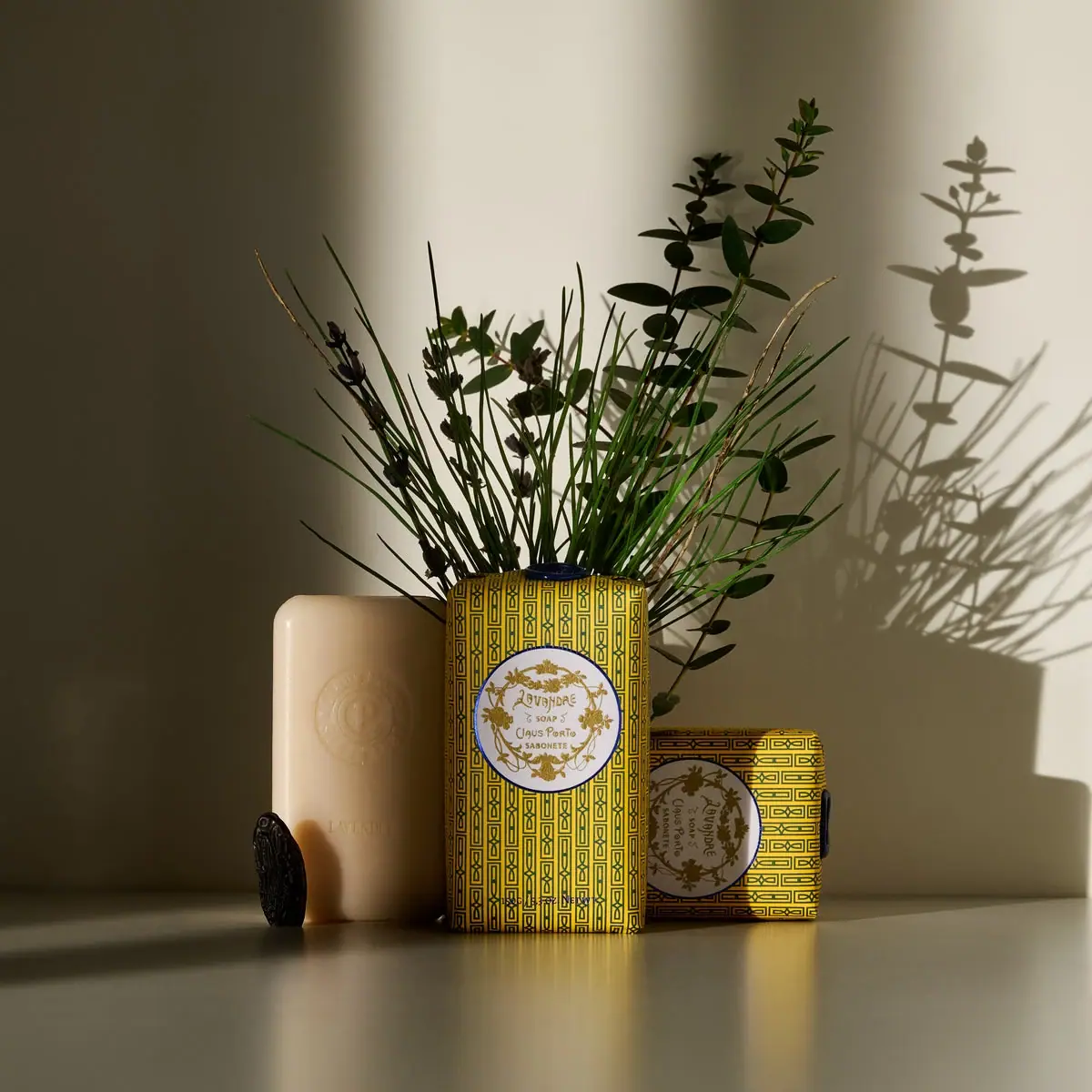
Claus Porto
Golden geometric wrapping around a pale floral medallion

ISAMAYA
Gold horse medallion with crystal-like mane and red eye

Aerangis
a quiet numbered object, an intimate scent memory

Alexander McQueen
An oval flacon crowned with dense black relief
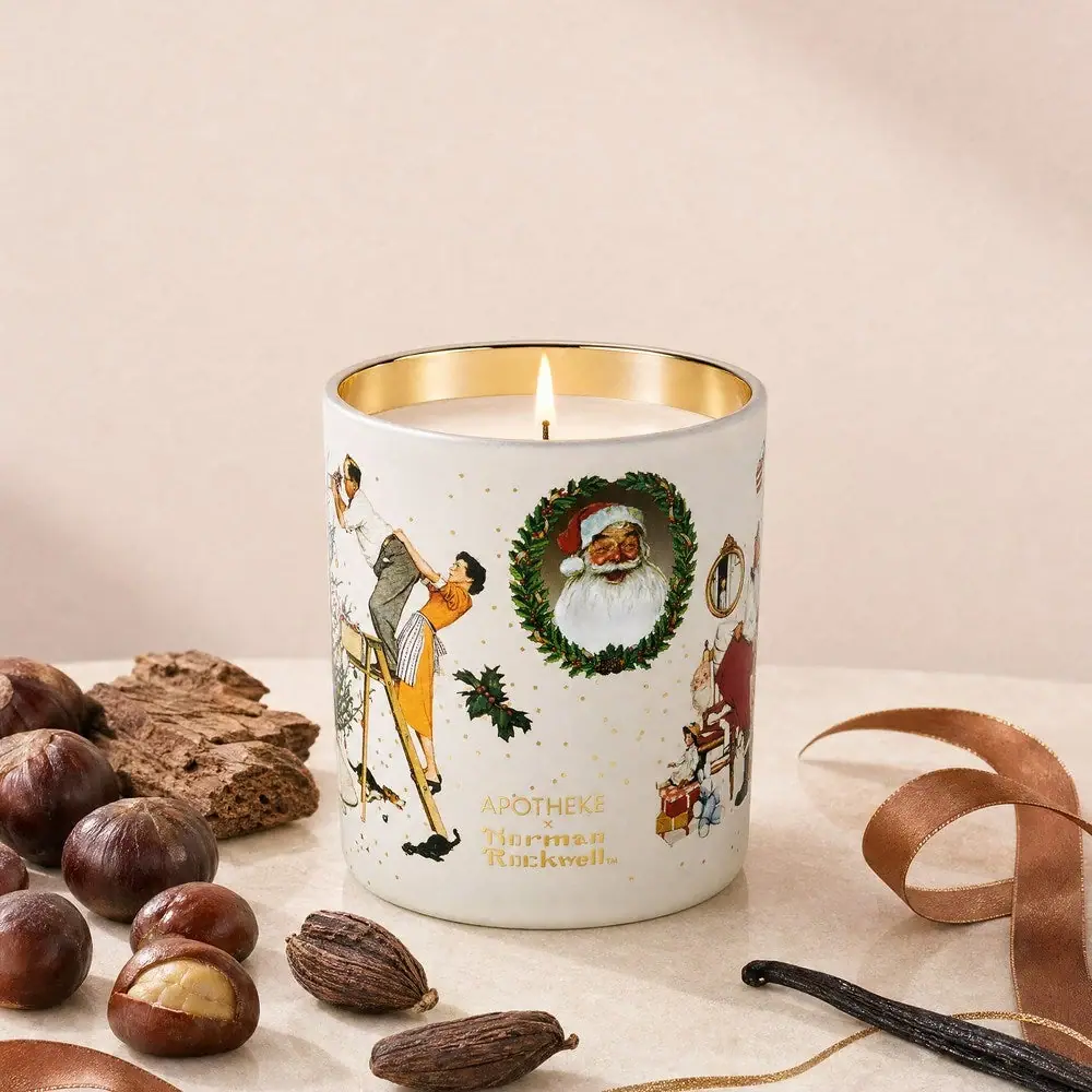
Apotheke
White holiday vignettes with a warm golden interior

Arquiste
blush transparency, white lettering and a stepped gold cap