Lip Oil

Photography: kyliecosmetics.com. All imagery belongs to its respective owner.
What makes the design work
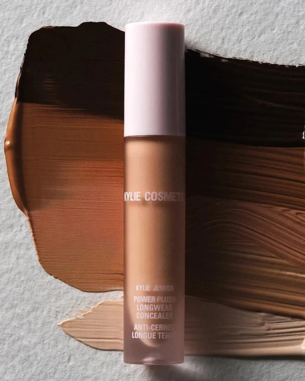
Kylie Cosmetics brand studyVisual observations across the brand’s packaging. Individual formats and editions may vary.
Drip cap
Glossy Ballet Slipper (#f6cfd6) cap with drips running down about 15% of the clear tube below it.
Vertical chrome name
Tall condensed capitals in Chrome Silver (#c9c9cb) running up the cap, filling about 90% of its width.
Shade window
Clear tube showing the product colour under the drip, the only thing that changes between shades.
Reading the label
No applied label: names are printed directly on the component, usually vertically, and the drip device frames the shade window on wand products.
- Cap
- Chrome vertical capitals and founder name, with drip running down onto the tube
- Body
- Clear window showing the shade, or a vertical product name on opaque tubes
- Base
- Rounded lowercase wordmark, product type and volume
Typography & hierarchy
The product or brand name, set vertically along the length of the component, is the largest element. On liquid lipsticks the brand takes over in tall chrome capitals on the cap with the founder's full name in tiny capitals beside it. The rounded lowercase wordmark appears at the base of tubes or pressed into compact lids; legal text is tiny near the base.
Display
Druk Condensed, Bebas Neue
Tall condensed sans capitals
Uppercase · Bold
Headline
Cooper Black, Recoleta Bold
Rounded soft serif, bubbly
Lowercase wordmark; title case product names · Bold
Label
League Gothic
Extra-condensed grotesque
Uppercase · Regular
Typeface suggestions based on visual similarity. These are not verified font identifications.
How the range holds together
One pink component colour across everything; shades are shown by the clear tube or pan, and product types differ by the font of the vertical name rather than by pack colour.
Shelf presence
On the counter the range reads as a field of identical baby-pink caps and compacts, with the shade colours lined up through clear tubes like a swatch strip; the drip makes the lipsticks recognisable from the cap alone.
Related packaging
More curated references in make-up, matched by format and visual style.



Featured from Kylie Cosmetics
The selected packaging reference for this brand.