About this packaging
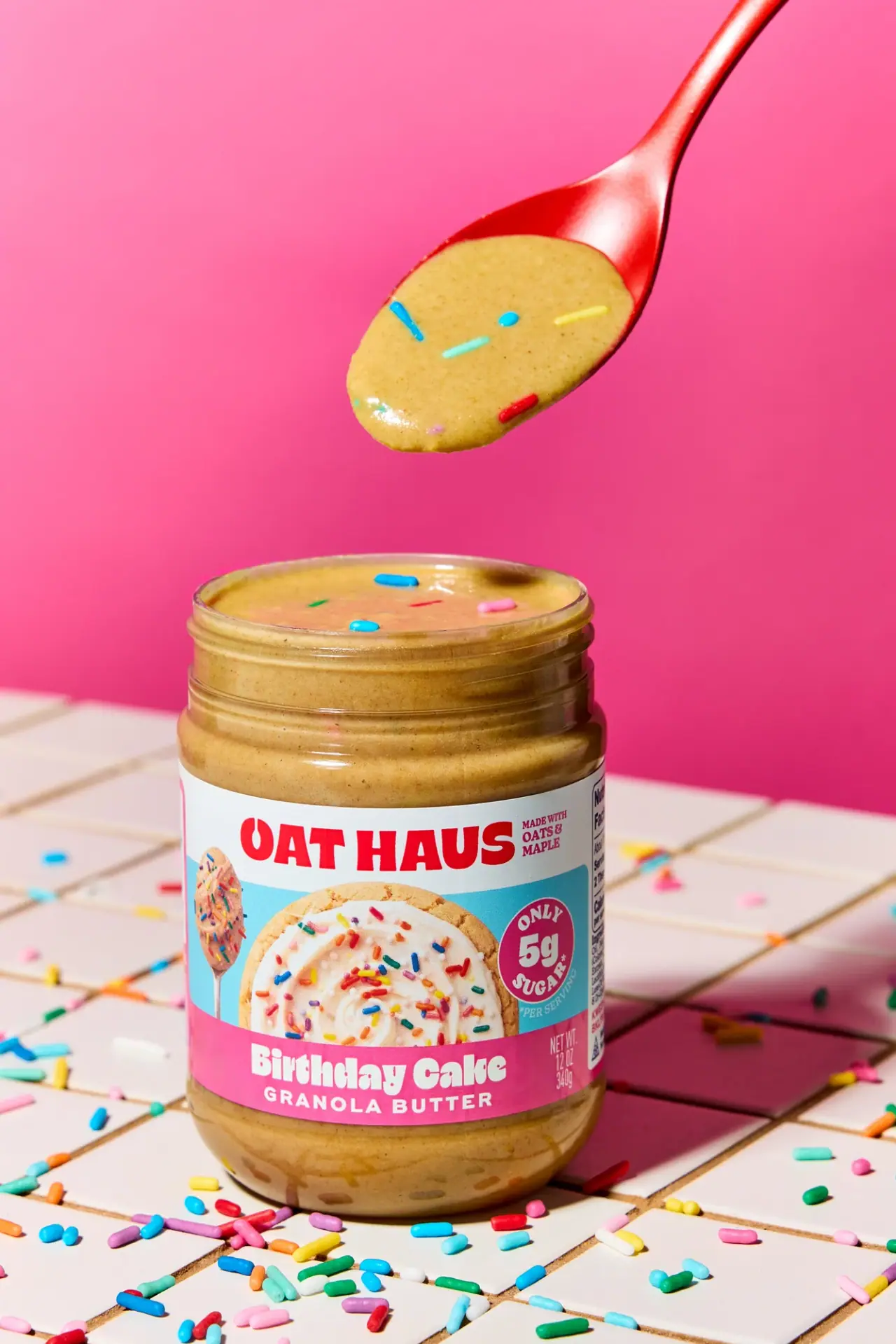
Oat Haus’s Birthday Cake Granola Butter is shown in an open 12 oz jar with colorful sprinkles visible in the spread. The label turns the birthday-cake flavor into a party-like visual system, using a bold brand name, a frosted food image, and a pink flavor band.
Oat Haus describes this flavor as inspired by boxed vanilla Funfetti cake and states that each jar contains 12 oz. The brand notes that sprinkles can settle or shift during transit, a product characteristic directly reflected in the open-jar imagery.[1]
Pack construction & use
- Jar
- The selected image shows an open, wide-mouth jar with the spread and sprinkles visible above the label. Oat Haus confirms the 12 oz jar format; the product page does not identify its material.[1]
- Banded wraparound label
- The front combines an oversized red wordmark on white, a photographic-looking frosted baked-item and spoon image on cyan, and a pink flavor band. A magenta circular claim badge sits at the right within the cyan field; net contents read 12 oz / 340 g.Observed in the reference photograph
What makes the design work
Editorial analysis of this packaging reference.
A clear band system segments the wrap label
The white upper band carries the oversized red wordmark, a turquoise middle field holds the frosted food image and magenta circular callout, and the pink lower band contains the flavor name in large white lettering. This layered structure lets the variety name remain prominent even as small nutrition and ingredient details share the wrap.
The open jar extends the label’s flavor story
The product is photographed with its wide mouth uncovered and the spread visibly dotted with sprinkles. The close-up connects the photographic food cue with the actual topping in the jar, giving the customer a direct cue to the flavor without leaning only on the name.
Bright staging reinforces the playful SKU identity
Hot pink dominates the scene, while scattered rainbow sprinkles continue across the tabletop and around the jar. The product remains easy to distinguish because the label uses distinct turquoise, white, and pink zones rather than blending into the background as one uninterrupted pink field.
Ideas for your next brief
- Use separate label bands to hold brand, product cue, and flavor name when a playful SKU still needs practical front-of-pack information.
- Show a spread or condiment open when the product texture and inclusions help distinguish the flavor from its category peers.
- Repeat a few label colors in the photography, but preserve enough contrast between the jar label and background to keep the product readable.
Sources & further reading
Researched 19 October 2026