About this packaging
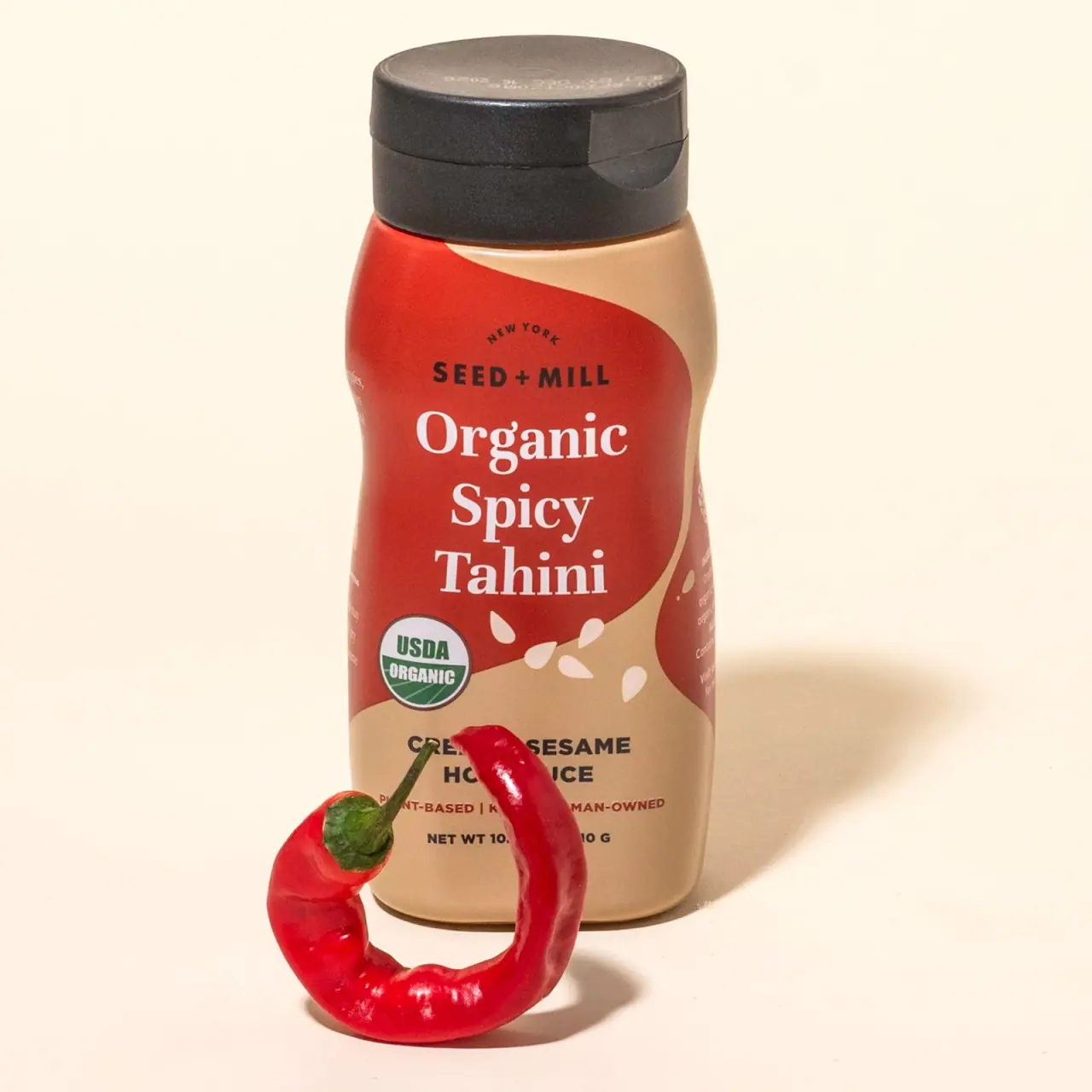
Seed + Mill’s Organic Spicy Tahini uses a contoured squeeze bottle and a curved red field to distinguish a sesame condiment from a conventional hot sauce. White serif product lettering occupies the red field, with certification and ingredient descriptors arranged lower on the front.
Seed + Mill describes its spicy tahini as double-milled sesame with chili and positions the squeeze format for drizzling. The opened Savory Squeeze Duo page shows the same spicy tahini bottle and its ingredients.[1]
Pack construction & use
- Dispensing form
- The selected image shows a waisted squeeze bottle with a dark flip-top closure.[1]
- Curved front graphic
- A red curved panel carries the stacked “Organic Spicy Tahini” name; a USDA Organic seal and smaller product text sit below it.Observed in the reference photograph
What makes the design work
Editorial analysis of this packaging reference.
Contour and grip
The narrowing middle and broader base give the bottle a recognizable waist. The dark cap clearly marks the dispensing end of the pack.
Name follows the field
The curved red panel accommodates the tall stacked name while leaving the tan ground visible at the sides and base.
Flavor cues stay specific
A chili prop reinforces the spicy variant, while the sesame-drop marks and certification seal provide supporting cues without replacing the product name.
Ideas for your next brief
- Use a curved label field to carry a tall product name on a contoured squeeze bottle.
- Keep variant cues, certification, and product naming in separate visual zones so the name remains dominant.
Sources & further reading
Researched 19 October 2026