Photography: Oat Haus official photography. Images belong to their respective owners.
Oat Haus

Birthday-party color blocks with oversized grocery typography
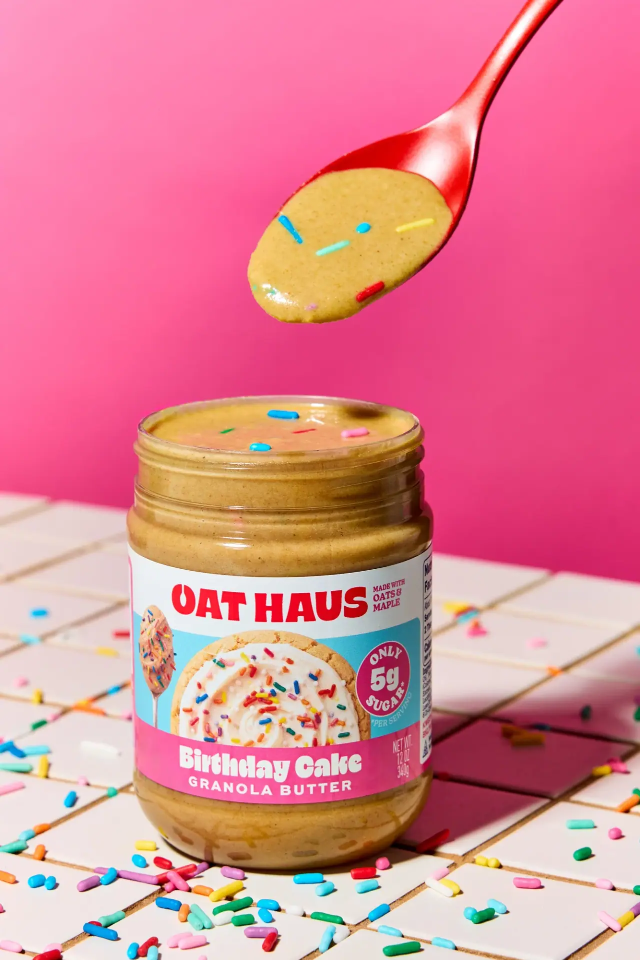
The selected Birthday Cake Granola Butter jar combines familiar pantry packaging with exuberant flavor communication. A red wordmark fills a white upper band, a cyan middle field carries a photographic-looking frosted food cue, and a saturated pink base gives the flavor its own large white headline. The open jar reveals tan spread and colored sprinkles, extending the label story into the product itself. The result is playful but strongly segmented: brand, appetite appeal, claim and flavor each have a distinct place.
- Pantry & sauces
- Light pack
- Bold typographic
- Playful colour
About this study
Selected 12 oz / 340 g Birthday Cake jar in official open-jar photography. Analysis covers its visible wrap and exposed vessel; it does not establish absent lid details, full side information or other flavor editions.
Sources & evidence · Reviewed 2026-10-19Color Palette
Approximate colours interpreted from photography. These are screen references, not official brand colours or print specifications.
Label
Brand-band white
#F2F5F2
Approximate pale ground behind the red identity; separates the logo from the busy food-image field.
Food-panel cyan
#63CBDA
Cool middle field that gives the warm baked-food image and magenta badge distinct contrast.
Flavor pink
#EF4B94
Saturated lower band carrying the white flavor name; nearby background pink is a separate photographic choice.
Ink
Wordmark red
#E92538
Strong warm red for the large upper brand name and small adjacent message.
Accent
Claim-badge magenta
#AA235E
Deeper circular accent within the cyan panel, keeping the claim separate from the food image.
Typography
Suggested visual alternatives, not confirmed brand typefaces. Any scale below is an illustrative estimate.
Two substantial display levels organize the label: the broad uppercase brand at the top and the large mixed-case flavor at the bottom. The flavor letters have a chunky, rounded personality, while the smaller category descriptor uses spaced capitals. A circular badge interrupts the image field with a large numeral and curved words. Net contents occupy a narrow side area, avoiding another large centered block.
Fonts
Brand headline
Archivo Black
- Looks like
- Heavy compact display capitals
- Type
- Heavy grotesque sans-serif
- Weight
- Regular display weight
- Case
- Uppercase
- Tracking
- Tight but optically separated
- Fallback
- Arial Black, sans-serif
Proposed for a new short brand name across a white band. Build a strong, compact silhouette without duplicating the distinctive letter treatments of Oat Haus.
Flavor headline
Lilita One
- Looks like
- Chunky rounded display lettering
- Type
- Rounded display sans-serif
- Weight
- Regular display weight
- Case
- Title case
- Tracking
- Normal; preserve counters in small reproduction
- Fallback
- Arial Rounded MT Bold, sans-serif
Alternative for a friendly two-word flavor name in a colored lower strip. Test descending letters and long names before fixing band height.
Category and details
Barlow
- Looks like
- Bold practical sans-serif
- Type
- Grotesque sans-serif
- Weight
- Medium, Bold
- Case
- Uppercase for category; mixed case as needed
- Tracking
- Open for short category line, normal for details
- Fallback
- Arial, sans-serif
Proposed for a restrained category descriptor, net contents and supporting label information. It should explain the product without introducing a third flamboyant display voice.
Structure & Proportions
Visual proportions and finish previews are illustrative. Confirmed construction details and uncertainties are distinguished in the study notes.
Proportions
| Purpose | Value | Preview |
|---|---|---|
| Label segmentation | Three horizontal zones have different jobs; the middle food field is taller than the brand strip, while the lower strip is deep enough for flavor plus category. | — |
| Visible contents | A broad exposed neck and a smaller clear base area keep the actual spread visible around the wrap. The open view exaggerates this access compared with a closed retail jar. | — |
| Brand width | The name dominates the upper front but leaves room for a small ingredient-oriented message beside it. | — |
| Badge scale | The circular callout is smaller than the food image but large enough to establish a distinct numeric read at the right. | — |
Shapes
| Element | Value | Preview |
|---|---|---|
| Jar | Broad straight-sided cylinder with a threaded neck and softly rounded base; exact physical dimensions unmeasured. | |
| Label bands | Horizontal rectangular color zones wrapping around the cylindrical body. | |
| Claim badge | A magenta circle with pale lettering and a large central numeral, positioned in the cyan field. |
Finishes
Clear vessel appearance
Exposed neck and base around the opaque wrap; jar material remains unverified. · transparent
Smooth printed wrap
Three-color label architecture; visible smoothness does not identify varnish, laminate or paper stock. · matte
Formats and materials
| Formats | Wide-mouth jar; official capacity 12 oz, with 340 g visible on the selected label |
| Materials | Clear jar substrate is not identified by the consulted product page; the photograph alone does not distinguish glass from polymer., Wraparound label stock, adhesive and surface treatment are unverified. |
| Closures | The jar is photographed open, exposing external neck threads and its broad mouth. The lid, seal and liner are absent from this approved image. Do not import a closure color or rib pattern from another flavor or edition as though it were observed here. |
| Decoration | Full-width white brand band, Cyan photographic food panel with separate circular badge, Pink flavor strip with white lettering and a smaller category line |
Front Panel
Schematic reading order. The diagram’s zone heights do not represent measured artwork proportions.
The wrap divides brand recognition, appetite cue and flavor identification into horizontal bands. This is a useful hierarchy for a dense grocery label: shoppers can read the large names first while smaller claims and practical copy occupy their own areas. The partial side panel confirms that the wrap continues beyond the hero front, but its full information order is not visible.
| Zone | Content |
|---|---|
| Brand strip | Oversized red uppercase identity on white, with a much smaller message nearby. The light ground keeps the red name clean despite the strongly colored areas below. |
| Appetite panel | A photographic-looking frosted round baked item with sprinkles and a spoon occupies the cyan field. Treat it as a food image, not a verified illustration technique or a literal image of the jar contents. |
| Claim circle | A magenta circular badge presents a prominent sugar-related number. This study records its graphic role without independently validating or recommending the claim. |
| Flavor strip | Large rounded white flavor lettering sits above a smaller spaced category descriptor. Narrow net contents appear toward the right edge, leaving the flavor as the main lower read. |
Range System
The official page presents several named flavors, but this study documents the Birthday Cake wrap only. The observed three-band hierarchy offers an interpretable framework for an original range: keep recognition and category stable, change flavor name and food cue, and allow a controlled color zone to assist navigation. No exhaustive Oat Haus color-to-flavor map is asserted.
- For a fictional cocoa spread, replace the appetite image and flavor strip together while keeping brand contrast equally strong.
- For a longer flavor name, reflow the lower headline deliberately instead of compressing every letter into the same width.
- Keep a meaningful product descriptor visible so celebratory naming does not obscure whether the jar contains spread, frosting or another food.
Back of Pack & Shelf
A narrow portion of side information is visible at the jar's right, but the complete nutrition and ingredient panels are not. Their exact dimensions, sequence and required copy cannot be reconstructed from this image.
- Obtain a flat wrap or complete rotation before documenting nutrition-panel architecture.
- Do not transcribe unreadable side details or derive serving information from the badge alone.
- In an original food-packaging brief, reserve adequate space for verified product information before finalizing decorative coverage.
On shelf
Interpretively, red-on-white identity and a bright flavor strip provide two fast recognition anchors. Cyan separates the central food cue from the warm spread and pink surroundings. On a shelf, where the lid is present and the spoon absent, the printed label must carry more of the explanation than it does in this open-jar scene. Test the design as a closed object before judging its retail clarity.
Imagery
The open jar stands on a pale tiled surface against hot pink, with scattered multicolor sprinkles and a red spoon carrying the spread above it. The product texture, label food cue and loose sprinkles form three linked layers of appetite appeal. The official page notes that sprinkle appearance can change in transit; this styled surface should not be treated as a guarantee that every delivered jar looks identical.
Guidelines
Editorial principles for an original design brief, not official brand guidelines.
Do
- Give brand, food cue and flavor separate visual territories.
- Use large playful lettering where it improves recognition, not for every detail.
- Connect the styled food texture to the printed flavor story.
- Preserve clear category naming beneath a fanciful flavor title.
- Assess the closed retail pack as well as the open campaign image.
Don't
- Do not identify the jar material from transparency alone.
- Do not invent a lid finish when it is absent from the selected photograph.
- Do not call a photographic-looking food image a flat illustration without evidence.
- Do not copy nutrition claims or infer their substantiation from a badge.
- Do not let scatter props obscure the flavor name or turn the entire package into one pink field.
Sources & evidence
How this study was built
structure · Sourced fact
The official page confirms a 12 oz jar; the selected front also displays 340 g. No jar material specification was found.Oat Haus — Birthday Cake Granola Butterlabel · Visual observation
White brand band, cyan food-image area and pink flavor strip organize the wrap into three horizontal stages.Oat Haus — Birthday Cake Granola Butterpalette · Visual observation
The badge is magenta within cyan, and the upper identity is red on white; scene colors are not substituted for pack colors.Oat Haus — Birthday Cake Granola Buttertypography · Visual observation
Heavy brand capitals and rounded flavor lettering dominate, with a smaller spaced category line below.Oat Haus — Birthday Cake Granola Butterimagery · Visual observation
An open jar, spoon and loose sprinkles expose the product's texture. The printed food cue has photographic-looking detail rather than simple line illustration.Oat Haus — Birthday Cake Granola Butterimagery · Sourced fact
The brand notes that sprinkles can shift or change during transit, so the styled top surface is not a fixed appearance guarantee.Oat Haus — Birthday Cake Granola Butterrange · Editorial interpretation
Using stable brand/category zones with variable food cues is proposed range guidance derived from the selected jar, not a documented universal brand rule.
What remains unverified
- Jar substrate, closure and label stock unverified; lid is absent.
- Food image is described visually without claiming its exact production technique.
- Full nutrition/ingredient side panels are not readable.
- Font identities, dimensions and launch date are unverified.
- Claim badge is observed artwork, not independent nutritional verification.
Give your AI
packaging taste
Give your design or image tool a packaging study: palette, type, structure, front panel and principles for an original brief.
Export this styleFree with an email. PACK.md works in Claude, ChatGPT, Cursor and image tools.
More like this

Behave
struck-through wordmark on sour neon pouches
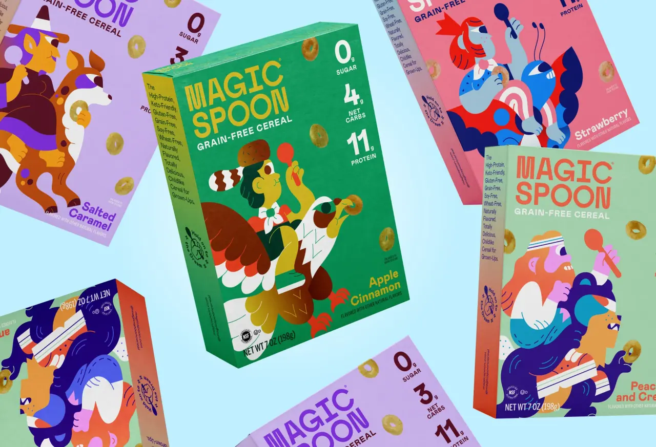
Magic Spoon
saturday cartoon cereal for grown-ups

Partake
one saturated carton per cookie flavour
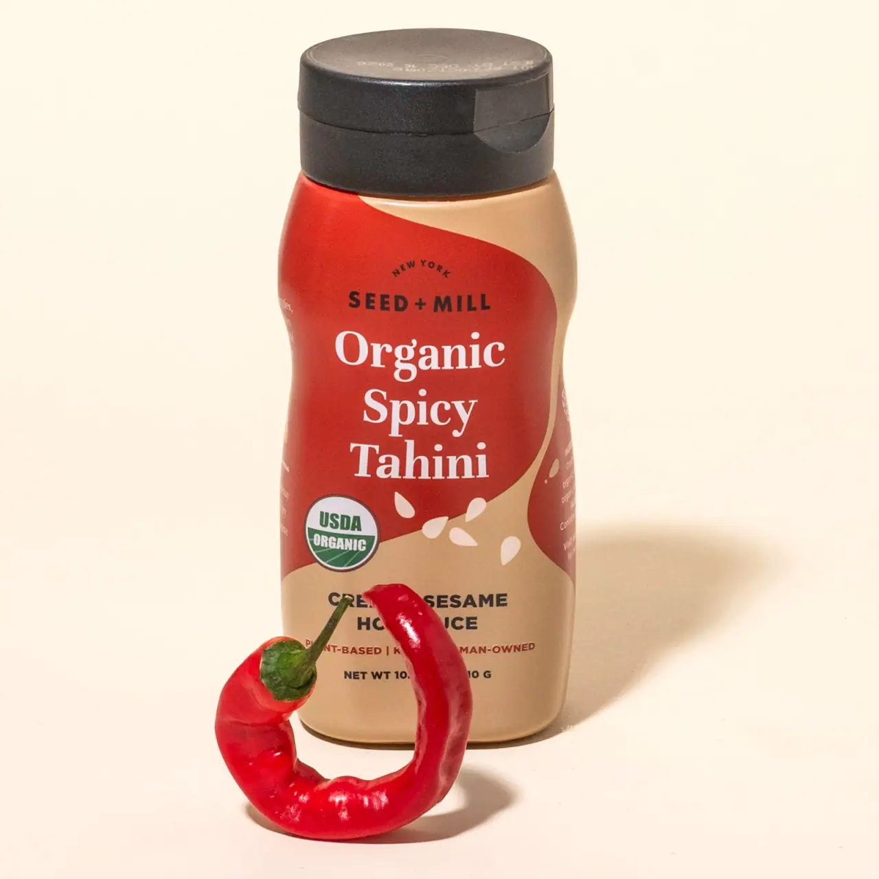
Seed + Mill
Cream serif lettering inside a flowing red tahini field
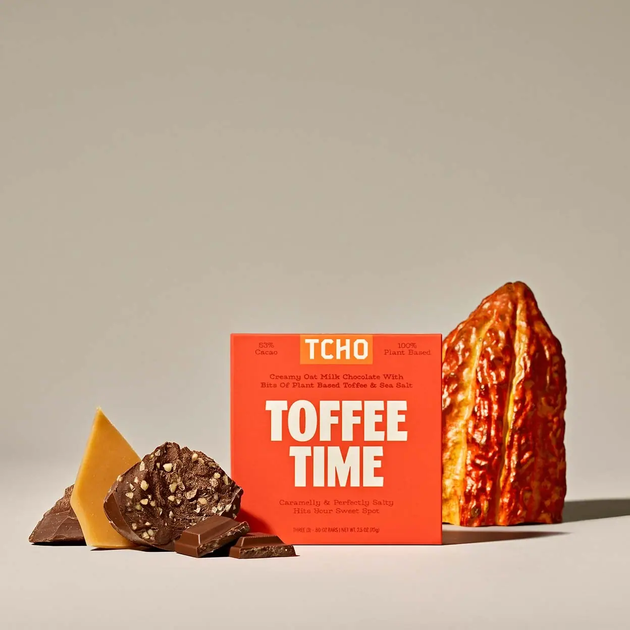
TCHO
Giant cream flavour lettering on a hot orange-red square

Tony's Chocolonely
circus-poster slab letters on a yellow wrapper

ACURE
Iridescent spectacle with practical, tightly ordered type

Bask
sunny yellow with a playful turquoise signature