Photography: Oribe official photography. Images belong to their respective owners.
Oribe

Pale gold column with a clear sculpted glass base
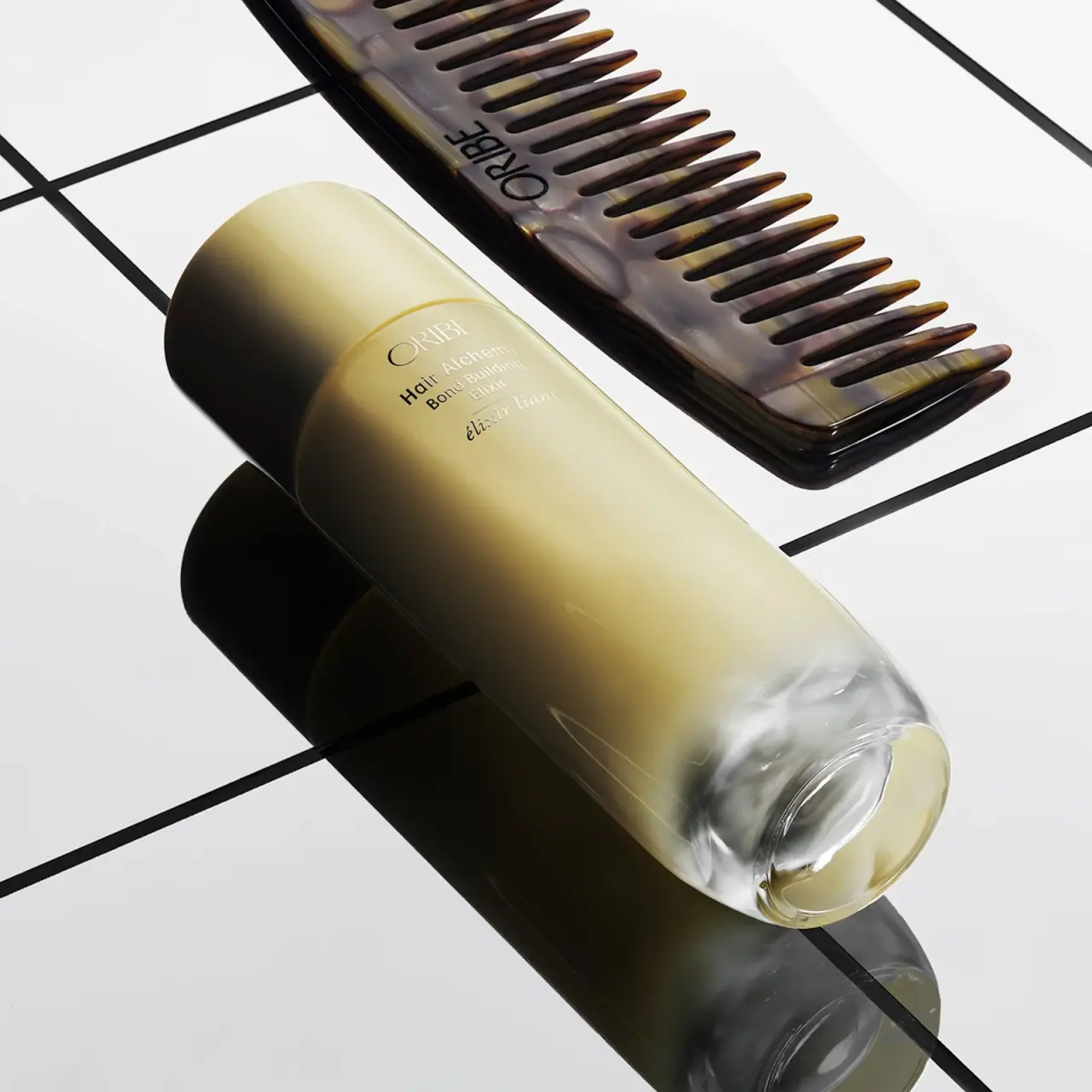
Hair Alchemy Bond Building Elixir presents a long pale gold-toned bottle with a matching broad cap and a distinct clear lower section. A tiny centered cluster of refined producer lettering, mixed-case product naming and an italic French line sits just below the cap seam, leaving most of the body visually open. The selected official photograph places the bottle diagonally beside a tortoiseshell-looking comb on a white grid. Oribe confirms the bottle is glass; the cap material, surface-color process and exact internal dispensing construction remain unverified. The comb is a separate styling prop, not a demonstrated included accessory.
- Hair
- Light pack
- Luxe monochrome
- Clinical minimal
About this study
Selected official closed Hair Alchemy Bond Building Elixir bottle with separate comb prop; current listing provides glass and pump-use context.
Sources & evidence · Reviewed 2026-10-19Color Palette
Approximate colours interpreted from photography. These are screen references, not official brand colours or print specifications.
Pack body
Pale alchemy gold
#D2CB9D
Main body and cap appearance; approximate under strong directional light. It is not proof of a metallic coating or exact formula color.
Ink
Reflective lettering midtone
#8C866D
Front lettering shifts from dark to pale across the image. This captures its reflective-looking behavior rather than asserting separate black and white inks.
Accent
Clear base highlight
#E1E2D7
Representative light reflected and refracted through the lower glass section; not opaque white base material.
Typography
Suggested visual alternatives, not confirmed brand typefaces. Any scale below is an illustrative estimate.
The small ORIBE line leads the compact upper-front cluster. Hair Alchemy follows, then Bond Building Elixir over short lines. A fine separator and italic French descriptor finish the cluster. Scale and type changes do the organizing; no large icon or oversized claim is visible on this selected face.
Fonts
Original producer identity
Bodoni Moda
- Looks like
- Refined high-contrast serif capitals
- Type
- Serif
- Weight
- Regular 400
- Case
- Uppercase
- Tracking
- Slightly open, with optical spacing around broad round letters.
- Fallback
- Georgia, serif
A restrained original producer name at the top of the cluster. Avoid reproducing Oribe’s distinctive wordmark and proof the fine strokes against the actual reflective surface.
English family and treatment
DM Sans
- Looks like
- Compact clean sans-serif
- Type
- Geometric sans-serif
- Weight
- Regular 400 / Medium 500
- Case
- Title case
- Tracking
- Neutral, with short line lengths and modest line spacing.
- Fallback
- Arial, sans-serif
Separate family from exact treatment with line breaks rather than decorative badges. Keep Bond Building Elixir-equivalent fictional wording legible at actual bottle scale.
Secondary-language descriptor
Lora
- Looks like
- Gentle italic serif
- Type
- Serif
- Weight
- Regular 400 Italic
- Case
- Lowercase or sentence case
- Tracking
- Natural italic spacing; no exaggerated tracking.
- Fallback
- Georgia, serif
A short secondary-language line beneath a fine separator. Use a real translation for a new product rather than decorative foreign-language filler.
Structure & Proportions
Visual proportions and finish previews are illustrative. Confirmed construction details and uncertainties are distinguished in the study notes.
Proportions
| Purpose | Value | Preview |
|---|---|---|
| Long quiet body | The printed cluster occupies a small upper area, leaving most of the elongated face free of copy. This is a compositional observation, not a measured coverage percentage. | — |
| Cap continuity | Cap and body are close in width, so the seam rather than a strong shoulder step marks the transition. | — |
| Clear lower zone | The transparent-looking base is substantial enough to interrupt the pale body color and reveal the vessel’s depth in the diagonal photograph. | — |
Shapes
| Element | Value | Preview |
|---|---|---|
| Continuous column | Long rounded bottle with a broad cap and restrained seam; no sharp rectangular front corners. | |
| Clear sculpted base | Curved lower glass refracts the background and creates an oval-looking footprint in perspective. | |
| Upper copy cluster | Small centered group of short lines, visually isolated within a much larger uninterrupted field. |
Finishes
Soft pale-gold surface
Upper bottle and cap appearance; treatment unverified · matte
Clear reflective glass
Lower bottle section · transparent
Reflective-looking fine lettering
Upper front; decoration process unspecified · metallic
Formats and materials
| Formats | Elongated closed bottle with a broad rounded cap, nearly continuous side profile and clearer-looking sculpted lower section., The official product page lists a standard 3.4 oz size; no quantity is readable in this selected view, so the size is source context rather than a photographed-label transcription. |
| Materials | Oribe explicitly identifies this product’s bottle as glass. The selected image shows a clear lower glass section and a pale gold-toned upper appearance, but the color application and wall construction are not specified., The cap material is unverified. Oribe’s general statement about FSC-certified paper packaging does not identify the bottle’s decoration method or establish that a paper label is visible here. |
| Closures | The matching pale cap is fitted over the dispensing area and meets the body at a fine seam. An official-page professional tip refers to using pumps, providing evidence of pump dispensing for the listed product; the selected image does not expose the actuator, stem, collar or removal mechanism. |
| Decoration | Compact centered producer and bilingual product information near the upper front., A delicate dividing rule separates the English naming from the italic French line., Reflective-looking text can appear dark or light depending on angle; foil, metal ink or other application process is unconfirmed. |
Front Panel
Schematic reading order. The diagram’s zone heights do not represent measured artwork proportions.
Anchor a small readable information cluster high on the body, close enough to the cap seam to create a coherent top section. Keep the lower body quiet so the pale-to-clear transition remains a main feature. The English and French treatments differ typographically while staying on the same center axis.
| Zone | Content |
|---|---|
| Cap and seam | Broad pale cover with rounded top and fine division at the body; no visible cap typography. |
| Producer | ORIBE in fine capitals above the smaller product wording. |
| English identity | Hair Alchemy, followed by Bond Building Elixir across short lines. |
| French descriptor | Italic élixir liant below a fine rule, providing a distinct yet subordinate language treatment. |
| Lower body | Large open pale surface transitioning into a clear glass base; no reliably readable amount in this view. |
Range System
The product belongs to Hair Alchemy, and the official page recommends companion shampoo and conditioner. That establishes a named routine context without proving all products share this exact bottle, glass material or color treatment. For an original system, keep family and specific treatment distinct within the small copy cluster.
- Preserve a stable family-name position while changing the treatment name and actual container function.
- Do not transfer this bottle’s confirmed glass material to every Hair Alchemy format.
- Use a separate explicit amount field when documenting another size, rather than treating a similar silhouette as proof of capacity.
Back of Pack & Shelf
The reverse and bottom markings are hidden or unreadable. The diagonal view reveals the lower glass optics but not a complete underside label, ingredient panel or dispensing assembly.
- For an original treatment bottle, reserve a practical rear or base area for ingredients, amount and traceability.
- Treat the brand’s glass-recyclability statement as bottle-specific; verify cap and pump handling separately.
- Do not apply the general paper-certification statement to the glass decoration or infer an unseen carton specification.
On shelf
The package’s quiet luxury impression comes from its long uninterrupted surface, closely matched cap and body, and visible glass base rather than a large front logo. The small reflective-looking text can lose contrast in bright glare, so an adaptation should be proofed at real scale and multiple angles. The nearby comb improves category recognition in this image; the bottle should still identify itself clearly when shown alone. These are design interpretations rather than measured retail outcomes.
Imagery
The official image arranges the bottle diagonally against a white surface crossed by black grid lines, with a large tortoiseshell-looking Oribe comb nearby. Strong directional light casts dark shadows and exposes the clear base’s optical depth. The comb adds a hair-routine cue and warm contrast, but neither its material nor inclusion with the elixir is established. The grid and dark comb should not become extra package colors. A useful crop retains the whole cap, small upper label and clear lower section.
Guidelines
Editorial principles for an original design brief, not official brand guidelines.
Do
- Keep family, exact treatment and secondary-language descriptor distinct within the small label cluster.
- Use lighting that reveals both the pale surface and the clear glass base.
- Carry confirmed glass information only to this product’s bottle, with cap and pump details separately qualified.
- Show the bottle alone as well as with a comb so category identification does not depend on an accessory.
Don't
- Do not call the entire package glass when only the bottle is confirmed.
- Do not assume the pale-gold appearance is metallic coating or the true color of the formula.
- Do not identify the comb as included or made of genuine tortoiseshell.
- Do not apply the FSC paper statement to an unverified bottle label or printing method.
Sources & evidence
How this study was built
structure · Sourced fact
Official FAQ identifies glass bottle; professional tip refers to pump dispensing.Oribe — Hair Alchemy Bond Building Elixirpalette · Visual observation
Pale gold upper surface, clear lower zone and reflective-looking text; comb/grid excluded.typography · Visual observation
Fine producer capitals, plain mixed-case English and italic French line.label · Visual observation
Small centered upper cluster leaves most of body open.imagery · Visual observation
Separate comb, diagonal pose and black grid frame the bottle without proving an included set.edition · Sourced fact
Page lists standard 3.4 oz; quantity not read from selected photo.Oribe — Hair Alchemy Bond Building Elixirrange · Sourced fact
Companion Hair Alchemy products are named; their materials and shapes not generalized.Oribe — Hair Alchemy Bond Building Elixir
What remains unverified
- Cap material, color process and decoration method unverified.
- Actual actuator hidden despite source reference to pumps.
- No readable amount, reverse or base markings in selected view.
- Original fonts unknown; colors/proportions approximate.
Give your AI
packaging taste
Give your design or image tool a packaging study: palette, type, structure, front panel and principles for an original brief.
Export this styleFree with an email. PACK.md works in Claude, ChatGPT, Cursor and image tools.
More like this

African Botanics
Technical black label with a low serif signature

bareMinerals
a restrained black compact framing the powder itself

BeautyPWR
Clear square shell, white cream cup, black serif identity

Corpus
sage gloss with whispered gold lettering

Costa Brazil
Pale matching vessels with small, deliberate bilingual labels

Crown Affair
Pale frosted-looking bottle, black pump and small looping emblem

HAKU
Pearly narrow tube with stacked serif identity and clear base

Haus Labs
mirror chrome hardware over frosted shade