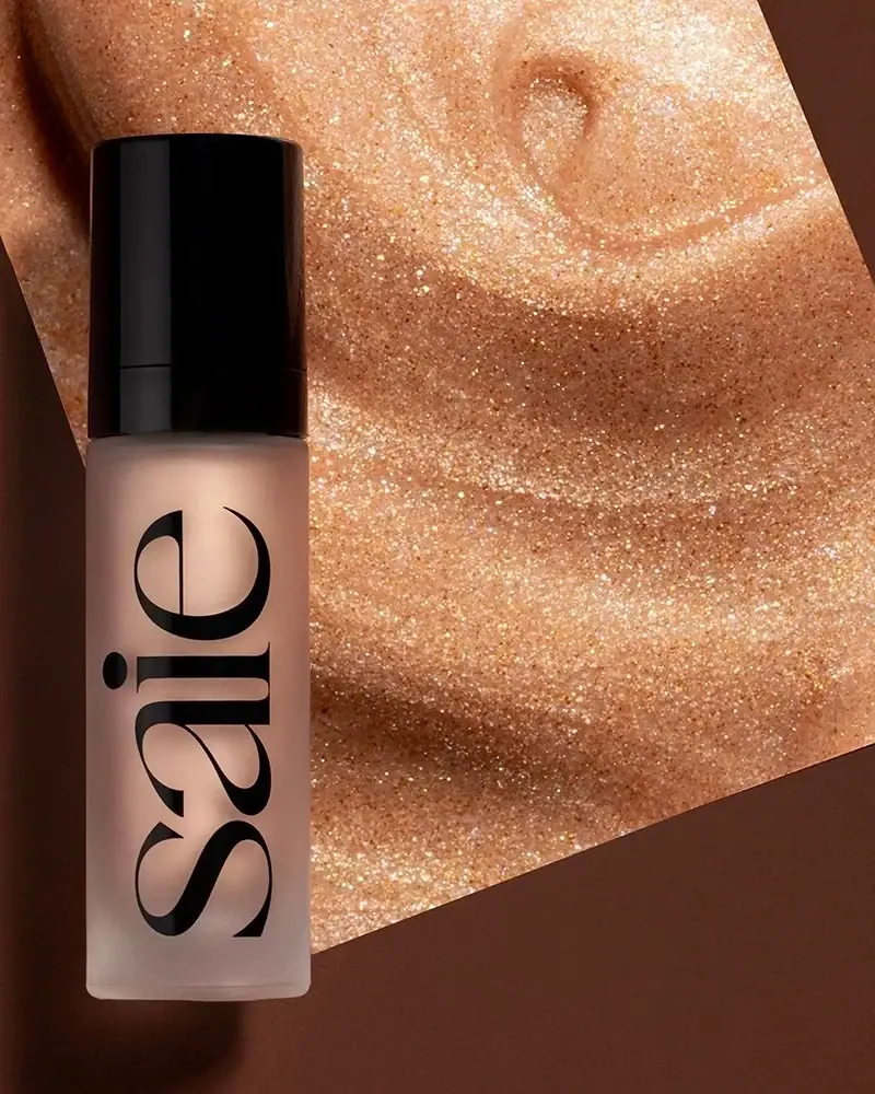
Glow Sculpt™

Photography: saiehello.com. All imagery belongs to its respective owner.
What makes the design work
Saie brand studyVisual observations across the brand’s packaging. Individual formats and editions may vary.
Giant wordmark
Lowercase heavy soft serif rotated to read bottom to top, about 85% of body height and 70% of face width, in Wordmark Black.
Frosted wall
Frosted translucent body that diffuses the product shade behind the black type.
Black overcap
Tall glossy Lacquer Black cap, about 35% of closed height, identical on every liquid.
Reading the label
No label: a single black print of the rotated wordmark runs centred along the height of the frosted container, with secondary text moved to the back.
- Front face
- Vertical lowercase wordmark spanning almost the full body height
- Cap
- Plain glossy black overcap, no text
- Back or side
- Product name, shade, volume and legal text in small sans
Typography & hierarchy
The wordmark dominates every liquid product, set lowercase and rotated 90 degrees so it reads bottom to top and fills nearly the whole face. Everything else (product name, descriptor, volume) is tiny sans text on the back or the side, and on compacts the wordmark shrinks to a debossed centre mark on the lid.
Display
Recoleta Black, GT Super Display Bold
Heavy high-contrast display serif with ball terminals
Lowercase · Regular (heavy by design)
Label
Akzidenz-Grotesk Condensed, Helvetica Condensed
Condensed grotesque
Uppercase · Medium
Body
Helvetica, Inter
Small neutral sans
Uppercase for descriptors, sentence case for copy · Regular, Medium
Typeface suggestions based on visual similarity. These are not verified font identifications.
How the range holds together
The product's own colour behind frosted or clear walls is the only variable; black caps, black wordmark and its vertical placement are identical on every liquid, and powders and liners become fully black components.
Shelf presence
On a counter or a product grid the range reads as a row of soft-coloured columns crossed by the same giant black word, so the shelf billboards the name while the shades stay readable.
Related packaging
More curated references in skincare, matched by format and visual style.



Featured from Saie
The selected packaging reference for this brand.