


Saie

giant lowercase wordmark over frosted shade
Saie builds its system on one oversized device: the lowercase wordmark set in a chunky high-contrast serif, rotated to run vertically up almost the full height of every bottle and tube in black (#1a1719). The containers are frosted or clear so the product's own shade (blush pink, bronze, gloss coral, pearl highlighter, skin tones) becomes the pack colour, and every one is capped in the same tall glossy black overcap. Powders and liners switch to solid black compacts and pencils with the wordmark debossed or printed small, so the whole range reads as shade colour plus black. Everything else (product name, shade, volume) is tiny sans on the back.
- Make-up
- Light pack
- Bold typographic
- Luxe monochrome
- Colour-coded range
Color Palette
Approximate colours interpreted from photography. These are screen references, not official brand colours or print specifications.
Pack body
Lacquer Black
#141215
Glossy overcaps, compact cases and liner pencil barrels across the whole range
Frost Clear
#ece9e7
Frosted translucent bottle walls that diffuse the product colour behind the type
Label
Carton White
#f5f3f1
Plain white outer carton carrying the same black wordmark
Ink
Wordmark Black
#1a1719
Giant vertical wordmark and small descriptors printed on frosted bottles
Range coding
Dew Blush Pink
#d7928f
Liquid blush showing through the frosted bottle
Bronze Glow
#9a7a63
Liquid bronzer showing through the bottle
Gloss Coral
#ec6f66
Lip gloss in a clear tube, the brightest note in the range
Skin Tint Sand
#d8b48c
Tinted moisturiser and concealer shades through frosted walls
Pearl Highlight
#e9e1d9
Pearlescent highlighter gel, nearly white behind black type
Powder Rose
#c08a72
Baked powder shade visible in the open black compact pan
Typography
Suggested visual alternatives, not confirmed brand typefaces. Any scale below is an illustrative estimate.
The wordmark dominates every liquid product, set lowercase and rotated 90 degrees so it reads bottom to top and fills nearly the whole face. Everything else (product name, descriptor, volume) is tiny sans text on the back or the side, and on compacts the wordmark shrinks to a debossed centre mark on the lid.
Type scale
Estimated cap size as a share of the panel · Front of the 15 ml frosted bottle body, cap excluded, about 70 mm tall
bottle-wordmark
22% · Regular · Display
lune
tube-wordmark
16% · Regular · Display
lune
compact-deboss
6% · Regular · Display
lune
pencil-name
2.4% · Medium · Label
LIP LINER 101
back-product
2% · Medium · Body
DEWY LIQUID BLUSH
shade
1.6% · Regular · Body
SHADE · SOFT ROSE
Fonts
Display
DM Serif Display
- Looks like
- Recoleta Black, GT Super Display Bold
- Type
- Heavy high-contrast display serif with ball terminals
- Weight
- Regular (heavy by design)
- Case
- Lowercase
- Tracking
- Tight, about -3%
- Fallback
- Didot Bold, Georgia Bold
The wordmark, rotated vertically on every bottle and tube and debossed tone on tone on compact lids; always black.
Label
Archivo Narrow
- Looks like
- Akzidenz-Grotesk Condensed, Helvetica Condensed
- Type
- Condensed grotesque
- Weight
- Medium
- Case
- Uppercase
- Tracking
- Wide, about +8%
- Fallback
- Arial Narrow, sans-serif
Product name set small and vertically on liner pencils, and shade names on base stickers.
Body
Inter
- Looks like
- Helvetica, Inter
- Type
- Small neutral sans
- Weight
- Regular, Medium
- Case
- Uppercase for descriptors, sentence case for copy
- Tracking
- Slightly open, about +3%
- Fallback
- Helvetica, Arial, sans-serif
Format and shade descriptors, volume, ingredients and legal, kept off the front face.
Structure & Proportions
Proportions
| Purpose | Value | Preview |
|---|---|---|
| Wordmark length | About 85% of the bottle body height, rotated | |
| Wordmark x-height | About 70% of the bottle face width | |
| Cap height | About 35% of total closed height on bottles | |
| Print coverage | About 30% of the front face is black ink | |
| Colours per pack | Two: black plus the product shade seen through the wall | — |
| Density | One huge word and nothing else on the front | — |
Shapes
| Element | Value | Preview |
|---|---|---|
| Bottle | Slim straight cylinder with tall black overcap | |
| Gloss and concealer | Slim tube with wand and black cap | |
| Compact | Round black case with flat lid | |
| Liner | Thin black pencil | |
| Wordmark | Vertical line of type, no frame |
Finishes
Frosted translucent plastic
Liquid bottles and tubes · frosted
Clear plastic
Gloss tube · transparent
Glossy black
Caps, compacts and pencils · gloss
Tonal deboss
Compact lid wordmark · emboss
Formats and materials
| Formats | Pump bottle, Lip gloss tube with wand, Concealer tube with doe-foot, Round powder compact, Liner pencil, Squeeze tube, Glass jar |
| Materials | Frosted plastic, Clear plastic, Glass, Black plastic |
| Closures | Tall glossy black overcaps on bottles and wand tubes, flat black hinged compact lids, black pencil cap |
| Decoration | Direct screen print in black, Rotated vertical wordmark, Debossed wordmark on compact lid |
Front Panel
Schematic reading order. The diagram’s zone heights do not represent measured artwork proportions.
No label: a single black print of the rotated wordmark runs centred along the height of the frosted container, with secondary text moved to the back.
| Zone | Content |
|---|---|
| Front face | Vertical lowercase wordmark spanning almost the full body height |
| Cap | Plain glossy black overcap, no text |
| Back or side | Product name, shade, volume and legal text in small sans |
Range System
The product's own colour behind frosted or clear walls is the only variable; black caps, black wordmark and its vertical placement are identical on every liquid, and powders and liners become fully black components.
- Liquid blush = pink fluid behind frost
- Liquid bronzer = bronze fluid
- Gloss = coral gloss in clear tube
- Highlighter = pearl gel
- Concealer and tint = skin shades behind frost
- Powder blush and eyeshadow = black compact with debossed mark
Back of Pack & Shelf
The back of each bottle carries a small black print block read through the frosted wall: product name, shade, short use line and volume; the white carton holds the full ingredient list, legal, recycling and barcode.
- Product name and shade in small capitals
- Short how-to-use line
- Full INCI ingredient list on the carton
- PAO symbol, batch code and volume
- Recycling note and barcode on the carton
On shelf
On a counter or a product grid the range reads as a row of soft-coloured columns crossed by the same giant black word, so the shelf billboards the name while the shades stay readable.
Imagery
None. Typography and the visible product colour are the entire decoration.
Guidelines
Do
- Set the wordmark lowercase in a heavy soft Display serif and rotate it to run up about 85% of the bottle height.
- Use frosted or clear walls (#ece9e7) so the formula's own shade becomes the pack colour.
- Cap every liquid in the same tall glossy black (#141215) overcap, about 35% of closed height.
- Print in black (#1a1719) only on the front; move product names and volumes to the back.
- Turn powders and pencils into fully black components with a small debossed or printed mark.
- Keep the wordmark size and position identical on every liquid.
Don't
- Don't tint the plastic itself; colour must come from the product inside.
- Don't set the wordmark horizontally or in capitals on liquids.
- Don't add illustrations, patterns or claim badges to the front.
- Don't introduce gold, silver or coloured caps.
- Don't crowd the face with a second line of large type.
- Don't use a sans-serif for the wordmark.
Give your AI
packaging taste
Give your design or image tool a packaging study: palette, type, structure, front panel and principles for an original brief.
Export this styleFree with an email. PACK.md works in Claude, ChatGPT, Cursor and image tools.
More like this

AKT
Lilac stage directions with a quiet metallic detail

al.ive body
warm architectural calm, built as a paired vanity object
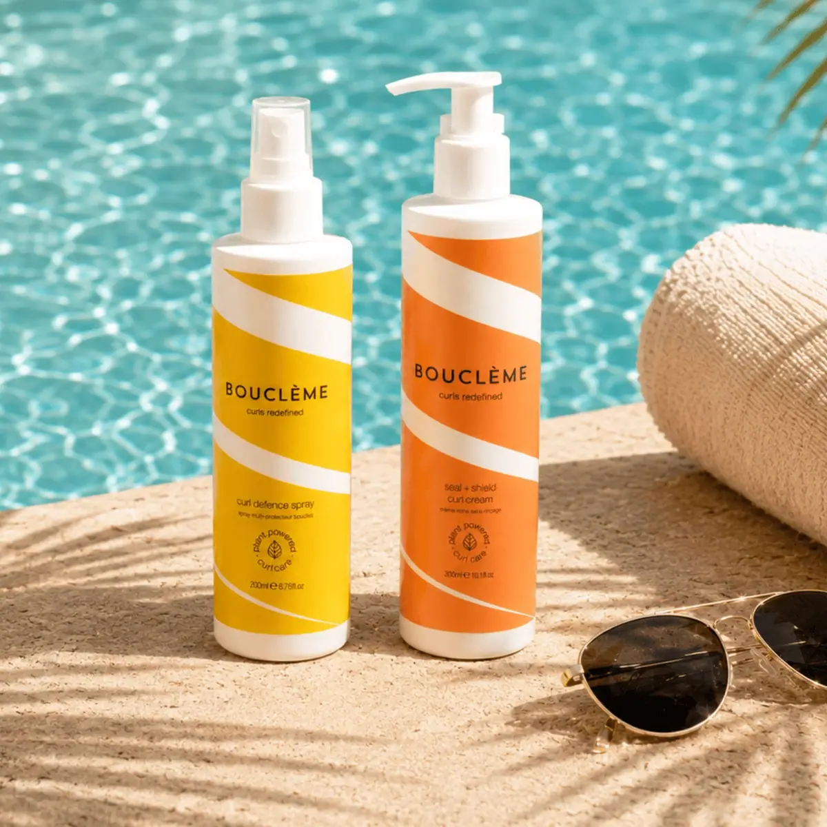
Bouclème
warm colour blocks crossed by flowing white ribbons
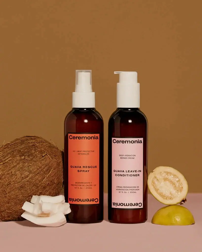
Ceremonia
Warm colour labels bounded by upright and inverted wordmarks

Color Wow
Tall condensed naming on a broad reflective silver jar
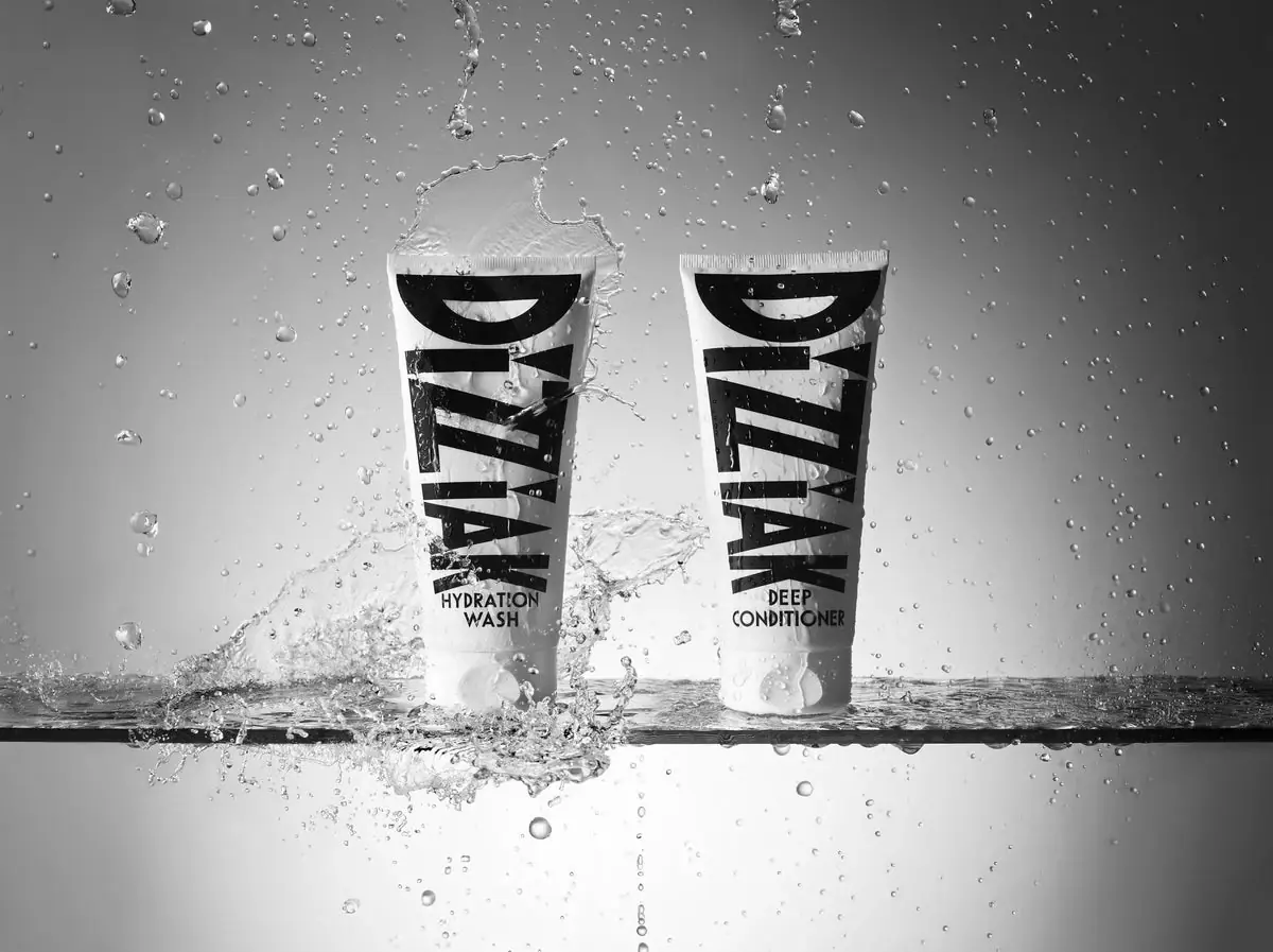
DIZZIAK
Oversized black lettering unites two pale haircare tubes

Dr. Bronner’s
A bright soap wrapper with a densely ordered voice

EADEM
Mirror-bright tube, oversized black identity, juicy campaign color