About this packaging
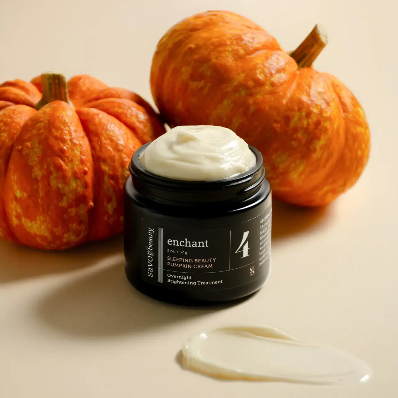
Savor Beauty’s seasonal Black Label Sleeping Beauty Pumpkin Cream is shown in a broad black jar with the cream exposed. A large numeral 4 and fine dividing rules organize its dense, compact front label.
Savor Beauty identifies Sleeping Beauty Pumpkin Cream as a seasonal Black Label night cream and overnight mask.[1]
Pack construction & use
- Jar
- The selected cover shows an open, wide screw-top jar with cream visible; its label reads 2 oz / 57 g.Observed in the reference photograph
- Front label
- A large numeral 4 is separated by a vertical rule from the product name; treatment copy is smaller, and the Savor Beauty name runs vertically at the edge.Observed in the reference photograph
What makes the design work
Editorial analysis of this packaging reference.
A sourced routine step becomes the largest numeral
The official product instructions identify this cream as Step 4, supporting the meaning of the large photographed numeral. A fine vertical divider separates it from the lowercase enchant name and compact product details, while the maker runs vertically along the label's left edge.[1]
Dense copy, clear zones
The jar’s compact face carries brand, product, and treatment descriptors, but the thin rules and alignment divide them into discrete reading zones. This offers a practical model for fitting routine information onto a small curved surface.
Dark field with seasonal context
White typography remains legible against the black label, while the photographed pumpkins and warm neutral ground introduce seasonal color outside the pack. The contrast preserves a consistent dark identity without requiring seasonal graphics on the front label.
Ideas for your next brief
- Use a large numeral as a quick routine or range cue, then separate it clearly from the product name.
- Keep seasonal cues in the campaign imagery when the core package identity needs to remain stable.
Sources & further reading
Researched 19 October 2026