Photography: Savor Beauty official photography. Images belong to their respective owners.
Savor Beauty

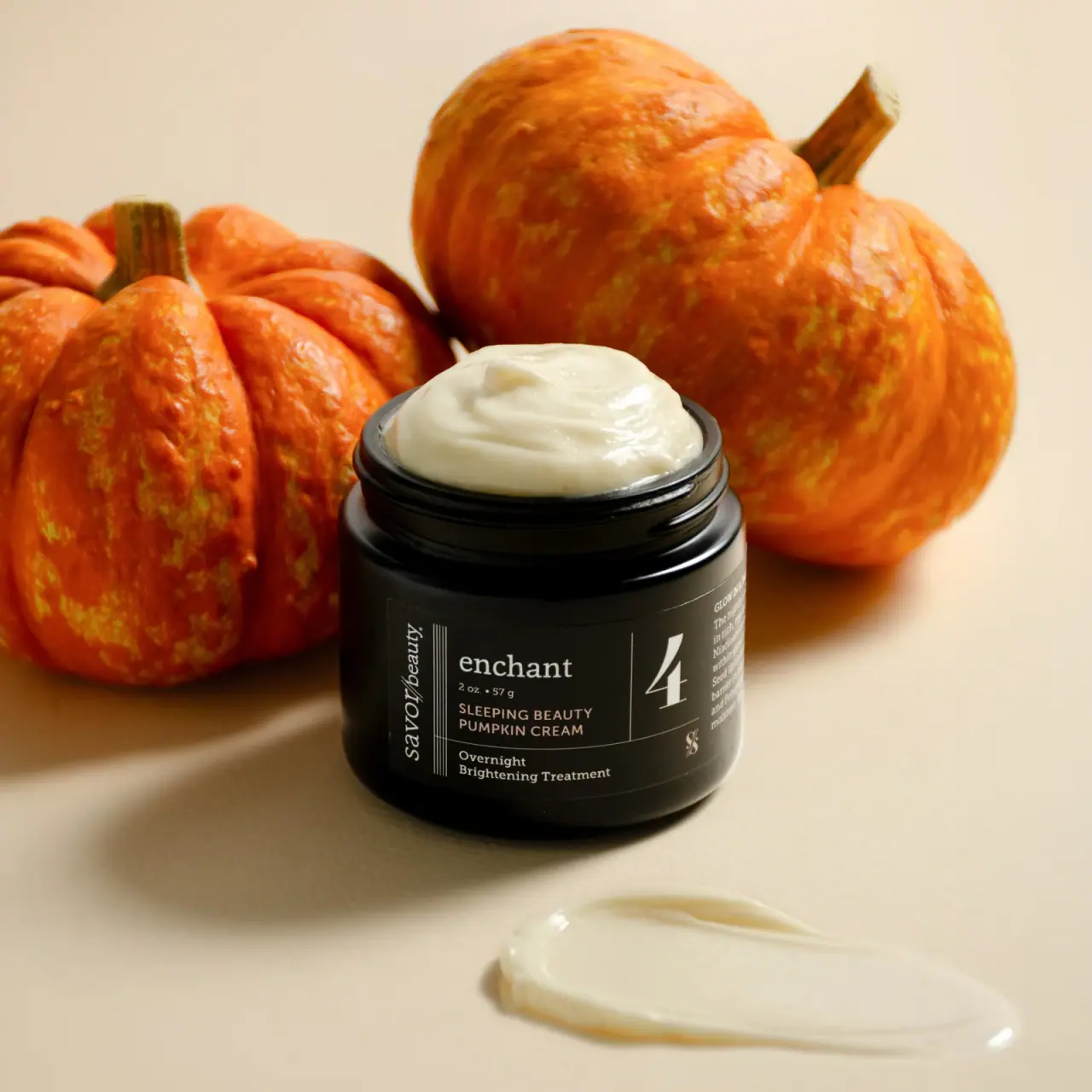
Black ruled jar label with vertical maker and routine numeral
The selected seasonal Sleeping Beauty Pumpkin Cream uses a broad dark jar and a carefully divided black label. A vertical maker at the left, lowercase enchant title, compact product lines and large fine-stroke 4 create several reading zones on a short curved face. The source identifies the numeral as the product's routine step. Pale cream is exposed above the open threaded neck, while orange pumpkins and a cream smear supply seasonal context outside the packaging.
- Skincare
- Dark pack
- Apothecary
- Luxe monochrome
About this study
Selected seasonal Black Label Enchant Sleeping Beauty Pumpkin Cream, open jar with visible 2 oz / 57 g label. Step 4 meaning is confirmed by current official instructions.
Sources & evidence · Reviewed 2026-10-19Color Palette
Approximate colours interpreted from photography. These are screen references, not official brand colours or print specifications.
Pack body
Deep black jar
#141510
Approximate dark vessel appearance with glossy rim highlights; material and tint are not verified.
Label
Soft charcoal label
#292A22
Slightly lighter low-glare field separates the printed information from the shiny neck and shoulders.
Ink
Warm ivory lettering
#D9D7BF
Maker, enchant title, numeral, rules and supporting copy read as pale warm contrast under the scene lighting.
Muted pale peach title
#C8AE97
Compact uppercase product name appears slightly warmer than surrounding text; exact ink color is not established.
Accent
Pale cream contents
#EBE5C8
Visible product above the rim and in the foreground smear; orange pumpkin color belongs to props rather than the jar.
Typography
Suggested visual alternatives, not confirmed brand typefaces. Any scale below is an illustrative estimate.
A large elegant serif 4 occupies its own narrow right-hand zone. To the left, enchant is a lowercase serif heading above a small quantity and a two-line uppercase sans product name. Below a horizontal rule, the treatment descriptor returns to a small serif. At the far left, savor/beauty runs vertically in an italic-like serif style. The system gains richness from orientation and typographic contrast, while thin rules prevent the different voices from becoming one dense block.
Fonts
Identity and routine numeral
Cormorant Garamond
- Looks like
- Elegant readable serif with italic
- Type
- Serif
- Weight
- Regular, Medium, Italic
- Case
- Lowercase name; large numeral
- Tracking
- Natural optical spacing
- Fallback
- Georgia, serif
Use for an original short title and a clearly separated routine number. A vertical maker can work on a short jar, but its reading direction and physical print size need deliberate testing.
Product and quantity details
DM Sans
- Looks like
- Compact neutral sans
- Type
- Grotesque sans-serif
- Weight
- Regular, Medium
- Case
- Uppercase product; mixed-case units
- Tracking
- Slightly open product name
- Fallback
- Arial, sans-serif
Keep product identity concise and grouped beneath the larger title. Preserve a clear distinction between quantity, product name and treatment wording instead of giving all three equal weight.
Structure & Proportions
Visual proportions and finish previews are illustrative. Confirmed construction details and uncertainties are distinguished in the study notes.
Proportions
| Purpose | Value | Preview |
|---|---|---|
| Wide short reading face | The jar's broad front supports several side-by-side zones rather than a single tall centered stack. | — |
| Narrow maker rail | The vertically oriented maker occupies a slim left strip, preserving more horizontal room for product information. | — |
| Number cell | A single fine rule reserves a distinct area for the large 4, giving the routine cue prominence without putting it above the title. | — |
| Lower descriptor strip | A horizontal rule creates a shallow lower band for two treatment lines beneath the main title and product name. | — |
Shapes
| Element | Value | Preview |
|---|---|---|
| Jar | Broad cylinder with rounded shoulder, wide opening and visible external neck threads. | |
| Threaded neck | Several dark circular thread ridges remain exposed because the lid is removed. | |
| Label grid | Fine vertical and horizontal rules divide a curved rectangular wrap into distinct text zones. | |
| Routine numeral | Large fine-stroke 4 occupies a narrow independent panel beside the product title. |
Finishes
Reflective dark vessel
Neck and shoulder catch bright highlights; material remains unspecified. · gloss
Low-glare label appearance
Dark wrap carries fine pale rules and copy with softer reflection than the neck. · matte
Formats and materials
| Formats | Open wide-mouth cream jar; photographed label reads 2 oz / 57 g |
| Materials | The jar appears dark and opaque in this lighting, with a glossy neck and rounded lower edge. The accessed product page does not identify glass, plastic, specific resin or recycled content, so a material is not assigned from appearance., A dark wrap label is visibly distinct from the vessel near its edge. Label stock, adhesive, ink system and coating are not specified. The exposed pale cream is product content, not an insert or white inner container. |
| Closures | External threads are clearly visible around the open neck, supporting a screw-top format. The lid is absent from the selected scene, so its profile, finish, liner and material remain unknown. The cream is styled into a raised mound above the rim; that presentation does not establish shipping fill height or the amount normally exposed when first opened. |
| Decoration | Vertical maker along left edge, Multiple fine vertical rules beside maker, Lowercase enchant heading, Large routine numeral in separate cell, Horizontal rule above treatment descriptor |
Front Panel
Schematic reading order. The diagram’s zone heights do not represent measured artwork proportions.
The front behaves like a small editorial grid wrapped around a jar. A vertical brand rail is followed by a larger title-and-product block, then the routine number and a partially visible side paragraph. A thin horizontal line separates the lower treatment description. The design makes dense information manageable through zones rather than by removing all detail. Because the surface curves, the rightmost paragraph becomes less readable and should not be reconstructed beyond what the image resolves.
| Zone | Content |
|---|---|
| Left maker rail | savor/beauty runs from bottom to top in a vertical italic-like serif treatment, beside several fine parallel rules. |
| Main heading | Lowercase enchant sits above the small 2 oz / 57 g quantity. |
| Product name | Sleeping Beauty Pumpkin Cream appears in two compact uppercase sans lines beneath the title. |
| Routine cell | Large 4 is separated by a fine vertical line; the official instructions identify Step 4. |
| Lower treatment strip | Two small serif lines describe an overnight brightening treatment below a horizontal rule; a small emblem sits toward the numeral side. |
| Curved side paragraph | Additional fine copy continues around the right side, only partially legible in the selected view. |
Range System
The current official page identifies this as a seasonal Black Label return and places it at Step 4 in the brand's routine. That supports the numeral's navigational role, but does not establish every other number or label configuration across the range. An original routine family could keep a stable number cell and vary product names within the adjoining grid. Seasonal context can be supplied through campaign imagery while retaining a restrained dark package.
- Use a verified routine position as a large separate cue, not an unexplained decorative number.
- Keep the product title and quantity together while reserving a distinct rail for the maker.
- Document seasonal edition and formula context without assuming every returning release has identical packaging.
Back of Pack & Shelf
The reverse, underside and lid are unseen. The front's partly visible side paragraph does not provide a complete ingredient or direction panel.
- Inspect the full wrap before describing its complete copy sequence.
- Verify lid and vessel materials independently.
- Do not infer shipping fill or closure liner from the styled cream mound.
On shelf
Interpretively, the large 4 and pale enchant heading are the strongest close-to-medium-distance anchors, while the vertical maker rewards a closer view. Fine rules allow several text styles to coexist, but small reverse-out copy needs a high-resolution front photograph to remain useful online. A closed view would add important information about recognition during storage. The transferable principle is disciplined zoning on a short curved surface, backed by a number with a documented meaning.
Imagery
Two orange pumpkins fill the background, with the open black jar in front and a broad smear of pale cream on the warm neutral surface. The soft organic pumpkin shapes contrast with the ruled label and circular jar. The cream mound and smear show texture at two scales, while the black vessel stays visually distinct from the warm setting. The pumpkins supply seasonal context; their orange does not become a package color, and the image does not quantify any ingredient concentration.
Guidelines
Editorial principles for an original design brief, not official brand guidelines.
Do
- Verify the meaning of a routine number.
- Use rules to separate dense information.
- Distinguish title, product name and treatment descriptor.
- Keep seasonal scene color separate from packaging.
- Record the selected edition's actual quantity.
Don't
- Do not assume a dark jar is glass.
- Do not invent a missing lid design.
- Do not treat styled overflow as shipping fill.
- Do not assign ingredient concentration from props.
- Do not copy the vertical maker and numbered grid exactly.
Sources & evidence
How this study was built
edition · Sourced fact
Official page identifies seasonal Black Label night cream/overnight mask and includes the selected image.Savor Beauty — Sleeping Beauty Pumpkin Creamrange · Sourced fact
Instructions identify Step 4, establishing the large numeral's routine meaning.Savor Beauty — Sleeping Beauty Pumpkin Creamstructure · Visual observation
Open wide dark jar exposes neck threads and pale cream; lid is absent.typography · Visual observation
Vertical italic-like maker, lowercase serif heading, uppercase product name and large serif numeral create distinct roles.label · Visual observation
Fine vertical and horizontal rules divide the short wrap into multiple reading zones.palette · Visual observation
Dark vessel and label contrast with pale text and cream; orange belongs to pumpkins.imagery · Visual observation
Pumpkins, raised cream mound and foreground smear create seasonal texture context outside the label.
What remains unverified
- Jar, lid and label materials unspecified.
- Lid, underside and complete reverse unseen.
- Original fonts, exact ink colors and print processes unverified.
- Styled cream mound and pumpkins are not fill-level or concentration evidence.
Give your AI
packaging taste
Give your design or image tool a packaging study: palette, type, structure, front panel and principles for an original brief.
Export this styleFree with an email. PACK.md works in Claude, ChatGPT, Cursor and image tools.
More like this
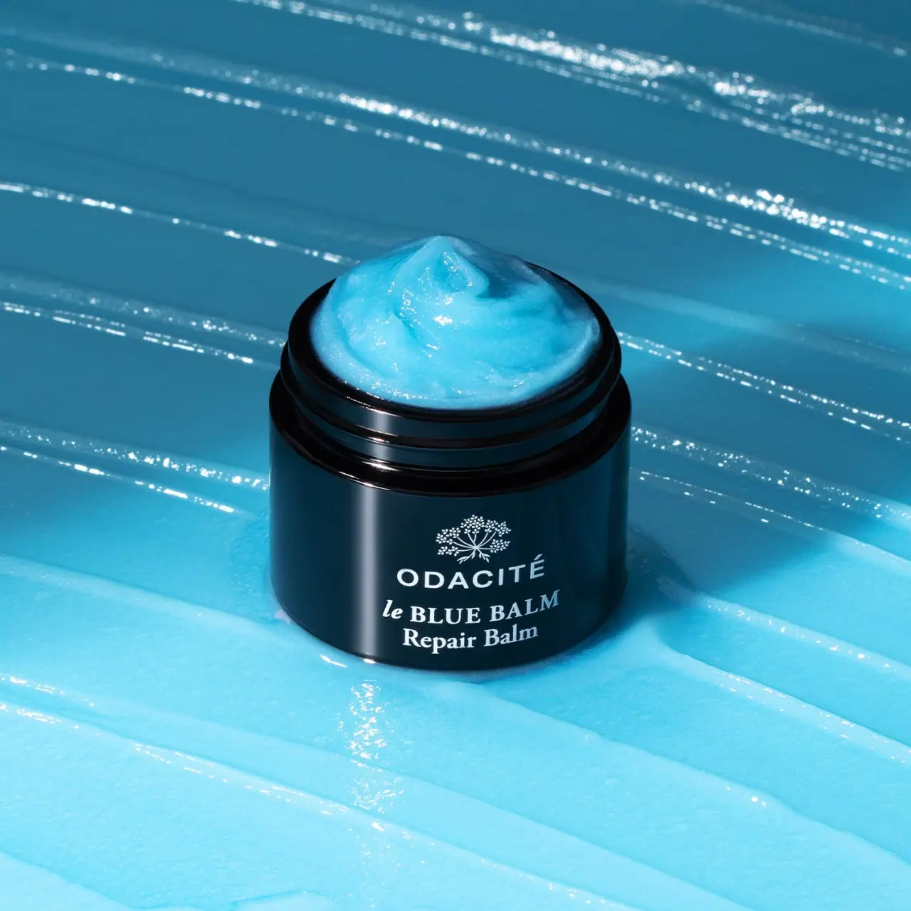
Odacité
Open dark balm jar with white type and blue contents
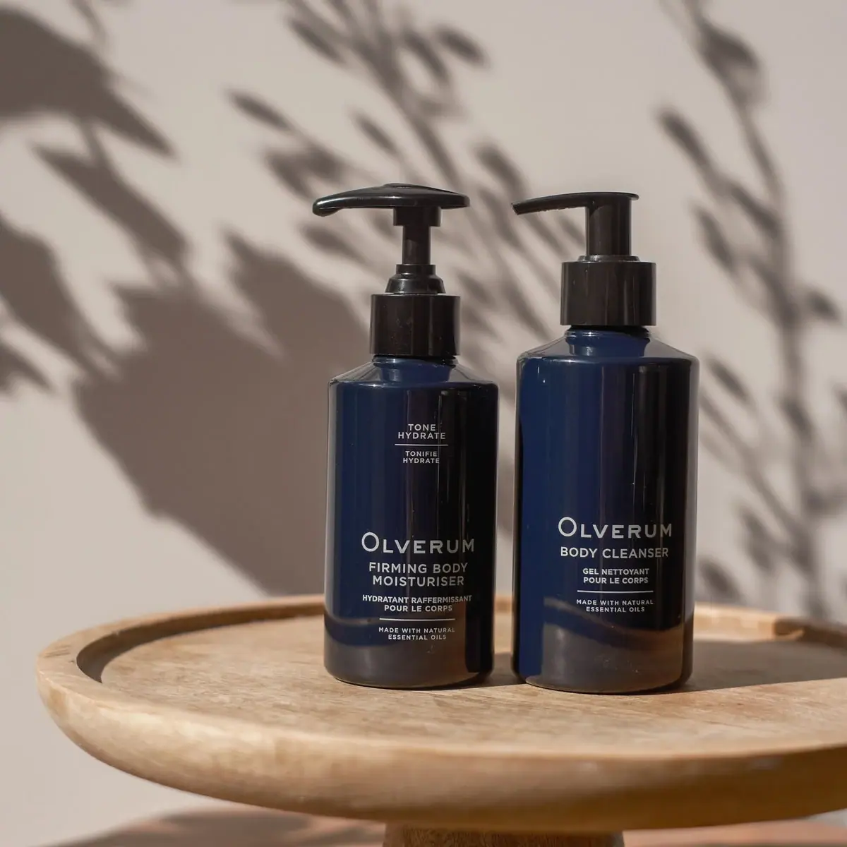
Olverum
Navy bodycare pair with pale centered copy and black pumps
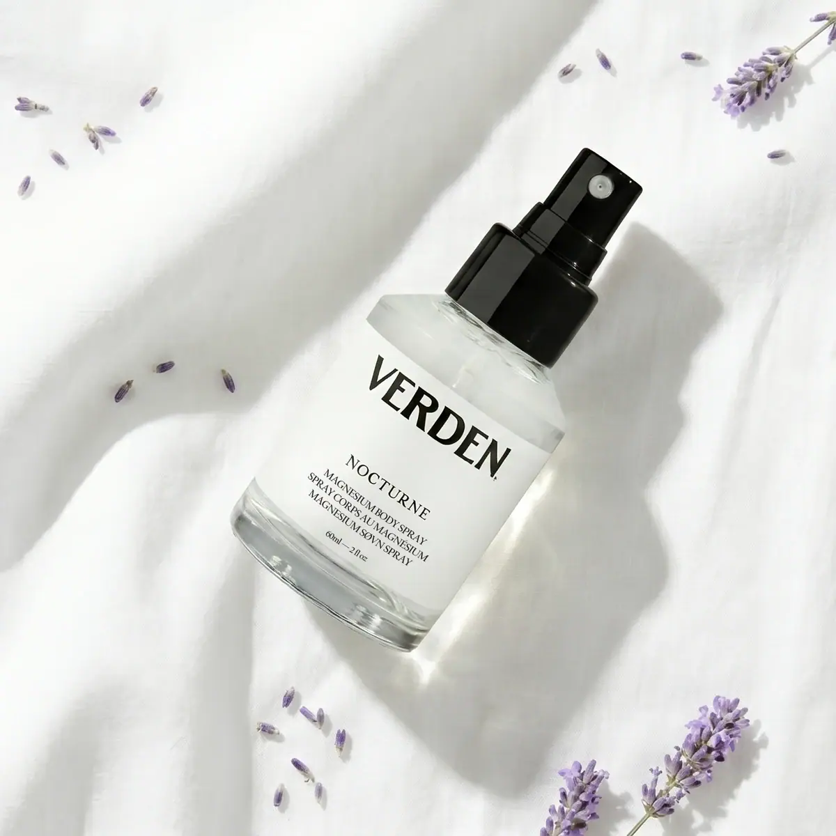
Verden
Bold serif identity on a quiet white spray label
AMASS
A ruled botanical document on a dark rounded bottle
Black Blaze
Warm amber, quiet paper and a deliberate vertical rhythm

Aesop
a botanical still life around a disciplined apothecary label

African Botanics
Technical black label with a low serif signature

al.ive body
warm architectural calm, built as a paired vanity object