Photography: Seed + Mill official photography. Images belong to their respective owners.
Seed + Mill

Cream serif lettering inside a flowing red tahini field
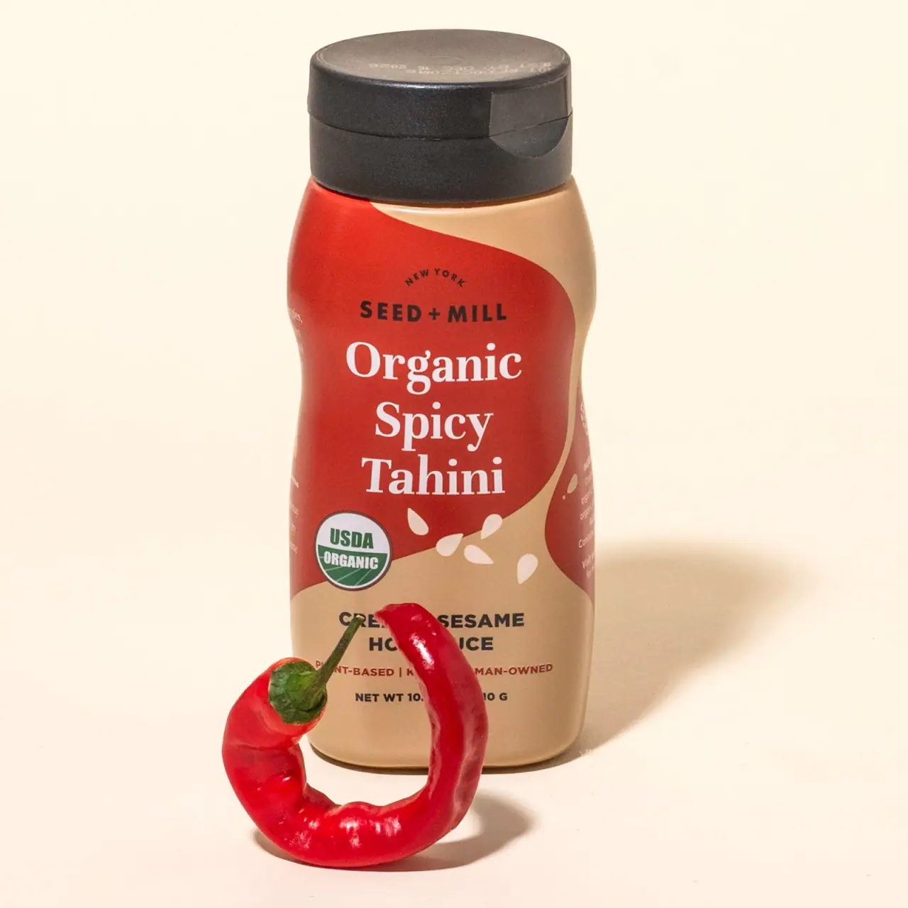
The selected Organic Spicy Tahini squeeze bottle combines a soft waisted silhouette with a large red field that bends across its tan-looking front. Three stacked words in cream serif lettering identify the product, while a compact black brand name sits above. Small seed-like marks continue the curved composition below the title. The dark broad closure supplies a strong visual endpoint and makes the dispensing format clear. A red chilli in the official photograph reinforces the spicy cue, but partly hides lower information. This study follows the pictured squeeze bottle, keeping its printed artwork separate from the scene and from unverified material assumptions.
- Pantry & sauces
- Light pack
- Bold typographic
- Playful colour
About this study
The selected Organic Spicy Tahini squeeze bottle in the official chilli-prop photograph. Only its visible front and current product context are covered; no exact edition date, reverse layout or complete construction specification was established.
Sources & evidence · Reviewed 2026-10-19Color Palette
Approximate colours interpreted from photography. These are screen references, not official brand colours or print specifications.
Pack body
Charcoal closure
#34302B
Approximate dark cap appearance, echoed visually by the brand and descriptor lettering.
Label
Chilli red field
#C93628
Approximate main red graphic in the selected cover. It gives the spicy variant a strong warm signal without making the entire visible bottle red.
Sesame tan
#D2A880
Approximate tan-looking front ground around the red curve. The photo alone does not establish how much comes from decoration, container or contents.
Ink
Cream title and seeds
#FFF1D8
Approximate light serif lettering and small seed-shaped marks. This warm light tone keeps the product name distinct from the darker supporting text.
Accent
Seal green
#406846
Approximate small organic-seal colour. It is an observed certification graphic, not a general decorative accent or a licence to reuse the seal.
Typography
Suggested visual alternatives, not confirmed brand typefaces. Any scale below is an illustrative estimate.
The front gives the product name three substantial centred lines in a clear serif face. Mixed case preserves the familiar word shapes of Organic, Spicy and Tahini. The brand above uses much smaller bold sans-serif capitals with a compact arched place name. A heavy sans-serif descriptor below clarifies the product's role as a sesame-based sauce. The contrast is functional: serif for the main edible identity, sans serif for the compact brand and practical explanation.
Fonts
Product-name alternative
Libre Baskerville
- Looks like
- Readable medium-contrast serif with generous lowercase
- Type
- Transitional serif
- Weight
- Regular to bold
- Case
- Title case
- Tracking
- Natural, with optical line fitting
- Fallback
- Georgia, serif
A three-line fictional condiment name. Balance the lines without compressing them so severely that their counters and serifs become brittle.
Brand and descriptor alternative
Archivo
- Looks like
- Sturdy compact grotesque capitals
- Type
- Grotesque sans serif
- Weight
- Bold
- Case
- Uppercase
- Tracking
- Slightly open for the brand, neutral for descriptors
- Fallback
- Arial, sans-serif
A smaller independent brand name and a short functional descriptor. Keep the two roles separated spatially rather than making both compete with the main title.
Supporting-copy alternative
Source Sans 3
- Looks like
- Plain readable sans serif
- Type
- Humanist sans serif
- Weight
- Regular and semibold
- Case
- Sentence case or short capitals
- Tracking
- Normal
- Fallback
- Arial, sans-serif
Practical detail on an original label. This can be replaced by the primary sans family for a tighter system; three proposals do not imply three fonts are required.
Structure & Proportions
Visual proportions and finish previews are illustrative. Confirmed construction details and uncertainties are distinguished in the study notes.
Proportions
| Purpose | Value | Preview |
|---|---|---|
| Bottle contour | The shoulder broadens below the cap, narrows through the middle and widens toward the base. This creates a visible waist without establishing an ergonomic performance claim. | — |
| Headline field | The main red shape offers enough width for a tall three-line name while allowing tan areas to remain visible around its changing edge. | — |
| Closure balance | The broad dark cap gives the soft body a firm visual top. These observations describe the photographed shape, not measured dimensions or engineering tolerances. | — |
Shapes
| Element | Value | Preview |
|---|---|---|
| Contoured body | Rounded shoulders and base with an inward waist through the middle. | |
| Red colour field | An asymmetric flowing boundary, broader behind the title and curving into the tan ground below. | |
| Seed marks | Small pale teardrop-like forms scattered near the lower curve. | |
| Closure | Broad shallow cylinder with a flattened top and a front opening notch. |
Finishes
Low-glare decorated body
Tan and red surfaces in the selected image; appearance does not prove matte varnish or a particular label stock · matte
Dark closure surface
Cap and opening tab, with small lighting highlights; no soft-touch property is established · matte
Formats and materials
| Formats | Waisted squeeze bottle with broad closed flip-top cap |
| Materials | A squeezable container is supported by the official product format; exact body resin and barrier construction are unverified., Dark closure is visible, but cap material grade, liner and hinge construction are not specified., The front carries continuous graphics; the image does not establish whether decoration is a sleeve, adhesive label or another process. |
| Closures | The dark cap has a broad flattened top and a visible front opening notch. It occupies the upper end of the displayed bottle. No dispensing aperture is shown, so flow rate, valve design and leak resistance cannot be inferred from the photograph. |
| Decoration | Sweeping red field with large light serif product naming, Scattered pale seed-shaped marks, Small organic seal and compact supporting typography in separate lower zones |
Front Panel
Schematic reading order. The diagram’s zone heights do not represent measured artwork proportions.
The curved colour field does more than ornament the front: it contains the long product name and guides the transition toward the lower information area. Typography remains mostly centred even though the background shape is asymmetric. The small brand at the top, large serif name in the centre, seed marks and seal lower down, and functional descriptor at the foot form separate reading zones.
| Zone | Content |
|---|---|
| Upper identity | Compact black SEED + MILL lettering beneath a small arched location line. It remains clearly smaller than the product name. |
| Central red field | Large cream Organic Spicy Tahini lettering split into three centred lines, with comfortable space around the serif forms. |
| Lower curved edge | Pale seed-like forms connect the red shape to the tan area without becoming a dense repeating pattern. |
| Lower left | A round organic certification graphic creates a small independent proof-point zone. Its presence is observed; certification status was not audited for this study. |
| Foot | Dark descriptor, smaller claims and quantity line. The chilli prop partly obscures this area, so not every character is transcribed or treated as clearly visible. |
Range System
The official Savory Squeeze Duo groups the spicy and plain tahini squeeze products, supporting a product-family relationship. This study visually analyses only the spicy bottle. The red field and chilli cue fit its named variant, but a complete rule for all label colours, formats or certifications would require separate references.
- Observed selected pack: warm tan ground, red curved field, light serif name and dark closure.
- Sourced relationship: the spicy and plain squeeze bottles are offered together in a named duo.
- Interpretation for new products: keep the label's reading order stable while changing a purposeful variant field and a plainly written product name.
Back of Pack & Shelf
The back is absent from the selected cover. The official page links a reverse image, but it was not visually inspected at readable resolution in this review. Nutrition, ingredients, barcode and instructions are therefore not assigned to exact positions here.
- Review a readable reverse image before documenting the actual back-panel system.
- For original production work, plan food information separately rather than using the visible decorative seed area as an assumed regulatory zone.
On shelf
Interpretation: the combination of a familiar squeeze format, a large serif product name and a flowing red field can bridge a cooking ingredient and a ready-to-use table condiment. The official page describes drizzle-oriented use, giving that format a practical context. The design still needs to make tahini readable rather than relying only on red, because a red bottle alone could be read as a conventional hot sauce. Shape and naming work together to resolve that ambiguity.
Imagery
A single curled red chilli leans in front of the bottle against a pale warm ground, echoing the red label while communicating the variant. Directional shadows give the otherwise simple composition depth. The prop strengthens the spicy cue, but its position obscures some footer information. That is acceptable as a mood image only when another view supplies the missing detail; it should not be mistaken for a complete documentary front view. The light background remains distinct from the tan packaging ground.
Guidelines
Editorial principles for an original design brief, not official brand guidelines.
Do
- Use a clearly written product name to distinguish the condiment from adjacent categories.
- Balance a flowing graphic with an orderly reading axis.
- Keep functional descriptors, certifications and decorative marks in distinct zones.
- Show the dispensing format clearly without claiming untested ergonomic benefits.
- Pair an atmospheric prop image with an unobstructed information view where needed.
Don't
- Do not call the bottle a particular polymer without a specification.
- Do not copy certification seals into fictional designs.
- Do not treat a seed-shaped graphic as evidence of ingredient sourcing.
- Do not assume the partly hidden footer is fully readable.
- Do not turn one variant's red field into an undocumented universal brand rule.
Sources & evidence
How this study was built
structure · Sourced fact
The brand identifies a squeeze format and drizzle use; no material grade or dispensing specification is supplied.Organic Spicy Tahini Squeeze Bottle — Seed + Milllabel · Visual observation
The approved cover shows a large three-line serif name inside the red field, smaller brand above and partly obscured lower information.Organic Spicy Tahini Squeeze Bottle — Seed + Millpalette · Visual observation
Tan and red dominate the visible pack, with light naming and a dark closure; the pale scene is not treated as the bottle's colour specification.Organic Spicy Tahini Squeeze Bottle — Seed + Millrange · Sourced fact
The duo listing connects the plain and spicy squeeze products, but only the selected spicy artwork is analysed here.Savory Squeeze Duo — Seed + Millimagery · Visual observation
A curled chilli echoes the variant field while blocking part of the footer, distinguishing mood photography from a complete information view.Organic Spicy Tahini Squeeze Bottle — Seed + Milltypography · Editorial interpretation
Proposed Google font families recreate a serif/sans hierarchy for original work, not the actual identity artwork.
What remains unverified
- Exact bottle resin, closure mechanism, label substrate and decoration process are unverified.
- The chilli prop obscures some lower front information.
- A reverse photo is linked by the source but was not inspected at readable resolution in this review.
- Fonts, colour values and qualitative proportions are analytical alternatives or estimates, not production assets.
Give your AI
packaging taste
Give your design or image tool a packaging study: palette, type, structure, front panel and principles for an original brief.
Export this styleFree with an email. PACK.md works in Claude, ChatGPT, Cursor and image tools.
More like this

Behave
struck-through wordmark on sour neon pouches
Magic Spoon
saturday cartoon cereal for grown-ups
Oat Haus
Birthday-party color blocks with oversized grocery typography

Partake
one saturated carton per cookie flavour
TCHO
Giant cream flavour lettering on a hot orange-red square

Tony's Chocolonely
circus-poster slab letters on a yellow wrapper

ACURE
Iridescent spectacle with practical, tightly ordered type

Bask
sunny yellow with a playful turquoise signature