About this packaging
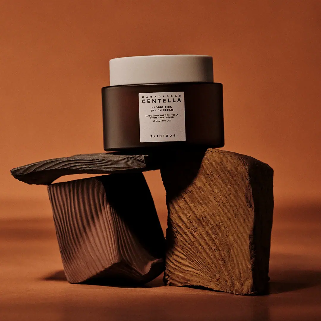
SKIN1004’s Probio-Cica Enrich Cream uses a broad dark jar, pale lid and compact white label to present a multiword product name within a restrained system. The official product identity is confirmed, but its accessible page view did not establish the jar’s material or recycling route.
SKIN1004 identifies the product as Probio-Cica Enrich Cream.[1]
Pack construction & use
- Jar format
- The selected cover shows a squat cylindrical dark-brown jar with a wide cream-colored lid. The material cannot be determined from the image alone.Observed in the reference photograph
What makes the design work
Editorial analysis of this packaging reference.
A wide lid balances the squat body
The lid forms a broad horizontal cap over the short jar, making the package feel stable rather than top-heavy. The contrast between the cream lid and dark body separates closure from contents visually.
One lead ingredient phrase sets hierarchy
CENTELLA is the largest visible word on the small label, with smaller product descriptors centered below. This gives the front face a clear first read despite several lines of copy.
Spacing gives the brand a quiet signature
A noticeable blank interval separates the product copy from the spaced SKIN1004 wordmark near the label base. That pause prevents the small panel from reading as one dense block.
Ideas for your next brief
- Use a broad closure to visually counterbalance a low, wide jar body.
- Choose one short front-panel phrase to lead when the product name contains several descriptors.
- Preserve whitespace between product information and the brand mark on a compact label.
Sources & further reading
Researched 19 October 2026