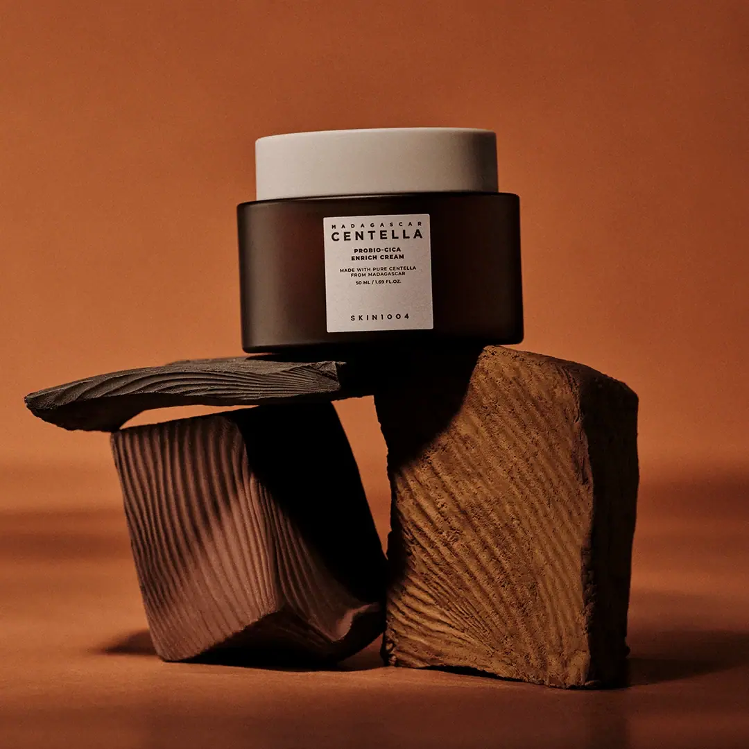
Photography: SKIN1004 official photography. Images belong to their respective owners.
SKIN1004

cream lid above a brown jar and clinical panel
The selected Probio-Cica Enrich Cream combines a broad dark brown jar, a pale flat lid and a small portrait label. Its typography places CENTELLA ahead of the maker: the ingredient-family name is bold near the top, while SKIN1004 waits at the bottom after a large empty interval. This is a compact container with an unusually tall reading rhythm. Warm sculptural forms and a rust-coloured backdrop belong to the photograph, not the packaging.
- Skincare
- Light pack
- Clinical minimal
- Apothecary
About this study
Selected closed Probio-Cica Enrich Cream 50 mL jar with dark brown body and pale lid; not a specification for other SKIN1004 products.
Sources & evidence · Reviewed 2026-10-19Color Palette
Approximate colours interpreted from photography. These are screen references, not official brand colours or print specifications.
Pack body
Dark brown body
#39251E
Approximate jar appearance under warm lighting; not a verified resin or glass tint specification.
Label
Warm pale panel and lid
#E5DDCC
Approximate light surfaces linking the lid to the front label despite their different shapes and reflections.
Ink
Near-black information
#23201D
Approximate front typography. Weight and spacing, rather than multiple ink colours, create the hierarchy.
Typography
Suggested visual alternatives, not confirmed brand typefaces. Any scale below is an illustrative estimate.
A tiny spaced MADAGASCAR line introduces the largest and heaviest word, CENTELLA. PROBIO-CICA and ENRICH CREAM form a smaller two-line identification beneath it. A finer origin statement and the visible 50 ML / 1.69 FL. OZ. line complete this upper group. The maker, SKIN1004, is separated near the label foot with generous tracking. The result is ingredient-led at first glance and maker-led only after the eye crosses the empty lower field. All visible text uses a restrained uppercase sans-serif vocabulary.
Fonts
Ingredient-name alternative
Archivo
- Looks like
- Archivo for a strong compact uppercase ingredient line
- Type
- Sans serif
- Weight
- Bold 700
- Case
- Uppercase
- Tracking
- Moderately open
- Fallback
- Arial, sans-serif
Use one prominent ingredient-family line, keeping the remaining product name smaller but readily readable. Test the widest name in an independently designed range rather than forcing every variant into identical spacing. This is not an identification of the original CENTELLA lettering.
Information alternative
Inter
- Looks like
- Inter for origin, function and quantity
- Type
- Sans serif
- Weight
- Regular 400 / Medium 500
- Case
- Uppercase with mixed case available for longer copy
- Tracking
- Open for short labels, normal for explanatory text
- Fallback
- Arial, sans-serif
Separate product type from provenance through size and spacing. Preserve useful quantity text rather than treating it as decorative microtype. A different brand name should receive its own rhythm and position; the isolated SKIN1004 footer is an observation, not an asset to duplicate.
Structure & Proportions
Visual proportions and finish previews are illustrative. Confirmed construction details and uncertainties are distinguished in the study notes.
Proportions
| Purpose | Value | Preview |
|---|---|---|
| Wide object, tall reading axis | The jar is wider than it is tall, but the label creates a compact vertical column within that squat silhouette. | — |
| Separated signature | An open interval divides the upper ingredient/product information from the maker near the bottom. | — |
| Light upper edge | The shallow pale lid forms a continuous horizontal band above the dark body without a tall sculptural closure. | — |
Shapes
| Element | Value | Preview |
|---|---|---|
| Jar | Broad cylinder with subtly rounded lower corners. | |
| Lid | Shallow flat-topped cylinder. | |
| Front panel | Compact portrait rectangle, approximately square-looking at a glance. |
Finishes
Dark reflective body
Soft highlights on the curved jar; material and coating remain unverified. · gloss
Diffuse pale lid
The broad light upper surface appears smoother and less reflective than the body. · matte
Formats and materials
| Formats | Selected closed 50 mL cream jar with broad cylindrical body, pale shallow cylindrical lid and a small portrait front panel. |
| Materials | The official product page confirms cream identity and available capacities but does not provide a component bill of materials., Brown appearance does not establish amber glass; pale lid appearance does not identify a particular polymer. Label substrate, adhesive and any internal liner remain unknown. |
| Closures | The closed lid is broad, nearly flat and slightly narrower in appearance than the body below it. Its pale colour makes the upper edge easy to distinguish from the dark jar. A thin junction is visible, but the photograph does not reveal the thread, seal, underside or opening action. It also does not show a spatula, inner disc, refill pod or tamper feature. None should be added to the structural description solely because similar skincare jars sometimes include them. |
| Decoration | Small pale portrait panel on a much wider dark body., Dense upper information group and isolated maker at the foot., No illustration or visible colour coding inside the label. |
Front Panel
Schematic reading order. The diagram’s zone heights do not represent measured artwork proportions.
The front panel centres its lines within a narrow column. Most reading occurs in the upper half: origin, ingredient family, product name, origin statement and quantity follow one another before the large blank interval. The quantity is not placed at the very bottom of the label. SKIN1004 occupies that lower position alone. This distinction matters because moving the volume to a conventional bottom footer would change the selected design’s actual rhythm. The contrast between a small label and a large surrounding dark area gives the front a precise, contained quality.
| Zone | Content |
|---|---|
| Origin and family | Small spaced MADAGASCAR above bold CENTELLA. |
| Product identity | PROBIO-CICA / ENRICH CREAM in two shorter lines. |
| Supporting information | Smaller origin wording followed by 50 ML / 1.69 FL. OZ. |
| Maker | Widely spaced SKIN1004 after a substantial open interval. |
Range System
The official product page offers 15 mL and 50 mL choices, and the selected label visibly identifies 50 mL. The current routine-set page also lists a 50 mL cream. Those sources establish product context, not identical geometry for every size. This study describes the photographed jar only. Other SKIN1004 ingredient families, tubes and bottles require separate visual review before any universal rule about brown containers or maker placement is claimed.
- Selected 50 mL jar: dark body, pale lid and small ingredient-led label.
- 15 mL is a sourced size option, not a second photographed format analysed here.
Back of Pack & Shelf
Reverse and base are not visible. Ingredients, batch coding, manufacturer information and opening instructions cannot be located on the object from this front view. Product-page ingredient information is useful context but does not prove its exact placement on the physical package.
- Inspect the rear and base before mapping mandatory information.
- Verify component materials from packaging documentation.
- Check the open jar before describing seal, liner or refill compatibility.
On shelf
Interpretation: the pale lid and pale central panel create two distinct light anchors on a dark squat silhouette. CENTELLA should be the earliest readable word, while the isolated maker requires a closer look. The small label may lose detail on a crowded shelf or at thumbnail size. An original design using this hierarchy should test whether product function remains clear when the origin line and supporting claim become unreadable.
Imagery
The jar rests among warm brown grooved sculptural forms against a rust-coloured field. Their irregular edges contrast with the regular cylinder and flat label. The scene reinforces a warm, earthy impression, but these props are not confirmed ingredients, supplied accessories or packaging components. Their saturated orange-brown colour should not enter a package palette as though printed on the label. A neutral-light comparison would be needed to separate the body’s intrinsic colour from the scene’s warm reflections.
Guidelines
Editorial principles for an original design brief, not official brand guidelines.
Do
- Separate ingredient family, product function and maker clearly.
- Keep quantity legible within its real information group.
- Test the small label at shelf and thumbnail distance.
- Treat the warm scene separately from component colours.
Don't
- Do not infer glass from brown colour.
- Do not invent a refill or inner seal from the closed lid.
- Do not move the photographed quantity to an inaccurate bottom zone.
- Do not generalise one jar to the complete brand range.
Sources & evidence
How this study was built
context · Sourced fact
Official page identifies the cream and offers 15 mL and 50 mL options.SKIN1004 — Probio-Cica Enrich Creamrange · Sourced fact
Official set lists the cream at 50 mL, consistent with the visible front quantity.SKIN1004 — Perfect Anti-Aging Routine Settypography · Visual observation
CENTELLA is bold near the top; maker is isolated near the bottom.SKIN1004 — Probio-Cica Enrich Creamlabel · Visual observation
Quantity follows the smaller origin claim before the large empty interval.SKIN1004 — Probio-Cica Enrich Creamstructure · Visual observation
Broad closed jar has pale shallow lid; no internal mechanism is visible.SKIN1004 — Probio-Cica Enrich Creamshelf · Editorial interpretation
Small panel and isolated maker require viewing-distance checks.
What remains unverified
- Jar and lid materials, label stock and closure internals are unverified.
- Original fonts, physical dimensions and decoration processes are unknown.
- Reverse and base unseen; palette is approximate under warm lighting.
Give your AI
packaging taste
Give your design or image tool a packaging study: palette, type, structure, front panel and principles for an original brief.
Export this styleFree with an email. PACK.md works in Claude, ChatGPT, Cursor and image tools.
More like this
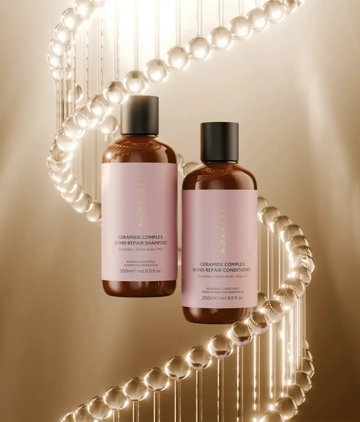
Monpure
Amber duo with rose labels and vertical gold identities
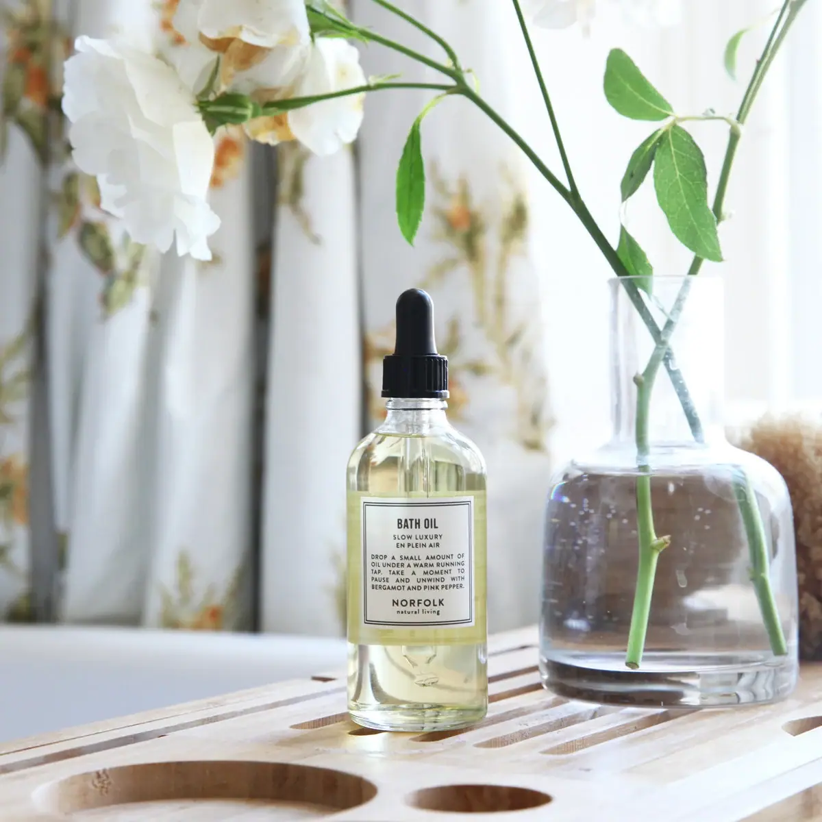
Norfolk Natural Living
Double-bordered bath-oil label on a clear black-dropper bottle
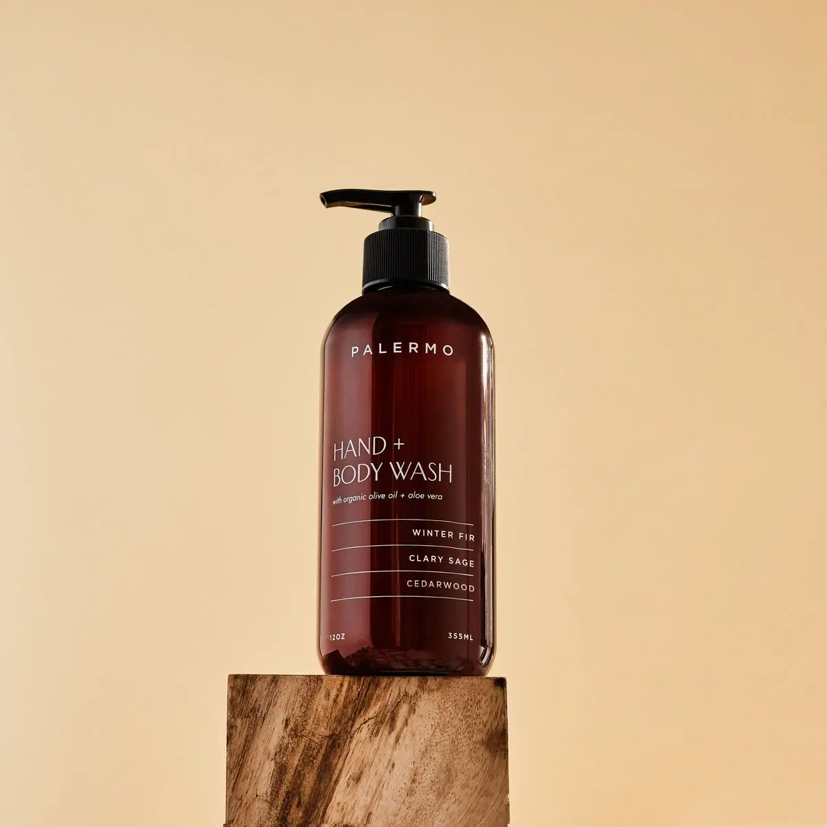
Palermo Body
Amber wash bottle with airy maker and ruled scent rows
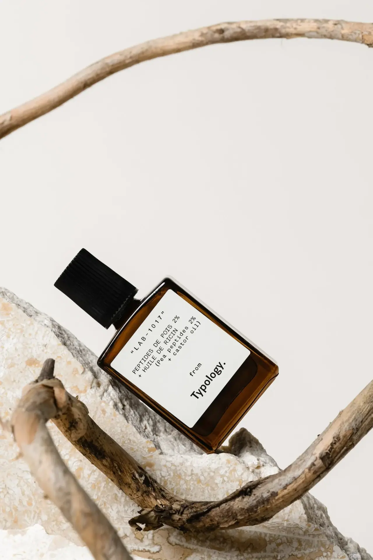
Typology
amber rectangle with a code-led bilingual white formula label

Aesop
a botanical still life around a disciplined apothecary label

African Botanics
Technical black label with a low serif signature

AussieZinc
Sun-yellow numerals on a tall, information-rich white cylinder

bareMinerals
a restrained black compact framing the powder itself