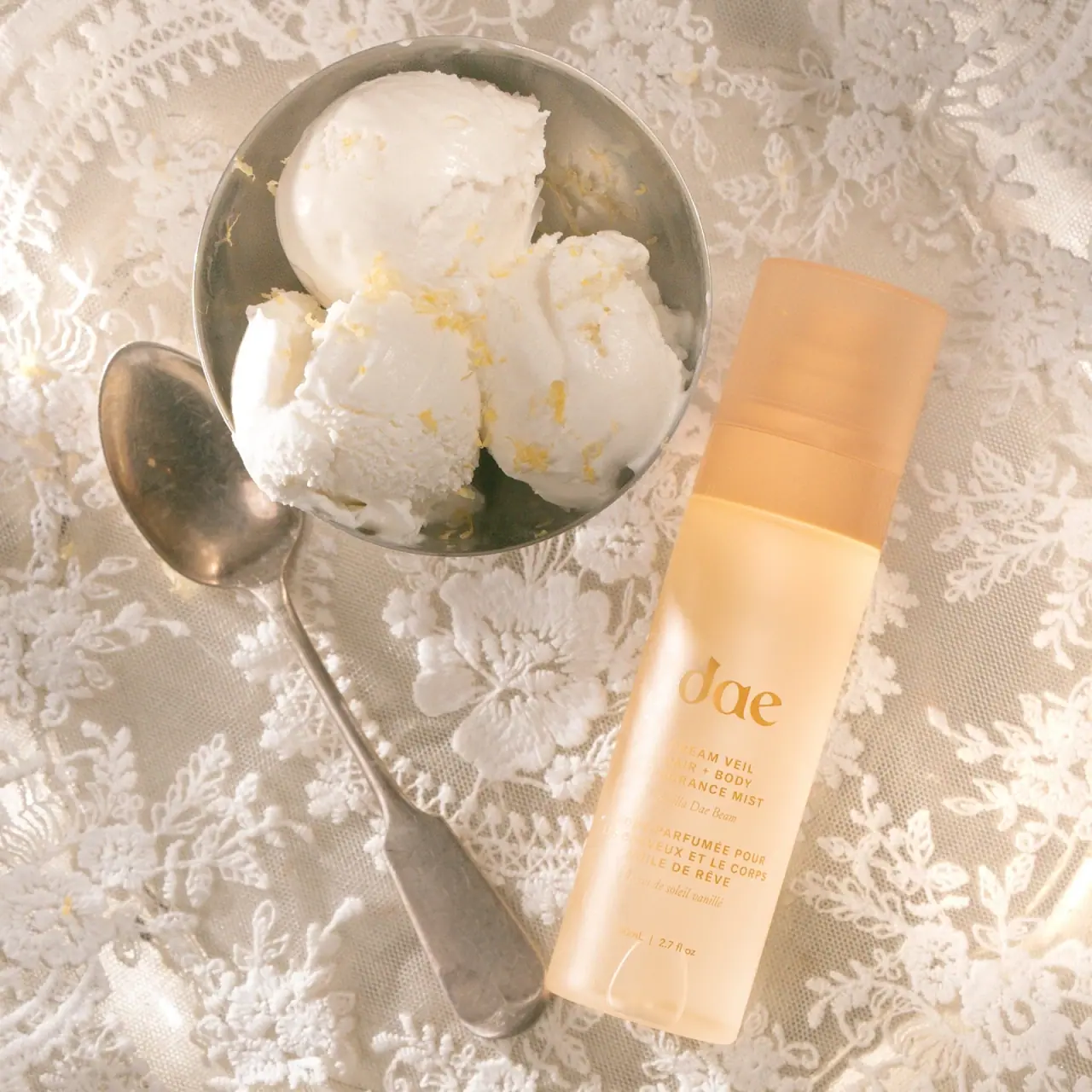
Body Fragrance Mist Pink Guava

Photography: summerfridays.com. All imagery belongs to its respective owner.
What makes the design work
Summer Fridays brand studyVisual observations across the brand’s packaging. Individual formats and editions may vary.
Stacked wordmark
Two lines of medium geometric capitals with a full stop, about 40% of the face width, centred near the top of tubes.
Shade-matched body
Whole component in one opaque soft-matte colour drawn from the product or scent (pistachio, cocoa, plum).
Vertical stick mark
Wordmark rotated to read up slim balm sticks, pens and lip-oil tubes.
Reading the label
No label on most products: text is printed directly on the coloured component, centred near the top on tubes and bottles or running vertically along slim sticks and pens.
- Upper centre
- Two-line uppercase wordmark with full stop
- Middle
- Sun emblem or SPF figure where relevant; otherwise empty colour field
- Lower centre
- Product name, bilingual descriptor, size
Typography & hierarchy
The brand name is the only large text and it is not very large: two stacked lines of spaced uppercase sans with a full stop, centred near the top of tubes or running vertically up sticks and pens. Product name and a bilingual English and French descriptor follow in tiny sans, then size in the smallest line. SPF figures are the one place a number is set large.
Display
Futura Medium, Brandon Grotesque Medium
Geometric sans, medium weight, generous tracking
Uppercase · Medium
Body
Gotham Light, Futura Book
Light humanist-geometric sans
Title case for product names, sentence case for descriptors · Light, Regular
Numeral
Futura Medium
Geometric sans numerals
Uppercase with numerals · Medium
Typeface suggestions based on visual similarity. These are not verified font identifications.
How the range holds together
Colour of the component follows the product shade or scent, while wordmark, type sizes and placement stay identical; complexion and cheek products sit in neutral cream or oat compacts with the product colour visible through the open pan.
Shelf presence
Together the range looks like a palette of soft muted colours, each component a single flat shade with the same small white wordmark, so it reads as a coordinated set rather than as individual products.
Related packaging
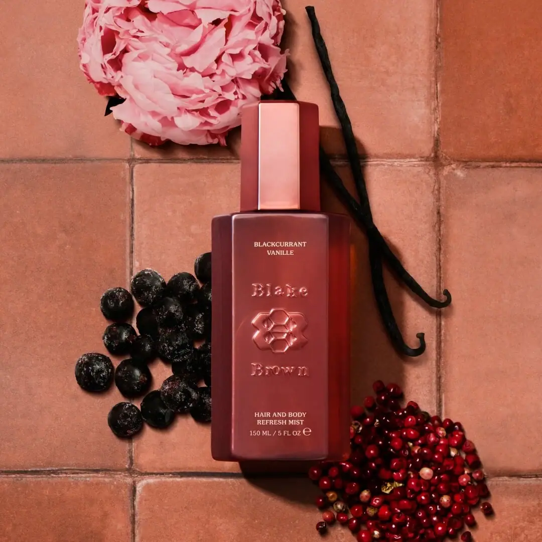
More curated references in perfume, matched by format and visual style.