


Summer Fridays

sun-warmed tubes dressed in their own shade
Summer Fridays dresses each component in an opaque, softly matte colour that matches or flatters the product inside, so a pistachio body balm comes in a pistachio tube (#c5c68a) and a cocoa lip balm in a cocoa tube. The only constant is a small stacked uppercase sans wordmark with a trailing full stop, printed in white or a tonal ink, set vertically on slim sticks and pens and debossed into the lids of chunky cream and oat-beige compacts. A short bilingual English and French descriptor and the size sit low on the face. Mists move to a tinted translucent bottle with a matching cap, and the fragrance takes the same calm into a fluted glass flacon with a ribbed silver cap and a cream paper label.
- Skincare
- Light pack
- Pastel soft-touch
- Colour-coded range
- Clinical minimal
Color Palette
Approximate colours interpreted from photography. These are screen references, not official brand colours or print specifications.
Pack body
Cloud Cream
#f3eee8
Blush compacts, balm stick sleeves and white tube caps; the neutral base of the colour range
Oat Shell
#e6d4c3
Bronzer compact and lip-oil caps in a warm beige soft-touch plastic
Ink
Matte White
#ffffff
Stacked wordmark and small descriptor printed on coloured tubes, mists and pens
Ink Navy
#2a2f45
Vertical wordmark on the white balm stick and other pale components
Accent
Sun Gold
#c9a46a
Small sun emblem on SPF and fragrance labels, and fine gold label type
Range coding
Pistachio Milk
#c5c68a
Body butter balm tube, matched to the pistachio scent
Guava Pink
#e9638a
Body mist cap and tinted translucent bottle
Cocoa Butter
#7a4c34
Hot Cocoa lip butter balm tube with a white cap
Plum Liner
#8e2f4a
Lip liner pen and berry lip oil, the colour of the product itself
Apricot SPF
#f2ad66
Mineral sunscreen bottle and cap, with a gold sun emblem
Typography
Suggested visual alternatives, not confirmed brand typefaces. Any scale below is an illustrative estimate.
The brand name is the only large text and it is not very large: two stacked lines of spaced uppercase sans with a full stop, centred near the top of tubes or running vertically up sticks and pens. Product name and a bilingual English and French descriptor follow in tiny sans, then size in the smallest line. SPF figures are the one place a number is set large.
Type scale
Estimated cap size as a share of the panel · Front of the 200 ml body butter balm tube, about 180 mm tall
wordmark
4% · Medium · Display
GOLDEN HOUR.
spf-figure
3.5% · Medium · Numeral
SPF 50
stick-wordmark
3% · Medium · Display
GOLDEN HOUR.
product-name
1.6% · Regular · Body
Body Butter Balm
descriptor
1.3% · Light · Body
Rich body balm / Baume riche corps
size
1.1% · Light · Body
200 ml | 6.7 fl oz
Fonts
Display
Jost
- Looks like
- Futura Medium, Brandon Grotesque Medium
- Type
- Geometric sans, medium weight, generous tracking
- Weight
- Medium
- Case
- Uppercase
- Tracking
- Wide, about +15%
- Fallback
- Futura, Century Gothic, sans-serif
The wordmark stacked on two lines with a trailing full stop; set vertically on narrow components and debossed tone on tone on compact lids.
Body
Mulish
- Looks like
- Gotham Light, Futura Book
- Type
- Light humanist-geometric sans
- Weight
- Light, Regular
- Case
- Title case for product names, sentence case for descriptors
- Tracking
- Normal
- Fallback
- Avenir Light, Helvetica, sans-serif
Product name, bilingual descriptor separated by a slash, size line and back copy.
Numeral
Jost
- Looks like
- Futura Medium
- Type
- Geometric sans numerals
- Weight
- Medium
- Case
- Uppercase with numerals
- Tracking
- Normal
- Fallback
- Futura, Arial, sans-serif
SPF figure on sunscreen, set larger than anything except the wordmark.
Structure & Proportions
Proportions
| Purpose | Value | Preview |
|---|---|---|
| Print coverage | Under 5% of the component face | |
| Wordmark position | Centred, about 20% down from the top of tubes | |
| Wordmark width | About 40% of the tube face width | |
| Compact lid | Lid about 30% of compact height, chunky and square | |
| Colours per component | Two: one body colour plus one ink | — |
| Density | Mostly empty colour field; type clustered top and bottom | — |
Shapes
| Element | Value | Preview |
|---|---|---|
| Tube | Squeeze tube on a flat-top cap | |
| Compact | Chunky square with rounded corners and a round pan | |
| Stick and pen | Slim cylinder with flush cap | |
| Sun emblem | Small radiating sun disc | |
| Fragrance | Fluted flacon with ribbed silver cap |
Finishes
Soft-touch matte plastic
Tubes, sticks, compacts and pens · soft-touch
Tinted translucent plastic
Body mist bottle · frosted
Tonal deboss
Compact lids · emboss
Fluted clear glass
Fragrance flacon · transparent
Formats and materials
| Formats | Squeeze tube, Square compact, Balm stick, Lip oil with doe-foot wand, Liner pen, Mist bottle, SPF bottle, Perfume flacon |
| Materials | Plastic, Tinted translucent plastic, Fluted glass |
| Closures | Flat-top screw and flip caps matched to the body, chunky lift-off compact lids, push-on pen caps, a ribbed silver metal cap on the fragrance |
| Decoration | One-colour pad print, Tonal deboss on compact lids, Small sun emblem, Cream paper label on fragrance |
Front Panel
Schematic reading order. The diagram’s zone heights do not represent measured artwork proportions.
No label on most products: text is printed directly on the coloured component, centred near the top on tubes and bottles or running vertically along slim sticks and pens.
| Zone | Content |
|---|---|
| Upper centre | Two-line uppercase wordmark with full stop |
| Middle | Sun emblem or SPF figure where relevant; otherwise empty colour field |
| Lower centre | Product name, bilingual descriptor, size |
Range System
Colour of the component follows the product shade or scent, while wordmark, type sizes and placement stay identical; complexion and cheek products sit in neutral cream or oat compacts with the product colour visible through the open pan.
- Pistachio Milk body balm = pistachio tube
- Pink Guava mist = pink cap and tinted bottle
- Hot Cocoa lip balm = cocoa tube, white cap
- Plum stain and liner = plum component
- SPF = apricot bottle + gold sun
- Blush and bronzer = cream or oat compact, shade in the pan
Back of Pack & Shelf
The back of each component carries a short column in the same ink: bilingual directions, the ingredient list, then PAO, batch, recycling and origin in the smallest line; cartons repeat the colour with the same layout.
- Bilingual English and French directions
- Full INCI ingredient list
- PAO symbol and batch code
- Recycling note and made-in line
- Barcode on the carton
On shelf
Together the range looks like a palette of soft muted colours, each component a single flat shade with the same small white wordmark, so it reads as a coordinated set rather than as individual products.
Imagery
No illustration or photography on pack beyond a small radiating sun emblem; colour itself does the work.
Guidelines
Do
- Colour the whole component in one opaque soft-matte shade drawn from the product or its scent, such as pistachio (#c5c68a) or cocoa (#7a4c34).
- Stack the uppercase Display wordmark on two lines with a trailing full stop, about 40% of the face width.
- Run the wordmark vertically on sticks, pens and slim tubes.
- Use white ink (#ffffff) on mid and dark shades and a darker tone or navy on pale ones.
- Deboss the wordmark tone on tone into compact lids instead of printing it.
- Keep descriptors bilingual and tiny, about 1.3% of face height, at the base.
- Keep print coverage under 5% of the face.
Don't
- Don't use glossy or metallic plastics on core products; the finish is soft and matte.
- Don't add patterns, illustrations or photography to the components.
- Don't put more than one colour on a single component other than the ink and a cap.
- Don't set the wordmark large or in a serif.
- Don't use black packaging; the darkest bodies are cocoa and plum.
- Don't use saturated primary colours; keep every shade muted.
Give your AI
packaging taste
Give your design or image tool a packaging study: palette, type, structure, front panel and principles for an original brief.
Export this styleFree with an email. PACK.md works in Claude, ChatGPT, Cursor and image tools.
More like this

Cocokind
sideways lowercase on spa-water pastels

Herbivore
pastel tinted vessels with a white tag

OSEA
sea-glass frosted bottles and a tidal wordmark

OUAI
sheer tinted bottles, small black capitals

Byoma
candy-coloured barrier science on a shelf
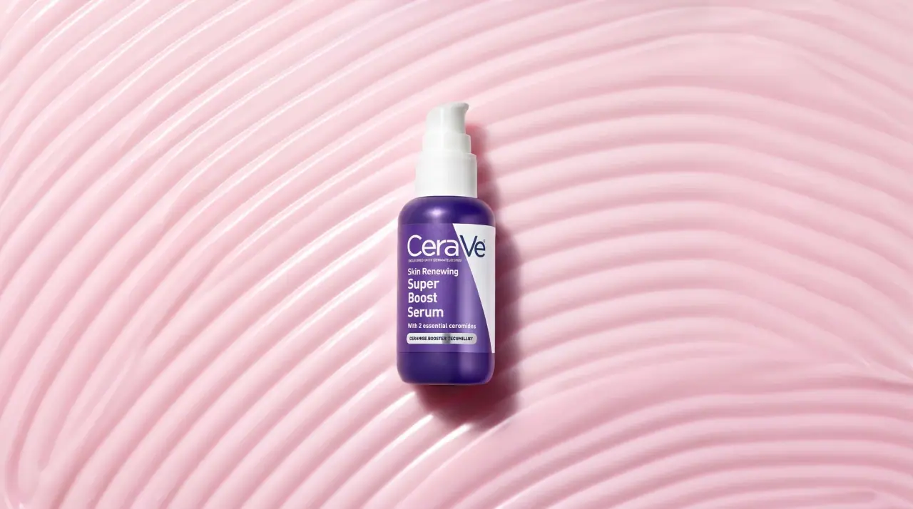
CeraVe
white pump bottles split by a coloured diagonal
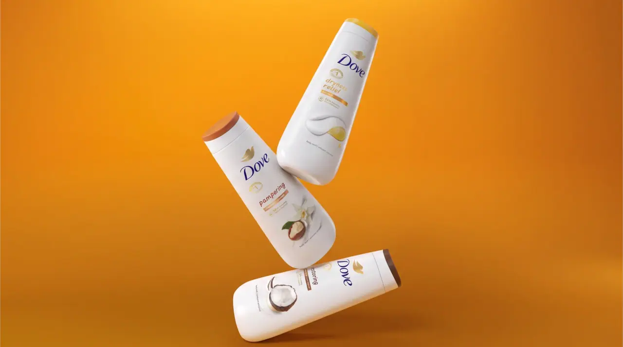
Dove
milk-white curves with a gold dove and navy script
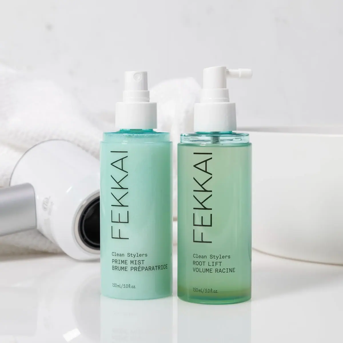
FEKKAI
Green styling duo with vertical hairline maker and white actuators