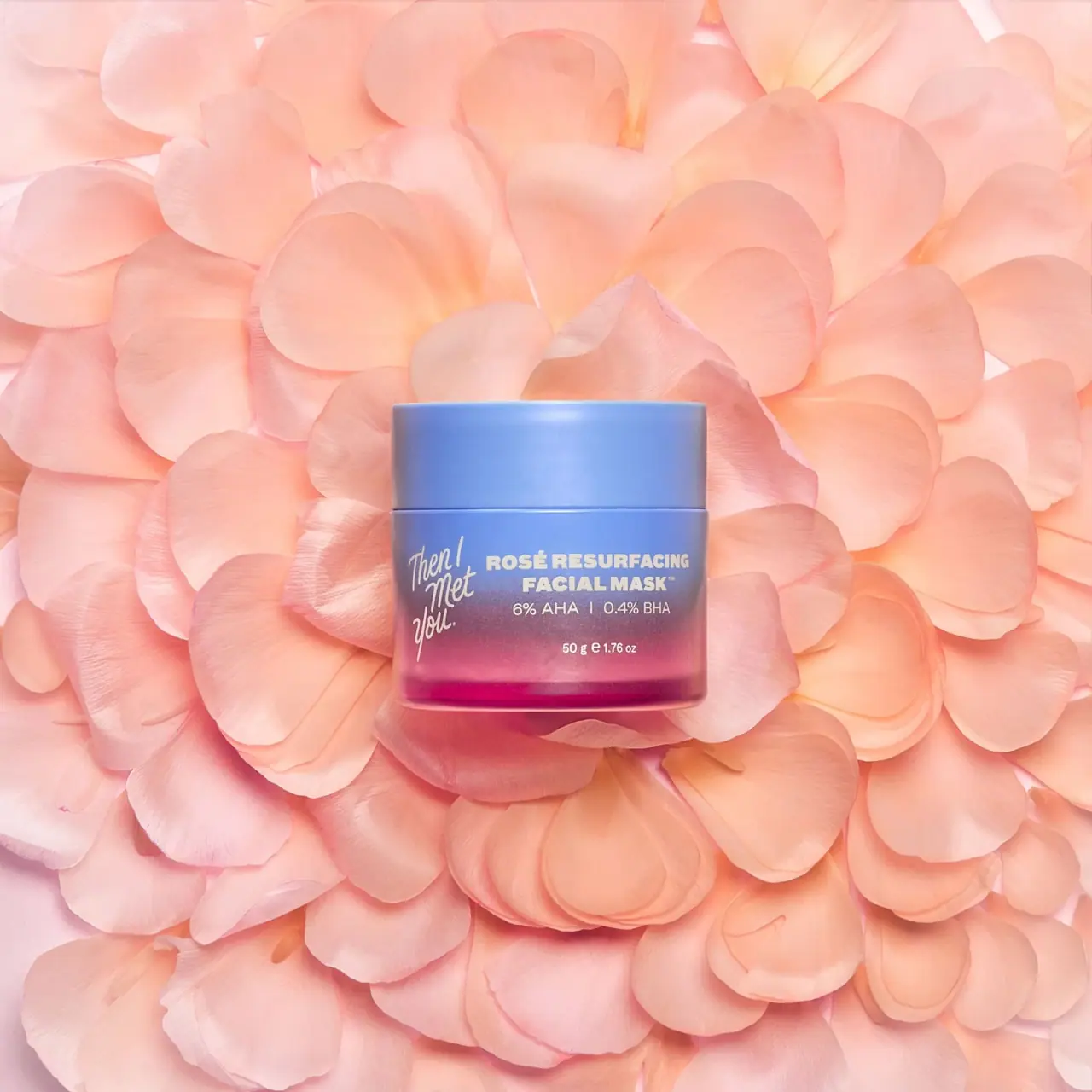
Photography: Then I Met You official photography. Images belong to their respective owners.
Then I Met You

periwinkle-to-rose jar with a handwritten side signature
Rosé Resurfacing Facial Mask pairs an opaque periwinkle lid with a body that shifts from blue through purple into rose-magenta near the base. Cream graphics divide the curved front into two unequal areas: a narrow stacked handwritten maker signature at left and a wider, heavier product block at right. The acid percentages and net weight sit below that title in progressively smaller lines. Peach rose petals surround the jar in the selected official image, reinforcing the product story without becoming part of its printed graphics.
- Skincare
- Light pack
- Playful colour
- Bold typographic
About this study
The 50 g Rosé Resurfacing Facial Mask in the approved official petal-set image. This study covers the visible front and does not establish universal brand rules or hidden construction.
Sources & evidence · Reviewed 2026-10-19Color Palette
Approximate colours interpreted from photography. These are screen references, not official brand colours or print specifications.
Pack body
Periwinkle upper field
#7E93CF
Approximate lid and upper-body appearance. Directional light changes the blue across the curved surface; no official colour standard is claimed.
Purple transition
#9E769F
Approximate middle transition on the jar. This is one point within a gradual shift, not a separately bounded printed panel.
Ink
Warm pale typography
#EEEAD6
Approximate signature, title and information colour. Peach petals belong to the set and are excluded from the packaging palette.
Accent
Rose-magenta lower field
#BB4275
Approximate lower-body appearance. Contents, transparency and surface treatment may all affect the result; their contributions are not independently established.
Typography
Suggested visual alternatives, not confirmed brand typefaces. Any scale below is an illustrative estimate.
The maker signature uses narrow, expressive strokes arranged across several short stacked words. Beside it, ROSÉ RESURFACING and FACIAL MASK form a dense two-line uppercase title. A lighter line for the two percentages follows immediately below; a larger interval separates that group from net weight. The title has the strongest stroke weight, while the maker mark gains presence through its unusual vertical shape. This creates complementary forms of emphasis rather than simply making the brand the largest text.
Fonts
Handwritten identity alternative
Caveat
- Looks like
- Caveat for a loose personal signature direction
- Type
- Handwriting
- Weight
- Medium 500
- Case
- Mixed case
- Tracking
- Natural handwritten spacing
- Fallback
- cursive
Explore a short original phrase as a narrow stacked identity. Adjust line breaks to preserve an overall vertical rhythm, but avoid copying the distinctive slant, joins or arrangement of the Then I Met You signature.
Product title alternative
Archivo
- Looks like
- Archivo for a dense heavy sans-serif title
- Type
- Grotesque sans serif
- Weight
- ExtraBold 800
- Case
- Uppercase
- Tracking
- Compact but open enough for a curved surface
- Fallback
- Arial, sans-serif
Set an independent product name across two deliberate lines. Check that counters remain open at the final print size and that letters near the jar's sides do not become difficult to read through curvature.
Supporting information alternative
Inter
- Looks like
- Inter for percentages and net quantity
- Type
- Sans serif
- Weight
- Regular 400
- Case
- Numerals and abbreviated units
- Tracking
- Normal
- Fallback
- Arial, sans-serif
Keep numerals and units quieter than the product title while preserving their grouping. These are functional recommendations for a new design; no original physical font sizes are known.
Structure & Proportions
Visual proportions and finish previews are illustrative. Confirmed construction details and uncertainties are distinguished in the study notes.
Proportions
| Purpose | Value | Preview |
|---|---|---|
| Broad title area | The right-hand text group takes more front width than the narrow signature at left. Both occupy the same overall information band rather than forming a centred vertical stack. | — |
| Substantial lid field | The lid has enough visible height to read as a solid blue volume above the changing body colour. Its height is not translated into a measured manufacturing ratio. | — |
| Grouped numerical detail | The percentage line stays close to the product title, while net weight sits lower with more space above it. Spacing expresses a difference in role without a divider box. | — |
Shapes
| Element | Value | Preview |
|---|---|---|
| Jar and lid | Two aligned cylindrical volumes separated by a fine horizontal seam. | |
| Signature silhouette | Narrow irregular stack with descending handwritten strokes. | |
| Product text block | Broad two-line rectangular mass with smaller supporting lines beneath. |
Finishes
Low-glare blue appearance
Lid and upper body; tactile coating unverified. · matte
Luminous lower edge
Rose-magenta base with some transparent-looking highlights; material and wall construction unknown. · transparent
Formats and materials
| Formats | Wide, low cylindrical mask jar with straight-looking sides, a broad opaque lid and a visible horizontal closure seam. |
| Materials | Jar and lid component materials are not confirmed by the inspected manufacturer text. A customer review is not treated as a component specification., The colour transition's method, surface coating, ink and any inner liner are unverified. Transparent-looking lower edges do not by themselves prove glass. |
| Closures | A broad periwinkle lid closely matches the body width, creating a near-continuous side outline interrupted by a thin seam. Its comparatively tall sidewall gives the blue upper area substantial presence. The photograph shows it closed; threads, an inner seal and the mouth are hidden. No opening force, refill arrangement or supplied applicator is inferred. |
| Decoration | Narrow handwritten maker signature at the left of the front., Heavy two-line uppercase product title to the right., Smaller percentage pair and net quantity below the title., Colour transition creates interest without an illustrated floral label. |
Front Panel
Schematic reading order. The diagram’s zone heights do not represent measured artwork proportions.
The artwork uses the jar wall as one broad field rather than adding a visibly separate rectangular label. A left signature balances a right product group, with the latter organised around a central axis of its own. The heavy title sits over the cooler portion of the gradient; small weight information falls lower, where the colour becomes warmer. This placement matters because the background behind each line has a different tonal value. A flat diagram should preserve these relationships while acknowledging that the photographed sides are curved away from the viewer.
| Zone | Content |
|---|---|
| Solid upper volume | Periwinkle lid without readable front text in this view. |
| Left maker signature | Pale expressive lettering stacked into a narrow vertical shape. |
| Right product block | Heavy uppercase title over a lighter numerical concentration line. |
| Lower quantity | Small 50 g / 1.76 oz declaration separated from the title group. |
| Rose lower edge | Warm gradient terminates in a more saturated luminous-looking base. |
Range System
This study concerns the selected 50 g Rosé mask. The official page confirms the product and its percentage pair, but does not establish a complete packaging colour system for all Then I Met You products. The transferable principle is a contrast between a stable identity voice and a product-specific colour treatment. Applying it to another format would require new alignment decisions rather than shrinking the entire jar composition.
- Selected reference: periwinkle lid, blue-to-rose body, handwritten maker and heavy mask title.
- Source match: the photographed net weight and percentage pair agree with the official product information.
- Original-design exercise: maintain two contrasting type voices while choosing an independently justified gradient and layout.
Back of Pack & Shelf
The reverse, underside, open mouth and any carton are not shown. No full directions, ingredients or warning layout can be recovered from the front. The visible percentages identify the treatment in this design study; they are not presented as an instruction to formulate or use a product.
- Obtain an unobstructed full rotation before mapping small supporting copy.
- Inspect open-container images before drawing a liner or closure construction.
- For new packaging, check the smallest text against every colour it crosses within a gradient.
On shelf
Interpretation: a solid periwinkle lid can provide a clear upper silhouette while the warmer lower body helps distinguish this edition. The heavy title should remain more immediately legible than the handwritten signature's complete wording, particularly on a small screen. A new design using this principle should test pale text over the lightest gradient region and inspect the curved outer letters at oblique viewing angles, rather than relying solely on a straight-on product image.
Imagery
The jar rests against overlapping peach petals that fill the entire frame. Their fine edges and irregular shapes contrast with the smooth regular vessel, while their warm tone echoes the lower jar without exactly matching it. The official page describes rose petals within the formula, giving the photographic motif a product-specific basis. The image does not show that loose petals are supplied with the package, nor does it establish the packaging's material or environmental properties.
Guidelines
Editorial principles for an original design brief, not official brand guidelines.
Do
- Treat a gradient as a background that changes contrast behind each line.
- Use different type voices to distinguish maker personality from product identification.
- Preserve meaningful spacing between title, numerical detail and quantity.
- Keep photographic petals separate from the packaging's own graphics and colour specification.
Don't
- Do not identify glass, coating or decoration technique from luminous edges alone.
- Do not assume all products use this gradient or the same front layout.
- Do not copy the handwritten brand signature or exact paired text composition.
- Do not turn visible acid percentages into formulation or usage recommendations.
Sources & evidence
How this study was built
context · Sourced fact
Official page identifies the 50 g / 1.76 oz mask and the same percentage pair visible on the front.Then I Met You — Rosé Resurfacing Facial Mask, official product and imageryimagery · Sourced fact
Brand describes rose petals in the formula, supporting the product-specific photographic motif without implying included loose petals.Then I Met You — Rosé Resurfacing Facial Mask, official product and imagerypalette · Visual observation
Opaque periwinkle lid sits above a body shifting through purple to rose-magenta.Then I Met You — Rosé Resurfacing Facial Mask, official product and imagerytypography · Visual observation
Narrow handwritten signature at left contrasts with a broader heavy uppercase title at right.Then I Met You — Rosé Resurfacing Facial Mask, official product and imagerylabel · Visual observation
Regular percentage line follows the title closely, with smaller net weight separated below.Then I Met You — Rosé Resurfacing Facial Mask, official product and imageryshelf · Editorial interpretation
Pale text over a changing gradient requires checks at its lightest regions and at oblique jar angles.
What remains unverified
- Jar, lid and liner composition and gradient application process are unverified.
- Original typefaces, physical dimensions and spacing measurements are unknown.
- Reverse, underside, opening and carton are unseen.
- Colours are approximate screen observations; peach petals are scenery, not packaging components.
Give your AI
packaging taste
Give your design or image tool a packaging study: palette, type, structure, front panel and principles for an original brief.
Export this styleFree with an email. PACK.md works in Claude, ChatGPT, Cursor and image tools.
More like this

ACURE
Iridescent spectacle with practical, tightly ordered type

Bask
sunny yellow with a playful turquoise signature

Beame
Orange bubble lettering, pink mascot, clear product badge

Bread Beauty Supply
bubblegum pumps and a fat black wordmark

Cut By Fred
Orange gel, cropped geometry and bold bilingual utility

Dune Suncare
Coral bottle with striped vertical identity and small left-aligned copy

e.l.f. Cosmetics
Pink tube, black cap, oversized thin lowercase signature
Ethique
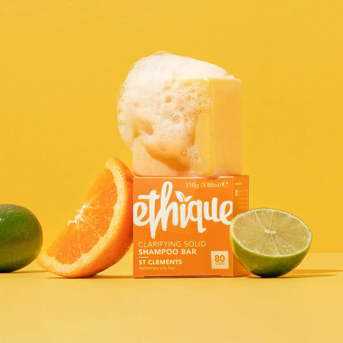
Orange carton, oversized white script and a lathered square bar