
Photography: Benamôr official photography. Images belong to their respective owners.
Benamôr

Ornamental lilac medallion suspended above golden botanical oil
Jacarandá Calming Dry Oil organizes an expressive product around a compact decorative seal. A clear 100 mL bottle reveals golden oil and botanical-looking inclusions, while a patterned lilac, cream and yellow circle supplies a stable graphic center. The brand name and bilingual product description sit below it in dark type. A short silver-colored cap keeps the vessel practical. The central contrast is between carefully repeated ornament and the less predictable appearance of the contents, not simply a floral print applied to a blank bottle.
- Body & bath
- Light pack
- Botanical
- Heritage label
- Retro illustrated
About this study
Selected 100 mL Jacarandá Calming Dry Oil as shown in the approved official campaign image. This is a front-view analysis, not a full Benamôr brand manual or a reconstruction of its 1925 packaging.
Sources & evidence · Reviewed 2026-10-19Color Palette
Approximate colours interpreted from photography. These are screen references, not official brand colours or print specifications.
Label
Medallion lilac
#A98BBB
Approximate purple of the repeating floral forms within the circular graphic; not sampled from the blue campaign ground.
Warm cream
#F3EEDB
Pale negative space within the medallion makes the small patterned shapes legible.
Ink
Outline charcoal
#39342D
Approximate dark color uniting the central emblem, medallion edge and information typography.
Accent
Golden oil
#E7C45D
Visible product color provides the main warm field through the clear bottle. It is not a proven ink or fixed brand standard.
Closure silver
#C4C2B9
Neutral metallic-looking cap with warmer and cooler reflections; composition qualification appears under structure.
Typography
Suggested visual alternatives, not confirmed brand typefaces. Any scale below is an illustrative estimate.
The central initial is embedded in a small shield-like outline inside the medallion. Curved collection lettering surrounds it. Beneath the circle, a wider, lighter uppercase brand name forms a second recognition layer, followed by a small origin line, bilingual product description, lilac strip and volume. The unusual lesson is that the prominent symbol does not replace the written brand: the two are separated vertically and serve different reading distances.
Fonts
Brand name
Jost
- Looks like
- Light geometric capitals
- Type
- Geometric sans-serif
- Weight
- Regular
- Case
- Uppercase
- Tracking
- Open, optically balanced across the word
- Fallback
- Century Gothic, sans-serif
An alternative for an independently named brand below the emblem. Preserve a broad, relatively quiet line instead of competing with the ornate circle through heavy weight.
Circular inscription
Montserrat
- Looks like
- Compact simple capitals on an arc
- Type
- Geometric sans-serif
- Weight
- Medium
- Case
- Uppercase
- Tracking
- Open enough to separate letters along a curve
- Fallback
- Arial, sans-serif
Proposed for collection and provenance text around an original medallion. Adjust each letter's position on the arc rather than stretching a completed straight text line.
Product information
Barlow Condensed
- Looks like
- Compact functional sans
- Type
- Condensed sans-serif
- Weight
- Regular, Semibold
- Case
- Mixed case for description; capitals for units
- Tracking
- Normal
- Fallback
- Arial Narrow, sans-serif
Alternative for bilingual descriptions and volume. Distinguish the languages through line order, not an additional decorative font, and maintain readable gaps above the colored strip.
Structure & Proportions
Visual proportions and finish previews are illustrative. Confirmed construction details and uncertainties are distinguished in the study notes.
Proportions
| Purpose | Value | Preview |
|---|---|---|
| Graphic concentration | The medallion occupies a substantial part of the upper front width without covering the entire body; the exact ratio is unmeasured. | — |
| Information sequence | A compact stack beneath the medallion reaches toward the base. The centered axis ties different widths and languages into one column. | — |
| Transparency | Visible product remains around the circle and through the lower information field, making the liquid an active part of the presentation. | — |
| Closure scale | The cap is shallow relative to the body and uses texture rather than height to establish a distinct top edge. | — |
Shapes
| Element | Value | Preview |
|---|---|---|
| Medallion | Large circular graphic containing a concentric inscription and decorative patterned field. | |
| Inner emblem | A small outlined shield-like form inside the circle; its exact silhouette belongs to the existing identity and should not be copied. | |
| Vessel | Straight-sided clear body with rounded shoulders and a gently rounded base. | |
| Closure | Low cylindrical silver-colored cap with horizontal ridges. |
Finishes
Transparent body
Visible around and behind the graphic zones; no tint or coating specification established. · transparent
Metallic-looking closure
Ribbed cap; the official aluminum wording is qualified because its recycling instructions ambiguously name a jar. · metallic
Formats and materials
| Formats | Clear bottle, official capacity 100 mL |
| Materials | Official recycling copy identifies glass packaging and an aluminum lid, but calls the vessel a jar; verify exact component mapping for this bottle edition., Printed decoration substrate and application method are not established by the photograph. |
| Closures | A short silver-colored screw-cap-style closure with horizontal ridges sits directly above the rounded shoulders. It occupies little visual height, leaving the colorful contents and medallion dominant. No internal reducer, applicator or seal is visible. |
| Decoration | Patterned circular seal with dark ornamental rim, Central shield-like initial and curved collection inscription, Separate brand and product typography below the seal, plus a narrow lilac band |
Front Panel
Schematic reading order. The diagram’s zone heights do not represent measured artwork proportions.
The medallion behaves as a visual label even though its actual stock and application method are unresolved. Centered typography continues below it rather than being confined within the circular boundary. This lets a decorative badge carry recognition while a more open lower field carries explanation.
| Zone | Content |
|---|---|
| Patterned seal | Lilac floral forms and pale spaces repeat around a light center. The dark perimeter holds the busy pattern together against the changing appearance of the oil. |
| Central identity | An initial inside a shield-like shape, with the collection name and origin/date inscription around it. This nested structure supplies a clear center within the pattern. |
| Written brand | A wide uppercase line below the circle and a smaller provenance line. Their relative simplicity creates a pause before the functional copy. |
| Product description | Two compact language lines, a fine lilac ingredient-message strip and large net contents near the bottom. These are distinct information levels, not part of the ornamental repeat. |
Range System
The official Jacarandá collection links its identity to Lisbon's purple-flowering trees and includes several body-care formats. This verifies a named family and inspiration, but the present analysis covers only the dry-oil bottle. A proposed extension would carry the medallion rhythm across formats while adapting its size and simplifying details for smaller surfaces.
- On an original opaque cream tube, use a controlled background color to replace the oil's warm contribution rather than pretending the clear-bottle effect survives unchanged.
- For a small balm, reduce the number of repeated ornamental units before reducing their stroke weight to illegibility.
- Use a clear product-type line alongside any family pattern so perfume, oil and lotion remain distinguishable without relying on container shape alone.
Back of Pack & Shelf
The approved image shows the front only. Reverse directions, ingredients, barcode and symbols are not visible. The source's recycling instructions are contextual information, not evidence of their placement on this package.
- Document an edition-matched reverse before drawing a full label layout.
- Keep actual ingredient identification separate from visual guesses about the botanical pieces.
- Do not assign paper stock, an adhesive layer or direct printing based solely on the clear front appearance.
On shelf
As a design interpretation, the medallion provides a repeatable recognition point while the visible oil and inclusions make each viewing angle less uniform. The silver-colored cap prevents the palette from becoming entirely warm. At thumbnail scale, the circle and golden body are likely to survive better than the fine ring inscription; therefore an original adaptation should be evaluated with small text temporarily hidden as well as at full reading size.
Imagery
The campaign makes the bottle appear suspended within a curling liquid splash, accompanied by almonds and lilac-colored blossoms against blue. This staging echoes the product story but is separate from package construction. The apparent flower pieces inside the bottle should not all be described as printed decoration: the official description includes petals, while its ingredient list names a different botanical term. No species identification is inferred from the photograph.
Guidelines
Editorial principles for an original design brief, not official brand guidelines.
Do
- Give an intricate repeat a clear center and a strong boundary.
- Let visible contents contribute to the color story without mislabeling them as print.
- Separate decorative identity from practical bilingual information.
- Keep the cap visually restrained when the front already contains pattern and product texture.
- Proof the small curved inscription and lower copy at actual intended print size.
Don't
- Do not copy the B shield, exact repeat or curved origin inscription.
- Do not confuse the blue campaign background with the package palette.
- Do not call the label paper or identify every botanical shape as printed.
- Do not infer a historical launch date from the 1925 heritage text.
- Do not present an ambiguous recycling paragraph as an unqualified component specification.
Sources & evidence
- Benamôr — Jacarandá Calming Dry Oil 100 mlproduct
- Benamôr — Jacarandá collectionbrand
- Benamôr — Our Storybrand
How this study was built
structure · Sourced fact
The page confirms 100 mL and contains glass/aluminum recycling guidance with ambiguous jar terminology; component mapping stays qualified.Benamôr — Jacarandá Calming Dry Oil 100 mllabel · Visual observation
The front shows a patterned medallion, central initial and separate lower typography; no paper substrate can be established.Benamôr — Jacarandá Calming Dry Oil 100 mlpalette · Visual observation
Lilac and cream ornament contrast with golden visible contents and a silver-colored cap; blue is campaign background.Benamôr — Jacarandá Calming Dry Oil 100 mltypography · Visual observation
A central emblem, curved inscription and lighter written brand create separate recognition layers; font suggestions are alternatives.Benamôr — Jacarandá Calming Dry Oil 100 mlrange · Sourced fact
The official collection provides jacaranda-tree inspiration and several product formats, without establishing universal artwork placement.Benamôr — Jacarandá collectionedition · Sourced fact
Benamôr's own history associates its origins with Lisbon in 1925 and Art Deco tubes; this does not date the selected oil bottle.Benamôr — Our Storyimagery · Sourced fact
The product description includes petals. Botanical-looking shapes visible through the oil should not automatically be classified as printed flowers.Benamôr — Jacarandá Calming Dry Oil 100 mlrange · Editorial interpretation
Adaptation of medallion complexity to smaller formats is proposed design guidance, not a documented brand production rule.
What remains unverified
- Exact decoration substrate, adhesive use and printing process unresolved.
- Recycling copy identifies glass and aluminum but ambiguously calls the product a jar.
- Marketing petal terminology and ingredient-list botanical terminology differ; species is not inferred visually.
- No measured dimensions, attributed fonts or reverse-panel photograph.
- Screen colors and suggested range adaptations are interpretive.
Give your AI
packaging taste
Give your design or image tool a packaging study: palette, type, structure, front panel and principles for an original brief.
Export this styleFree with an email. PACK.md works in Claude, ChatGPT, Cursor and image tools.
More like this
Panier des Sens
Botanical orange-blossom tube with a framed bilingual cartouche
Good & Well Supply Co.
Pale winter bird illustration on a grey amber-jar label
ARRAN
Festive golden linework on garnet with a grain-textured collar
Bopo Women
a botanical figure on a coordinated blush-pink pair
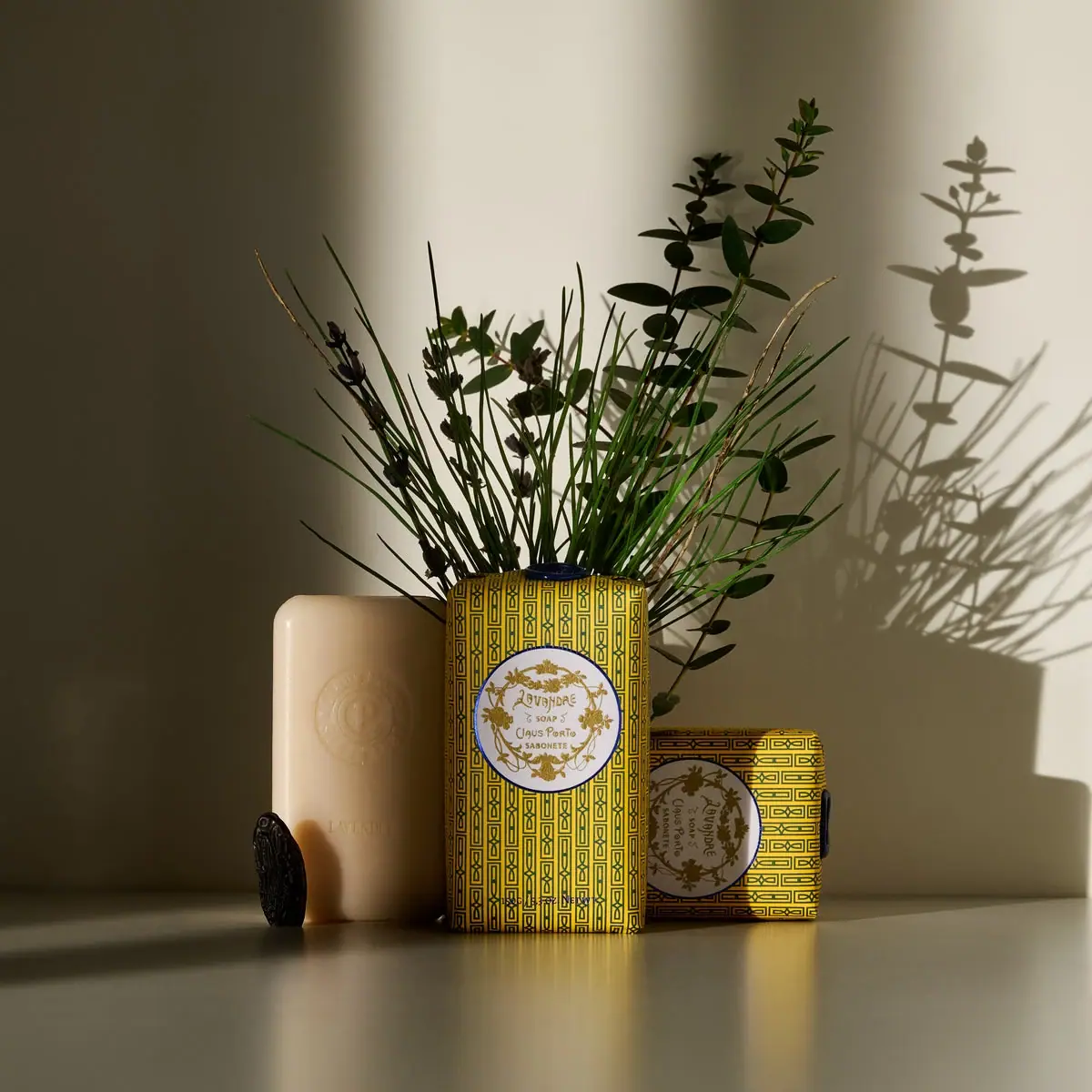
Claus Porto
Golden geometric wrapping around a pale floral medallion
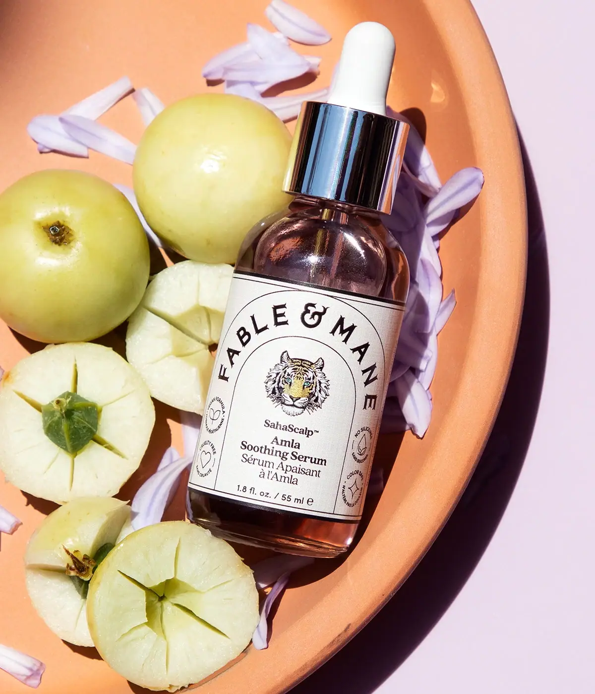
Fable & Mane
Arched serif maker, tiger portrait and amber dropper bottle
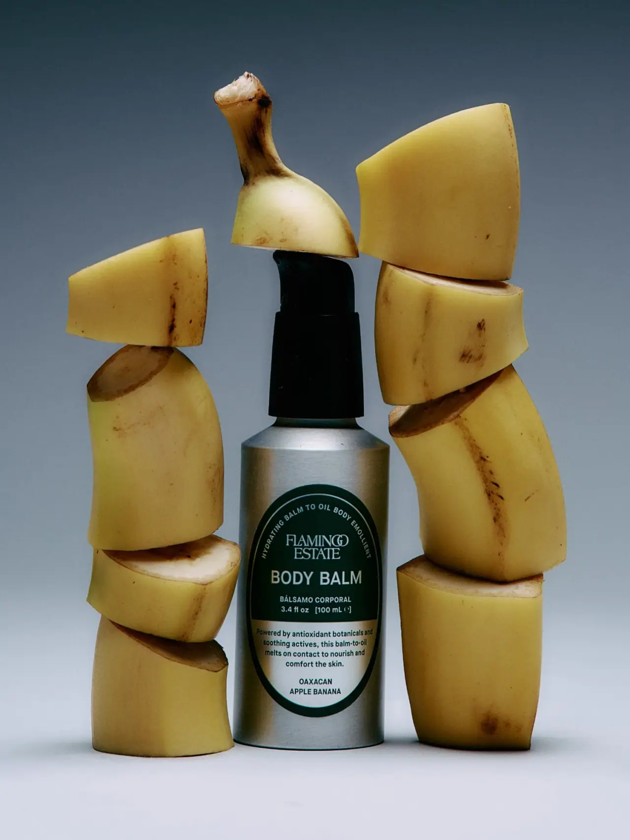
Flamingo Estate
A green oval turns silver utility into botanical character
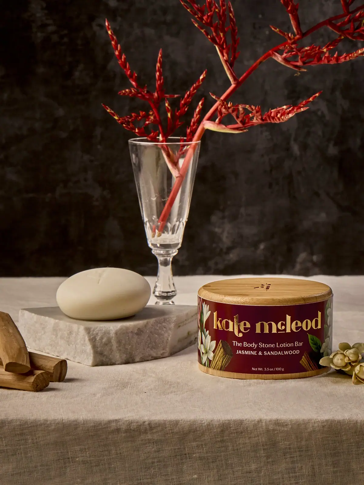
Kate McLeod
A burgundy botanical wrap around a reusable bamboo case