Photography: Flamingo Estate official photography. Images belong to their respective owners.
Flamingo Estate

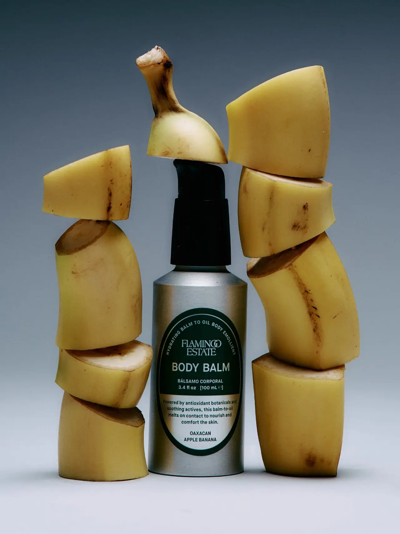
A green oval turns silver utility into botanical character
The selected Oaxacan Apple Banana Body Balm uses a silver cylindrical pump bottle as a quiet structural frame for a tall dark-green oval. The oval combines a curved introductory line, a compact serif house mark, a large sans-serif category and a pale lower information field. Its character comes from the tension between a practical metallic container and an almost traditional product seal. Stacked banana pieces make the campaign playful, but the label itself stays typographic and information-rich. This study concerns the photographed 100 ml pump bottle, not every Flamingo Estate body product or a universal brand label rule.
- Body & bath
- Light pack
- Heritage label
- Botanical
About this study
Selected 100 ml Oaxacan Apple Banana Body Balm pump bottle and its dark/pale oval label. Current page title is Banana Body Balm; analysis remains tied to the photographed front.
Sources & evidence · Reviewed 2026-10-19Color Palette
Approximate colours interpreted from photography. These are screen references, not official brand colours or print specifications.
Pack body
Silver aluminium appearance
#A2A7A5
Approximate midtone of the exposed bottle. Its silver surface reflects the blue-grey scene and yellow props, so those reflected colours should not be treated as separate bottle coatings.
Label
Deep green
#06362D
Dark oval field and outer border. It supplies the main graphic identity and a strong contrast against the light lettering and silver cylinder.
Pale lower field
#DADBD0
Approximate light information area in the lower oval. The photograph cannot establish whether this is opaque printed colour, a reflective label substrate or another construction.
Ink
Near-black hardware and copy
#101714
The pump provides a dark silhouette above the bottle; darker copy reverses the upper panel’s light-on-green relationship within the lower field.
Typography
Suggested visual alternatives, not confirmed brand typefaces. Any scale below is an illustrative estimate.
The narrow, curved introductory line follows the oval’s upper arc and leads into the small two-line serif house mark. Below, the large sans-serif category is the strongest functional read. A bilingual descriptor and quantity form smaller supporting lines. The lower pale area contains a compact paragraph and the named variant at the bottom. Serif branding, large plain capitals and curved microcopy each have a distinct job, allowing substantial information to fit within one bounded shape.
Fonts
Serif house-name alternative
Cormorant Garamond
- Looks like
- Cormorant Garamond
- Type
- Serif
- Weight
- Medium 500 / SemiBold 600
- Case
- Uppercase
- Tracking
- Compact with careful optical spacing
- Fallback
- serif
An alternative for a short original house name set on two lines. The original interlocking-looking wordmark is not reproduced; use the serif contrast to distinguish producer identity from functional category text.
Category and variant
Roboto Condensed
- Looks like
- Roboto Condensed
- Type
- Condensed sans serif
- Weight
- Medium 500 / SemiBold 600
- Case
- Uppercase
- Tracking
- Neutral for the category; slightly open for short variant lines
- Fallback
- sans-serif
A practical substitute for the clear body-balm headline and compact lower variant. Adjust line breaks to the oval’s changing width rather than stretching the letters or letting text approach the curved border.
Curved descriptor and paragraph
Inter
- Looks like
- Inter
- Type
- Sans serif
- Weight
- Medium 500 / SemiBold 600
- Case
- Uppercase on the arc; sentence case in the paragraph
- Tracking
- Modest on the arc, normal in body copy
- Fallback
- sans-serif
Use for smaller information that needs consistent readability. The curved line should be treated as a secondary detail, while the short paragraph requires a proper printed proof on the actual label surface.
Structure & Proportions
Visual proportions and finish previews are illustrative. Confirmed construction details and uncertainties are distinguished in the study notes.
Proportions
| Purpose | Value | Preview |
|---|---|---|
| Bottle body | A narrow upright cylinder supports a tall pump assembly; the side walls remain visible around the oval rather than being covered by a full graphic sleeve. | — |
| Label | The oval occupies much of the usable front height, tapering around the upper curved copy and lower variant. Width changes meaningfully from top to centre to bottom. | — |
| Information | The category is larger than the brand block’s individual lines, while the paragraph and quantity remain clearly subordinate. No exact type-size ratio is measured. | — |
Shapes
| Element | Value | Preview |
|---|---|---|
| Bottle | Straight cylindrical body with a short sloping shoulder and flat-looking base. | |
| Label field | A vertically elongated oval whose curvature determines the usable text width. | |
| Pump | Tall dark collar and actuator with the upper outline partly hidden by a prop. |
Finishes
Satin metallic bottle
Exposed aluminium body; material is source-confirmed, exact surface process is not. · metallic
Quiet dark label appearance
Deep-green oval field; coating and substrate unverified. · matte
Formats and materials
| Formats | A 100 ml cylindrical body-balm bottle with sloping shoulder and a tall dark pump. The official page gives the volume, and the same quantity is visible on the selected front. |
| Materials | Flamingo Estate describes the bottle as 100% aluminium. That statement is treated as a brand-reported bottle-body specification, not as a claim that the pump, label, internal coating or complete assembled package is aluminium., The pump composition, label substrate, adhesive and any internal liner are not specified in the inspected product source. |
| Closures | A black pump rises from a broad dark collar. A banana piece partly overlaps the upper actuator in the photograph, so the exact nozzle outline and locking arrangement cannot be fully assessed. No refill system or removable-pump specification is established. |
| Decoration | A tall oval with a dark outer edge and a thin inner line organises the typography. The lower field reverses the contrast for paragraph copy and variant identification. |
Front Panel
Schematic reading order. The diagram’s zone heights do not represent measured artwork proportions.
The oval acts as a complete information container, but it is divided into a dark upper field and a pale lower field. Light text on green handles identity, category and quantity; dark text on the lower area handles the short explanatory paragraph and variant. This reversal prevents the full label from becoming one uninterrupted dark block.
| Zone | Content |
|---|---|
| Curved upper line | A short descriptor follows the inner oval arc. It makes the border active while remaining smaller than the central category; it should not carry information essential to quick identification. |
| House mark | A compact serif producer name sits under the arc. The small two-line block leaves room for the large functional category below. |
| Category and quantity | The body-balm headline anchors the dark field, followed by a smaller Spanish descriptor and the visible 3.4 fl oz / 100 ml quantity. These lines explain the item without requiring the campaign props. |
| Lower paragraph | A short sentence-case block appears on the pale field. Its role is explanatory; this study records the hierarchy without treating the photographed cosmetic benefit wording as independently verified performance evidence. |
| Variant base | The Oaxacan Apple Banana designation sits at the bottom in two compact uppercase lines, where the oval narrows. Its line breaks are part of fitting the naming system to the physical label shape. |
Range System
The selected product page now uses the shorter title Banana Body Balm, while the photographed front carries the fuller Oaxacan Apple Banana designation. These names are treated as context for the same selected product, not as evidence of an unobserved packaging redesign. Other Flamingo Estate formats were not audited here.
- For an original series, the dark upper category field could remain stable while the lower named variant changes. This is a proposed adaptation of the observed hierarchy, not a verified brand-wide template.
- A longer variant needs a deliberate line break within the narrowing oval. Do not compensate by shrinking the entire label, because category and quantity already have clear roles and useful relative sizes.
Back of Pack & Shelf
The back, base and open pump are not shown. No carton is included in the selected image.
- Verify ingredients, use instructions and required warnings from final artwork before creating a reverse map.
- Treat the aluminium statement as component-specific and avoid extending it to pump composition or local disposal outcomes.
- Check whether the curved bottle needs a separate rear label or a wider wrap in production; neither arrangement is established by this view.
On shelf
The green oval and silver body are likely to form the first visual impression, followed by the large category lettering. The house name and detailed paragraph ask for a closer look. This is a design interpretation, not a measured recognition result. The oval gives this utilitarian pump format a distinct graphic silhouette even when the playful banana staging is removed.
Imagery
Two irregular columns of banana pieces flank the bottle, and a small top piece balances over the pump. The organic cut faces and natural blemishes contrast with the straight silver cylinder and precisely bounded oval. A cool blue-grey background intensifies the yellow fruit without requiring a yellow label. The arrangement is deliberately sculptural rather than a normal usage scene. It supports the named banana inspiration, but it does not establish fruit species from appearance or prove that visible fruit pieces describe the formula’s ingredient composition.
Guidelines
Editorial principles for an original design brief, not official brand guidelines.
Do
- Fit the text to the oval’s changing width, with controlled line breaks near its narrower ends.
- Keep the category easier to find than the curved descriptor or lower paragraph.
- Attribute aluminium to the bottle body and keep unverified pump and label composition separate.
- Use photographic props to expand the product story while preserving an unobstructed front label.
Don't
- Do not sample the yellow bananas or blue-grey background as printed package colours.
- Do not call the whole assembled pack aluminium or promise universal recyclability.
- Do not infer foil or a special label substrate from the reflective lower field.
- Do not let the upper curved wording become a second large headline that competes with the category.
Sources & evidence
How this study was built
structure · Sourced fact
The official page lists 100 ml and identifies the bottle as 100% aluminium.Banana Body Balm — Flamingo Estateedition · Visual observation
The selected front carries the fuller Oaxacan Apple Banana designation and 100 ml quantity.label · Visual observation
An elongated green oval includes a pale lower field, curved upper descriptor and central category.typography · Visual observation
Serif house mark contrasts with large sans-serif category and smaller supporting copy.palette · Visual observation
Silver, deep green, pale lower field and dark pump are pack colours; bananas and background are scene colours.imagery · Visual observation
Stacked banana pieces frame the bottle and partly overlap the pump top.range · Editorial interpretation
Stable upper identity and variable lower naming are proposed design principles, not audited brand-wide rules.
What remains unverified
- Brand-reported aluminium applies to the bottle; pump, liner, label and adhesive composition remain unspecified.
- Reflective label appearance does not establish foil or substrate.
- Pump top is partly overlapped by a prop; back, base and open mechanism are unseen.
- Font alternatives and colours are approximate, with qualitative proportions rather than measured dimensions.
Give your AI
packaging taste
Give your design or image tool a packaging study: palette, type, structure, front panel and principles for an original brief.
Export this styleFree with an email. PACK.md works in Claude, ChatGPT, Cursor and image tools.
More like this

Benamôr
Ornamental lilac medallion suspended above golden botanical oil
Claus Porto
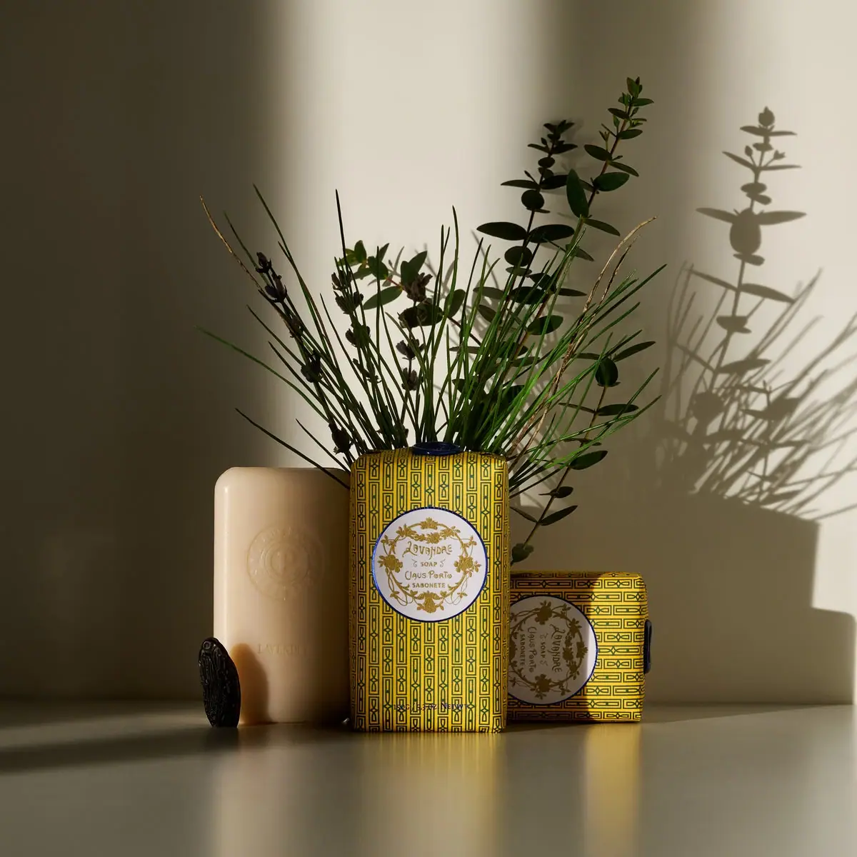
Golden geometric wrapping around a pale floral medallion
Kate McLeod
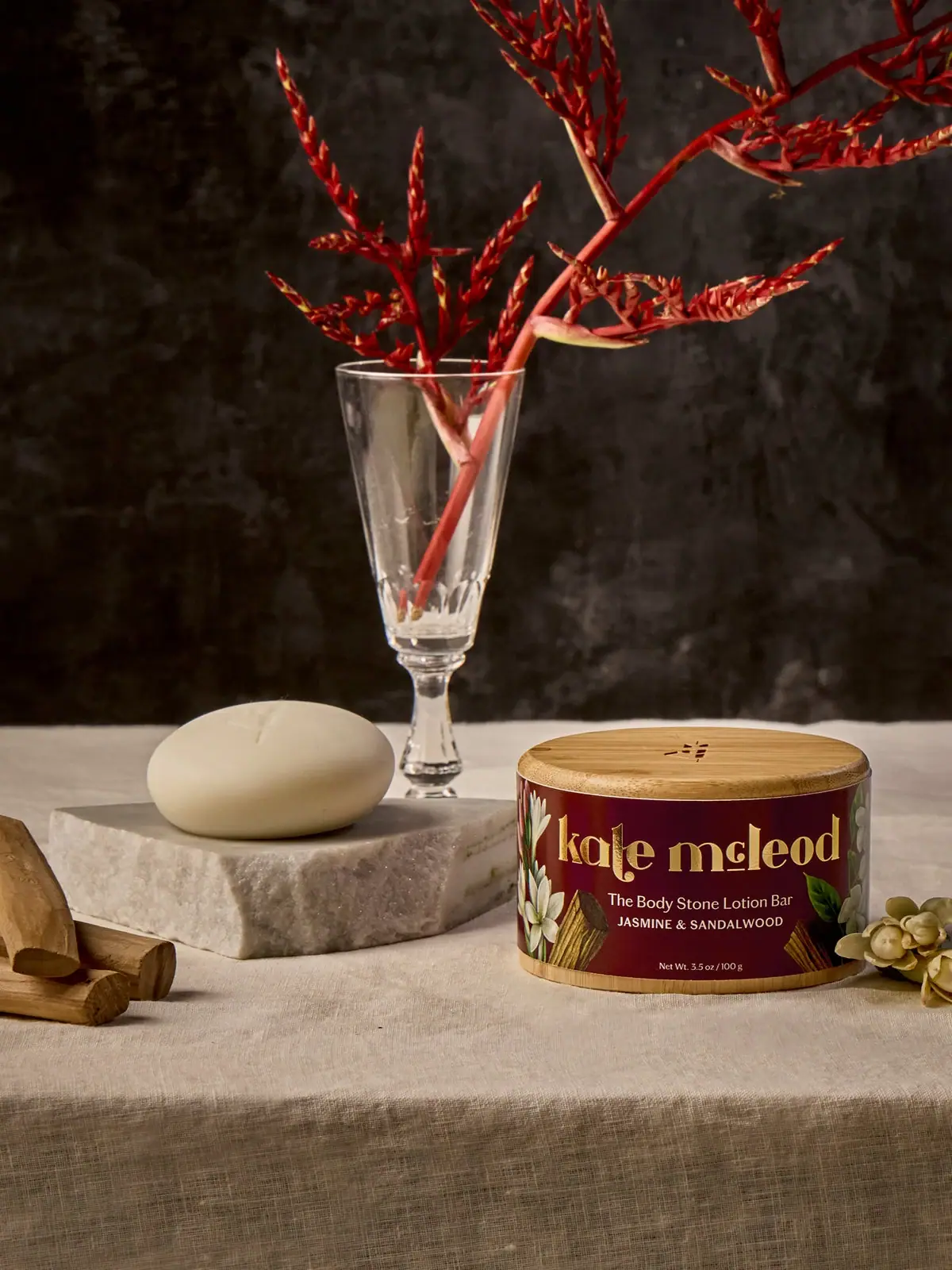
A burgundy botanical wrap around a reusable bamboo case
Panier des Sens
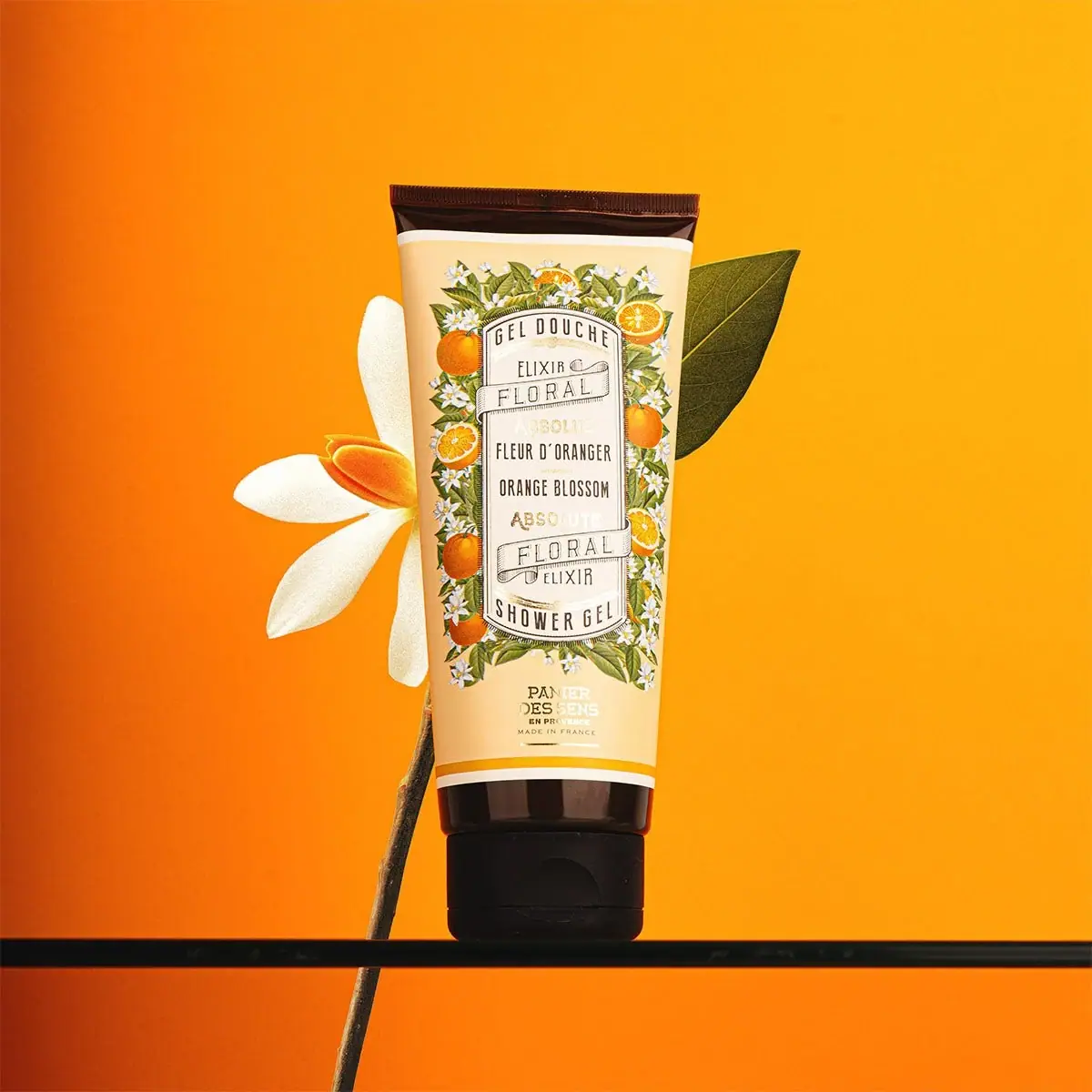
Botanical orange-blossom tube with a framed bilingual cartouche
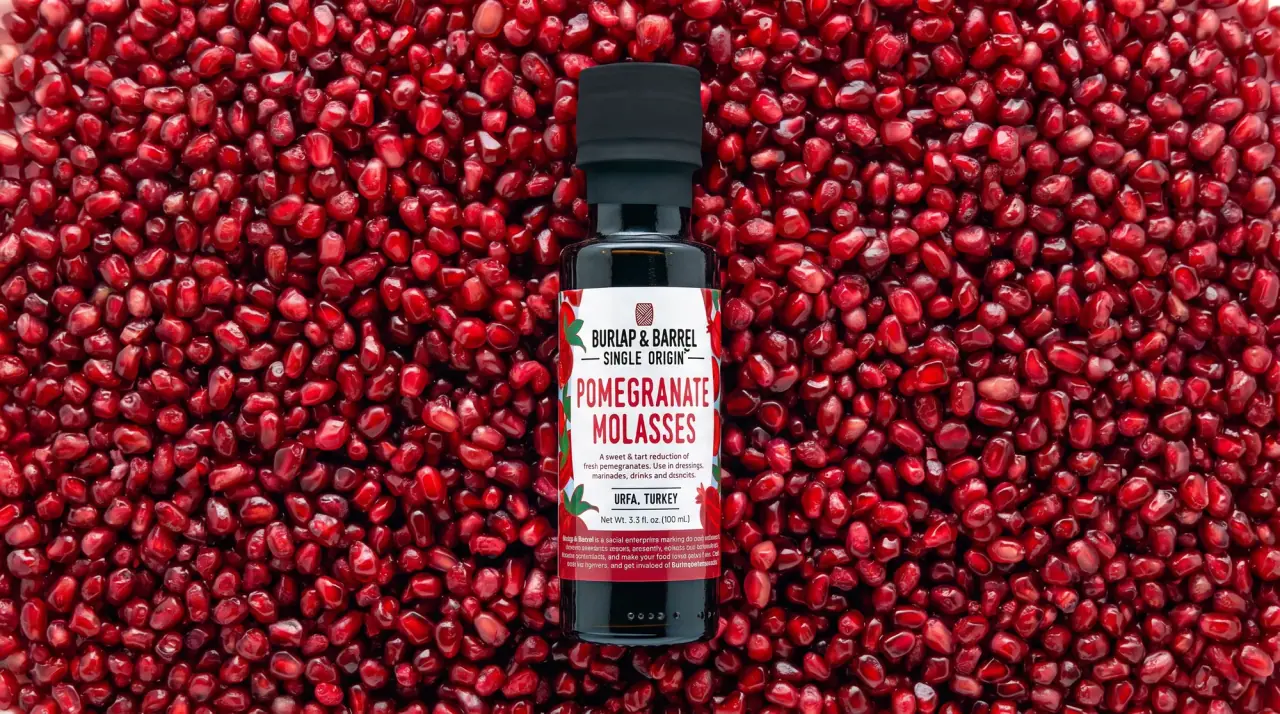
Burlap & Barrel
field-guide labels on clear spice jars
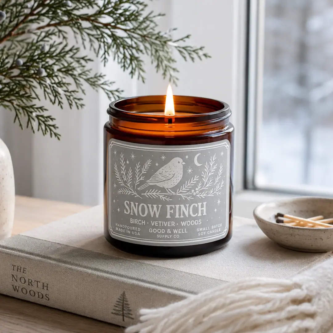
Good & Well Supply Co.
Pale winter bird illustration on a grey amber-jar label
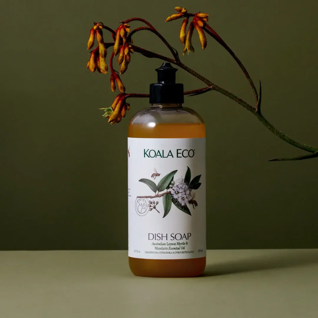
Koala Eco
Naturalist botanical drawing on a generous white household label

Aesop
a botanical still life around a disciplined apothecary label