
Photography: Rich Begany — cosmetics photography. Images belong to their respective owners.
bareMinerals

a restrained black compact framing the powder itself
The selected BAREPRO reference reduces the closed compact to a round black surface and a short white identity. Opened slightly, it reveals a single pale pressed-powder pan within a narrow dark rim. The visual system changes with use: branding leads when closed, while product colour leads when open. Rich Begany’s photograph makes that transition visible in one view, using surrounding powder textures to amplify the otherwise restrained case. This is the photographed black compact edition, not a technical specification for the current BAREPRO 24HR product.
- Make-up
- Light pack
- Luxe monochrome
- Clinical minimal
About this study
Earlier black BAREPRO compact as photographed by Rich Begany. Current 24HR product content is used only for explicitly identified family context, not to verify this specimen’s case, shade or refill system.
Sources & evidence · Reviewed 2026-10-19Color Palette
Approximate colours interpreted from photography. These are screen references, not official brand colours or print specifications.
Pack body
Soft black case
#292623
Approximate dark case tone under the selected studio light. The lid appears lighter than the edge because of illumination, not necessarily a second material colour.
Ink
Pale white identity
#EDE9E4
Approximate masterbrand and BAREPRO lettering. No ink formulation or decoration process is established.
Accent
Visible powder tone
#DCA486
Approximate tone of the exposed powder, included as product colour rather than packaging ink. It does not identify the exact shade or define the palette of the entire foundation range.
Typography
Suggested visual alternatives, not confirmed brand typefaces. Any scale below is an illustrative estimate.
The bareMinerals masterbrand occupies the wider upper line on the lid. A smaller, more widely spaced BAREPRO line sits beneath it. Both remain compact relative to the circular surface, leaving a generous black perimeter. The difference is not simply size: mixed-case identity and spaced capitals separate brand from product family. There is no visible shade name, benefit list or volume statement on this upper face.
Fonts
Masterbrand alternative
Lora
- Looks like
- Lora as a restrained serif exploration
- Type
- Contemporary text serif
- Weight
- Regular
- Case
- Mixed or title case
- Tracking
- Optical spacing for the invented brand name
- Fallback
- Georgia, serif
Explore a compact mixed-case name with enough character to stand alone on a blank lid. Do not copy the bareMinerals letterforms or its distinctive capitalisation.
Product-family alternative
Montserrat
- Looks like
- Montserrat for a short secondary capital line
- Type
- Geometric sans serif
- Weight
- Medium
- Case
- Uppercase
- Tracking
- Moderately open on a short name
- Fallback
- Arial, sans-serif
Use beneath an original identity to distinguish a powder family. Keep it visibly subordinate and test white-on-black small type on actual production samples rather than copying photograph-sized lettering.
Structure & Proportions
Visual proportions and finish previews are illustrative. Confirmed construction details and uncertainties are distinguished in the study notes.
Proportions
| Purpose | Value | Preview |
|---|---|---|
| Lid identity | The two-line lockup occupies a small central area, leaving the circular shape and empty black field dominant. | — |
| Pan and rim | The round powder pan fills most of the visible base opening. A narrow dark rim separates its warm tone from the outer case. | — |
| Case profile | The compact reads as shallow relative to its diameter. This is a qualitative observation, not a verified thickness or diameter. | — |
| Open presentation | The lid overlaps part of the pan in the photograph, revealing exterior identity and contents at the same time. That staged angle is not evidence of a designed detent position. | — |
Shapes
| Element | Value | Preview |
|---|---|---|
| Closed case | Circular lid with a softly rounded perimeter. | |
| Product pan | Round single-pan layout concentric with the base. | |
| Opening interface | Small front-edge interruption visible beneath the lid; mechanical details unknown. |
Finishes
Subdued black lid appearance
Top surface; no soft-touch coating or specific texture is verified. · matte
Reflective rim appearance
Narrow inner edge surrounding the pan; this does not identify its material or coating. · gloss
Formats and materials
| Formats | Selected object: round hinged-looking compact containing one visible pressed-powder pan. |
| Materials | Case, pan and hinge materials are not established by the consulted sources. The black exterior may look familiar, but its polymer or metal specification must not be guessed. |
| Closures | The lid is held partly open, revealing the circular pan and a shallow case profile. A small interruption at the front edge suggests an opening interface, but the latch, hinge mechanism, retention force and full opening angle cannot be verified from this single image. |
| Decoration | Two-line identity on the lid., No illustration or decorative border on the visible closed face., Exposed powder becomes the main colour field when the compact opens. |
Front Panel
Schematic reading order. The diagram’s zone heights do not represent measured artwork proportions.
The visible lid has a centred typographic lockup with no enclosing graphic device. The brand line is longer and larger, while the product-family line is shorter and spaced. Practical information is absent from this shown face, but its position elsewhere cannot be assumed. When open, the visual centre moves from the lid to the powder rather than to another printed label.
| Zone | Content |
|---|---|
| Masterbrand | bareMinerals sits above the secondary line, spanning the wider part of the small lockup. |
| Product family | BAREPRO appears smaller below, with open spacing that gives a short name sufficient visual presence. |
| Black perimeter | A substantial clear area surrounds the identity, preserving the simple circular silhouette. |
| Open product field | The warm-toned powder surface is framed by a narrow black ring. No pan decoration or shade marking is confidently visible. |
Range System
The current official BAREPRO 24HR page organises shade choices through depth, number and undertone, including cool, neutral and warm options. That is useful contemporary family context, but the photographed black compact’s exact shade and historical naming system are unverified. No uniform current case or refill architecture is inferred.
- Current listing example: Fair 10 Cool combines depth, index and undertone.
- Current listing example: Medium 30 Neutral uses the same naming categories for another option.
- Selected photograph: the exposed powder has a warm pale appearance, but lighting and staging prevent a reliable shade match.
- Interpretation for a new range: keep exterior identity consistent while making shade identification easy to locate on a separately verified label area.
Back of Pack & Shelf
The base and lid interior are unseen. A mirror, sponge compartment, shade sticker, barcode, ingredients or refill release might exist, but none is established here. The current official product includes a sponge; that does not prove its storage location in this earlier photographed case.
- Obtain underside and fully opened views before mapping shade information or applicator storage.
- For an original compact, specify a clear shade identifier without relying on the powder colour alone.
- Verify pan removal and closure construction before making any refillability or recyclability claim.
On shelf
Interpretation: the short white lockup on black is easy to isolate from a busy visual background. The plain case could support recognition across shades without adding different decorative colours to every lid. However, a closed top with only a family name gives limited shade information; a real retail system needs a separate readable identifier. This study did not test retail visibility, handling comfort or shade-selection performance.
Imagery
The compact is staged diagonally across broad curved fields of loose powder in warm brown shades, separated by a pale sweeping channel. These large arcs echo the circular case while introducing movement and tactile texture. The lid’s shadow crosses the pressed pan, making its open state evident. The surrounding material is photographic styling, not an expanded package palette or proof of the exact included shade. A product-and-texture view communicates use more directly than a closed packshot, but should be paired with neutral lighting for accurate shade evaluation.
Guidelines
Editorial principles for an original design brief, not official brand guidelines.
Do
- Use a concise hierarchy on a circular lid rather than filling it with claims.
- Photograph exterior and contents together when the opening action matters.
- Keep shade identification separate from uncertain image colour.
- Distinguish an earlier photographed edition from current product specifications.
Don't
- Do not invent a mirror, sponge compartment or refill mechanism from this view.
- Do not mistake the surrounding powder textures for printed packaging graphics.
- Do not describe BAREPRO as larger than the masterbrand in this image.
- Do not copy the bareMinerals wordmark or assume a soft-touch coating from subdued reflections.
Sources & evidence
- Rich Begany — Cosmetics, BAREPRO powder texture curve photographphotographer
- bareMinerals — Current BAREPRO 24HR Skin-Perfecting Powder Foundationproduct
How this study was built
edition · Sourced fact
Photographer portfolio identifies the BAREPRO image; current official listing concerns the 24HR family and is kept separate.Rich Begany — Cosmetics, BAREPRO powder texture curve photograph · bareMinerals — Current BAREPRO 24HR Skin-Perfecting Powder Foundationstructure · Visual observation
Partly open circular case reveals a single pan and narrow rim, without revealing the underside or full interior.Rich Begany — Cosmetics, BAREPRO powder texture curve photographtypography · Visual observation
The masterbrand is the wider larger line; BAREPRO is a smaller spaced secondary line.Rich Begany — Cosmetics, BAREPRO powder texture curve photographpalette · Visual observation
Black case and pale lettering are pack colours; the visible powder is separately identified as product colour.Rich Begany — Cosmetics, BAREPRO powder texture curve photographlabel · Visual observation
No shade or regulatory information is visible on the lid face; unseen panels are not reconstructed.Rich Begany — Cosmetics, BAREPRO powder texture curve photographrange · Sourced fact
Current official shade names distinguish depth, index and undertone, without identifying the pictured historical shade.bareMinerals — Current BAREPRO 24HR Skin-Perfecting Powder Foundationimagery · Editorial interpretation
Curved texture fields echo the case shape and help explain contents; they are styling, not package decoration.
What remains unverified
- Photographed production year, exact shade and case materials are unverified.
- Underside, mirror, applicator storage, latch mechanism and refillability are not established.
- Original fonts, physical dimensions and surface coating remain unknown.
- Current product claims and sponge inclusion cannot be projected onto the photographed edition.
Give your AI
packaging taste
Give your design or image tool a packaging study: palette, type, structure, front panel and principles for an original brief.
Export this styleFree with an email. PACK.md works in Claude, ChatGPT, Cursor and image tools.
More like this

African Botanics
Technical black label with a low serif signature

BeautyPWR
Clear square shell, white cream cup, black serif identity

Corpus
sage gloss with whispered gold lettering

Costa Brazil
Pale matching vessels with small, deliberate bilingual labels

Crown Affair
Pale frosted-looking bottle, black pump and small looping emblem

HAKU
Pearly narrow tube with stacked serif identity and clear base

Haus Labs
mirror chrome hardware over frosted shade
Hourglass
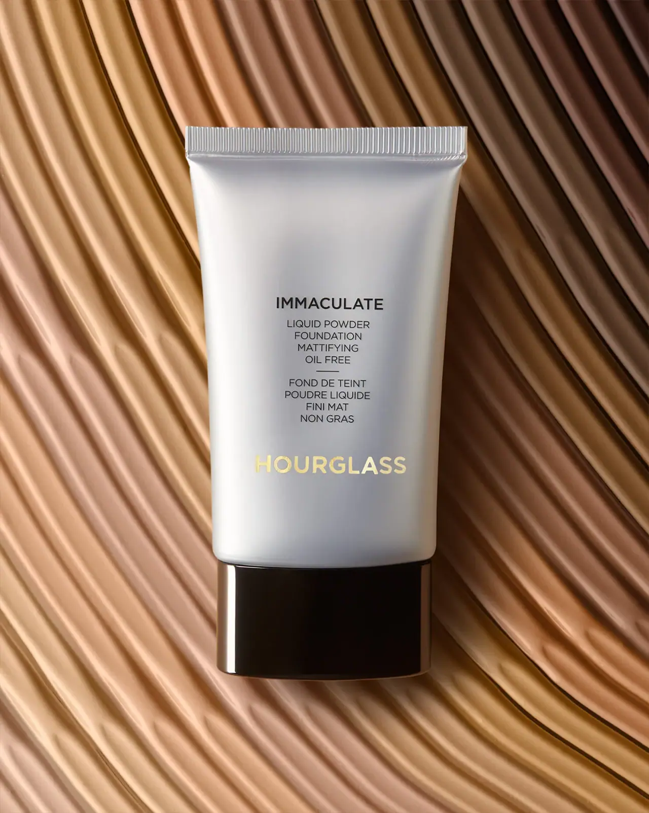
Silver-grey foundation tube with bilingual precision and golden signature