
Photography: African Botanics official photography. Images belong to their respective owners.
African Botanics

Technical black label with a low serif signature
Intensive Recovery Cream places a technical-looking product block and a large serif brand signature at opposite ends of a dark label. The near-black cylindrical bottle and matching broad pump make an uninterrupted silhouette, but the label reflects less light than the exposed body. Small uppercase copy begins high on the left; the two-line identity anchors the lower right. This subtle asymmetry gives an otherwise restrained monochrome package its structure. The study concerns the photographed 50 mL treatment, not the complete African Botanics range.
- Skincare
- Dark pack
- Clinical minimal
- Luxe monochrome
About this study
Selected 50 mL Intensive Recovery Cream front and visible pump in official photography. No universal brand rules, component material specification, complete label artwork or efficacy validation are claimed.
Sources & evidence · Reviewed 2026-10-19Color Palette
Approximate colours interpreted from photography. These are screen references, not official brand colours or print specifications.
Pack body
Near-black vessel
#121213
Approximate dominant body and pump tone. A dark reddish undertone is visible at exposed edges, but the photograph does not establish a standardized tint.
Label
Soft charcoal label
#202224
Approximate lower-reflection dark panel, subtly distinct from the glossier body through texture rather than strong hue contrast.
Ink
Pale neutral type
#DADCD8
Shared light lettering connects small functional text and the larger serif identity. Its grayish appearance may reflect scene exposure rather than a deliberately gray ink.
Typography
Suggested visual alternatives, not confirmed brand typefaces. Any scale below is an illustrative estimate.
The product name occupies two short uppercase sans-serif lines at the upper left. A smaller group of ingredient-oriented statements follows after a visible gap. Much farther down, a larger two-line serif wordmark sits toward the right, giving the brand a different voice and anchor. The hierarchy therefore combines position, family and scale rather than adding colored pills or multiple badges. The serif signature is the expressive element; technical copy remains comparatively plain.
Fonts
Product and technical block
Inter
- Looks like
- Compact neutral grotesque
- Type
- Neo-grotesque sans-serif
- Weight
- Regular, Semibold
- Case
- Uppercase
- Tracking
- Normal to slightly tight, with readable line spacing
- Fallback
- Helvetica, Arial, sans-serif
Proposed for an original product title and short technical descriptor. Use weight and a deliberate gap between levels instead of turning every line into bold text.
Brand signature
Bodoni Moda
- Looks like
- High-contrast editorial serif capitals
- Type
- Modern serif
- Weight
- Regular, Medium
- Case
- Uppercase
- Tracking
- Close optical spacing; protect fine strokes in print
- Fallback
- Didot, Georgia, serif
Alternative for an independently named two-line brand signature. Its contrast can introduce elegance against plain technical copy, but the actual African Botanics lettering and line breaks should not be copied.
Structure & Proportions
Visual proportions and finish previews are illustrative. Confirmed construction details and uncertainties are distinguished in the study notes.
Proportions
| Purpose | Value | Preview |
|---|---|---|
| Label height | The panel occupies much of the body below the pump while leaving exposed bottle at the top and base. Its exact height and wrap coverage are unmeasured. | — |
| Vertical separation | The gap between technical copy and brand signature exceeds the spacing within either group, creating two distinct reading territories. | — |
| Horizontal balance | Upper copy aligns left while the larger lower identity is shifted right. The result is balanced through opposing anchors rather than perfect centered symmetry. | — |
| Collar width | The broad collar visually extends the bottle diameter, making the dispensing system a substantial top section rather than a thin neck accessory. | — |
Shapes
| Element | Value | Preview |
|---|---|---|
| Body | Tall straight cylinder with a subtly rounded base; no dimensional drawing or exact aspect ratio is inferred. | |
| Front panel | A near-rectangular dark area with softly rounded-looking corners, distinct from the exposed reflective vessel. | |
| Pump assembly | Broad stacked cylindrical collar supporting a short upright head and horizontal dispensing projection. |
Finishes
Low-reflection label appearance
Main dark information panel; no tactile soft-touch coating or paper grade is confirmed. · matte
Glossy-looking dark vessel
Exposed body and pump catch stronger highlights than the label; material and finishing process remain open. · gloss
Formats and materials
| Formats | Upright cylindrical pump bottle; official product capacity 50 mL / 1.7 oz |
| Materials | Body material and tint composition are not specified in the inspected product page., Pump components, label stock and any protective coating are unverified; dark translucency does not prove glass. |
| Closures | A broad black cylindrical collar spans nearly the full body width beneath a short pump head. The dispenser projects sideways and appears glossy in the selected lighting. The official instructions refer to pumps, supporting the format, but neither internal mechanism nor an airless system is established. |
| Decoration | Rectangular dark front panel with subtly rounded-looking corners, Upper-left treatment naming and smaller ingredient-oriented copy, Low, right-positioned two-line serif identity with a broad open interval above it |
Front Panel
Schematic reading order. The diagram’s zone heights do not represent measured artwork proportions.
The layout resembles a restrained technical card: product and ingredient-oriented information at the upper left, a quiet central field, and a large identity at the lower right. The black panel almost merges with the vessel, so light typography and spacing reveal the organization. There is no decorative botanical illustration despite the brand name.
| Zone | Content |
|---|---|
| Treatment name | Two compact uppercase lines identify the selected cream. The title begins close to the top-left reading corner without using a large banner. |
| Technical descriptors | Several smaller lines list ingredient-oriented terms. This study records the visual density and alignment of the block, not independent substantiation of its formula or performance statements. |
| Open middle | A large dark pause separates product information from identity. Preserving it allows the small upper text and larger lower serif to remain distinct. |
| Brand signature | Two uppercase serif lines near the lower right act as a closing signature. Their larger size and high-contrast strokes provide the main expressive contrast on the panel. |
Range System
One treatment bottle is analyzed. A hypothetical extension could preserve the technical upper block and low serif signature while changing the product name, but no complete African Botanics layout rule or color-coding scheme is established. Different containers would require fresh checks of curvature, label area and readable type rather than automatic duplication.
- For an original serum companion, keep the hierarchy of product title versus technical details while adjusting line lengths to the smaller face.
- On a wider jar, the opposing high-left and low-right anchors could be retained, but the central gap would need to become a horizontal rather than elongated vertical pause.
- Use explicit product names to distinguish an original all-dark range; do not assume subtle bottle dimensions are sufficient for routine identification.
Back of Pack & Shelf
The reverse and full wrap are not visible. Directions, volume, ingredient list, barcode and symbols cannot be placed from this front view. Website use instructions do not establish where they appear on the physical package.
- Obtain a matching rear image before recording regulatory or usage hierarchy.
- Keep the observed front ingredient-oriented block distinct from a complete ingredient list.
- Do not infer recycling instructions or pump disassembly from the dark vessel's appearance.
On shelf
Interpretively, the dark object can communicate restraint through silhouette while the two-line serif identity supplies recognition at closer range. Small upper copy may disappear earlier than the brand in a thumbnail, so an original adaptation should test whether the product name remains adequately prominent. The label/body contrast also depends on illumination; test the design without the strong light that makes the photograph's exposed edges visible.
Imagery
The bottle is photographed against a pale speckled, stone-like surface with directional light and a long dark shadow. Reflections along the vessel reveal its cylindrical geometry while the quieter panel keeps small copy relatively readable. The neutral set avoids adding an unsupported ingredient story through props. Its speckles belong to the surface behind the bottle, not a printed pattern or texture in the pack.
Guidelines
Editorial principles for an original design brief, not official brand guidelines.
Do
- Use typographic family and position to separate technical copy from identity.
- Retain enough open space for each text group to have its own role.
- Test the lower serif's fine strokes against actual print and curvature constraints.
- Describe the external pump without assuming an airless mechanism.
- Use lighting that reveals both the dark bottle edge and the quieter label.
Don't
- Do not equate dark translucent appearance with verified protective glass.
- Do not add botanical graphics simply because the brand name contains Botanics.
- Do not convert visible ingredient terms into independently verified efficacy claims.
- Do not label the matte-looking panel soft-touch without material evidence.
- Do not copy the exact serif signature or opposing text placement as a complete branded layout.
Sources & evidence
How this study was built
structure · Sourced fact
Official page lists 50 mL and refers to pump dispensing; it does not establish the body material or airless construction.African Botanics — Intensive Recovery Creamlabel · Visual observation
Product and smaller technical lines begin high-left, while the larger serif signature sits low toward the right.African Botanics — Intensive Recovery Creamtypography · Visual observation
Compact uppercase sans and larger high-contrast serif perform distinct roles; alternative fonts are not exact identifications.African Botanics — Intensive Recovery Creampalette · Visual observation
Near-black body, charcoal panel and pale type define the pack; the pale speckled background is excluded.African Botanics — Intensive Recovery Creamstructure · Visual observation
The panel has a quieter reflected response than the exposed vessel and broad pump collar, without proof of coating processes.African Botanics — Intensive Recovery Creamimagery · Visual observation
A pale textured ground and directional shadow reveal the bottle silhouette without ingredient props.African Botanics — Intensive Recovery Creamrange · Editorial interpretation
Adapting the upper technical block and lower identity to other formats is a proposed design method, not a verified cross-range specification.
What remains unverified
- Bottle substrate, pump mechanism and label stock unverified.
- Matte and gloss describe appearance, not confirmed coatings.
- Exact fonts, dimensions and label coverage are unmeasured.
- Reverse and complete wrap unseen; ingredient-oriented front copy is not independently assessed for efficacy.
Give your AI
packaging taste
Give your design or image tool a packaging study: palette, type, structure, front panel and principles for an original brief.
Export this styleFree with an email. PACK.md works in Claude, ChatGPT, Cursor and image tools.
More like this

bareMinerals
a restrained black compact framing the powder itself

BeautyPWR
Clear square shell, white cream cup, black serif identity

Corpus
sage gloss with whispered gold lettering

Costa Brazil
Pale matching vessels with small, deliberate bilingual labels

Crown Affair
Pale frosted-looking bottle, black pump and small looping emblem

HAKU
Pearly narrow tube with stacked serif identity and clear base

Haus Labs
mirror chrome hardware over frosted shade
Hourglass
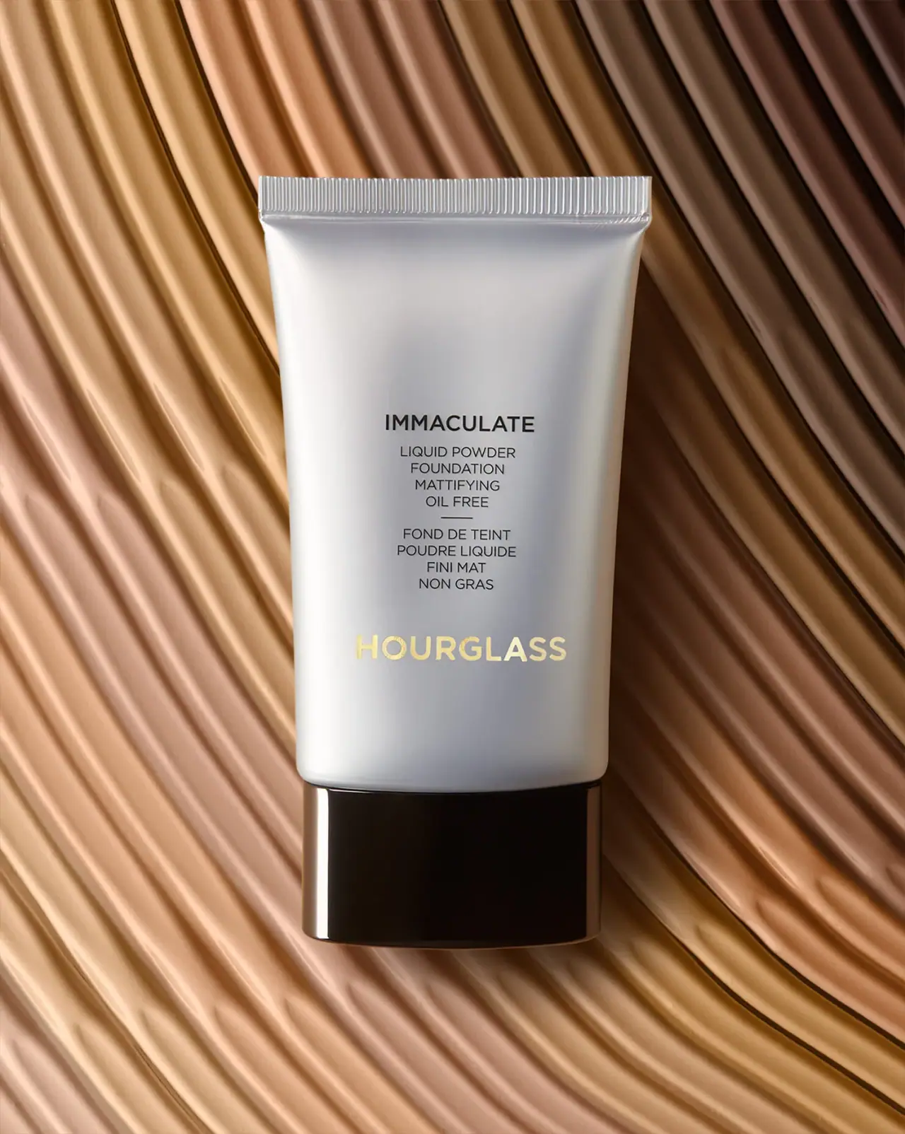
Silver-grey foundation tube with bilingual precision and golden signature