Photography: Imaginary Authors official photography. Images belong to their respective owners.
Imaginary Authors

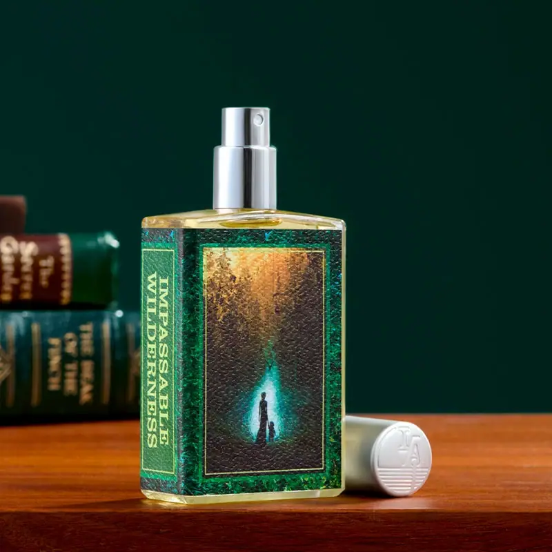
Green book-cover label with a forest scene and spine title
Impassable Wilderness presents its fragrance bottle like a small illustrated book. A green textured-looking wrap holds a framed woodland image on the broad face and a vertical title panel along the left side. Clear shoulders and a narrow base remain visible around it, while the exposed silver-coloured atomiser and detached pale cap reveal the spray format. The current official page explicitly identifies a collaboration with LAIKA’s Wildwood, making the narrative connection source-backed rather than merely a visual analogy.
- Perfume
- Light pack
- Heritage label
- Retro illustrated
About this study
Selected Impassable Wilderness illustrated 50 ml fragrance presentation; official Wildwood collaboration confirmed, label artist and component materials unverified.
Sources & evidence · Reviewed 2026-10-19Color Palette
Approximate colours interpreted from photography. These are screen references, not official brand colours or print specifications.
Pack body
Pale cap and silver spray
#D5D9D5
Approximate pale cap face and reflective spray assembly. Their materials are not established by this shared visual tone.
Label
Deep forest green
#19573E
Main book-cover-like border and spine panel. Variegation belongs to the textured artwork rather than a verified green leather material.
Dark woodland interior
#42392D
Shadowed forest illustration with warm brown and gold areas near the top.
Ink
Pale gilt-like lettering
#D1CC83
Vertical scent title and fine panel rules. Their pale golden appearance does not confirm metallic foil.
Accent
Turquoise story light
#45B5B3
Small luminous area within the printed forest scene around silhouetted figures; not the perfume colour.
Typography
Suggested visual alternatives, not confirmed brand typefaces. Any scale below is an illustrative estimate.
IMPASSABLE WILDERNESS is split into two lines and rotated along the left label panel, reading like the spine of a book. Thin pale rules frame that panel and the adjacent illustration. The large front image therefore leads visually while the title remains accessible along its edge. No large producer wordmark competes with the image on the visible broad face; attribution also appears as an IA-style monogram on the detached cap end. This is a label hierarchy built around story and title rather than a conventional central brand-and-fragrance stack.
Fonts
Spine-title alternative
Libre Baskerville
- Looks like
- Libre Baskerville
- Type
- Serif
- Weight
- Bold 700
- Case
- Uppercase
- Tracking
- Neutral to slightly open
- Fallback
- serif
Use a strong original serif title in a narrow framed panel. Rotate the complete line system coherently and test reading when the bottle is shown front-on and at an angle.
Secondary information proposal
Source Sans 3
- Looks like
- Source Sans 3
- Type
- Sans serif
- Weight
- Regular 400 / Medium 500
- Case
- Sentence case with short uppercase labels
- Tracking
- Neutral
- Fallback
- sans-serif
A practical proposal for a verified rear label or original catalogue text. Such secondary packaging typography is not visible here, so this is not an attribution of the actual hidden panel.
Structure & Proportions
Visual proportions and finish previews are illustrative. Confirmed construction details and uncertainties are distinguished in the study notes.
Proportions
| Purpose | Value | Preview |
|---|---|---|
| Book-cover division | The broad illustration area is much wider than the narrow vertical title panel at the left. | — |
| Clear margins | A thin transparent base and exposed shoulder remain outside the wrap, preserving the bottle outline. | — |
| Detached cap | The small horizontal cap adds a secondary cylindrical form beside the upright rectangular bottle. | — |
Shapes
| Element | Value | Preview |
|---|---|---|
| Bottle | Rectangular body with gently sloped shoulders and visible clear base. | |
| Spine panel | Narrow tall rectangle bordered by fine pale lines. | |
| Picture frame | Large upright rectangle around the woodland illustration. | |
| Cap end | Circular pale face with raised-looking monogram. | |
| Exposed spray | Small cylindrical actuator above a reflective collar. |
Finishes
Transparent vessel appearance
Exposed shoulders and base; component specification unknown. · transparent
Grained cover appearance
Illustrated label; tactile process unverified. · matte
Reflective spray
Exposed actuator and collar; material unknown. · metallic
Raised-looking cap monogram
Detached cap end; emboss is visual preview, not confirmed process. · emboss
Formats and materials
| Formats | A clear-looking rectangular fragrance bottle with slightly sloped shoulders, an exposed atomiser and a detached pale cap. The official page lists 50 ml; no quantity is legible on the selected visible label. |
| Materials | The accessed official product page does not provide a complete bottle, cap or label material specification. A transparent thick-edged vessel is described visually without assigning a glass grade or recycled content., The green cover-like surface has visible grain-like texture, but leather, embossed paper, coating and print methods are unverified. The cap and silver-coloured pump are likewise not classified as solid metal from appearance. |
| Closures | A silver-coloured spray button and collar are exposed above the shoulder, with the small nozzle visible near the top. The pale cap lies horizontally to the right, its circular end facing the camera. Magnetic retention, snap fit, thread arrangement and refillability are not established. |
| Decoration | A narrow spine-like title panel and larger framed picture area divide the wrap into two book-like regions., The central illustration shows a dark forest opening with small silhouetted figures and a concentrated turquoise glow beneath warm light. No specific illustrator is credited for this bottle artwork without direct attribution. |
Front Panel
Schematic reading order. The diagram’s zone heights do not represent measured artwork proportions.
The label wraps like a miniature book cover: a narrow vertical title strip occupies the left region, while the broad face becomes an illustrated panel. Fine pale borders give both areas the same graphic language. The forest scene contains its own focal light and figures, so little text is needed over it. Clear bottle margins keep the object recognisably a fragrance container despite the literary treatment.
| Zone | Content |
|---|---|
| Spine-like title | Two rotated uppercase serif lines identify Impassable Wilderness inside a narrow green bordered panel. |
| Green outer cover | A variegated dark-green frame surrounds the image and title, with a grain-like surface appearance. |
| Woodland narrative | The central framed artwork moves from warm upper light into a darker forest around a turquoise opening and small figures. |
| Cap attribution | The detached pale cap shows a raised-looking monogram and horizontal lines. It adds attribution outside the main illustrated label. |
Range System
The official product page presents Impassable Wilderness as a Wildwood film collaboration and names LAIKA production designer Nelson Lowry in its development context. It also references the original books’ writer Colin Meloy and illustrator Carson Ellis. Those relationships establish the narrative project but do not independently attribute the bottle illustration to any one of them. The selected design is not treated as a universal rule for every Imaginary Authors release.
- An original literary fragrance can use a spine-and-cover structure to separate title from image while preserving an identifiable bottle. Develop a distinct story and commission original artwork rather than borrowing an existing film scene.
- Collaboration credits should distinguish fragrance development, literary authorship and packaging illustration. A source naming a book illustrator does not automatically identify that person as the bottle-label artist.
Back of Pack & Shelf
The reverse, underside, carton and cap interior are unseen. No ingredient list, quantity position, synopsis panel or collector numbering can be reconstructed from this view.
- Obtain a full bottle rotation before describing any rear story text.
- Verify closure retention and refill access separately from the detached-cap pose.
- Keep book and film collaboration context distinct from unverified label-art credits.
On shelf
The green framed illustration and narrow title panel give this bottle a recognisable book-like identity. At reduced size the picture’s turquoise light may remain visible before the full vertical title can be read. This is visual interpretation rather than a recognition test. A straight-on front, left-side view and capped view would help a catalogue explain how the artwork wraps and how the complete silhouette changes when the cap is replaced.
Imagery
The bottle stands on a warm wooden surface beside a small stack of old-looking books against a dark green background. The books repeat the label’s spine-and-cover structure, making the literary idea immediate. The cap lies beside the base with its monogram facing outward, while the exposed atomiser demonstrates use. Warm reflections in the clear shoulder and base come partly from the scene and should not become a fixed perfume-colour specification.
Guidelines
Editorial principles for an original design brief, not official brand guidelines.
Do
- Separate confirmed film collaboration from unverified artwork credits.
- Preserve a readable spine title alongside the illustration.
- Describe label grain as appearance until its process is documented.
- Show the detached cap without assuming a magnetic closure.
Don't
- Do not claim leather or gold foil from a book-like appearance.
- Do not assign the label illustration to a named book artist without evidence.
- Do not treat scene reflections as a fixed fragrance colour.
- Do not invent rear synopsis text or collector numbering.
Sources & evidence
How this study was built
edition · Sourced fact
Official page explicitly describes Wildwood film collaboration and lists 50 ml.Impassable Wilderness — Imaginary Authorsrange · Sourced fact
Development context names LAIKA production designer and original book creators, without direct label-art attribution.Impassable Wilderness — Imaginary Authorsstructure · Visual observation
Rectangular transparent-looking bottle shows exposed atomiser and detached cap.typography · Visual observation
Rotated uppercase serif title sits in a narrow left panel; cap has raised-looking monogram.label · Visual observation
Green grain-like frame encloses title and woodland picture as separate book-like regions.palette · Visual observation
Dark green, pale title rules, warm forest and turquoise focal light belong to label artwork.imagery · Editorial interpretation
Books and wooden surface reinforce the label’s literary structure.
What remains unverified
- Bottle/cap/label material specifications and decorative processes unverified.
- Film and book collaborators are not automatically label-art credits.
- Current 50 ml source-listed; no visible quantity transcription.
- Reverse, carton, cap interior and refill system unseen.
- Fonts proposed and colours approximate.
Give your AI
packaging taste
Give your design or image tool a packaging study: palette, type, structure, front panel and principles for an original brief.
Export this styleFree with an email. PACK.md works in Claude, ChatGPT, Cursor and image tools.
More like this
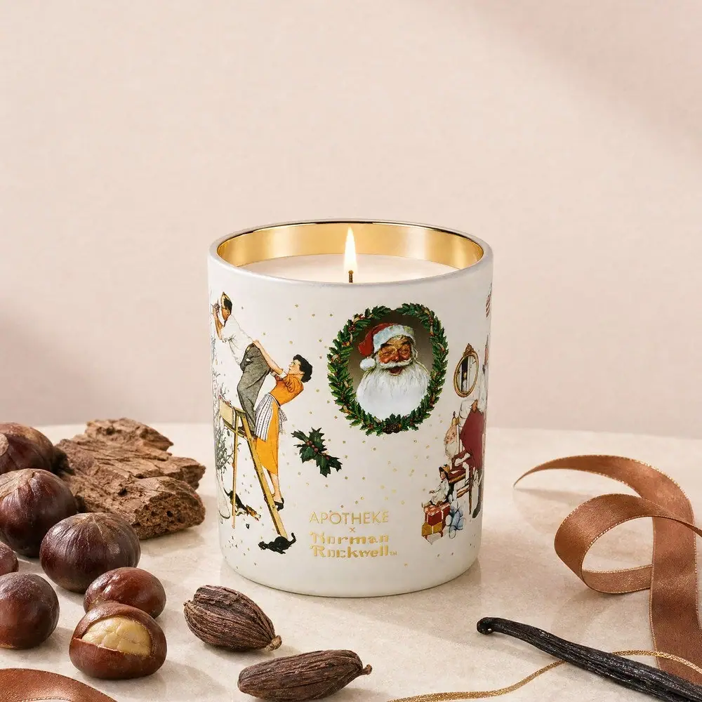
Apotheke
White holiday vignettes with a warm golden interior
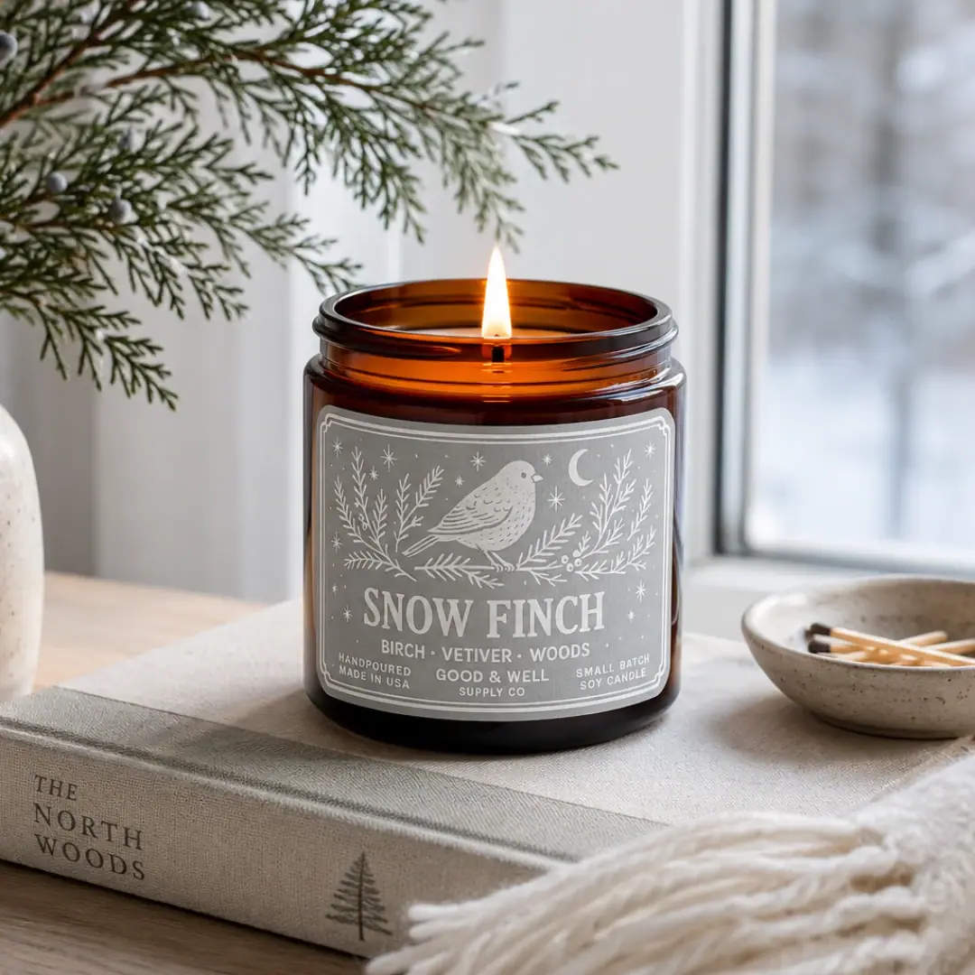
Good & Well Supply Co.
Pale winter bird illustration on a grey amber-jar label
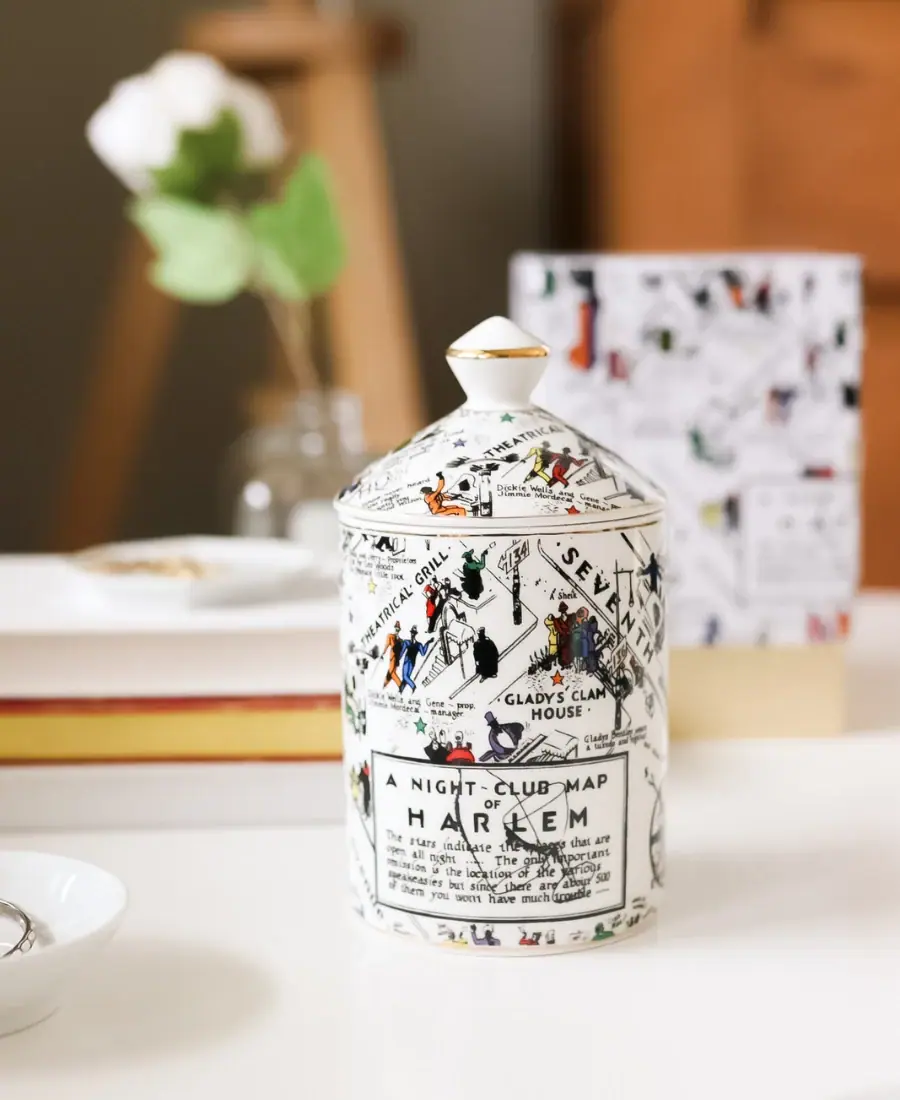
Harlem Candle Company
Illustrated ceramic map jar with coordinated lid and gold trim
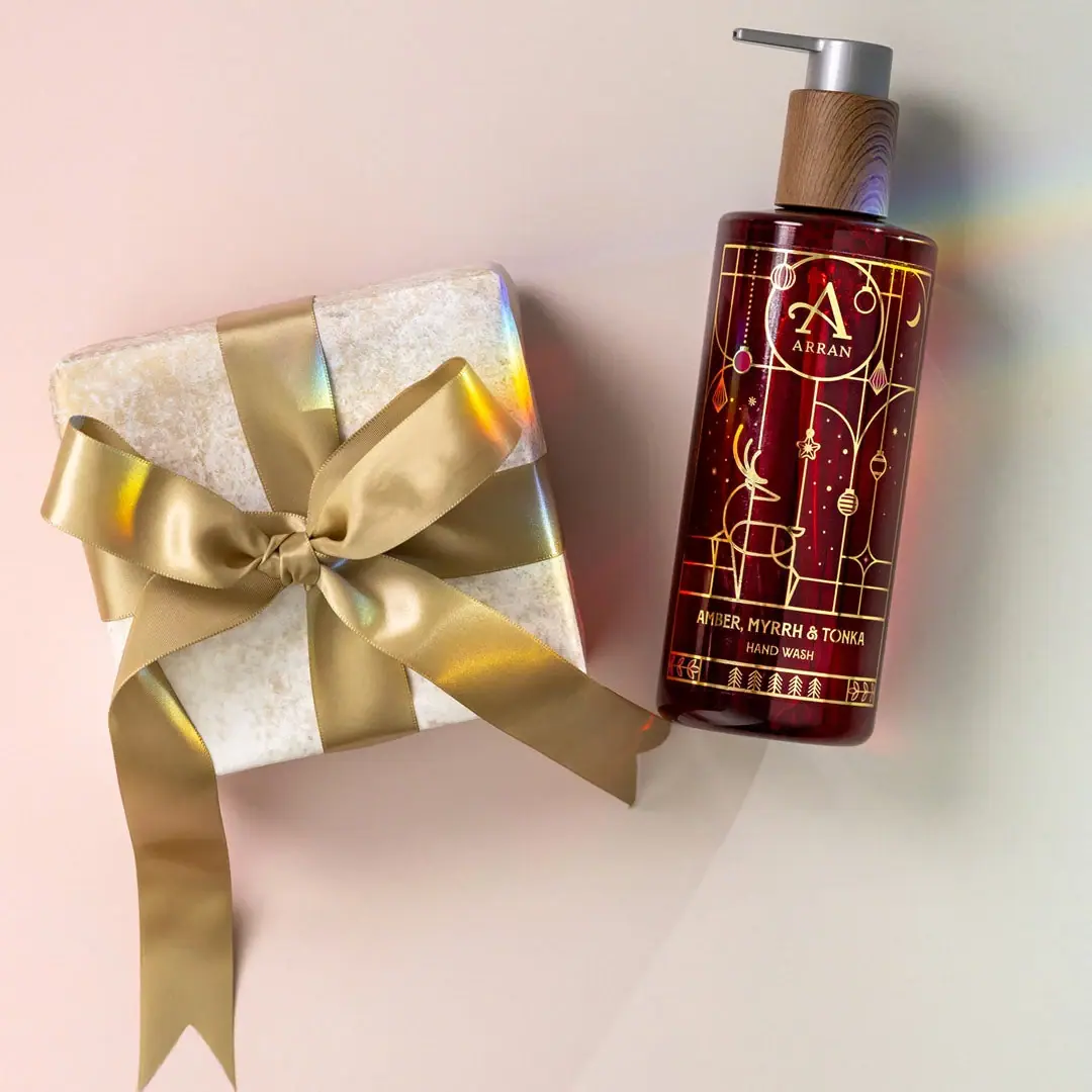
ARRAN
Festive golden linework on garnet with a grain-textured collar

Bachan's
octopus mascot on a red-capped squeeze

Benamôr
Ornamental lilac medallion suspended above golden botanical oil
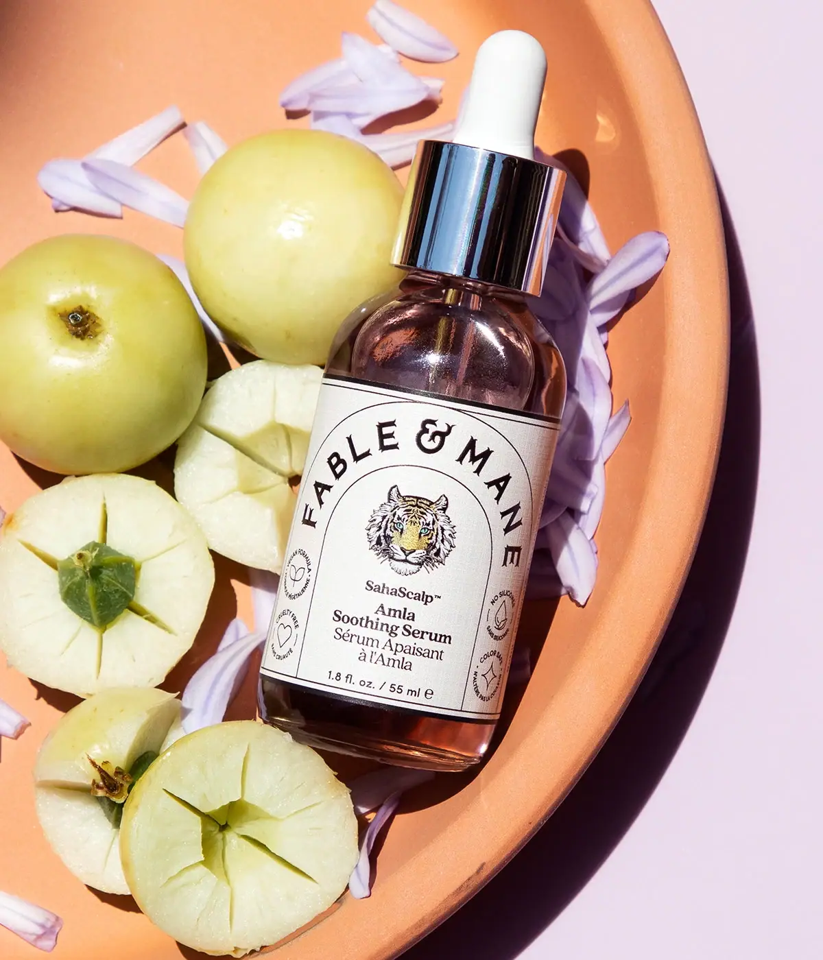
Fable & Mane
Arched serif maker, tiger portrait and amber dropper bottle
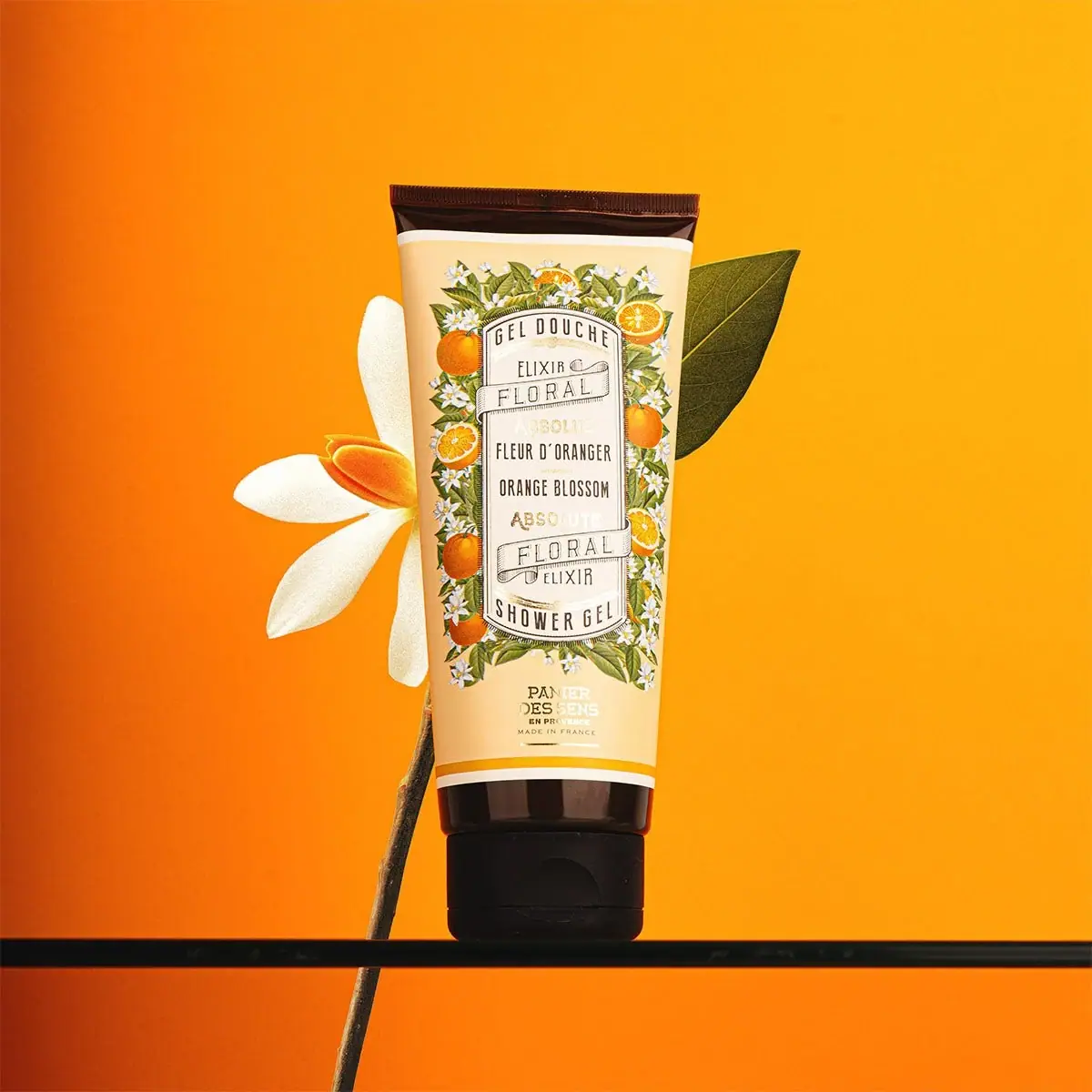
Panier des Sens
Botanical orange-blossom tube with a framed bilingual cartouche