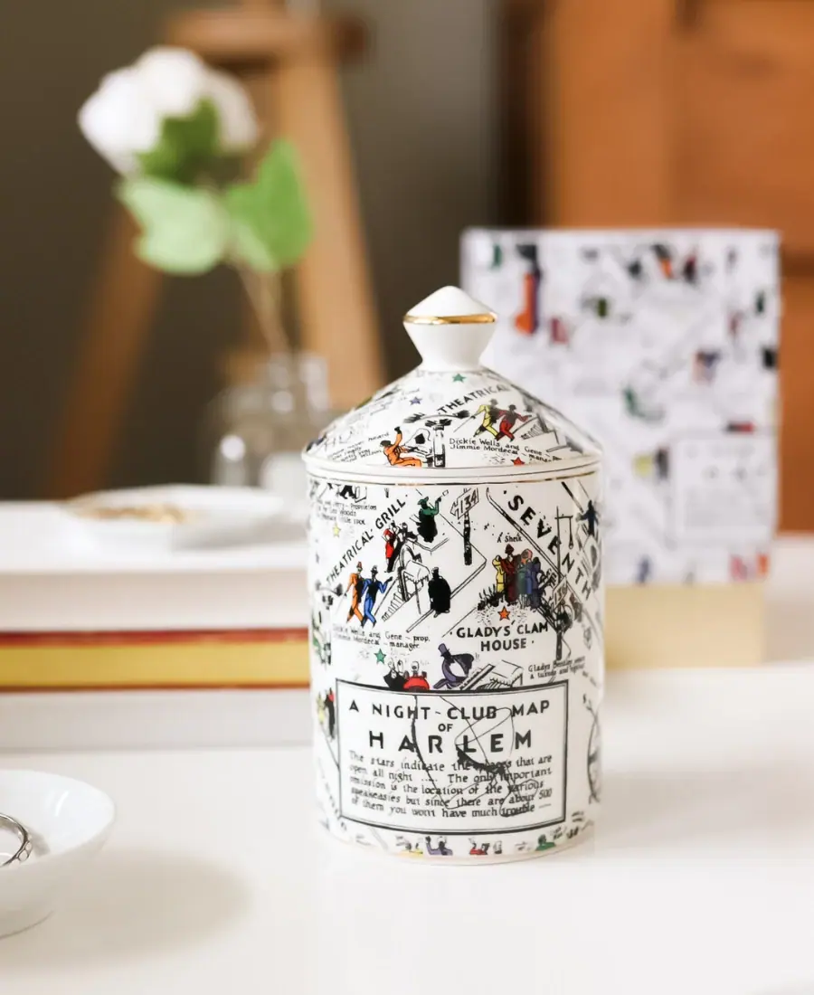
Photography: Harlem Candle Company official photography. Images belong to their respective owners.
Harlem Candle Company

Illustrated ceramic map jar with coordinated lid and gold trim
The Langston Nightclub Map ceramic candle turns its vessel and lid into one illustrated object. Black streets, hand-drawn-looking names and small colorful figures spread across a white ground, while a bordered map-title panel gives the visible face a local reading anchor. The sloped lid continues the drawing and rises to a pointed finial with a fine gold-colored band. The maker credits the underlying map to E. Simms Campbell; this study examines the selected ceramic edition rather than treating its artwork as a reusable generic pattern.
- Candles & home scent
- Light pack
- Retro illustrated
- Maximalist pattern
- Heritage label
About this study
Selected Langston Nightclub Map Ceramic Gold edition with fitted illustrated lid. Other Langston formats and unseen reverse artwork are not reconstructed.
Sources & evidence · Reviewed 2026-10-19Color Palette
Approximate colours interpreted from photography. These are screen references, not official brand colours or print specifications.
Pack body
Warm ceramic white
#F0EDE5
Approximate vessel and lid ground, keeping the dense black map legible and separating small colored figures.
Ink
Map black
#252721
Street outlines, names, figures and the bordered title panel form the principal illustrated structure.
Small figure red
#B74632
Localized clothing and scene accents rather than a large color field.
Map green
#356947
Small figures and markers distributed within the predominantly monochrome drawing.
Figure blue
#394E87
One of several small scene colors; exact palette is approximate and not a reconstruction of the original artwork file.
Accent
Gold trim
#B69249
Narrow reflective-looking accents at the finial and rim; the brand specifies a 22k gold design for this edition.
Typography
Suggested visual alternatives, not confirmed brand typefaces. Any scale below is an illustrative estimate.
Lettering is embedded within the map, with venue names and street labels changing size and direction to follow the illustrated geography. A low bordered panel carries the map title in larger hand-drawn-looking capitals, with smaller explanatory text beneath. The visible orientation does not show a dominant conventional brand wordmark or a clearly readable Langston scent headline. The package therefore offers a map-reading experience before a standard product-label experience; missing brand and scent information should not be invented on this face.
Fonts
Original illustrated-map labels
Patrick Hand
- Looks like
- Informal hand-lettered capitals
- Type
- Handwritten sans-serif
- Weight
- Regular
- Case
- Mixed case or uppercase by information role
- Tracking
- Natural irregular rhythm
- Fallback
- cursive
Proposed as a supporting reference for an entirely new illustrated map. Manually review orientation and spacing around original drawings rather than mechanically applying type to imitate historical artwork.
Retail supporting information
Inter
- Looks like
- Plain readable sans-serif
- Type
- Neo-grotesque sans-serif
- Weight
- Regular, Medium
- Case
- Mixed case
- Tracking
- Natural spacing
- Fallback
- Arial, sans-serif
Alternative for a new scent name, maker attribution and technical information outside the narrative artwork. The selected view does not establish where all of these appear on the source vessel.
Structure & Proportions
Visual proportions and finish previews are illustrative. Confirmed construction details and uncertainties are distinguished in the study notes.
Proportions
| Purpose | Value | Preview |
|---|---|---|
| Body and roof-like lid | The cylindrical body provides most of the illustrated area, while the low sloped lid extends the map upward without becoming as tall as the body. | — |
| Finial punctuation | The small pointed finial adds a clear topmost accent, with a thin golden line separating its white sections. | — |
| Map-title panel | The bordered rectangle occupies a localized lower-front area rather than replacing the all-over illustration with a full plain label. | — |
| Color distribution | Small colored figures punctuate a much larger white-and-black field; the drawing remains readable as a map rather than broad abstract color blocks. | — |
Shapes
| Element | Value | Preview |
|---|---|---|
| Vessel | Upright cylindrical ceramic body with a broad continuous illustrated wall. | |
| Sloped lid | Low dome-like top rises toward the central finial and follows the vessel's round footprint. | |
| Finial | Small sculpted lifting point with a pointed upper form and narrower lower neck. | |
| Map-title frame | Dark bordered rectangle embedded in the illustrated lower front. |
Finishes
Smooth ceramic appearance
White body and lid, with soft highlights; glaze and firing process remain unspecified. · gloss
Gold decorative accent
Fine rim and finial detail within the edition the brand describes as featuring 22k gold. · metallic
Formats and materials
| Formats | Ceramic Gold 12 oz candle vessel with matching fitted lid, identified by the official product page |
| Materials | The brand specifies a reusable ceramic jar, matching ceramic lid and 22k gold design for this edition., The accessed information does not specify ceramic body type, porcelain content, glaze chemistry, transfer technique or firing sequence. Those details are not inferred from the smooth white appearance. |
| Closures | The lid sits over the circular rim and rises into a low sloped dome beneath a shaped finial. The finial provides a visible lifting point. No gasket, locking system or airtight function is shown, and the fitted closed view does not reveal the interior contact surfaces. |
| Decoration | Attributed street-map illustration adapted across the curved vessel, Matching narrative drawing on the sloped lid, Bordered map-title panel within the larger composition, Small color accents distinguishing figures and points of interest |
Front Panel
Schematic reading order. The diagram’s zone heights do not represent measured artwork proportions.
The map itself is the visible information architecture. Streets and venue names cut across the curved wall, with figures occupying spaces between them. A bordered title panel provides a local pause in the dense drawing but does not create a fully plain front. The lid shares the same illustrative vocabulary, while the seam remains a physical boundary; precise line registration across that seam cannot be established from one orientation.
| Zone | Content |
|---|---|
| Narrative map field | Street names, small figures and venue labels fill most of the body, inviting close inspection and rotation rather than a single quick front read. |
| Map-title panel | The low framed area announces the map and includes small explanatory wording. Its hierarchy belongs to the illustration, not a newly inferred candle label. |
| Lid continuation | Related figures and lettering extend onto the sloped lid. The surface change is visible even where the graphic density is similar. |
| Trim and finial | Narrow gold-colored details define component boundaries and the lifting point without adding a large competing metallic field. |
Range System
The source lists other Langston candle formats alongside the ceramic edition, but this study does not assume those formats carry the same lid, material or full map treatment. The useful principle is coordinating an attributed narrative image across several physical surfaces while preserving readable local anchors. Any extension to an original collection should begin with independently commissioned artwork and a clear attribution plan.
- For an original wider vessel, redistribute a newly drawn map rather than stretching its figures and lettering.
- A smaller format may need fewer scenes and larger labels instead of an indiscriminate miniature reproduction.
- A matching outer box can introduce the story, but its exact crop and information hierarchy should be designed separately from the curved vessel.
Back of Pack & Shelf
The selected orientation shows only part of the wrap and a blurred patterned box behind it. The product gallery describes a branded opposite side, but this study does not reconstruct that side from text alone. The underside and candle interior are not visible.
- Acquire a full rotation before mapping venue placement, maker identity and any decorative seam.
- Inspect the underside for safety and production information separately from the narrative artwork.
- Do not infer carton stock or complete box graphics from the out-of-focus background object.
On shelf
Interpretively, the all-over map offers strong distinction at a distance through density and silhouette, while individual names and figures reward handling. The fitted lid helps the piece read as a complete decorative container after the candle is gone, consistent with the brand's reusable-vessel description. The tradeoff is that scent and maker information may need another viewing angle or outer packaging; the artwork title should not be mistaken for the fragrance name.
Imagery
The closed candle sits on a pale tabletop among books, small dishes, jewelry and a flower, with a patterned box behind it. Warm blurred furniture makes the illustrated ceramic object feel at home in an interior rather than isolated as a commodity. These props support the decorative-object reading but are not included components. The sharp focus on the vessel makes the drawing and finial the main points of attention.
Guidelines
Editorial principles for an original design brief, not official brand guidelines.
Do
- Keep the original artwork credit attached to the reference.
- Coordinate decoration across body and lid without assuming perfect seam registration.
- Use localized color to guide attention through dense linework.
- Give a complex illustrated field a few readable title anchors.
- Document material claims separately from unverified manufacturing processes.
Don't
- Do not reproduce Campbell's map as generic decorative stock.
- Do not call the ceramic porcelain without evidence.
- Do not describe the map title as the candle's scent name.
- Do not infer hand painting or transfer technique from the image.
- Do not mistake blurred lifestyle props for included accessories.
Sources & evidence
How this study was built
edition · Sourced fact
Brand credits the map illustration to E. Simms Campbell and identifies the Ceramic Gold 12 oz option.Harlem Candle Company — Langston Nightclub Map Ceramic Luxury Candlestructure · Sourced fact
Product page specifies reusable ceramic jar, matching ceramic lid and 22k gold design.Harlem Candle Company — Langston Nightclub Map Ceramic Luxury Candlelabel · Visual observation
A bordered map-title panel sits within a much larger field of streets, figures and venue lettering.Harlem Candle Company — Langston Nightclub Map Ceramic Luxury Candlestructure · Visual observation
Illustration continues onto a sloped lid with a pointed finial and narrow gold-colored trim.Harlem Candle Company — Langston Nightclub Map Ceramic Luxury Candlepalette · Visual observation
White and black dominate, with small multicolor figures and restrained golden accents.Harlem Candle Company — Langston Nightclub Map Ceramic Luxury Candletypography · Editorial interpretation
Suggested fonts support independently drawn artwork and retail copy; they do not identify the map's original lettering.range · Editorial interpretation
Coordinating narrative artwork across components is a transferable principle, while other Langston formats remain outside this study.
What remains unverified
- Ceramic subtype, glaze and decoration production processes unspecified.
- No underside, full reverse or interior directly inspected.
- Exact fonts and historical artwork layout not reconstructed.
- Background carton out of focus; stock and complete printing unknown.
- Dimensions and precise lid-to-body registration unmeasured.
Give your AI
packaging taste
Give your design or image tool a packaging study: palette, type, structure, front panel and principles for an original brief.
Export this styleFree with an email. PACK.md works in Claude, ChatGPT, Cursor and image tools.
More like this
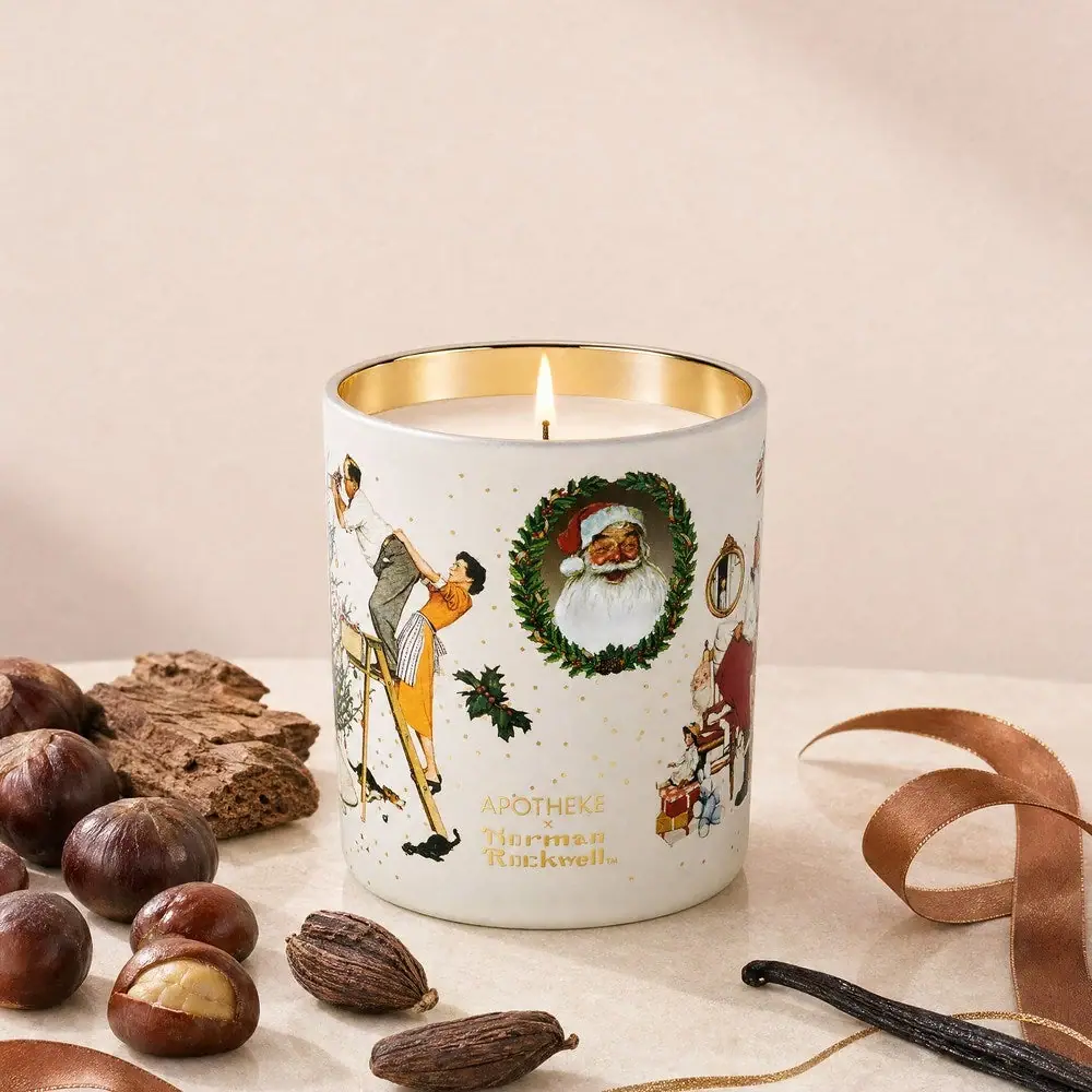
Apotheke
White holiday vignettes with a warm golden interior
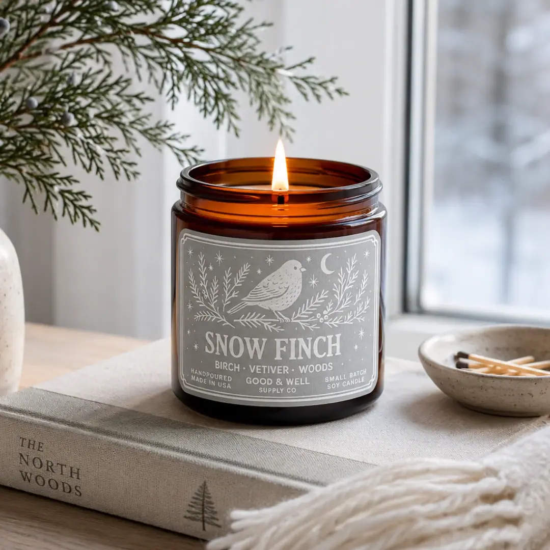
Good & Well Supply Co.
Pale winter bird illustration on a grey amber-jar label
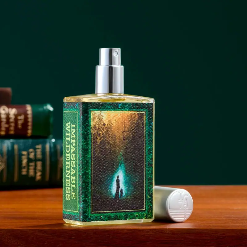
Imaginary Authors
Green book-cover label with a forest scene and spine title
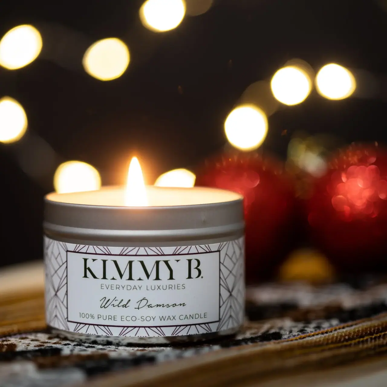
KimmyB
Silver tin, geometric frame and handwritten damson scent

Miu Miu
aqua relief, ivory neck band and a yellow disc

ARRAN
Festive golden linework on garnet with a grain-textured collar

Bachan's
octopus mascot on a red-capped squeeze

Benamôr
Ornamental lilac medallion suspended above golden botanical oil