Photography: Sol de Ibiza official photography. Images belong to their respective owners.
Sol de Ibiza

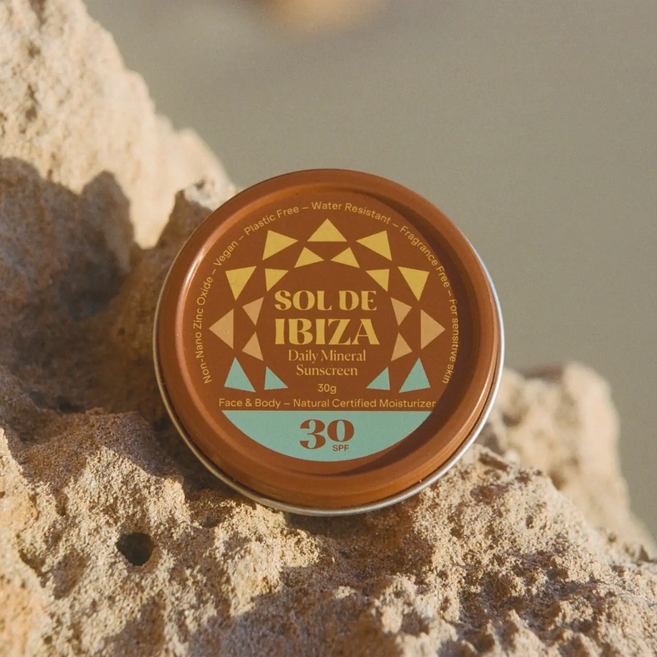
Terracotta sunscreen tin with triangular rays and turquoise SPF
The selected 30 g Face & Body Cream SPF30 tin turns its circular lid into the main information surface. A terracotta-brown field carries large ochre serif naming, two rings of triangular rays and a turquoise lower segment containing the protection number. Smaller claims follow the upper circumference, while product category and quantity remain in a central horizontal stack. The official brand identifies its cream containers as tinplate; the closed image does not reveal the internal coating or lid mechanism.
- Suncare
- Light pack
- Retro illustrated
- Heritage label
- Playful colour
About this study
Selected 30 g Face & Body Cream SPF30 closed tin; lid layout audited, underside and opening unverified.
Sources & evidence · Reviewed 2026-10-19Color Palette
Approximate colours interpreted from photography. These are screen references, not official brand colours or print specifications.
Pack body
Terracotta lid
#A3592D
Approximate brown-orange lid ground and rim, warmed by direct sunlight. The rough surrounding rock is a separate material.
Exposed silver rim
#B6B4A5
A thin reflective edge appears around the lid/base boundary. Exact protective coating is not established.
Ink
Ochre identity and rays
#DAB45A
Producer, product descriptor, perimeter text and several triangular rays use a warm yellow tone.
Accent
Pale sand rays
#D8AC71
Lighter triangles at the sides of the radial pattern. These are actual printed shapes, distinct from the similarly coloured stone props.
Turquoise lower field
#82B8AB
A curved lower segment and the lowest triangles introduce a cool contrast against the warm lid.
Typography
Suggested visual alternatives, not confirmed brand typefaces. Any scale below is an illustrative estimate.
SOL DE sits above a larger IBIZA in the centre, both in strong high-contrast serif capitals. Daily Mineral Sunscreen follows on two smaller serif lines, then 30 g and a face-and-body descriptor in sans serif. The bottom turquoise segment isolates a large serif 30 with a small SPF below. Around the upper perimeter, a fine curved sans serif line carries short claims separated by dashes. The design therefore has two major anchors: producer in the centre and protection number at the bottom.
Fonts
Producer and number alternative
DM Serif Display
- Looks like
- DM Serif Display
- Type
- Display serif
- Weight
- Regular 400
- Case
- Uppercase producer and large numerals
- Tracking
- Neutral to close
- Fallback
- serif
Use a distinctive serif for an original stacked name and protection-number placeholder. Test the relative weight of the central title and lower number so neither disappears within the radial pattern.
Curved and practical copy alternative
Inter
- Looks like
- Inter
- Type
- Sans serif
- Weight
- Regular 400 / Medium 500
- Case
- Sentence case with short identifiers
- Tracking
- Neutral; optically adjusted along the arc
- Fallback
- sans-serif
A clear sans serif is useful for perimeter copy and quantity. Curving a line changes its reading angle, so keep claims short and proof the full circumference at actual tin size.
Structure & Proportions
Visual proportions and finish previews are illustrative. Confirmed construction details and uncertainties are distinguished in the study notes.
Proportions
| Purpose | Value | Preview |
|---|---|---|
| Full lid canvas | The circular top offers almost the entire footprint for information, with a raised rim maintaining a visible boundary. | — |
| Radial frame | Triangles sit around the central text rather than behind it, keeping the stacked producer in a quieter interior area. | — |
| Lower number zone | The turquoise segment occupies the bottom portion, large enough for a strong 30 while leaving the product descriptor above its straight upper edge. | — |
Shapes
| Element | Value | Preview |
|---|---|---|
| Tin outline | Low circular container shown from the lid side. | |
| Triangular rays | Two offset rings of pointed geometric shapes around the producer. | |
| Lower colour segment | Curved-bottom turquoise field with a straight horizontal top. |
Finishes
Smooth coloured lid
Terracotta top and printed pattern; coating process unknown. · matte
Narrow metallic rim
Exposed edge at container boundary; cream tinplate category source-confirmed. · metallic
Formats and materials
| Formats | A closed low circular tin photographed almost face-on to the lid. The 30 g quantity is readable centrally, and the official product page offers 30 g and 100 g sizes. |
| Materials | The brand’s own website states that its cream containers are tinplate. That source supports the metal-container category rather than an aluminium assumption based on the silver rim., Interior lacquer, lid lining, ink formulation and any adhesive are not specified in the accessed evidence. The product page describes plastic-free reusable packaging, but a complete component bill of materials is not provided. |
| Closures | A raised terracotta rim surrounds the recessed-looking decorated lid face, with a narrow silver edge visible at the container boundary. The tin is closed, so the photograph does not establish whether the lid lifts or unscrews, nor any internal seal. |
| Decoration | Two interrupted rings of triangular rays surround the central producer. Warm yellow and pale sand triangles dominate the upper and side regions, with turquoise triangles near the bottom., A turquoise circular segment fills the lowest portion beneath the horizontal descriptor, separating the large protection number from the central title. |
Front Panel
Schematic reading order. The diagram’s zone heights do not represent measured artwork proportions.
The lid combines circular and horizontal organisation. Curved claims use the perimeter, triangular rays form a loose middle ring, and horizontal text occupies the centre. The turquoise base segment gives the protection number its own field. These nested zones prevent a compact lid from becoming one undifferentiated circle of copy, though the fine perimeter remains more demanding to read than the central name.
| Zone | Content |
|---|---|
| Perimeter claims | Short statements follow the upper arc, including material and formula-related language. They are documented as visible label copy, not independently assessed performance claims. |
| Geometric rays | Alternating triangle sizes produce a sun-like frame without a literal sun-face illustration. Their colours transition from warm upper rays to cool lower accents. |
| Central producer and category | Strong serif naming sits above the smaller daily-mineral-sunscreen descriptor and readable 30 g quantity. |
| Lower utility segment | A turquoise field carries a large terracotta 30 and small SPF. The face-and-body descriptor sits immediately above, joining practical category and protection information. |
Range System
The official listing offers 30 g and 100 g versions of this SPF30 cream. The selected cover clearly shows 30 g, so it is not treated as the larger tin. Other products exist on the brand site, but this study does not assign a universal turquoise-to-SPF code or assume that every container repeats the same lid geometry.
- An original tin range can preserve the centre for producer and category while changing a clearly controlled lower utility field. Any protection number or claim must be independently verified for the actual product.
- When resizing circular artwork, redraw the fine perimeter text and triangle spacing for the smaller lid. Mechanical reduction can preserve the pattern while making the claims too small to inspect.
Back of Pack & Shelf
The underside, side wall, interior and open lid are not shown. Ingredients, directions, batch information and the full recycling layout cannot be reconstructed from the decorative top.
- Obtain a base image before documenting the complete instruction and ingredient panel.
- Verify the opening mechanism with an open view rather than guessing from the round format.
- Keep mass units as grams; do not convert the 30 g label into 30 ml without density evidence.
On shelf
The central serif name and large lower 30 should remain the main recognition points in a reduced image. The radial triangles help distinguish the lid before small claims can be read. This is a visual interpretation rather than a tested consumer response. Because the package communicates primarily through its top, a catalogue should include the side and underside as complementary views to explain depth, opening and secondary information.
Imagery
The tin rests upright against rough sunlit stone, with warm shadows and a softly blurred background. The front-facing composition makes the lid readable despite the textured setting. Ochre and terracotta connect to the stone, while turquoise supplies the clearest cool accent. The package surface remains smooth and geometric against the irregular rock. This visual association is not evidence that the tin contains stone or that the scene establishes an environmental benefit.
Guidelines
Editorial principles for an original design brief, not official brand guidelines.
Do
- Keep the photographed 30 g size explicit.
- Use tinplate as the sourced material category rather than guessing aluminium.
- Proof curved copy at the real small-tin scale.
- Separate decorative rays from the large utility number.
Don't
- Do not turn 30 g into 30 ml.
- Do not infer a screw or lift-off lid from the closed image.
- Do not import stone texture into the pack’s material description.
- Do not reuse visible performance claims without product-specific verification.
Sources & evidence
How this study was built
edition · Sourced fact
Official product offers 30 g and 100 g; selected lid visibly reads 30 g.Face & Body Cream SPF30 — Sol de Ibizastructure · Sourced fact
Brand states its cream containers are tinplate.Cream container statement — Sol de Ibizatypography · Visual observation
Strong serif producer and 30 contrast with smaller curved sans-serif copy.label · Visual observation
Central naming, triangular rings, perimeter arc and turquoise lower segment divide the circular lid.palette · Visual observation
Terracotta, ochre, pale sand and turquoise occur on lid; thin silver rim remains visible.imagery · Visual observation
Closed tin is propped against rough stone in warm directional light.range · Editorial interpretation
One SPF30 tin does not establish a universal protection-level colour code.
What remains unverified
- Tinplate category sourced; interior coating and full component specification unknown.
- Closed lid mechanism and underside unseen.
- Fonts proposed and colours approximate in warm sunlight.
- Visible claims treated as label content; no independent performance assessment.
Give your AI
packaging taste
Give your design or image tool a packaging study: palette, type, structure, front panel and principles for an original brief.
Export this styleFree with an email. PACK.md works in Claude, ChatGPT, Cursor and image tools.
More like this
ARRAN
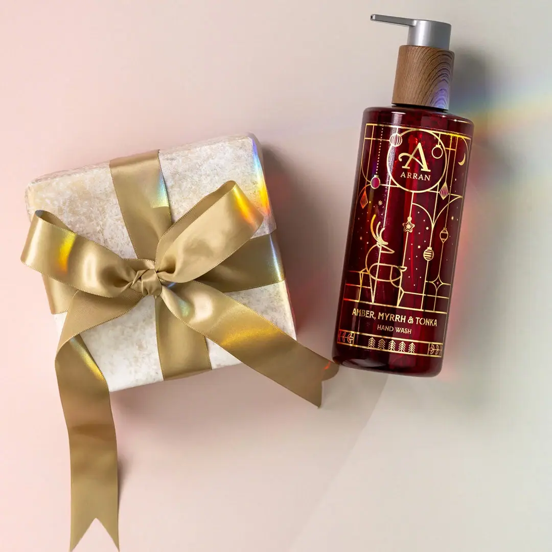
Festive golden linework on garnet with a grain-textured collar
Bathing Culture
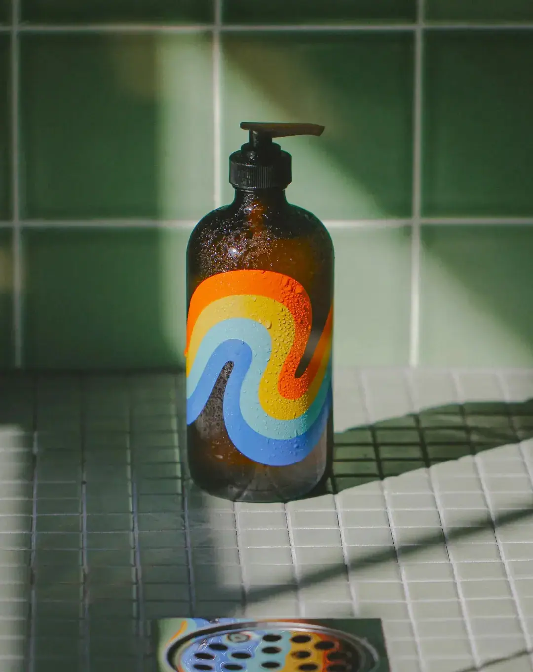
Flowing rainbow bands on dark refillable glass

Benamôr
Ornamental lilac medallion suspended above golden botanical oil
Fable & Mane
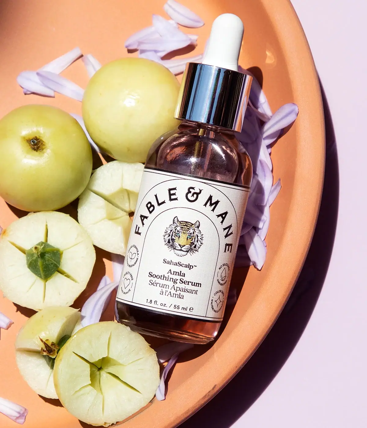
Arched serif maker, tiger portrait and amber dropper bottle
Flower Knows
Winged unicorn relief with pastel ribbons and reflective borders
Panier des Sens
Botanical orange-blossom tube with a framed bilingual cartouche
PoolBar London
Mint beach stripes with pink script and a lifebuoy badge
Apotheke
White holiday vignettes with a warm golden interior