Photography: Bathing Culture official photography. Images belong to their respective owners.
Bathing Culture

Flowing rainbow bands on dark refillable glass
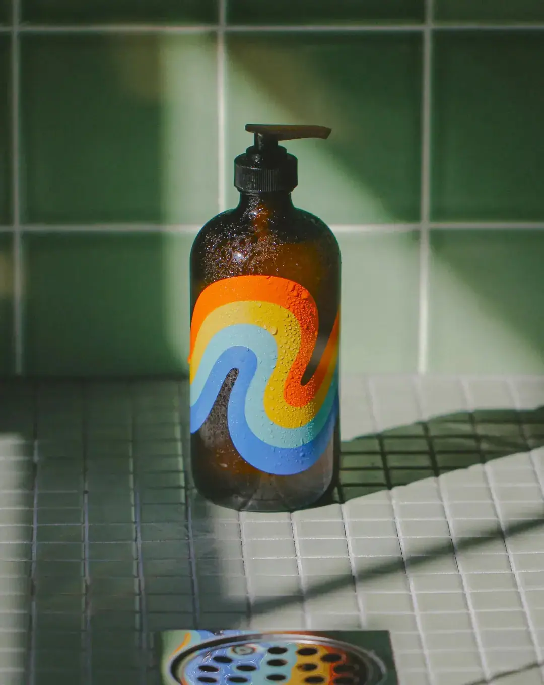
The selected Cathedral Grove Mind and Body Wash makes its most visible face an abstract colour field rather than a conventional product label. Four broad bands bend together across a dark amber-looking glass bottle: orange and yellow give way to pale aqua and blue. The motif occupies much of the straight body while leaving the shoulder and base exposed. A black pump provides a quiet functional ending above the colour. In the approved photograph, droplets, green tiles and sharp sunlight connect this graphic object to the act of bathing. Its visual strength lies in one large continuous gesture, not in an accumulation of illustrations, badges or large claims.
- Body & bath
- Light pack
- Retro illustrated
- Playful colour
About this study
The selected Cathedral Grove refillable glass pump bottle in the approved official shower-scene photograph. Analysis does not cover other scents, plastic versions, unseen labels or earlier artwork revisions. No exact date for the photographed edition was established.
Sources & evidence · Reviewed 2026-10-19Color Palette
Approximate colours interpreted from photography. These are screen references, not official brand colours or print specifications.
Pack body
Dark amber glass
#57351F
Approximate warm midtone of the photographed vessel. Transmitted light and dark reflections make its apparent brown vary considerably.
Pump black
#1F2420
Approximate dark closure tone in this green-lit scene. It visually joins the shaded bottle rather than competing with the bands.
Accent
Sun orange
#F47C08
Approximate outer warm band. Its high saturation draws attention against the dark glass before small details can be read.
Golden yellow
#D7B739
Approximate adjoining warm band, separating orange from the cooler interior and making the curve feel continuous.
Pool aqua
#92C7CF
Approximate light blue-green band. It provides the brightest cool interval without functioning as a white label panel.
Clear-sky blue
#628CCC
Approximate deeper blue band on the inner turn and lower sweep. This is a graphic colour, not evidence of a blue material.
Typography
Suggested visual alternatives, not confirmed brand typefaces. Any scale below is an illustrative estimate.
No front-facing wordmark, product name or small-copy hierarchy is legible in the selected cover. The demonstrable hierarchy is therefore graphic first, vessel second and dispenser third. Any type specification for this edition would require a readable additional view. For original work using this principle, place a concise identifier and practical product information on a separate readable area rather than forcing large lettering across every band.
Fonts
Proposed original identity
Barlow Condensed
- Looks like
- Friendly condensed grotesque direction; not an observed font match
- Type
- Condensed sans serif
- Weight
- Semibold or bold
- Case
- Uppercase or title case in a new identity
- Tracking
- Neutral; keep counters open at small sizes
- Fallback
- Arial Narrow, Arial, sans-serif
A compact fictional brand name on a deliberately separate information face. Its narrow width can preserve room for a large graphic without copying an existing wordmark.
Proposed practical information
IBM Plex Sans
- Looks like
- Readable humanist sans-serif direction; not an observed font match
- Type
- Humanist grotesque
- Weight
- Regular and medium
- Case
- Sentence case for instructions
- Tracking
- Normal; avoid decorative spacing in long copy
- Fallback
- Arial, sans-serif
Product function, scent name, directions and refill instructions in a fictional extension. Legibility should be checked around the bottle curvature and under wet-use lighting.
Optional alternative identity
Fraunces
- Looks like
- Soft expressive serif direction for a new design, not a reconstruction
- Type
- Soft display serif
- Weight
- Semibold
- Case
- Title case
- Tracking
- Optically fitted
- Fallback
- Georgia, serif
An alternative to the condensed identity choice if a new concept needs a warmer voice. Keep its use limited; combining all three families would add unnecessary competition to the graphic.
Structure & Proportions
Visual proportions and finish previews are illustrative. Confirmed construction details and uncertainties are distinguished in the study notes.
Proportions
| Purpose | Value | Preview |
|---|---|---|
| Graphic field | The visible bands span much of the straight-sided body while the curved shoulder stays largely undecorated. They are large enough to read as one shape before their individual colours are examined. | — |
| Negative space | Exposed glass forms both an outer margin and a winding interior gap. Those dark spaces let the coloured strip maintain a clear silhouette rather than becoming a solid rectangular colour patch. | — |
| Vessel and closure | The broad body dominates the narrow neck and pump. These are qualitative observations from a perspective photograph, not bottle dimensions or measured artwork ratios. | — |
Shapes
| Element | Value | Preview |
|---|---|---|
| Flowing colour motif | A continuous-looking ribbon with alternating rounded turns, parallel bands and no illustrated outlines. | |
| Bottle body | Straight cylindrical sides, rounded shoulders and a softened lower edge. | |
| Dispensing closure | Short vertical pump stem above a ribbed circular collar, with a long horizontal actuator. |
Finishes
Reflective glass appearance
Unprinted shoulder, side margins and base; specular highlights and droplets are photographic observations, not a coating specification · gloss
Solid-looking colour decoration
Orange, yellow, aqua and blue bands; apparent opacity does not identify ink chemistry, screen printing, decal or sleeve construction · matte
Formats and materials
| Formats | Rounded-shoulder cylindrical bottle with pump dispenser |
| Materials | Glass bottle identified by the official product page; the page reports 10% recycled material., Plastic pump identified by the brand as a mixed-material component. The product page cautions that it is difficult to recycle. |
| Closures | The selected bottle has a black dispensing pump with a ribbed collar, short stem and projecting horizontal actuator. Its nozzle points right in the photograph. Internal spring, dip-tube material, thread specification and dose are not documented by this study. |
| Decoration | Four broad nested colour bands following a flowing double bend, Glass remains visible around the graphic and inside its open turns, No rectangular front-label border is discernible; this does not prove a particular printing method |
Front Panel
Schematic reading order. The diagram’s zone heights do not represent measured artwork proportions.
The visible face is organised as an image surface. A large multiband wave sits below the shoulder and curves toward the base. No text panel interrupts its movement. The object demonstrates how recognition can precede reading, but the photograph does not reveal how required product information is resolved elsewhere on the vessel.
| Zone | Content |
|---|---|
| Closure and shoulder | Dark functional pump above exposed glass. This uncoloured upper section frames the decoration and keeps the silhouette easy to recognise. |
| Main body | A broad warm-to-cool sequence bends across the front. Continuous edges, not separate pictograms, hold the four colours together. |
| Lower body | The blue sweep finishes above the rounded base, leaving a visible dark margin rather than covering the entire object. |
| Information area | Not readable in this view. No brand, scent, ingredient or size text is reconstructed from the image. |
Range System
The product listing offers Cathedral Grove, Meadow Vision and Break Water. This study does not establish that particular rainbow colours encode those scents: only the selected Cathedral Grove vessel was visually reviewed. For an original range, distinguish structural continuity from variant navigation. A consistent large graphic may create family recognition, while a clearly readable scent identifier handles selection.
- Observed: the selected Cathedral Grove refillable glass bottle carries an orange, yellow, aqua and blue flowing graphic.
- Documented product context: other scent names exist in the same listing; their exact artwork relationships are outside this study.
- Interpretation for new design: retain a recognisable graphic rhythm but add an independently legible scent name, rather than relying on colour alone.
Back of Pack & Shelf
The reverse is not visible and no readable side panel is available in the selected cover. Ingredients, instructions, barcode and refill messaging cannot be assigned to actual positions. The absence of front text is not proof that the bottle has no information label.
- Request a clear reverse photograph before mapping the production label.
- In a fictional design, reserve a readable area for product identity and practical information without treating this recommendation as observed artwork.
On shelf
Interpretation: the warm and cool bands can remain recognisable when small text disappears at a distance. The dark vessel contains the colour instead of making the whole bottle brightly opaque. That balance can help the bottle read as a bathroom object worth retaining. The official product page offers bulk and in-store refill routes, supporting repeated use; the image alone cannot demonstrate durability, refill convenience or actual consumer retention.
Imagery
The printed motif is abstract; there are no trees or literal ingredient pictures on the visible face. The wet shower-floor scene supplies context through droplets, a drain and differently scaled green tiles. A bright patch of directional light creates a warm bottle highlight, while the graphic contrasts with the setting. The green tile field should not be sampled as the packaging's main colour. The brand FAQ names graphic-design and light-art influences, but it does not credit a particular person as the maker of this exact bottle artwork.
Guidelines
Editorial principles for an original design brief, not official brand guidelines.
Do
- Develop the large graphic as one coherent shape before refining its colours.
- Keep exposed vessel areas so the decoration has a clear edge and breathing room.
- Check identification at a distance and practical text at close range as separate tasks.
- Distinguish refill-system facts from untested assumptions about environmental benefit.
- Use scene lighting to show the object's material without hiding its graphic.
Don't
- Do not infer a scent-colour coding system from a single bottle.
- Do not invent typography or reverse-panel positions that the cover cannot show.
- Do not call the whole assembly plastic-free or straightforwardly recyclable because its body is glass.
- Do not describe water droplets as a permanent textured finish.
- Do not copy the exact rainbow path when developing an original identity.
Sources & evidence
- Mind and Body Wash Refillable Glass — Bathing Cultureproduct
- Manifesto — Bathing Culturebrand
- FAQ — Bathing Culturebrand
How this study was built
structure · Sourced fact
The official product page distinguishes the glass body from the mixed-material plastic pump; material claims cannot be applied to the whole assembly indiscriminately.Mind and Body Wash Refillable Glass — Bathing Culturepalette · Visual observation
The local approved cover shows warm amber-looking glass, four coloured bands and a dark pump; green belongs primarily to the tiled scene.Mind and Body Wash Refillable Glass — Bathing Culturelabel · Visual observation
The visible face is dominated by a continuous multiband curve. No legible wordmark or information hierarchy can be established from it.Mind and Body Wash Refillable Glass — Bathing Culturetypography · Editorial interpretation
Three proposed Google font choices support a fictional extension only and are explicitly not presented as recovered brand typography.range · Editorial interpretation
Other scent options are documented, but the reviewed image does not prove a scent-colour mapping. Refill context is supported separately by brand sources.Mind and Body Wash Refillable Glass — Bathing Culture · Manifesto — Bathing Cultureimagery · Visual observation
Droplets, tile grids and directional shadows situate the product in a bathing scene; these do not establish decoration technology or permanent texture.Mind and Body Wash Refillable Glass — Bathing Cultureimagery · Sourced fact
The brand FAQ names design and light-art influences without assigning authorship of this specific package to any of those influences.FAQ — Bathing Culture
What remains unverified
- The selected view contains no readable typography or reverse-panel information; font recommendations are original design proposals.
- No print-process specification, exact colour standard, dimensions or glass wall measurements were obtained.
- Current component statements are brand-reported, not independent verification of the photographed production run.
- FAQ includes legacy content and is used only for stated design inspirations, not present-day scent availability.
Give your AI
packaging taste
Give your design or image tool a packaging study: palette, type, structure, front panel and principles for an original brief.
Export this styleFree with an email. PACK.md works in Claude, ChatGPT, Cursor and image tools.
More like this
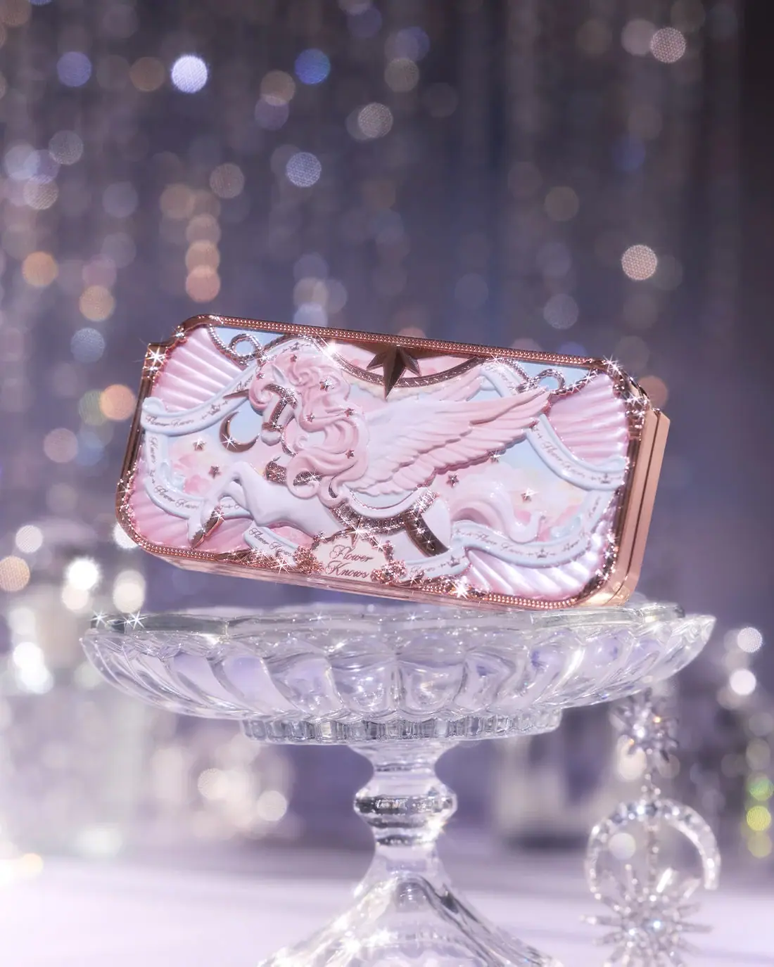
Flower Knows
Winged unicorn relief with pastel ribbons and reflective borders
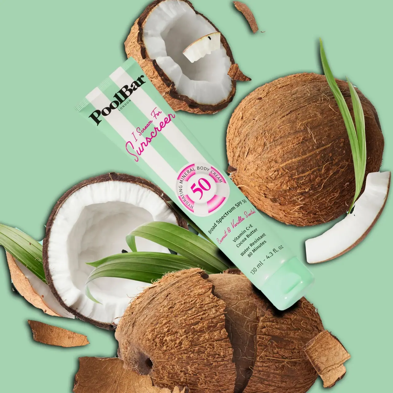
PoolBar London
Mint beach stripes with pink script and a lifebuoy badge
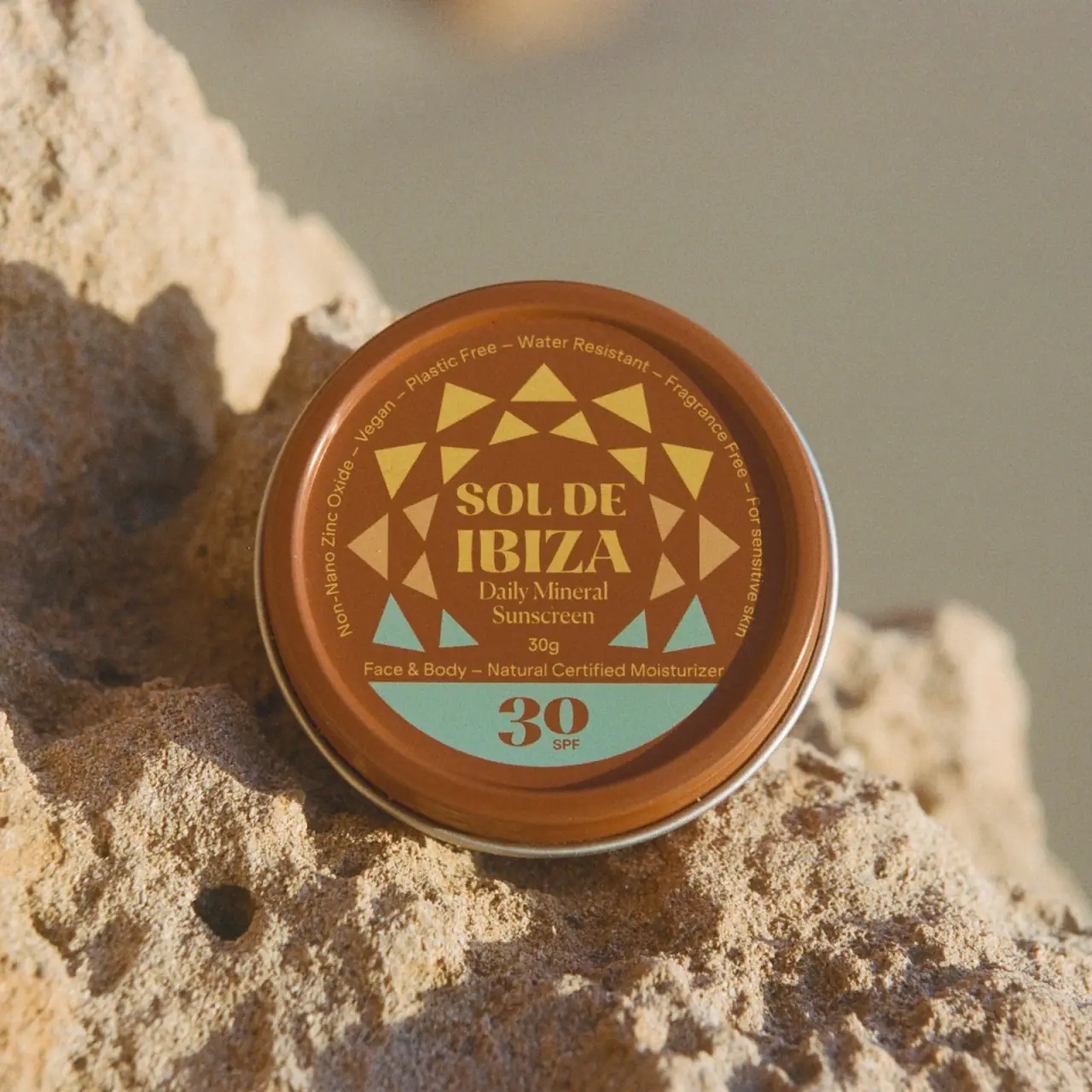
Sol de Ibiza
Terracotta sunscreen tin with triangular rays and turquoise SPF

Culture Pop
fruit-for-an-o wordmark on dewy cans
Diaspora Co.
marigold tins with a tiger crest
Literie
Quiet blue destination type with a playful coastal side panel
Milkjar
Green candle and carton share a white woodland illustration
Olipop
sunny soda fountain in flat colour